Houzz Tour: Sleek and Neat in Toronto
http://decor-ideas.org 03/26/2014 00:42 Decor Ideas
When you’re renovating a house, every square inch counts. Losing space because walls need to be thicker to provide more insulation can be the difference between a comfortable room and one where the furniture doesn’t quite fit. In this 1,600-square-foot, postwar house in Etobicoke, Toronto, Graham Smith and Joe Knight of Altius Architecture took pains to make the renovated space and the 750-square-foot addition comfortable, green and functional.
Houzz at a Glance
Who lives here: A family of 4
Location: Toronto
Size: 1,600 square feet (149 meters) plus a 750-square-foot (70-square-meter) addition; 4 bedrooms, 2½ bathrooms
Photography by Ihor Pona
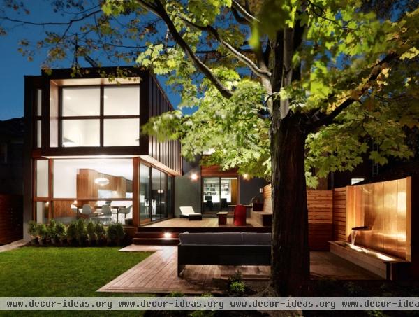
It’s worth looking at the rear addition first, as it’s unique. This side faces east, bringing in plenty of sunlight through full-height glazing to the kitchen and dining areas on the first floor and the main bedroom upstairs. This addition, which makes the plan an L shape, cradles a deck with steps down to a cozy seating area and a fountain beneath the branches of a large tree.
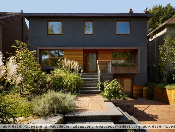
Unlike the addition, which is glass and standing-seam metal siding, the west-facing front is stucco and wood with punched-out openings. The stucco covers layers of new insulation on the outside of the existing masonry walls, increasing the house’s thermal mass. This mass helps moderate indoor temperatures, humidity and nighttime ventilation, greatly reducing cooling requirements.
The front door is up a few steps, but adjacent to the driveway (at right) is the day-to-day entrance, where a mudroom provides access to a laundry room and a rec room on this lower level, and to the stairs into the center of the house.
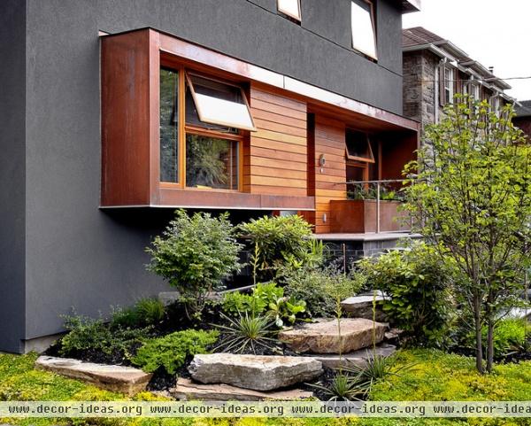
The punched-out Spanish cedar and copper frame achieves a few things: It breaks up the gray stucco, provides shade from the afternoon sun, creates a space for plants and signals where the entrance is.
In lieu of a traditional lawn, the front is planted with an interesting mix of ground cover, hardy plants and native grasses.
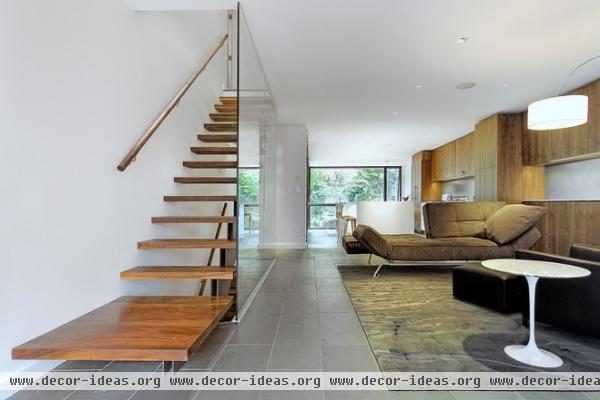
Inside it’s almost impossible to tell what’s old and what’s new, thanks to the continuous ceiling and slate flooring, which link the two spaces. (Hint: The white wall beyond the glass wall on the left is the line between old in the foreground and new beyond.)
Radiant heating also ties them together: in-floor in the addition and a retrofitted, staple-up application in the original house.
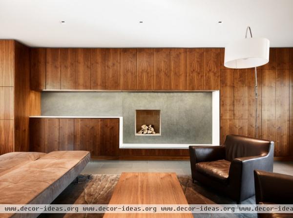
The side wall of the living room shows some of the care on the part of Smith and Knight to carry certain aspects of the design throughout the house. The recess and horizontal orientation of the fireplace recalls the punch-out at the front of the house, for example.
Plenty of storage is concealed behind the richly detailed cherrywood fronts around the recess.
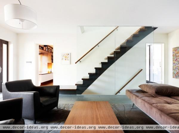
Opposite the fireplace, the stairs are carefully detailed as a single black stringer below wood treads. These are stairs meant to be seen behind a glass wall, not covered up by a solid one. The glass wall also means the architects have maximized the width of the house; valuable sight lines would have been lost with the framing and surfaces of a typical solid wall.
The door on the left leads to the den. The one on the right leads to a study and a powder room.
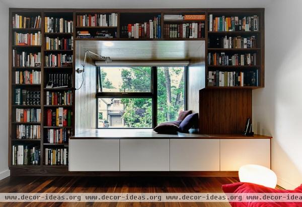
Here is the den, where shelves and a window seat, both built in, take advantage of the punch-out at the front of the house.
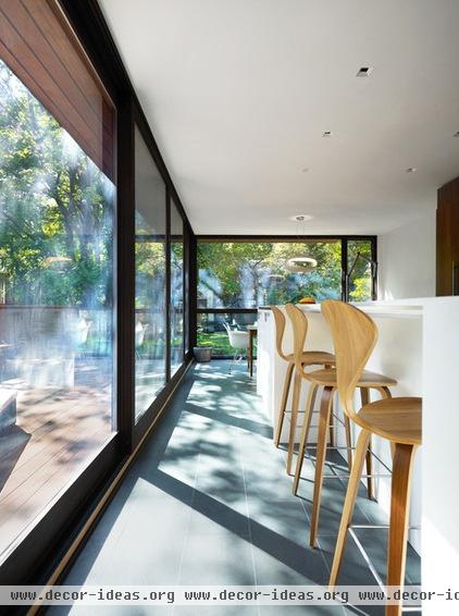
The kitchen occupies most of the addition on the ground floor. The large windows help heat the house in the winter; the morning sun heats the tile to create natural radiant heating for part of the day. The tree as well as the fencing help maintain privacy.
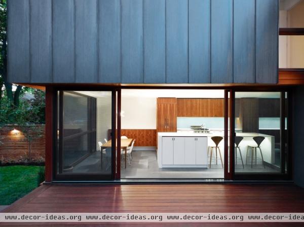
The glass wall facing the ipe wood deck slides away to partially connect the two spaces, making the house ideal for entertaining in good weather. The standing-seam copper siding over the glass gives the addition its distinctive appearance.
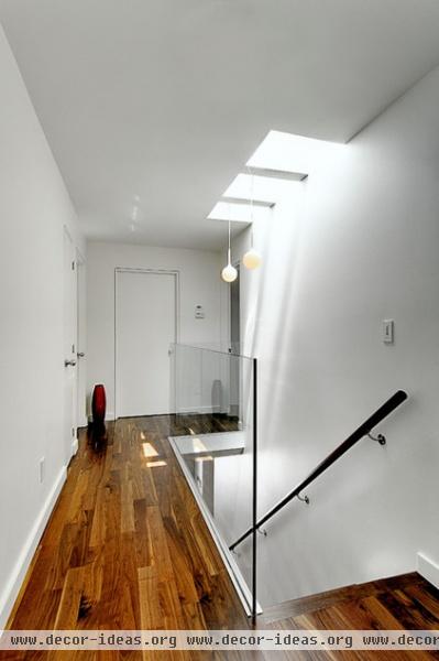
On the second floor, light from skylights brightens the hall, with its walnut flooring, and the living space below, thanks to the glass. (Note the guardrail that looks like a continuation of the glass wall.)
The natural light reduces the need for artificial lighting during the day, saving energy. Doors to the three bedrooms and a shared bathroom are in the distance.
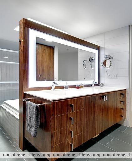
The main bath continues the attention to detail and design gestures like horizontal rectangles, found here in the illuminated frame around the mirror. The space opens to the dressing area, which the architects made possible by enclosing both the shower and the toilet. The walnut vanity picks up on the wood used for the flooring on this level.
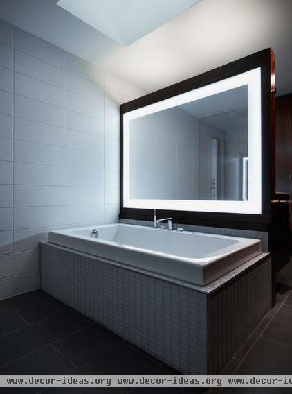
A skylight brings natural light to the large bathroom, working with the white porcelain to make it a bright space despite there being no other windows.
Browse more homes by style:
Small Homes | Colorful Homes | Eclectic Homes | Modern Homes | Contemporary Homes | Midcentury Homes | Ranch Homes | Traditional Homes | Barn Homes | Townhouses | Apartments | Lofts | Vacation Homes
Related Articles Recommended


