Put On a Good Face: Design Principles for Home Fronts
http://decor-ideas.org 03/25/2014 06:22 Decor Ideas
We spend so much time focused on fixing up the insides of our houses, we sometimes overlook what people see as they approach the front. The focal point of any home is the entry, so that’s a great place to start, as it sets the mood and look for your entire house.
Here are a few basic design principles to consider for enhancing the front of your house.
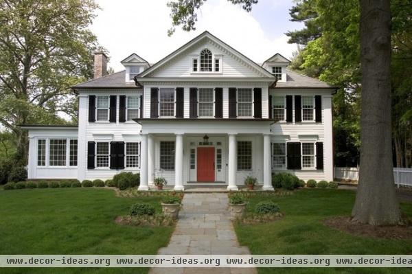
Depth and Symmetry
The center section extends beyond the main body of this house, which is equally divided on each side of the entry, with a minor sunroom set back on a third plane. This front entry works because the columns on the front porch continue the strong symmetry of the facade and add another level of depth. The height of the columns align with the window height on the first level, so they are not overwhelming, and the spacing keeps the covered porch feeling open.
The front door could have gotten lost on this facade, since it is so symmetrical and set back on the same plane as the windows, but the bright-colored paint gives it some personality and makes it feel like it’s ready to greet you.
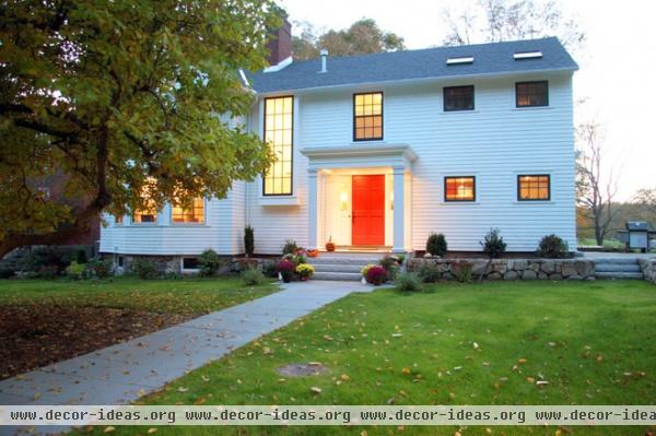
If you don’t have such a classically proportioned home, adding a portico and perhaps modifying some adjacent windows, as in this example, can give a sense of depth to an otherwise flat facade. The red door once again helps to establish that point of destination and provides one more layer of depth.
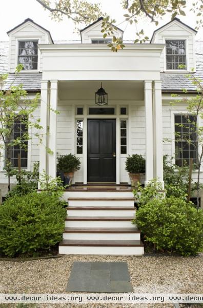
Height
The tall windows on the first floor and triple set of dormers on the second level are strong vertical elements on this facade. The slender, simple farmhouse-style square columns on the porch and equally proportioned sidelights on the front door harmonize the look.
The thin horizontal details on the columns and porch roof help to subtly break up the verticality but keep the focus on the height.
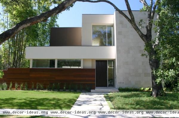
This modern house has clear horizontal and vertical planes, but the front entry is tall and thin, leading your eye up to the feature window on the second level and breaking up the horizontal planes on the left side of the house.
Width
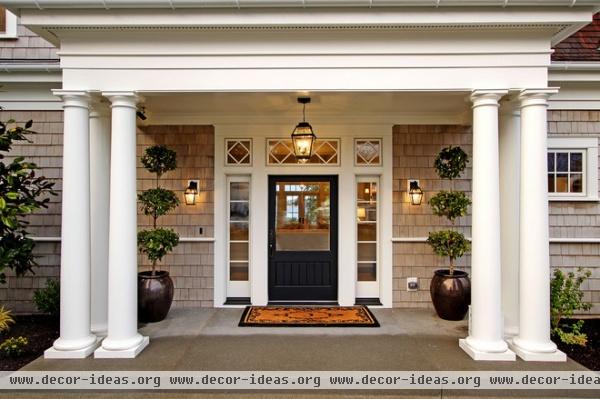
An extra-wide front door is a luxury that will make your house feel grand. Have one if you can; you won’t regret it. It does need some balance and context, however, so make sure you have space for sidelights or a glass panel above the door.
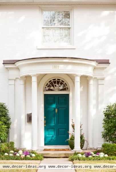
The engaged columns against the facade of this house not only give depth to the front, but also gently extend the width of the entry.
Harmony
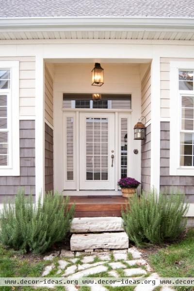
Coordinate with other design elements. You’ll notice that the glass panel over the front door mirrors the top panel of the windows on the facade here. Making this connection harmonizes the windows and entry door.
Odd Numbers
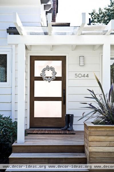
Items in odd numbers look more appealing, so when you’re choosing a front door with a strong design, such as this glass-paneled door on a more modern bungalow-style home, three is the perfect number of panels.
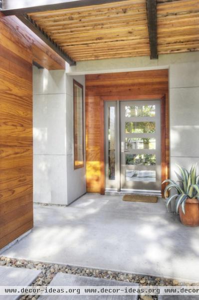
Or consider five panels, as on this front door.
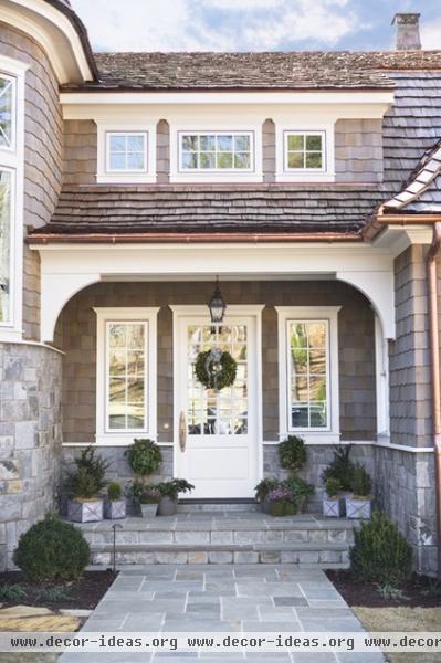
This house’s front area works with the design elements of the rest of the house and effectively uses the principle of odd numbers. The dormer, strong horizontal lines in the stone base and low, swooping rooflines make the pair of windows on either side of the door necessary to keep the horizontal element.
By mimicking the trio of windows above the door, the entry gets a boost in height and a strong sense of classical balance. The total effect is comfortable and approachable.
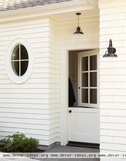
Don’t Forget the Other Sides
We often use side and back entries more than front entries, so turn these hardworking areas into design opportunities, too. Here the setback allows for a slight sense of depth, while the hanging light, oval window and Dutch door add character.
More: How to Choose a Front Door Color
Related Articles Recommended


