Houzz Tour: Updating a Midcentury Aerie in the Berkeley Hills
Derek Holley was vacationing in Sardinia when he received an urgent email from his real estate agent, letting him know about a house in California’s Berkeley Hills that had just come on the market. “I told her to let me know if there was something special that I should see,” Holley recalls. He had a friend check out the home, and the response was so favorable, he cut his vacation two weeks short to see the place in person.
“I loved it the moment I saw it,” he says. Perched on a hillside overlooking the San Francisco Bay and the Golden Gate Bridge, it has unmatched views. But the house itself needed lots of help: Its mid-’50s interior was gloomy, dated and marked by a clumsy indoor-outdoor flow. Deferred maintenance meant that most of its systems needed attention or replacing.
Holley hired architect David Yama of YamaMar Design in San Francisco to lighten and brighten the home, and to bring the quality of the structure in line with the magnificence of the view. Today house and vista work together as one, making it hard to tell where one ends and the other begins.
Houzz at a Glance
Who lives here: Derek Holley
Location: The Berkeley Hills area of Berkeley, California
Size: 2,700 square feet (251 square meters); 4 bedrooms, 3½ bathrooms
After photos by Bruce Damonte; styling by Alison Damonte
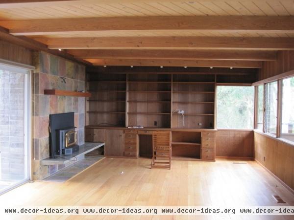
The house was built in the mid-1950s and was pretty advanced for its day, cantilevering 45 feet over its site and offering abundant views. But the old doors and windows were failing and felt clunky, making access difficult, while the redwood interior proved to be rather gloomy and monotonous. “If it’s everywhere, it’s just too dark,” says Yama.
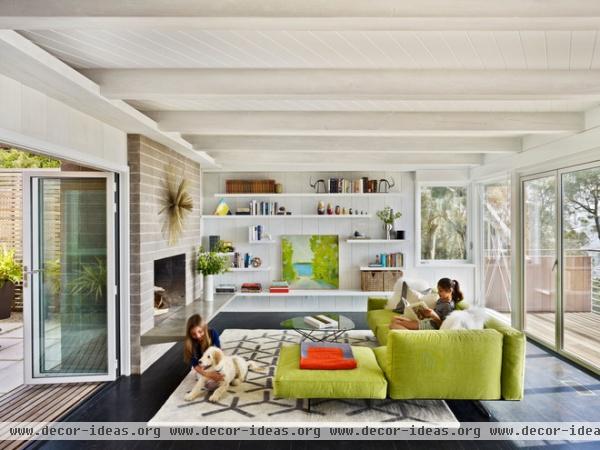
AFTER: “I like whitewashing, because you still have the texture of the wood, but it’s a much lighter surface,” says Yama, who applied the whitewash in three or four thin layers, providing better control over the results.
Although it might seem counterintuitive to darken the floors on a house that was feeling too dark, Yama applied a dark stain to the existing oak floors, creating a sharp contrast with the whitewashed walls that felt more formal and elegant.
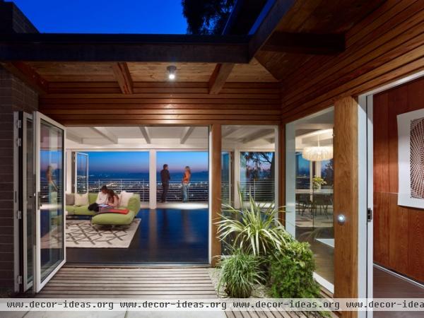
“In California you really want to have indoor-outdoor living if you can,” says Yama. Clunky sliders and a level change between the courtyard and the entry didn’t encourage that, so Yama worked with contractor U Unlimited to match the floor levels inside and out to encourage better flow, and to replace the sliders with retractable NanaWalls, erasing distinctions between interior and exterior.
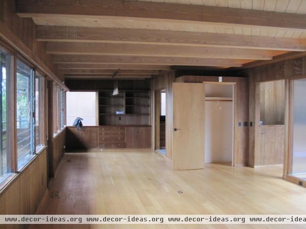
Narrow doorways did little to enhance access to the deck, while jalousie windows didn’t do the view any favors, either.
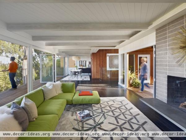
AFTER: Yama replaced the view-facing west wall with retractable NanaWalls, providing unfettered flow between the interior and the deck. An ill-advised slate facade was stripped from the fireplace, revealing the original concrete block underneath. In true ’50s fashion, the blocks look a bit like Roman brick.
Sectional: Arkitektura; carpet: Peace Industry
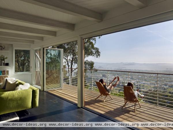
When the walls are retracted, the living room starts to feel like an extension of the deck. Guests naturally gravitate toward the view of Berkeley, the bay and the Golden Gate Bridge.
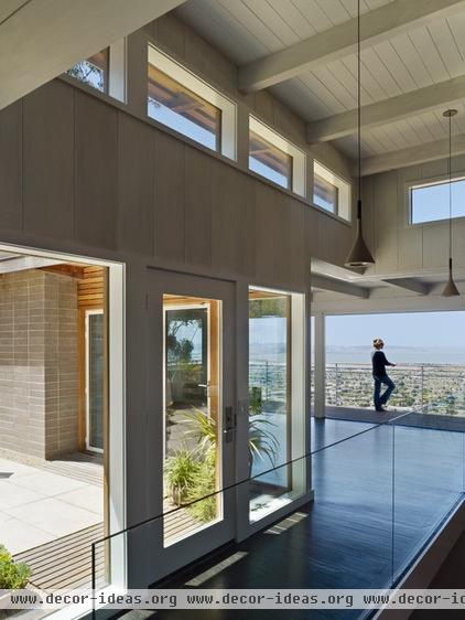
Yama replaced the failing anodized aluminum windows with new powder-coated aluminum units from Fleetwood. Transom windows illuminate a covered deck. Like all the decks in the house, this one got new railings.
Looking at this image, it’s hard not to think of Julius Shulman’s classic 1960 photograph of Case Study House #22 overlooking the Los Angeles skyline at night. The view may be different, but the feeling it evokes is just as awe inspiring.
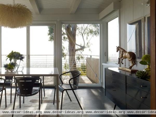
The dining area is consigned to one end of the main room. A fluffy light fixture from Coup d’Etat helps soften the room’s minimalist lines and adds a note of whimsy.
Dining table: custom; chairs: vintage
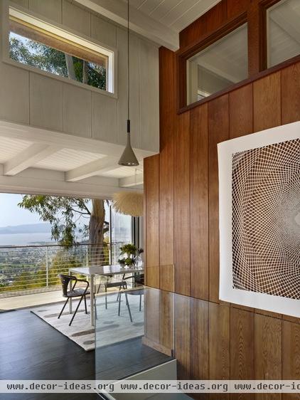
The painting over the stairway was purchased at a yard sale.
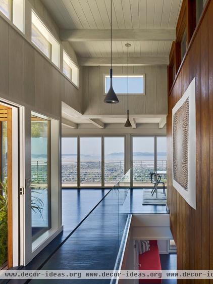
Before the remodel, the staircase to the lower level was flanked by a wooden half wall, making the descent feel constricted and limiting the flow of light into the downstairs. Yama’s mission throughout the remodel was to minimize doors and maximize glass. In keeping with that goal, he replaced the wood wall with panels of clear glass, enhancing the flow of light as well as the view.
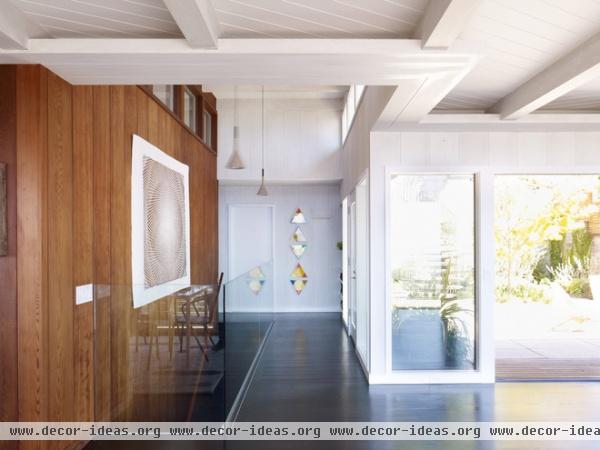
While most of the redwood was whitewashed, Yama preserved the paneling beside the stairs for warmth and contrast, and because that’s where the most impressive planks had been utilized.
Transom windows in the redwood wall admit extra light into the kitchen on the other side.
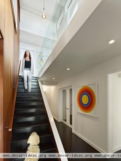
The new staircase lets a lot more light into the lower level.

The old house didn’t have a designated master bath, so Yama annexed some space from a neighboring bedroom and created a new bath that felt consistent with the home’s overall design.
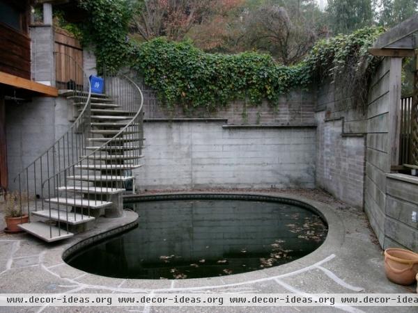
To enter the house from the street, you once had to descend a spiral staircase skirting a pond, then walk across a cracked concrete terrace. “The entry sequence was cold and uninviting,” observes Yama.
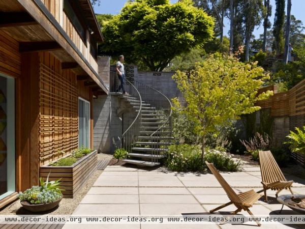
AFTER: The architect replaced the pond with plantings, softening the transition from the street (and making the process a whole lot safer).
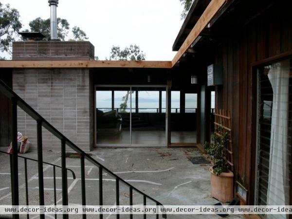
The old entry courtyard looked drab and leaked rainwater into the rooms below.
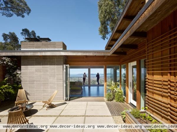
New concrete pavers brightened the entry and protect the spaces below. The gravel between the pavers echoes the gravel covering the roof, which was treated to a layer of rigid foam insulation. Slatted-wood strips in front of the doorways act like doormats, keeping out unwanted debris.
More: Houzz Tour: Craning Toward the View in Seattle


