My Houzz: Going White and Bright in Montreal
Architect Maxime Vandal and designer Richard Ouellette of Les Ensembliers loved the traditional features in their 1910 Arts and Crafts home and wanted to preserve them. But they also wanted a setting in which they could highlight their collection of contemporary art.
To accomplish both, the Montreal residents spent six months remodeling the house, moving and widening doorways, lacquering wood moldings in white, opening up spaces and adding a private apartment in the basement. “We wanted to enhance the space,” says Ouellette of his newly brightened, traditionally appointed residence. “There is a strong sense of continuous flow on each floor of the home.”
Houzz at a Glance
Who lives here: Maxime Vandal and Richard Ouellette; Richard’s mom, Mireille Couture; and their dog, Drue
Location: Westmount area of Montreal
Size: 3,000 square feet (418 square meters); 3 bedrooms, 3 bathrooms, plus a 1,500-square-foot (139-square-meter) basement apartment
Year built: 1910
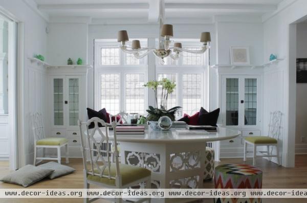
The home renovation project started in the dining room. “It’s natural we did, since it’s the center of the house,” Vandal says. “We had this large, beautiful set of windows and shutters that we wanted the door openings to reflect.”
They moved one doorway and expanded another two to the exact size of the windows. The perfectly square room has three doorways: one leading in from the front entry, a second leading to the kitchen and a third that opens to the butler’s pantry.
The chairs are secondhand finds. The couple’s carpenter replicated the chair motif on the table and in a few other areas of the home.
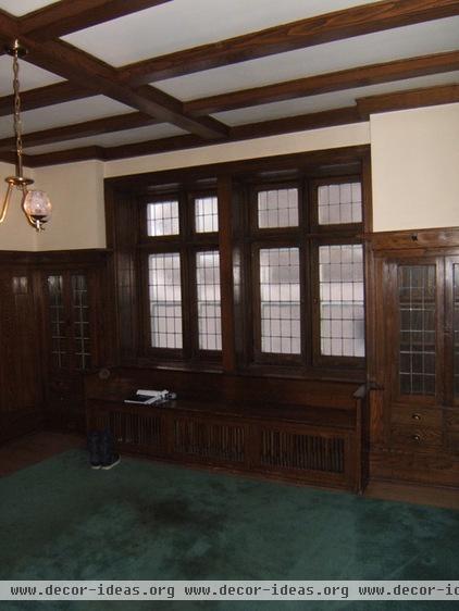
Before the remodel the moldings and wood paneling made the rooms very dark.
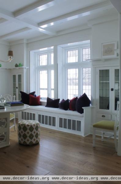
AFTER: Vandal and Ouellette brightened up the dining room by lacquering the original built-ins in a bright white.
Poufs: Design by Les Ensembliers, fabric by Martyn Lawrence Bullard
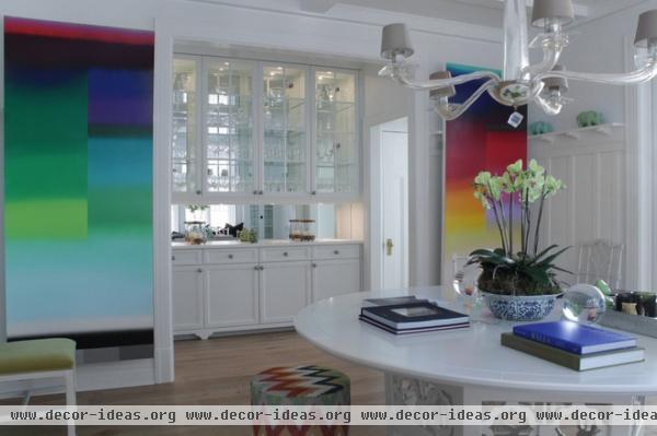
The home had a butler’s pantry with a small doorway leading into the dining room. The owners opened the doorway and added mirrors to the pantry to echo the windows on the opposite side. The doorway to the right of the pantry provides access to the powder room and secondary access to the kitchen.
During dinner parties the couple can close the pocket doors connecting the dining room and the kitchen, but still access the kitchen through the door to the right of the pantry. Colorful oversize contemporary art pieces contrast with the traditional wall paneling. “For me it’s showing great art in an old house,” Ouellette says.
Wall art: Nicolas Grenier
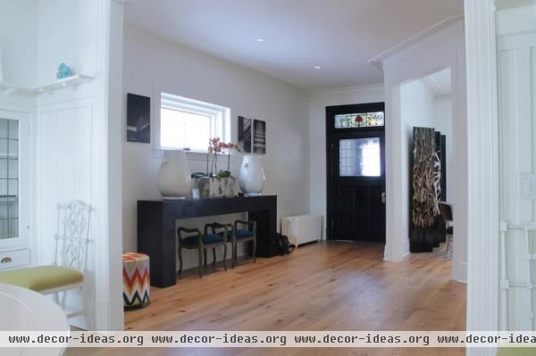
The front entrance felt significantly larger once the doorways were opened. The homeowners replaced the original flooring with engineered white oak.
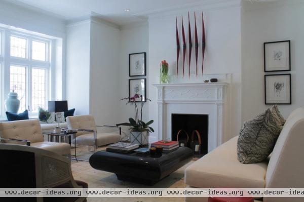
The challenge in the living room was to create adequate seating in a small space. Vandal and Ouellette ordered a custom armless couch to keep the room feeling open. A window banquette provides another layer of seating.
Art above fireplace: Paul Robinson, Art Mûr Gallery
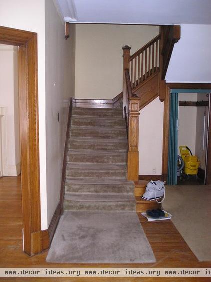
The owners thought the original stairs were interesting but dated.
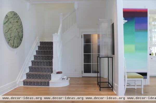
AFTER: Vandal and Ouellette lacquered the dark wood and replaced the drab runner with one sporting a modern geometric pattern.
Wall art: Laurent Lamarche, Art Mûr Gallery
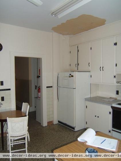
The original floor plan had four rooms at the back of the house: a small kitchen, a bathroom, a maid’s room and a laundry room.
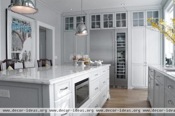
AFTER: Vandal and Ouellette combined all four rooms to create a large kitchen, which extends across the entire rear of the house. The back door was moved to the left, allowing the adjoining counter to be extended.
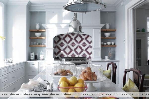
Design elements from the dining room chairs are repeated on the wall behind the range.
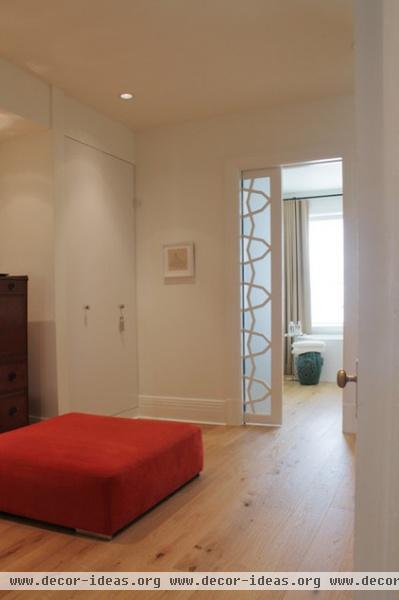
The master suite covers about half of the upper floor. The large dressing room has a doorway to the bedroom on the right, and a custom frosted door to the powder room that brings natural light into the dressing room.
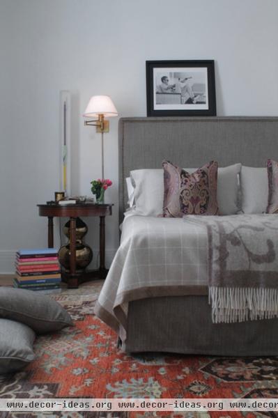
A large upholstered bed sits in the middle of the room.
Nightstand: Galerie M
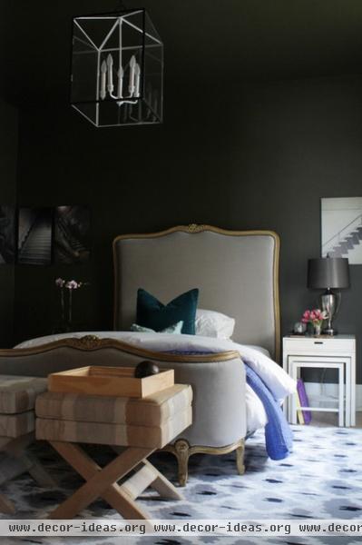
The homeowners painted the guest bedroom a dark, mellow color. The idea was to create a very comfortable and cozy sleeping space for visitors.
Photographs of stairs adorn one of the walls.
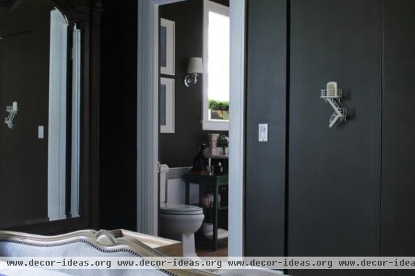
The casings were removed from the closet door to make it blend into the surrounding wall. A sculpture by local artist Guillaume Lachapelle adds a touch of whimsy.
The guest bathroom is shared by a second bedroom.
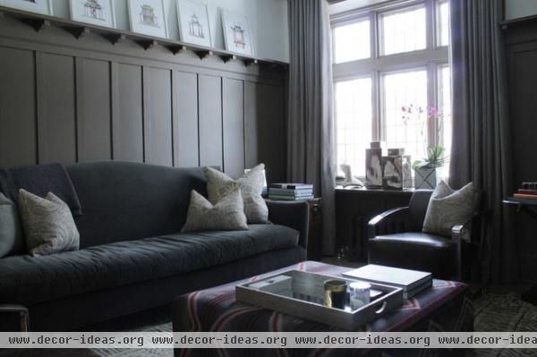
“We spend most of our time here,” Ouellette says of the den. He and Vandal repainted the wood paneling and mixed different materials together to create a cozy and relaxing space.
Sofa: Celadon Collection; ottoman: Les Ensembliers, with fabric by Ralph Lauren
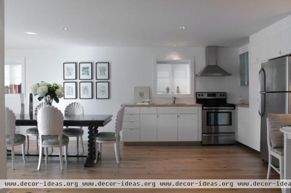
The couple built a basement apartment so Ouellette’s aging mother, Mireille Couture, could live with them. They added a budget-friendly Ikea kitchen and installed large doors that open to the garden, so the space felt less like a basement.
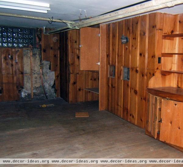
Wood panels once covered the basement walls, while a small window at the far end barely illuminated the room.
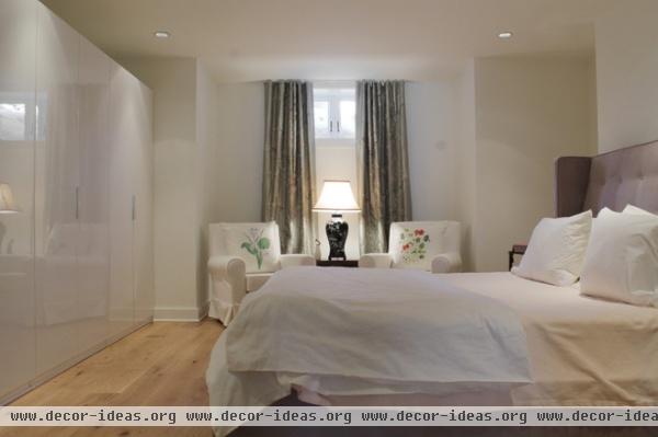
AFTER: There’s now a large bedroom with a small reading niche at the window. Ikea closets with glossy white doors line one wall.
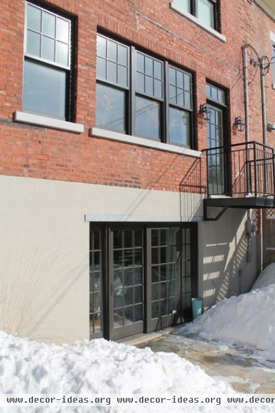
Ouellette and Vandal lowered the basement floor by 8 inches and moved the utility room to the other side of the house. This separate entrance leads to the lower-level apartment, which is filled with sun all afternoon.
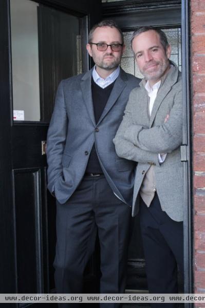
Vandal, left, and Ouellette stand at the entrance to their home.
See more photos of this home | Show us your home
Browse more homes by style:
Small Homes | Colorful Homes | Eclectic Homes | Modern Homes | Contemporary Homes | Midcentury Homes | Ranch Homes | Traditional Homes | Barn Homes | Townhouses | Apartments | Lofts | Vacation Homes
More: My Houzz: Open-Plan Living in a Converted Shoe-Factory Condo


