Room of the Day: A Wine Country Entry Worth Lingering In
http://decor-ideas.org 03/17/2014 22:24 Decor Ideas
When offered the chance to participate in a decorators’ showcase, many interior designers fight to win the so-called trophy rooms, such as the living room, dining room or main bedroom. But when Kathy Best got the chance to take part in Traditional Home’s Napa Valley Showhouse, she was attracted to the entryway for aesthetic and marketing reasons. “It was a larger space, and I thought I would enjoy the challenge of seeing what I could do with it,” she says, noting she also worked on a library, a bathroom and a gallery in addition to the entry. “I also figured that every single person who entered the space would have to pass through and see my work.”
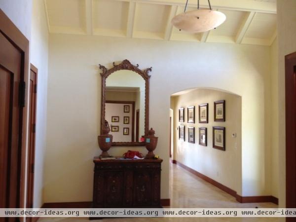
The entry, located in a guesthouse for Cardinale Winery in Oakville, California, was sizable but otherwise unremarkable, with a pale floor and a white ceiling. A large passageway on each wall meant wall space was not abundant. The only directive Best received: Leave the doors and base molding alone.
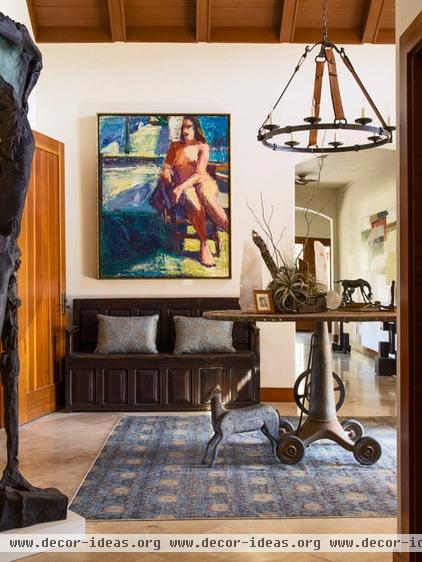
AFTER: Best decided to make the entry a place to linger and look, not just a glorified hallway. To do that she filled it with color, accessories and furniture designed to stop and engage the eye.
To warm the space, she had the white ceiling painted to look like wood and installed a vibrant blue ikat rug. The colors are picked up in a painting by Terry St. John. Meanwhile, an antique church pew invites people to sit and appreciate the art and sculptural objects on the rustic table. “The property is on a winery in the Napa Valley, which is also quite agrarian,” Best says. “I was trying to pull in elements and colors from the outside. For instance, the table is an old metal piece that was once used on a farm.”
Channeling the owner’s love of all things horses, Best chose small horse figures for the table and the floor, as well as a light fixture that features equestrian-inspired straps.
Rug: Tony Kitz Gallery; bench, table: Ma(i)sonry; horse on floor: Coup d’état; painting: Terry St. John, Dolby Chadwick Gallery, pillows: Epoca; light fixture: Dressage Round Ceiling Light, Circa
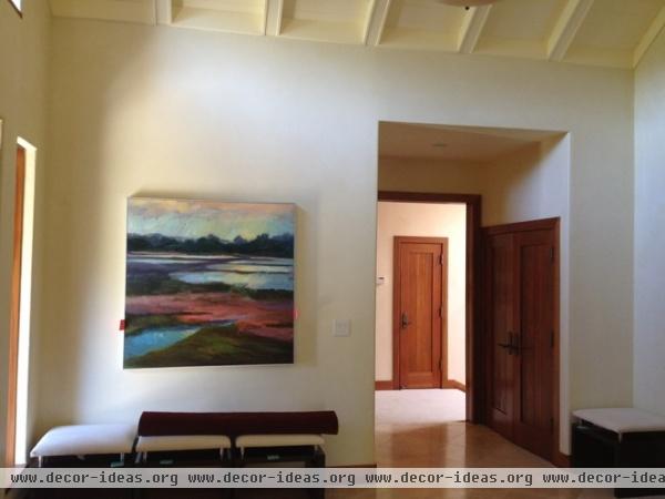
The opposite wall had one piece of quiet art and restrained seating.
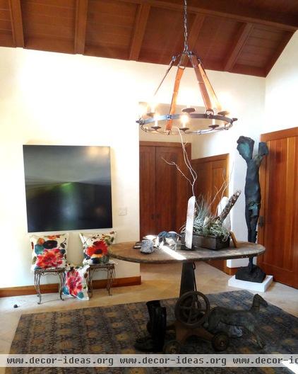
AFTER: The redone space features bold art and rusticated garden benches topped by pillows with an exuberant flower print. The large sculpture is by the late Stephen De Stabeler. Without taking up much floor space, the piece adds drama. “It reminds me of the ‘Winged Victory’ in the Louvre,” says Best.
Pillow fabric: Cap D’Antibes, Rubelli
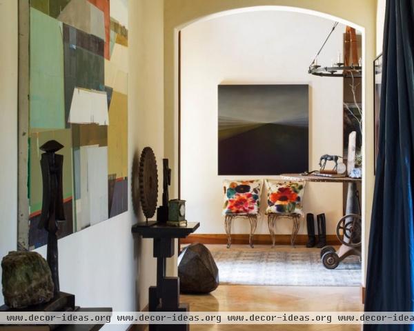
Large, chiseled sculptures look like rocks and blur the line between the front yard and the threshold. What was a plain wall is now a mini gallery.
Stone sculptures: Coup d’état; painting: Bernadette Jlyong Frank
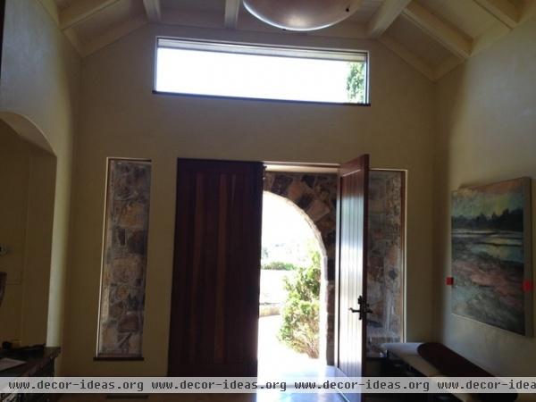
The space was once virtually empty.
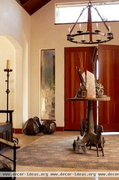
AFTER: “Since I didn’t have much wall space, I imagined the table surface as a mini museum,” says Best.

“I couldn’t have a large table, because I couldn’t stop the flow of visitor traffic,” she says. “But each item is to be considered and enjoyed.”
See more Rooms of the Day
Related Articles Recommended


