Houzz Tour: Major Changes Open Up a Seattle Waterfront Home
The home wasn’t all bad. There was plenty of space, it had a great view toward Vashon Island (off the coast of Seattle), and the interior brimmed with vintage charm. But a slipshod second-floor addition built by a previous homeowner simply had to go. “It was pretty poorly done,” says architect Tom Nychay of Sortun-Vos Architects. “It was done on the cheap, and a lot of construction was suspect. It was basically a space grab for a master suite and bathroom without being sympathetic to any style.”
What’s more, too many interior walls didn’t respect the view. And let’s not even mention the hard-to-find front door at the end of a bridgeway around the side of the house. So Nychay helped the family of four — a speech therapist, her copyright attorney husband and their two kids — add some character back to the house by erasing the second level, taking the house down to its shell and basically starting over.
Houzz at a Glance
Location: West Seattle
Who lives here: A couple and their 2 kids
Size: 4,350 square feet (404 square meters); 4 bedrooms, 3½ bathrooms
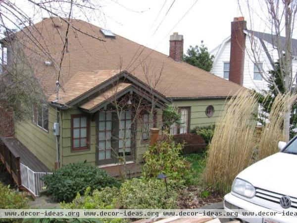
The home sits on a sloping hillside, with the front just below street level and the rest dropping off toward the water. The partial second floor that a previous homeowner tacked on made the home appear as one large expanse of roof shingles. The old front door was around the left side down a narrow bridgeway.
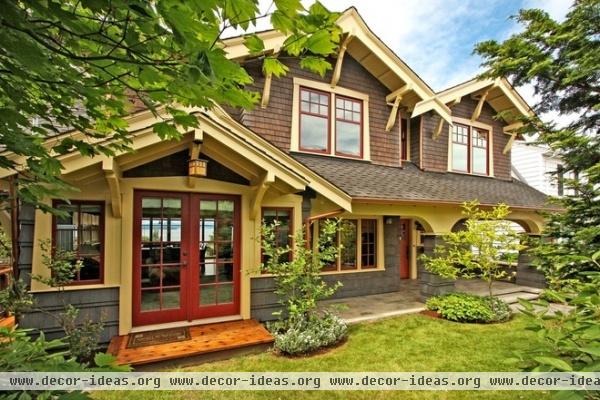
AFTER: While the interior is 1940s Tudor with Craftsman touches, the couple wanted a straight Craftsman appearance on the exterior. “We wanted a simple, stronger face to the house,” Nychay says. “Bigger shingles and a simple color with a little statement.” The latter comes from a punch of color around the window sashes and on the front door, a faux copper gutter and a cross-gable roof form in the center, which is a common Craftsman device.
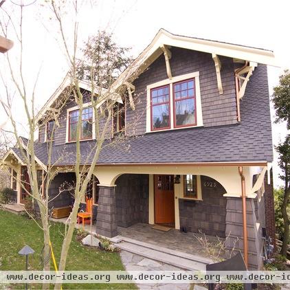
Because the original front door was confusing, an early design decision was to have a broad porch with a street-facing front door.
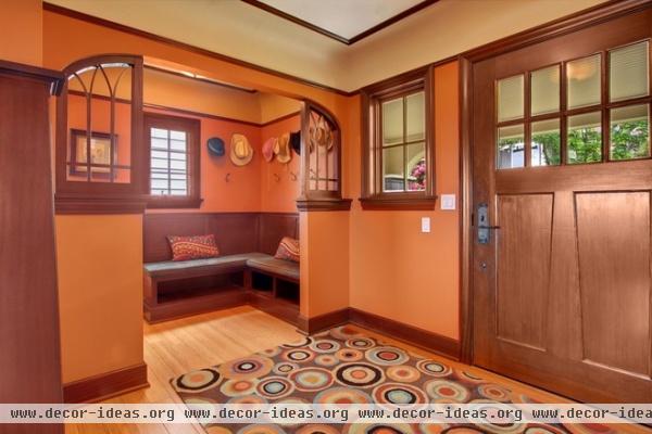
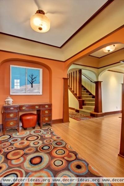
Nychay worked to enhance the Tudor-Craftsman interiors. “It’s certainly a different mix from a real formal standpoint, but I think the two styles work well together,” he says. A fair amount of the interior was retained, including the column treatments and arches. In other places Nychay mimicked these details.
A new mahogany-wrapped mudroom is just off the foyer. There are coat hooks and boot storage under the bench. To the left is a powder room. The foyer leads to the living room and a new staircase. The floors are new bamboo.
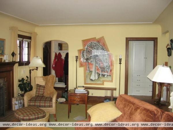
Passageways in the old house were narrow.
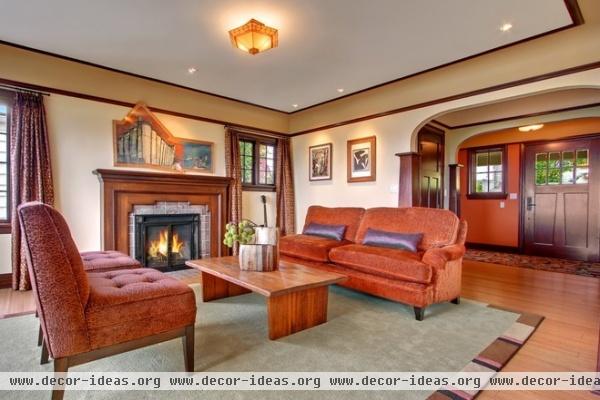
AFTER: Nychay expanded where he could, creating broad archways for better flow.
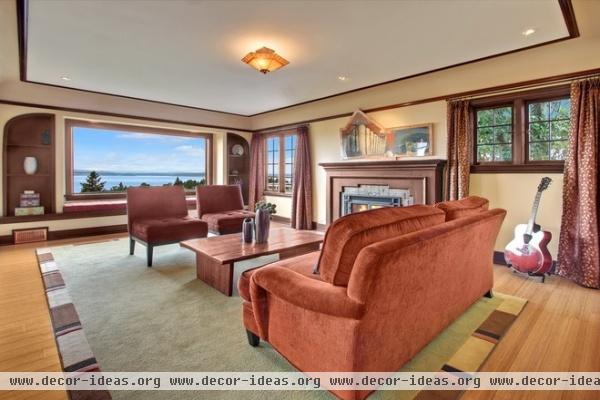
The fireplace is original. A window seat with bookcases on either side was added to hide heating ducts that run to the second floor. The view is toward Vashon Island.
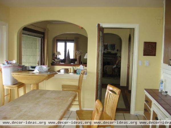
This is the old view from the kitchen through the dining room and into the living room. Again, Nychay and the homeowners felt like there was just too much wall surface area blocking light and views.
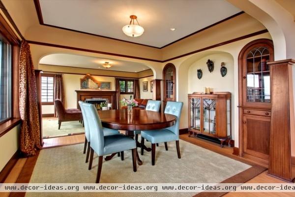
AFTER: Nychay removed the half walls and pushed the arches to their limits. The wood base, trim and built-in cabinets are all original.
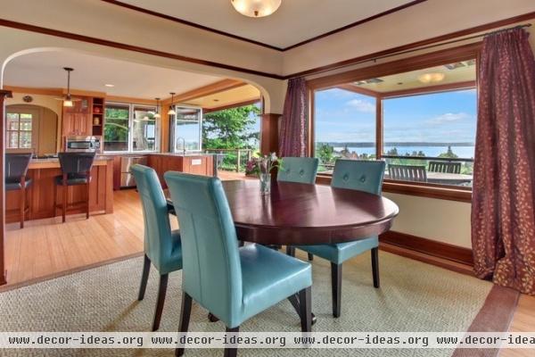
The flow between the living, dining and kitchen areas is now much more open, which allows the views in.
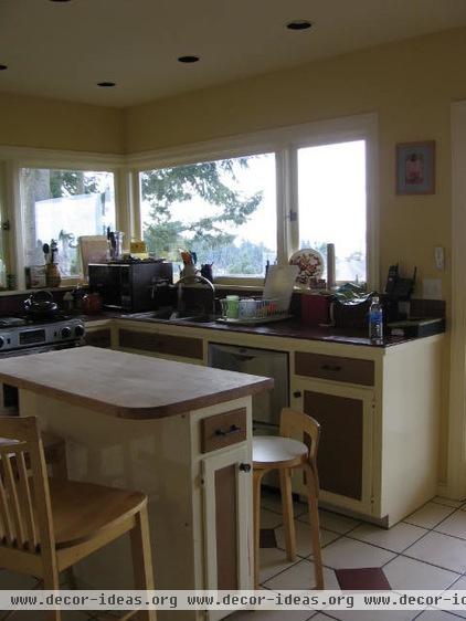
While a corner window offered a decent view of the ocean, the team didn’t feel like it captured enough.
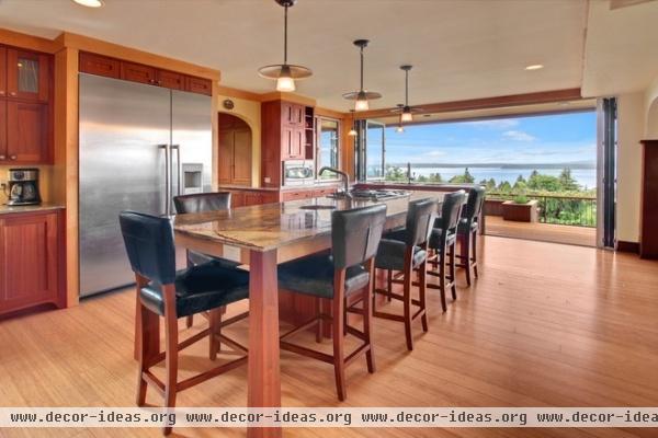
AFTER: A Sunflex wall completely connects the space to the infinite blue sky and the water.
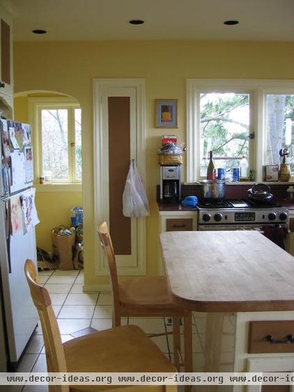
The previous arrangement of the appliances and cabinetry made things feel too compact, even though space was abundant. Plus, the back wall where the refrigerator was located blocked views of the ocean from the adjoining family room.
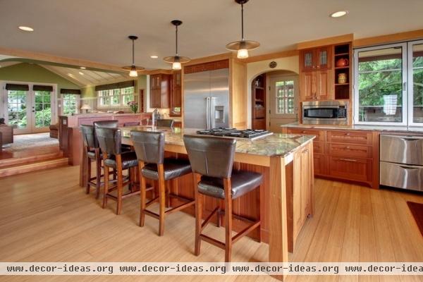
AFTER: Nychay pushed everything to one side and removed that back wall to expose the family room.
One of the homeowners was adamant about mixing different woods in the kitchen. The dark is mahogany; the lighter is maple. The countertops are granite.
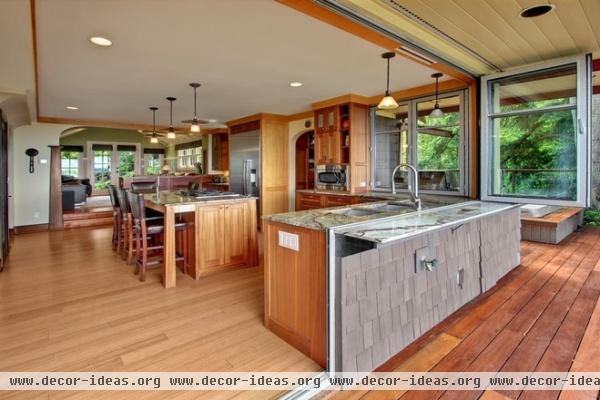
The Sunflex window mixes a swinging door and a folding one — an option Nychay says he couldn’t find at other companies — to achieve an unfettered sight line to the sea. “It’s pretty breathtaking,” the architect says.
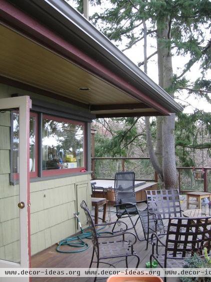
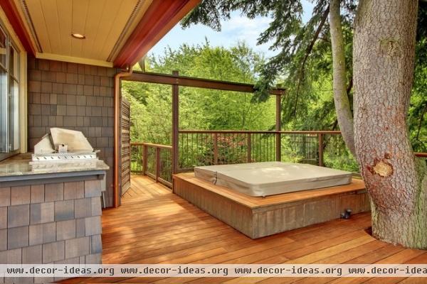
The deck and terraces were in fairly decent shape.
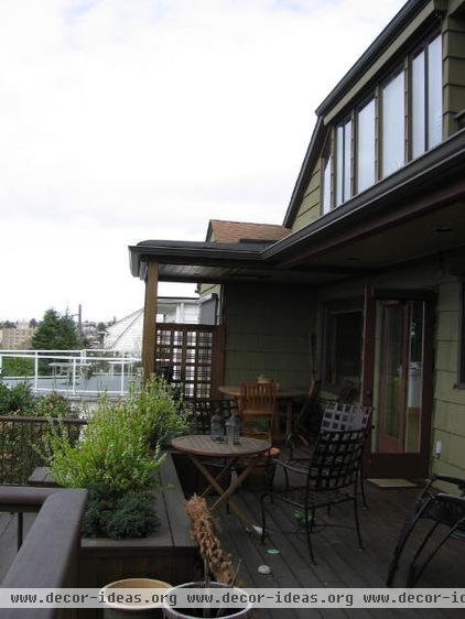
The second floor didn’t make full use of the potential space up there.
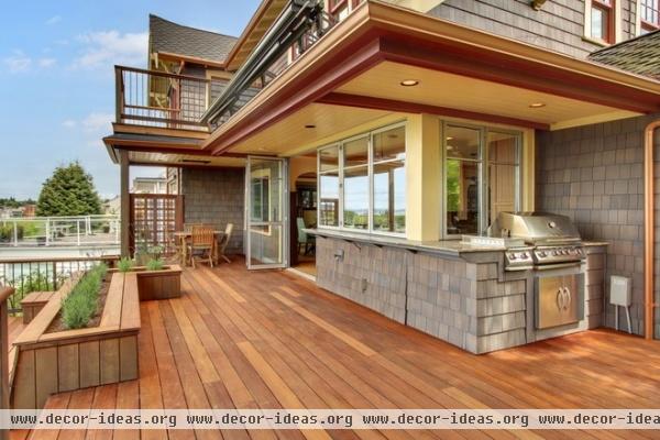
AFTER: The new level expanded the main bedroom and added two bedrooms for the kids.
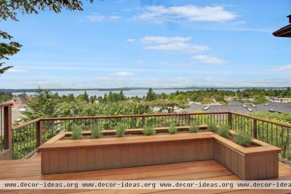
Wouldn’t you want to make the most of this view too?
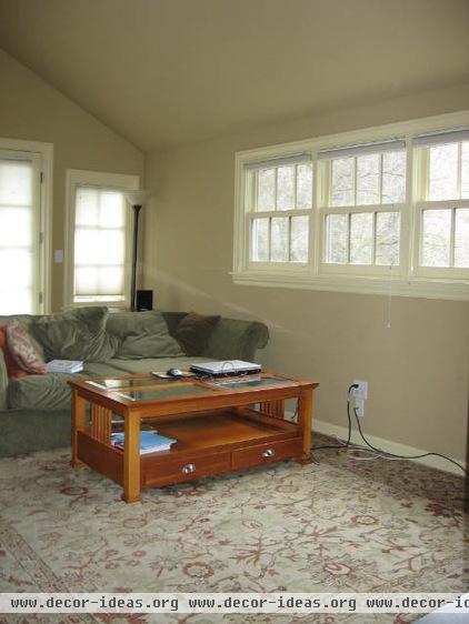
In the family room, they kept the existing windows and doors but otherwise completely redid the space.
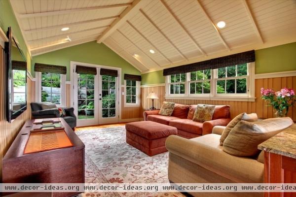
AFTER: A new ceiling treatment and painted MDF wainscoting add texture. The French doors lead to the front yard.
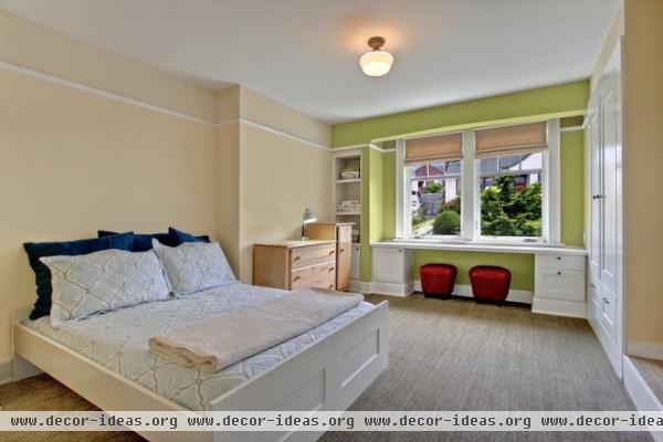
The kids’ bedrooms are located above the front door. The cabinets on the right open to a secret playroom.
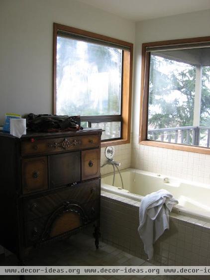
The previous main bathroom had views going for it, but the quality wasn’t as good as it could be.
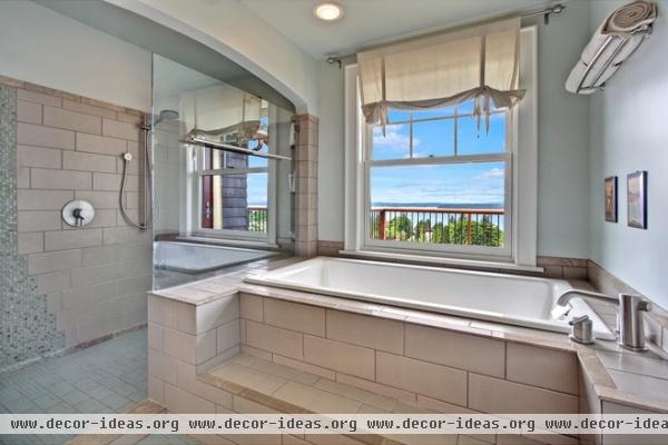
AFTER: A raised bath takes the bather right up to the window level for a floating experience.

Big windows let the homeowners wake up to sea and sky.
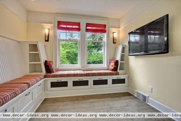
A custom built-in banquette with underbench storage makes for a small TV room at the top of the stairs.
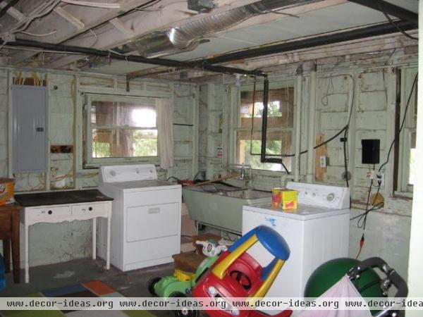
The previous basement was used as a laundry space and a dumping ground for furniture, toys and boxes.
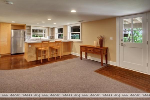
AFTER: A second kitchen and bar with direct access to the outdoors makes better use of the space.
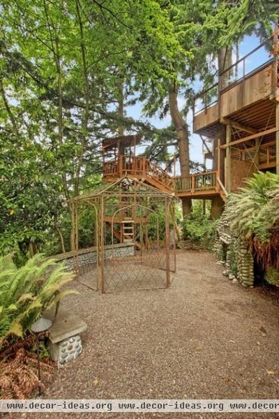
The home is the last property on a dead-end street, with unbuildable land that extends down the hill. The tree house, metal gazebo and stone bench were already there.

Neither Nychay nor the homeowners know much about the stone fireplace, when it was built or by whom. But that doesn’t mean the family doesn’t enjoy it.


