My Houzz: Boosting Light and Family Friendliness in a 1920s Townhouse
Soon after journalist-writer Sanne Bloemink and Rutger Lambriex bought their 1920s Amsterdam townhouse, they had to relocate to New York City for a six-year work assignment. They rented out the house while they were gone, but since they planned to return to the Netherlands with their three kids after the assignment, they wanted to update the interior and make the house more family friendly.
For help they turned to architect Pim van Oppenraaij of Studio Higgs, who worked with the pair long distance to reconfigure the layout, add a bathroom and introduce more light and color while choosing finishes that could stand up to kids.
Houzz at a Glance
Who lives here: Sanne Bloemink, Rutger Lambriex and their children, Julian (age 9), Teuntje (6) and Merel (4)
Location: Oud-West district of Amsterdam
Size: 2,260 square feet (210 square meters); 4 bedrooms, 2 bathrooms and a study
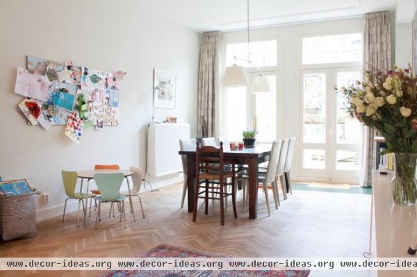
In designing the house, the couple tried to keep function and their children’s comfort in mind. They added a kid-size play area next to the family dinner table; a large magnetic board displays the children’s art, while floor baskets store toys and keep the space organized.
A band of glass set into the floor in front of the garden doors lets natural light into the basement. “It is also a way to create a connection between the person in the kitchen and the one working downstairs,” says Bloemink. “We can see each other even though we are on different levels in the house.”
An Afghan rug adds texture and color to the herringbone oak floor, which is more than 30 years old. “When we moved in, we only sandpapered and waxed it,” Bloemink says.
Curtains: Hema; wall paint: Cornforth White, Farrow & Ball; children’s table and chairs: Design Within Reach (chairs are Series 7 Children’s Chairs); pendant lamp: Tolomeo INC Double Shade Suspension, Artemide; dining chairs: Bottega Side Chair in Off White, Design Within Reach; baskets: Hable Construction
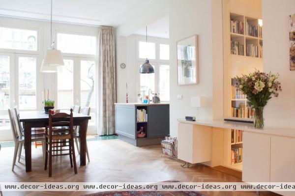
One of architect van Oppenraaij’s goals was to create more light and space, while establishing connections between the home’s different levels using interior windows. The spacious open-plan living room and kitchen offer sight lines to three different areas. Light is injected into the space’s otherwise dark and moody middle through a large window that peeks into the hallway.
The artwork is by Czech artist Daniel Pitin.
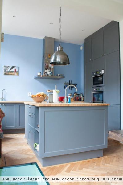
The couple was inspired by this kitchen, designed by Plain English in London.
The kitchen island has built-in storage space, eliminating the need for cabinets above the counters. The cabinets on the far wall stretch from floor to ceiling.
Wall paint: Parma Gray No. 27, Farrow & Ball; pendant lamp: Stoerelampen
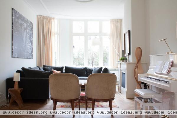
The glossy white piano is 6-year-old daughter Teuntje’s favorite spot. She loves to play as soon as she comes home from school.
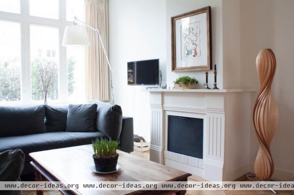
There were multiple fireplaces in the living room, but the couple kept just one. They moved it from the middle of the room to a spot closer to the window, creating a cozy seating area.
Floor lamp: Tolomeo, Artemide; print above fireplace: Daniel Pitin
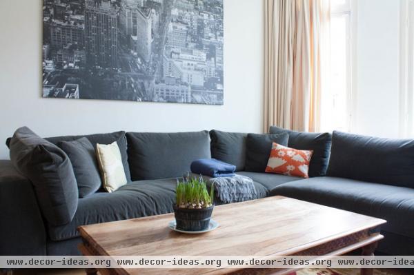
Rug: Raw Materials; sectional: Room & Board; art: Premiär, Ikea
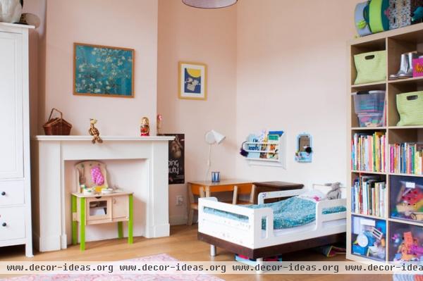
The two daughters, Teuntje and Merel, share a room. The bedroom used to be two separate spaces.
Merel’s bed is placed against a wall that was formerly a built-in closet. The closet doors are now used in the main bedroom.
Paint: Pink Ground No. 202, Farrow & Ball; bookcase: Expedit, Ikea
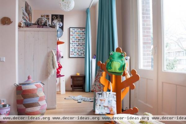
Teuntje sleeps on this side of the bedroom and has her own small playspace. The nook was created by tearing down the wall that separated the original two rooms.
Basket: Hable Construction; coat tree: P’kolino
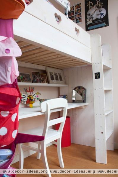
For space efficiency Teuntje has a loft bed with a desk underneath for crafting and doing homework.
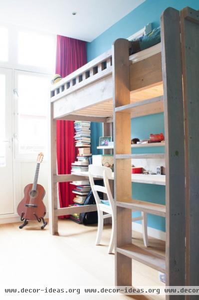
Julian’s room was formerly a bathroom. During the renovation everything was removed and the space was transformed into his bedroom, with a loft bed to save space.
Wall paint: Stone Blue, Farrow & Ball
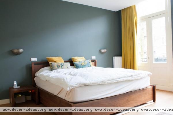
Bloemink also went with a blue hue for the walls in the master bedroom, using yellow as an accent color to give the room a warm feel.
Pillows, curtains: Hema; bed: Room & Board; wall paint: Farrow & Ball
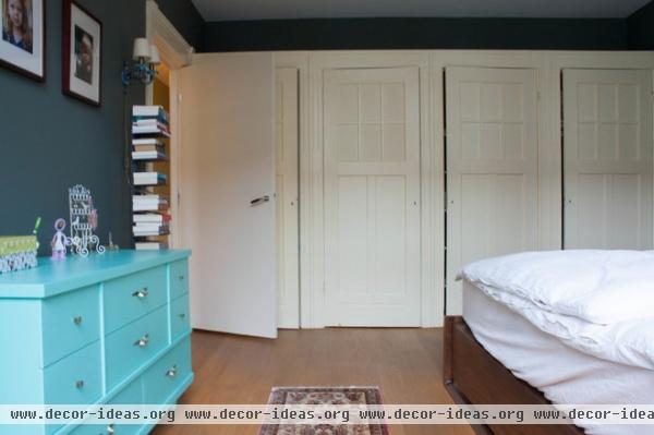
A vibrant turquoise dresser adds an extra jolt of color. Above it are portraits of the three kids. The closet doors were recycled from the daughters’ bedroom.
Dresser: Etsy; book stand: Sapien, Design Within Reach
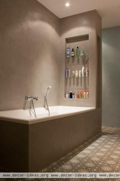
This bathroom was added during the renovation. The architect put it between the main bedroom and the girls’ room, taking space from both rooms, so the bathroom lacks a window.
A walk-in shower is hidden behind the wall of shelves. The Portuguese floor tiles are from Design Tegels.
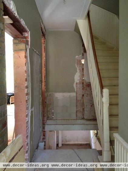
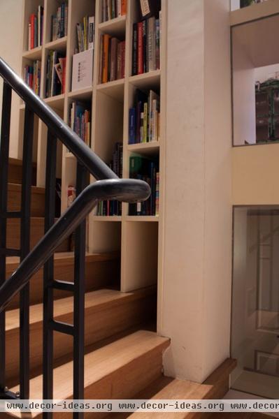
This photo shows the hallway where the architect added a window between the main living space and the bookcase that now lines the staircase.
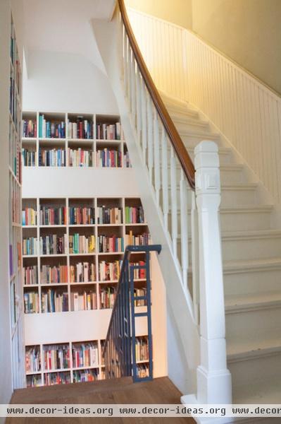
AFTER: New stairs to the basement were installed and lined with a bookcase wall. The large collection of books was formerly kept in the basement, but the homeowners wanted to include them in the new design.
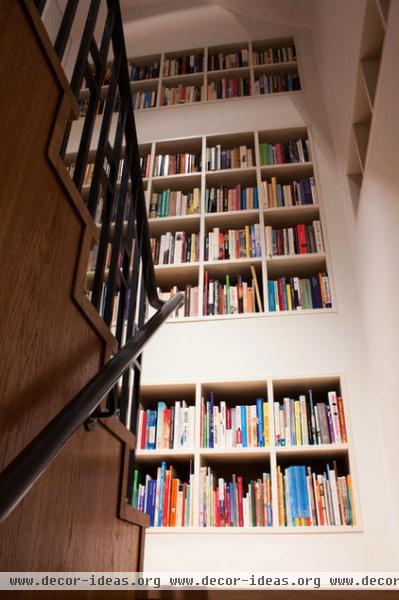
The kids love to sit at the bookcase wall with their friends and read.
To bring more light into the basement, the architect incorporated this window. When the kids read here, they are still visually connected with the living room.
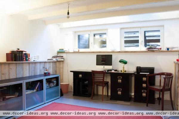
To get more light into the basement home office, the owners inserted a narrow glass band in the floor of the room above. The glass is positioned in front of French doors, maximizing the amount of light flowing downstairs.
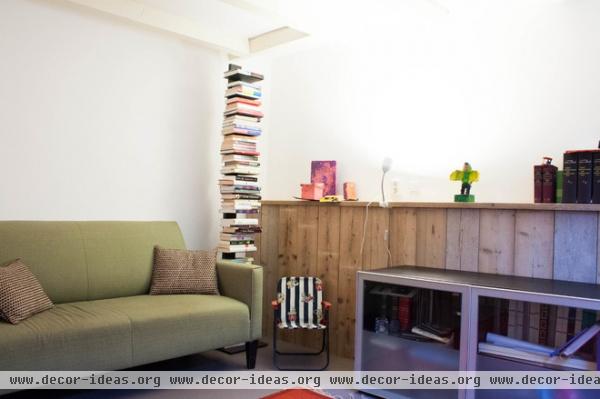
This sofa is another popular reading spot for the kids.
Book stand: Sapien, Design Within Reach
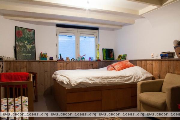
There’s also a guest room in the basement, where crafts made by the kids add cheer to the space.
See more photos of this home
Browse more homes by style:
Small Homes | Colorful Homes | Eclectic Homes | Modern Homes | Contemporary Homes | Midcentury Homes | Ranch Homes | Traditional Homes | Barn Homes | Townhouses | Apartments | Lofts | Vacation Homes
More: My Houzz: Playful Retro Style Perks Up a Dutch Home


