Houzz Tour: Welcoming Light and Gatherings in Melbourne
Architect Warwick Mihaly of Mihaly Slocombe subscribes to the theory that a homeowner’s presence should be felt in the home’s furnishings, paint colors and even architecture. It’s an ethos that’s found in all of his work. “Every one of our projects is a built extension of our clients’ personalities,” he says.
One of his latest, the Basser House, is no exception. Mihaly renovated and added a light-filled extension to a 100-year-old Edwardian structure for an academic employed by one of Melbourne’s leading universities. She shares the house with her two grown sons — one is a jazz pianist, and the other in the film industry. Beyond her academic career, the client is “an enthusiastic and talented cook,” Mihaly says. This fact, and her penchant for hosting large dinner parties, drove much of the project.
Houzz at a Glance
Who lives here: A single mother and her 2 children
Location: Melbourne
Size: 2,240 square feet (208 square meters); 3 bedrooms, 2 bathrooms
Photography by Peter Bennetts
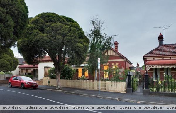
The street-facing structure exudes its century-old Edwardian heritage. Mihaly renovated a few elements in front, but his real handiwork is found at the rear.
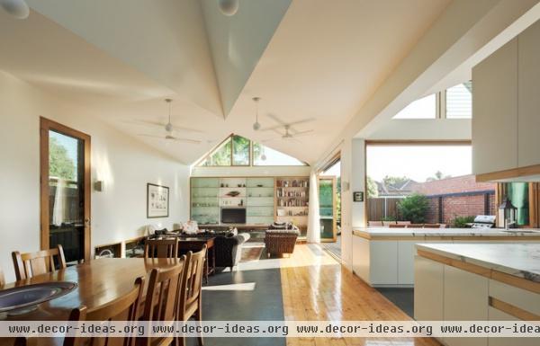
The new sunny L-shaped addition sits at the back of the original street-facing structure. It encompasses a dining area, kitchen and living area.
The architects echoed the gables of the original structure but shaped the ceiling to make the open space feel larger by bouncing sunlight around up high. Recycled Baltic pine wood flooring forms a walkway from the entry to a sliding wall that leads to a patio. Burnished concrete screed flanks the wood path, providing a dark backdrop in the otherwise light interior.
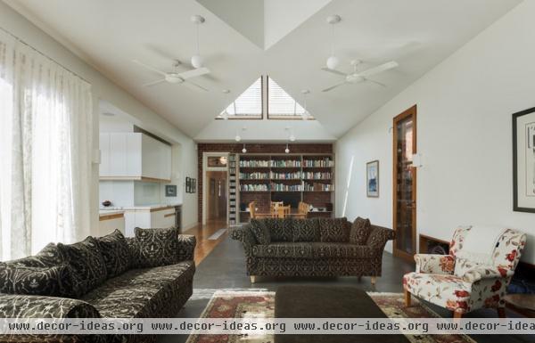
Because his client loves to entertain, Mihaly says, the house needed to accommodate dinners for 20 to 30 people easily. He designed the addition and the adjacent patio to function for the large gatherings.
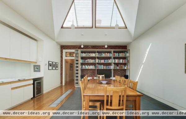
The sculpted ceiling brings light from multiple directions. Mihaly explains that the new roofs “signify the presence of [the original roofs], visible through the north-facing ‘sky’ windows” seen here.
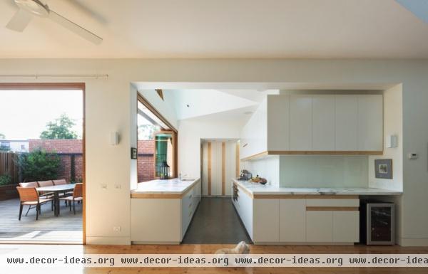
The fourth member of the family is Bob the dog. The connection to the outdoor space is apparent here, as is the connection of the kitchen to the patio through the sliding glass window.
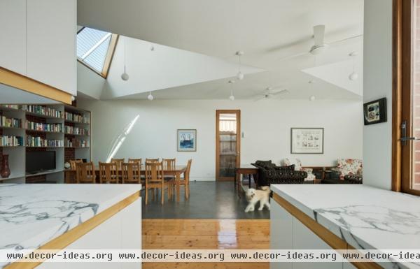
This view from the kitchen back to the living area is a good place to talk about materials. White intentionally dominates. “We stripped the colors we used back to one — white — and explored variation through grain and texture,” says Mihaly. There is white paint on the walls and ceilings throughout; white marble countertops in the kitchen, laundry and bathrooms; white laminate cabinets and white glass backsplashes in the kitchen; satin white tiles in the bathrooms; and felted white wallpaper in the study and walk-in closet. In this home white is not a single color; different effects are derived from the different materials.
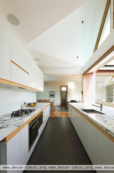
This view from deep in the workhorse kitchen accentuates the sculpted ceiling and the way wood is used to transition between white materials and frame certain areas.
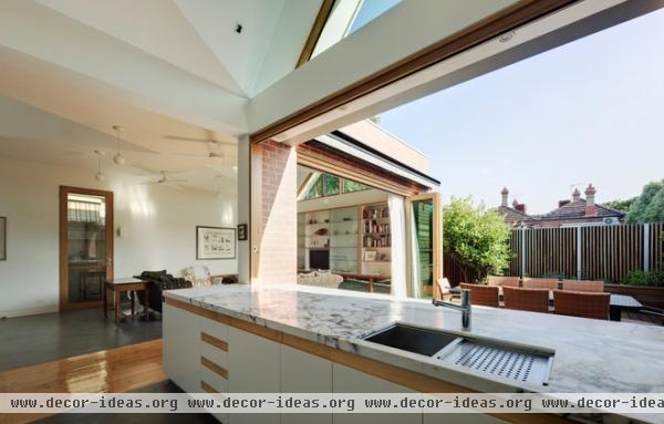
The sliding glass wall reveals how the architects made the kitchen the heart of the project. The house is not simply the spaces defined by the exterior walls; it is the indoor and outdoor zones, which come to the point of merging in this corner of the house. Accommodating up to 30 people comfortably for dinner without the patio would have been a bit of a stretch, but with this space it works well.
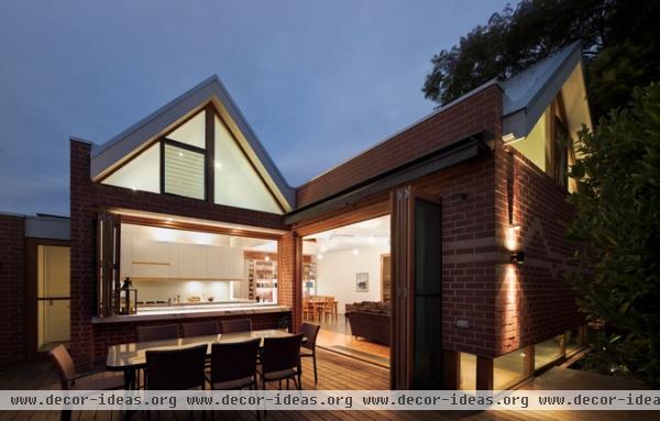
As indicated, the extension echoes the form of the original, while also using brick (some of it salvaged from the existing house) and corrugated metal roofing to tap into the local vernacular.
In this view we see how the personality of the owner comes across in the house — the kitchen and surrounding spaces express her love of cooking and entertaining; the bookshelves that bookend the living space tap into her intellectual curiosity.
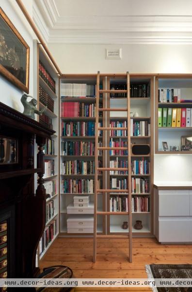
There are some smaller spaces too. The study, which is located in the original portion of the house, has a flat ceiling and crown molding, unlike the geometric sculpting of the addition. The architects designed the bookcase that wraps around two sides of the room, and the ladder.
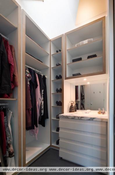
The custom casework extends into another small space: the walk-in closet between the main bedroom and bathroom. The white palette extends here, too, by way of a white dresser, white laminate on the shelves and the white surfaces of the sculpted ceiling.
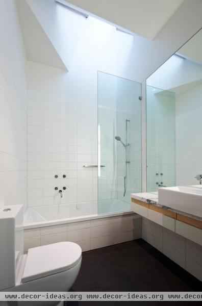
White tile and a white marble vanity continue the palette in the sons’ and guests’ bathroom. Here the sculpted ceiling brings light into the otherwise windowless room.
“We wanted the house to have a skin that invited touch,” Mihaly says. While this comes across in the materials selected, this bathroom makes it clear that light plays an important role in the “touching” as well.
More: Houzz Tour: Rammed Earth and Vineyard Views Stun Down Under


