Houzz Tour: Better Flow for a Los Angeles Bungalow
The front door was in the wrong place. That’s what stood out to architect Jeff Troyer when he arrived at his client’s 1920s home in Los Angeles to talk about a kitchen remodel. That discussion would have to wait.
Walking up, he saw a set of French doors facing the street, but got confused when he approached it and noticed another door directly to the left. “You weren’t really sure what door to use,” he says. It was the one on the left, and when he walked in, the confusion continued. “You walked right into the living room, then had to turn back and go through a TV room, walk right in front of the TV, then into the kitchen,” he describes. “You went through all the public rooms.”
So Troyer made a presentation to his clients that resulted in the expansive new kitchen they wanted but also a reconfiguration of the entry to the home. “A few small moves completely changed the way they use the house,” he says.
Houzz at a Glance
Who lives here: A TV producer, his wife and their 2 kids
Location: Westwood area of Los Angeles
Size: 1,932 square feet (179 square meters); 4 bedrooms, 3½ bathrooms
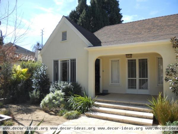
The French doors confused visitors, who weren’t sure if they should enter there or through the real front door to the left.
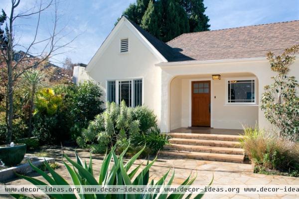
AFTER: Troyer removed the French doors, covered the original front door with stucco and added a single street-facing entryway.
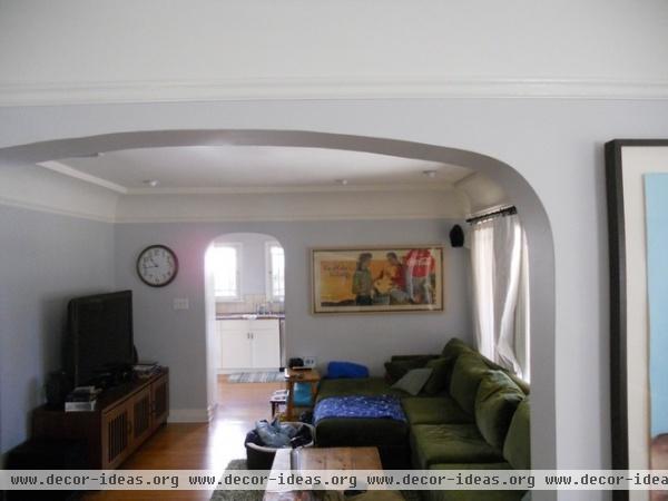
Guests had to enter the front door (the French doors were blocked by a sofa), round a corner through a foyer and walk through the living room to get to the other areas of the house.
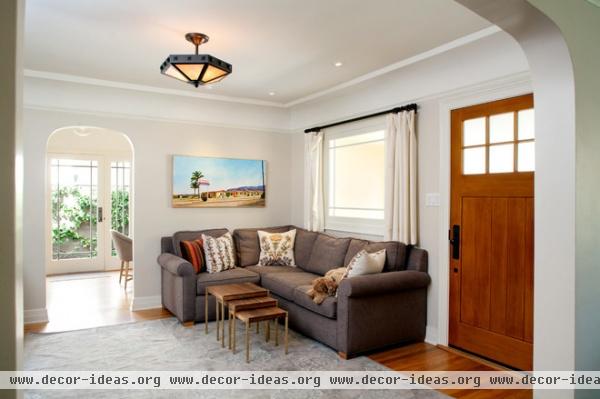
AFTER: Troyer turned the living room into more of a foyer, with a seating area and a piano.
Light: Brass Light Gallery
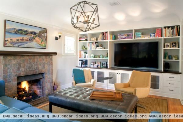
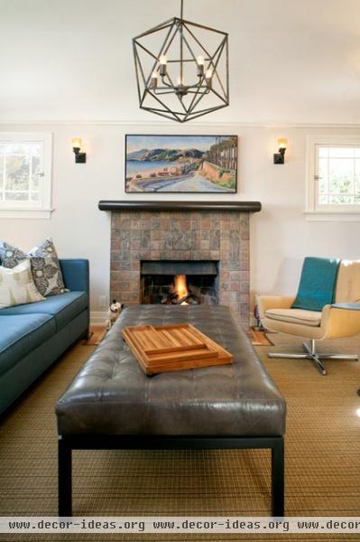
The fireplace features original tiles created by Ernest Batchelder, a renowned tile artist in the 1920s and 1930s in Southern California. Naturally, Troyer left them alone. “Those are worth a fortune now,” he says.
Troyer handled all the lighting design, tilework and millwork and helped his clients choose colors.
Sconces: Rejuvenation; ceiling fixture: Restoration Hardware
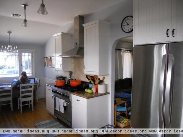
“The old kitchen wasn’t in horrible shape,” says Troyer. “It was a 10-year-old Ikea kitchen that served its purpose.”
The long, narrow layout wasn’t very functional, though. And the small dining room and breakfast room didn’t work for the clients. Troyer completely removed everything you see and donated the cabinets.
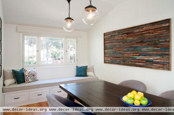
AFTER: The narrow proportions of the old kitchen were perfect for a new dining room and an extra-long table that can seat 12. The old dining room became the new kitchen.
Lights: Rejuvenation
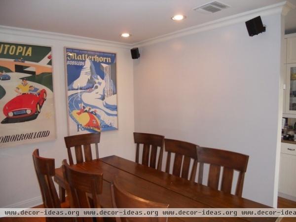
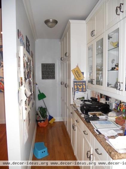
The old dining room and the wall separating it from a pantry were ripped out. This is where Troyer put the all-new kitchen.
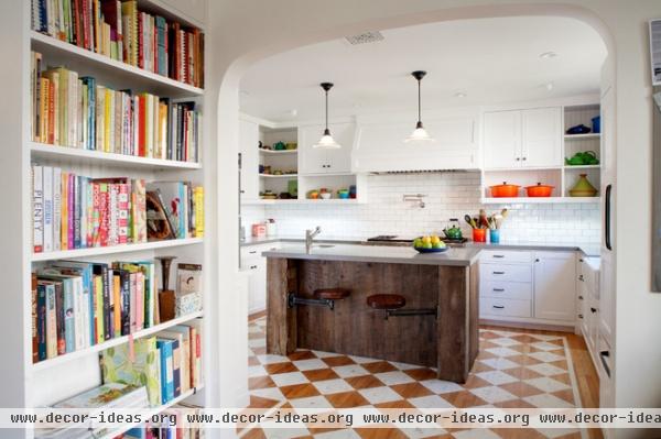
AFTER: Troyer brought in crisp white features with clean lines, a combination he knew would work well with the bungalow’s style. He kept some shelves open to display the homeowner’s colorful pottery collection.
Troyer worked with the existing floor to save on cost; he designed the diamond pattern, which the contractors taped off and painted. Then they buffed the floor to give it a worn appearance and sealed it.
Cabinet paint: Right White, Restoration Hardware
How to paint a hardwood floor
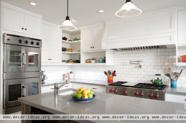
Countertops: Cesarstone; French-door ovens: American Range; lights: Rejuvenation
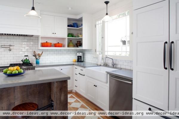
Beadboard backing in the open shelves provides visual interest. “I’ve done that in a few of my projects, and I just love how it looks,” Troyer says.
Sink: Kohler
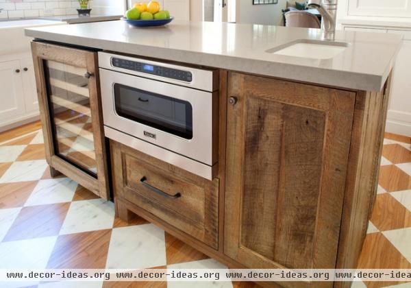
The custom reclaimed-wood island has a sink, storage, a microwave and a wine refrigerator.
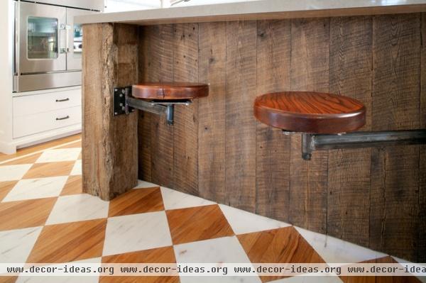
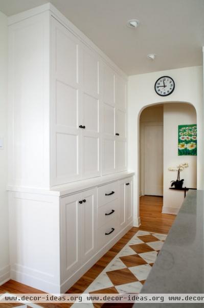
The island’s large size meant there wasn’t much space left between it and the custom built-in pantry wall. So Troyer designed custom swing-arm stools that wouldn’t cramp the walking path.
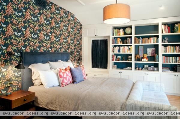
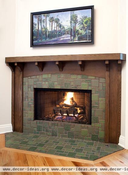
Troyer didn’t do much in the main bedroom, but he did design a new oak mantel and tile surround for the firebox.


