Room of the Day: Reclaiming a Family Area From Kid Chaos
http://decor-ideas.org 03/12/2014 22:22 Decor Ideas
“This room has really changed this family’s lifestyle,” says interior designer Jules Duffy. Redesigning the family room along with the adjacent turquoise dining room let the parents reclaim their first floor from chaos and too many toys. “The room was a mix of old sofas and a mishmash of pieces from college,” she says. “We also needed smart storage solutions to keep it from being cluttered.” In the dining room and this family room, Duffy’s intent was to keep the look cohesive via blue hues and a mix of textures, while giving each room its own distinctive look.
Photography by Laura Moss Photography

Duffy started with the dining room’s turquoise palette and added darker blues and larger, bolder prints. The family room combines natural elements, rich textures and strong graphic patterns.
Here you can see how the dining room and family room relate to each other. The clients’ love of antiques inspired Duffy’s purchase of the large wrought iron piece, found hanging in a garden store. “I knew I wanted something big and architectural for this wall,” she says.
Get a closer look at the dining room
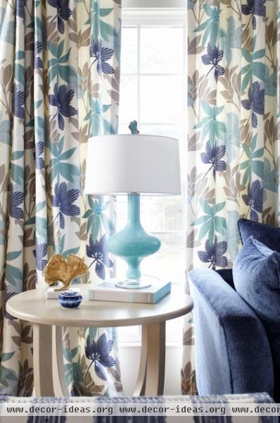
This abstract botanical fabric was the jumping-off point for the rest of the room. Glass lamps reflect light from the French doors, windows and transoms.
The family never uses the doors, so Duffy felt free to place the sofa close to them, which allowed for a pleasing furniture layout that emphasized the fireplace.
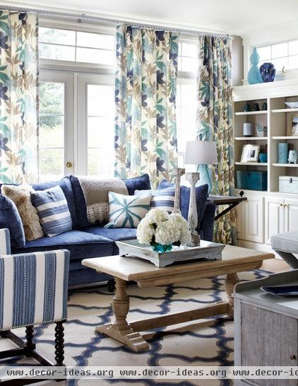
The sofa’s dark blue color and backed woven chenille fabric help keep it kid friendly. “Backing the chenille makes it sturdier,” Duffy explains. She treated all of the upholstery with Nano-tex to help it stand up to spills and dirt.

Duffy custom designed the upholstered furniture, including the striped bench, which adds a British colonial touch. The round rattan ottoman is a favorite perch for the family’s young daughter. Note that there are no matching end tables or lamps. “I like a more eclectic, slightly bohemian look,” she says. “The key is to make sure everything is balanced.”
The quatrefoil rug adds a large graphic print. It is an indoor-outdoor rug treated to stand up to spills, whether juice or red wine.
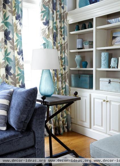
Duffy painted the existing built-ins tan to help the objects stand out. The family had photos they wanted to show off in here, but not a lot of books, so she had room to add vintage vessels in shades of blue. Weathered boxes on the lowest shelves provide sneaky storage.

Duffy advises homeowners to have fun mixing patterns and textures. To see if they work together, she recommends looking at a grouping in black and white (it’s easy to do with your camera phone and a black and white filter). “If the patterns complement each other, great; if they are too similar, it won’t work,” she says. “Looking at them in black and white shows this.”
Related Articles Recommended


