Houzz Tour: Unusual Mixes of Old and New in Texas
Any architect will tell you that the key to a successful building is a good client. Of course, what exactly a “good client” is can vary greatly. For architect Hugh Randolph’s renovation of a 1935 house in the Clarksville neighborhood of Austin, Texas, good clients were a creative couple who were passionate about the history of their house as they and their daughters became its newest residents.
Going so far as to document their research in a blog, Ryan and Kim Battle worked with Randolph to find inspiration in the house’s history. The result is a traditional house with modern touches that are sometimes subtle and sometimes overt, ultimately making something new and personal.
Houzz at a Glance
Who lives here: Ryan and Kim Battle and their 2 daughters
Location: Austin, Texas
Team: Architect: Hugh Randolph; interior designer: Kim Battle; builder: Risinger Homes
Size: 2,890 square feet (268 square meters)
Photography by Whit Preston and Casey Dunn
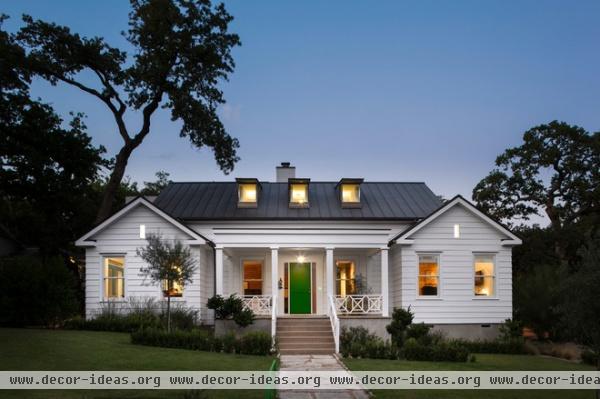
The decision to buy and remodel the house started with Randolph’s taking a shortcut in his car one day along Palma Plaza and seeing the house for sale. He thought of Ryan and Kim Battle, who were living in one of his modern commissions at the time but wanted something smaller and more sustainable. Six months after the discovery, the Battles bought the property and hired Randolph to help them transform it.
Looking at the symmetrical, southwest-facing front, it’s hard to see any dramatic changes, outside of the three modern dormers that replaced an existing pair, and the standing-seam metal roof. The dining room is to the left of the entrance, and the master bedroom is to the right.
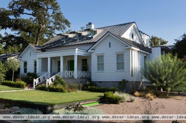
One of the most dramatic transformations to the house is basically invisible from outside. To make more space on the second floor for the girls’ bedrooms, a new roof was installed 4 feet higher than the old one. This change can be grasped in the sliver of wall above the roof of the front porch, but the execution is in keeping with the original to such a degree that the change is seamless.
The family discovered that the house sits on a corner lot that had been the driveway to the 500-acre estate of former Texas governor Elisha M. Pease. The house was designed in 1935 by Hilda Urbantke for her younger sister. Urbantke attended architecture school at the University of Texas in Austin, and in addition to designing houses, she was a pro-level golfer.
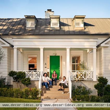
Randolph, an architect comfortable in designing in various styles, initially proposed a porch for the house’s other street facade, facing southeast. It would have been similar to the front porch shown here but less formal in its composition. Regardless, Kim Battle told him, “The front porch is all of the history, all of the tradition, I can handle,” setting the course for the rest of the house’s transformation.
That’s Kim with Ryan and one of their daughters on the porch.
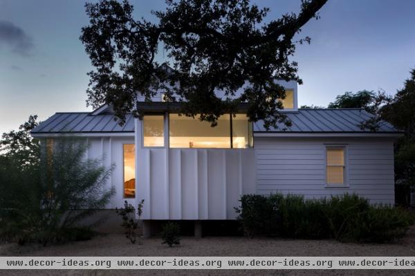
As executed, this facade around the corner features a new saddlebag hung off the side of the house. This adds space to the master bedroom on the first floor but maintains privacy from the street with a clerestory window.
On this view we can see the difference between the reused exterior wood siding (horizontal) and the stucco walls with vertical metal batten trim pieces. The contractor calls the latter “shadow casters.”
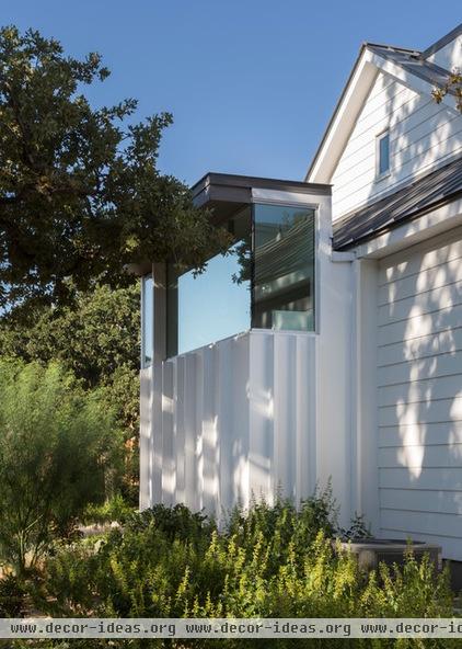
We started looking to the northeast and are now looking straight west. Continuing our counterclockwise path around the house, we can see that the clerestory is also a corner window, a contemporary touch that is clearly a departure from the house’s origins.
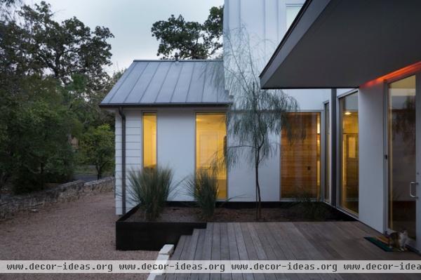
The house’s northeast elevation is even less formal than both the street-facing front and side. Here we see a new deck below a canopy that covers the walk from the garage (behind us) to the entry by the kitchen. We also see the driveway at left, a sizable planter beyond the ipe wood deck and a raised portion that adds more square footage to the second floor.
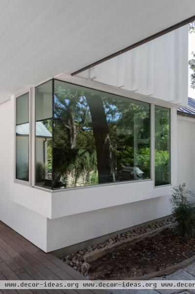
Taking a few steps backward, we come to the kitchen and its sizable corner window, which faces the garage and the yard on the west side of the house. Can’t tell it’s the kitchen?
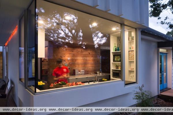
Here’s a view at dusk when light pours through the large windows from the inside.
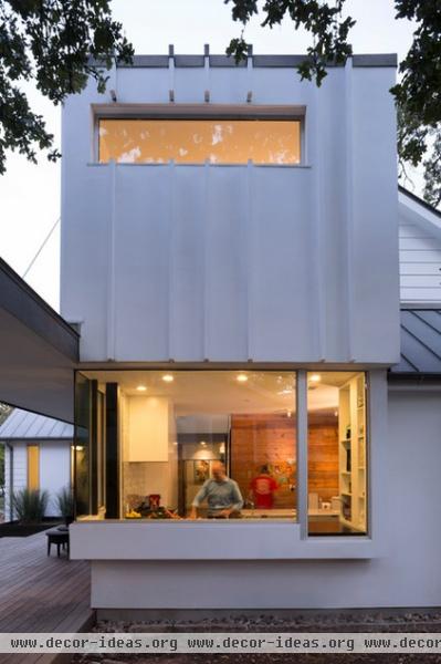
Another dusk view shows the second-floor extension on the house’s southeast facade.
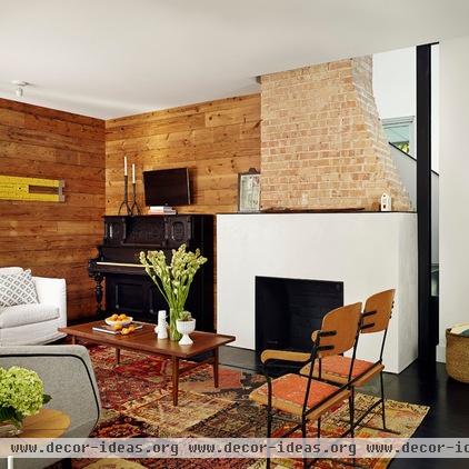
While the house’s exterior is a fairly faithful reworking of the original with a few additions (the extension on the first floor and two pop-ups for the second-floor bedrooms), the interior is an almost wholly new creation that nevertheless layers old and new. The former is anchored by the brick chimney, and the latter is predominantly drywall and reclaimed wood. Stepping inside from the porch on axis with the fireplace, you see the way old and new wrap around each other.
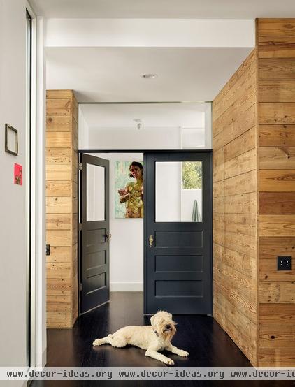
The wood walls are made from reused shiplap siding; they are the clearest expression inside of what the architect calls the house’s fiction. As he explains in a video about the house, “A lot of what is newly built looks old”; the house is a mix of the existing, the old reimagined and the new. In other words, it is not a simple dichotomy between old and new, a refreshingly realistic take on renovation.
“We didn’t want the home to be pure in its vocabulary,” Randolph says, “but rather to be a collection of smaller episodes that form a greater whole.” This comes across in everything from the dormers to the materials and the furnishings.
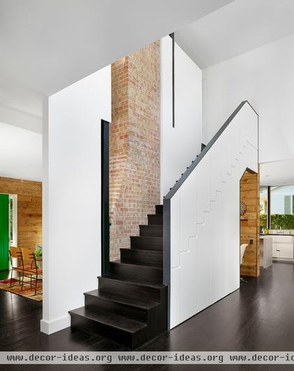
The way the chimney reappears behind the wall defining one side of the stair is an unexpected detail. If we were to see the top of the chimney, we’d see how it is detached from the roof; there is actually a skylight wrapping all four sides of the chimney. This detail expresses the fact that the chimney no longer serves a structural role; it is a remnant that is functional (still a hearth) but also an aesthetic object linking the house to its past.
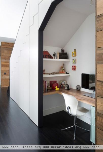
The back side of the stair is full of nice touches, such as the way the treads and risers are set as reveals in the white MDF panels (better seen in the preceding photo) and the way a small office space has been inserted below the stairs.
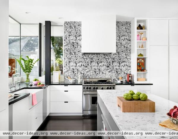
The kitchen looks out to the side yard and the garage. The covered walkway shelters the family as they walk from car to house and provides some shade for the large corner kitchen window.
Carrara marble is found atop the kitchen island, while soapstone was used for the other countertops. The wall behind the stove attracts the most attention. It is covered with wallpaper set behind a sheet of glass.
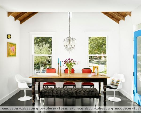
The kitchen opens to the dining room on one side, but instead of having a flat ceiling, the space opens to the wood roof. The furniture works with the symmetrical space, whose three windows (two hung windows and one fixed one up high) look to the front of the house.
Kim’s interior design sensibilities are clearly eclectic; different-style chairs surround the old table, below a chandelier that helps to lower the scale of the tall space. Her choices work well with the old-new gradient of the interior architecture.
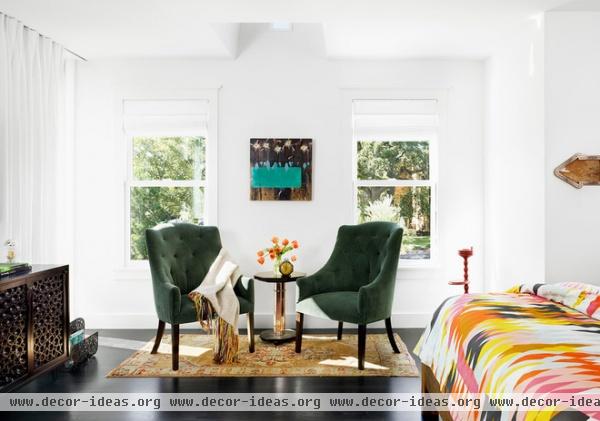
The furnishings in the master bedroom also work with the symmetry created by the windows. Here the ceiling is low, but it is cut to allow light in from the tall window.

Again we see a mix of old and new. Salvaged furniture is juxtaposed against the modern pattern of the bedspread.
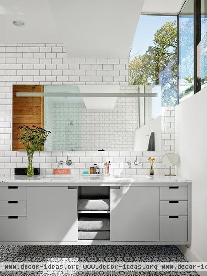
This last view of the house is the master bathroom, which is graced with the clerestory on the southeast side of the house. The white subway tile and reclaimed wood are other old counterpoints to the modern, floating vanity topped with Carrara marble.


