Houzz Tour: Playing With Good Tension in Austin
How long could you share one bathroom with your spouse and two boys? Lawyers Dan and Grace Foster lasted close to a decade before they gave in and decided to add more space to their 1,200-square-foot, two-bedroom 1938 house in the Travis Heights neighborhood of Austin, Texas. “They were all living on top of each other,” says architect Paul Clayton, who worked with project manager Carolina Cantu to add a 1,000-square-foot second floor and renovate the existing interiors.
The best part: The Fosters got to punch out their main bedroom to create a roomy new en suite bathroom, which they keep all to themselves.
Houzz at a Glance
Who lives here: Dan and Grace Foster, and their sons, Cade (age 9) and Luke (12)
Location: Austin, Texas
Size: About 2,400 square feet; 3 bedroom, 2½ bathrooms
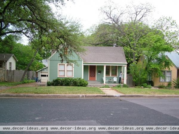
Dan, a modernist at heart, wanted to update the look of the exterior and interiors but keep some of the original charm.
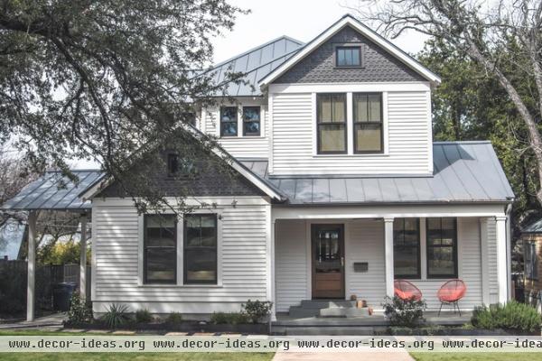
AFTER: A simple charcoal and white paint scheme leans modern, while shingles keep the exterior rooted in the past. “We struggled throughout to insert interesting, clean-line elements as we went along but keep it traditional in its presentation to the neighborhood,” says Clayton. “And that ended up being an interesting tension. A good kind of tension.”
Paint: Classic Gray by Benjamin Moore and Seal by Martha Stewart Living
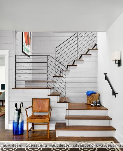
In the entry a modern steel stair railing on a painted shiplap backdrop plays to that tension as well. “We wanted to keep the bungalow feel but have everything be sharper inside, with a modern edge,” says Cantu.
Several schemes for the remodel were drawn up, one of which had the stairs located at the back of the house, but that would have prevented an expansion of the main bedroom and blocked views to the leafy backyard.
Paint: Cape Hatteras Sand, Benjamin Moore
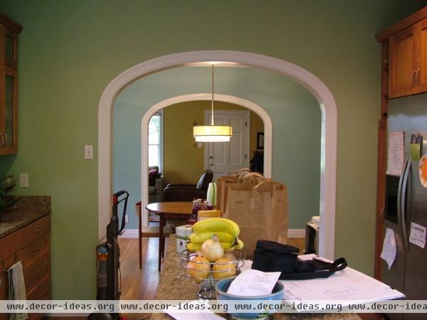
Dark cabinets and walls, and small windows, had made the kitchen and the connecting dining room dark.
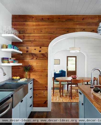
AFTER: Larger windows and lighter paint on the cabinets brighten the spaces.
The design team discovered original pine shiplap wood underneath the drywall. The wood was in such great shape that they decided to keep it. They painted it white everywhere except this kitchen wall. “It’s a real pretty wood. Seemed like we ought to leave it somewhere,” says Clayton.
Cabinet paint: Pepper Tree, Devoe Paints
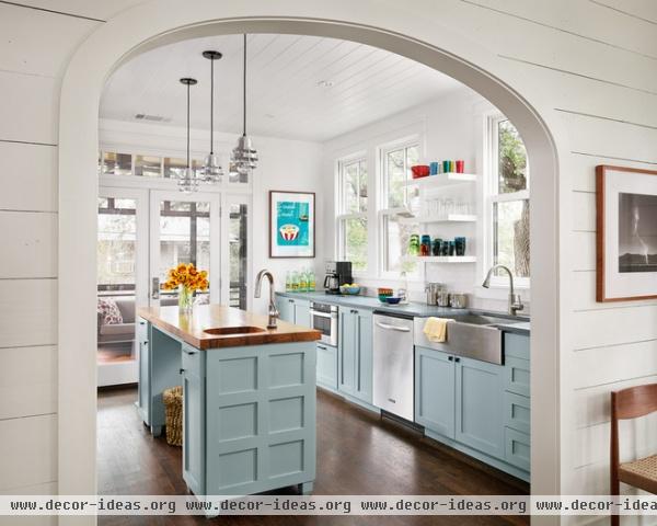
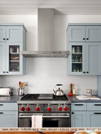
They reused some of the kitchen cabinets but replaced the countertops — there’s now a pecan slab on the island and sandstone on the perimeter. They refinished the original oak floors, which were an orange color, to a darker brown.
Originally, the ceiling was just drywall. They added a wood panel treatment to give it a homier feel.
Backsplash: Heath Ceramics; cabinets: Innovative Cabinets & Woodworks; countertops: Pietra del Cardosa; wall paint: White Heron, Benjamin Moore; pendants: Brewster Pendant, Barn Light Electric; main faucet: Kraus; island faucet: Delta; main sink, island sink: Kohler
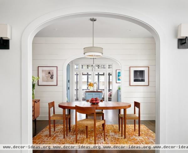
White shiplap walls reflect the light brought in by newly larger windows.
Wall paint: White Heron, Benjamin Moore
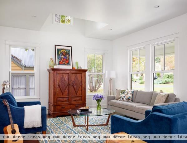
During construction, when the living room didn’t have a ceiling, the designers saw that a window on the second floor would not bring light down here. So they came up with this solution to channel the light into the first floor.
Wall paint: White Heron, Benjamin Moore
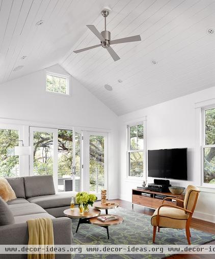
A new family room over the kitchen features a deck with views of downtown Austin. Surrounding live oak trees give it a tree house feel.
Wall paint: White Heron, Benjamin Moore
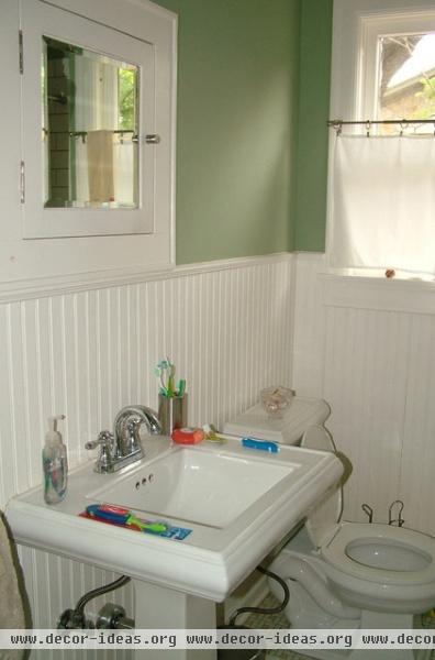
This is the only bathroom that the family of four shared for nearly a decade.
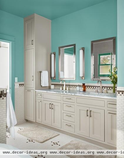
AFTER: A bump-out expanded the space; all-new cabinets and materials updated it while keeping the style grounded in the home’s history. One-inch hex tiles that form wainscoting match the original style. “We were trying to stay true to that historic nature of the bungalow,” Clayton says.
The mirrors are medicine cabinets with lights inside. The countertop is marble.
Wall paint: Stratton Blue, Benjamin Moore; cabinet paint: Cape Hatteras Sand, Benjamin Moore; countertop: Bianco Carrara marble; faucets, medicine cabinets: Restoration Hardware


