Design Workshop: Cool Lighting Tricks
http://decor-ideas.org 03/05/2014 05:22 Decor Ideas
Our dominant sense as humans is sight. We’ve evolved a finely tuned awareness of light levels around us and assigned them meanings — the warm afternoon sun, a cool and snowy sky, a candlelit table — all of them connected to human emotion. Architecture invokes light to play on these emotions, to render the scale and mood of our spaces, and to create functional places in which to live.
Good lighting designs balance three primary types of light: ambient, task and accent. Architects and designers make lighting decisions based on the needs of individual spaces and how to tip that balance to achieve certain effects. Here are a few cool tricks worth considering for your next project.
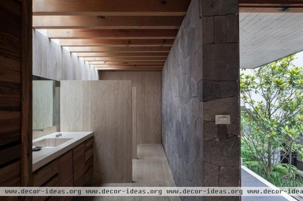
Hide the light source. Lighting a space from an unseen vantage point does two things: It emphasizes architectural form or structure, and it adds mystery and depth, especially to small spaces. Consider a skylight, solar tube or clerestory window to achieve this effect.
This house has been carved into the site’s topography. The hidden light source recalls both the weight of the surrounding earth and the change in elevation from one side to the other. It’s a complex house that never reveals itself all at once, and the light source complements that idea.
Not knowing where the light comes from, we instinctively draw our own conclusions and extend the perception of space to encompass the source of light outside. It’s a powerful effect.
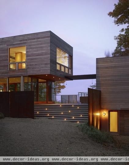
Employ irregular spacing. Lighting on a grid is a common approach and makes good sense when even light levels are required or for working around framing on an interior living space. But the more whimsical approach shown here conjures movement and invokes images of a starry sky, twinkling votives or lightning bugs.
Casting small pools of light in a random pattern encourages informal circulation and gathering. Take care to use this approach sparingly. In this example the regular pattern of the lighting in and on the flanking structures is what makes the irregular pattern stand out. If all the lighting were irregular, it would appear chaotic and disorderly.
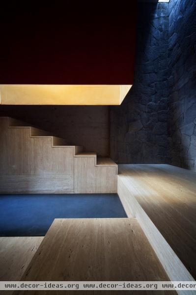
Use dramatic contrast. While many lighting techniques rely on the even distribution of light, a theatrical treatment can be useful for creating unique emotional connections to a place, establishing importance as well as leading people to a destination.
High levels of contrast in a lighting scheme allow this technique to work here. The light filtering in from above promotes a feeling of quiet reverence, seclusion and contemplation.
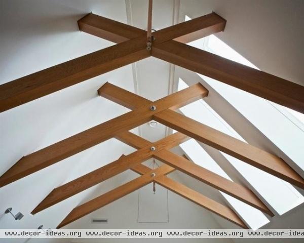
Use daylight. When it comes to lighting a space, natural light always wins. Daylight is full-spectrum light, composed of roughly equal parts of all wavelengths (colors) of light. It’s the light our senses are most tuned to, and we intuitively understand what changes in natural light mean — from weather to time of day and season. We can use natural light to bright and warm our rooms, and it’s an abundant free resource.
Locating openings higher in a wall or roof plane will permit you to admit more natural light deeper into a space. Always remember that the direction your windows face will influence the type and coloration of light you’ll receive. North-facing windows admit an even, diffuse light that’s closer to the blue end of the light spectrum. South- and west-facing openings allow large amounts of warmly toned but often high-contrast light. Knowing this, you can allow for a means of modulating it to prevent unwanted glare, heat buildup and fade-causing ultraviolet rays.
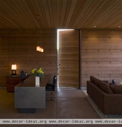
Consider the rule of three. Most successful lighting concepts use a combination of three types of lighting: ambient, task and accent. By layering all three in differing proportions, you can achieve professional results.
Ambient lighting. The general illumination in a space is called ambient light. While both task and accent lighting contribute to ambient lighting, ambient light sets the predominant light level and mood in a space. In the room here, most of the ambient light comes from a large wall of glass to the right (not shown), with some support from the wall washers located in the ceiling. The mood is sheltering with a steep gradient between the bright exterior wall and the dimly lit, cooler interior.
Task lighting. The pendant task lighting above the desk illuminates the work area. While it contributes to the ambient light, it’s clearly secondary. It also helps to divide the space for work and the one for repose.
Accent lighting. The table lamp functions as the accent; it lends a pop to the wall area nearby but does little for the real work zone in the room. The layering of it and the other two types allows for both light and dark places in the room and reinforces the overall interior concept of a cooler refuge in a desert landscape.
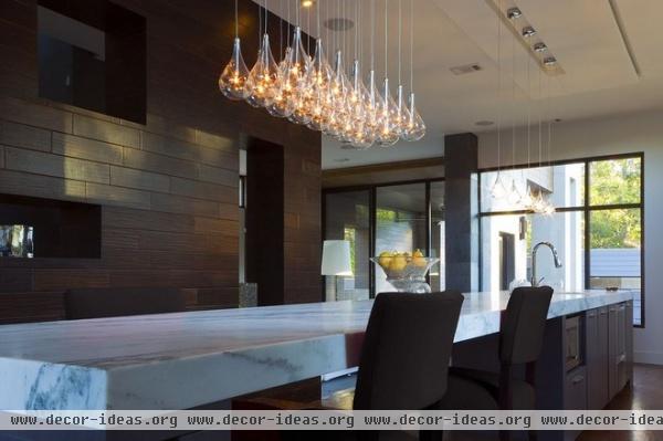
Be bold. Groupings of multiple fixtures always look better. Don’t be afraid to use a large number of the same type of fixture. They anchor spaces by defining an overhead plane and act as a stopping point for the eye. The pool of light they cast illuminates the horizontal plane below and creates an implied space. Think in multiples for maximum effect. It shows intent.
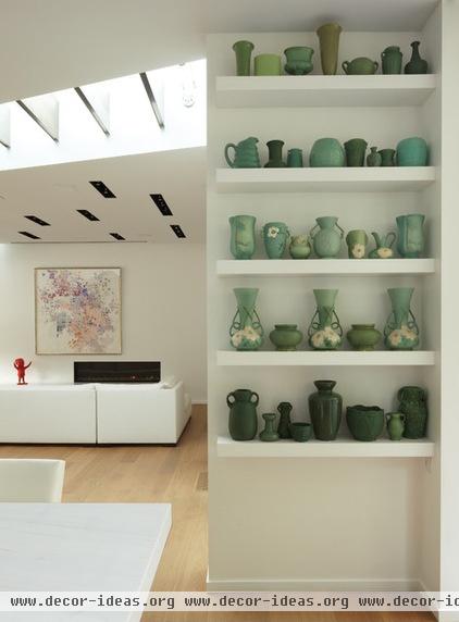
Consider the trim. One often-overlooked detail related to recessed lighting is its appearance when it isn’t illuminated. Lighting trim, the finished component that holds the bulb in the housing, can have a strong presence on a ceiling plane. If your ceiling is white, selecting a darker light trim will strongly emphasize its geometry. It will also reduce glare from the light source when lit. Selecting a white trim will tend to blend the fixtures into a white ceiling plane.
Here the architects integrated linear troughs into the larger design concept by staggering the dark trims to complement the structure in the ceiling.
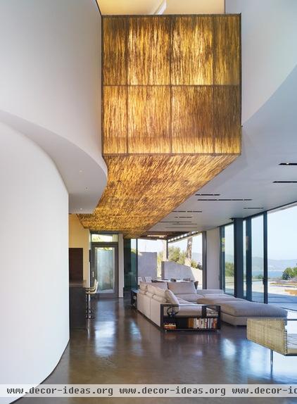
Think custom. Pair any translucent material with a light source and you’ve created something uniquely yours. The architects here added a translucent resin panel embedded with bear grass and added backlighting to create a 35-foot-long luminous sculpture. The view outdoors commands attention by day, and the fixture commands it by night.
The inner workings of custom luminaries can be fabricated from affordable, utilitarian lighting components and covered in more luxurious finishes. Be sure to include dimmers in your lighting design; you’ll want control over how much light emanates from your custom creation.
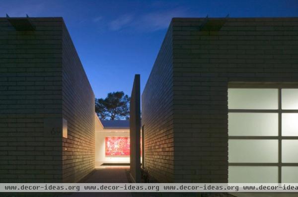
Light the destination. Light naturally draws us in and suggests refuge. This concept can be put to use in any part of a home, but it’s especially effective outside, to announce entry, establish gathering points and suggest hierarchy among building components. I really appreciate how the ambient light emanating from this garage is enough to bridge the gap between arrival and entry without the need for intermediate path lighting. This further enhances the destination lighting.
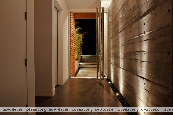
Uplight only. For pathways and circulation areas, it’s often suitable to provide only enough ambient light to get from here to there. Uplighting produces a relatively flat overall light, but washing a textured wall with soft streaks of light, as shown here, encourages movement and renders the wall surface an artful composition.
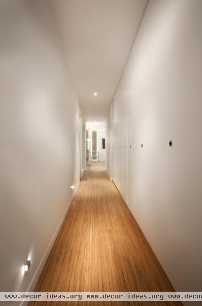
Do the math. Having a hard time knowing exactly how much light you need in a space? As a rough guide, calculate the square footage of the space you’re trying to light and multiply that total by 1.5 to get the total wattage required.
When selecting CFL (compact fluorescent) or LED (light-emitting diode) fixtures, be sure to check the lamp’s incandescent-equivalent wattage. For example, the light output of a 13-watt CFL is equivalent to a 60-watt incandescent. The wattage ratings measure how much electricity the bulb actually uses, not the amount of light it gives off. If you can afford it, use dimmers on every circuit for maximum control of light levels.
It can compensate for overlamping (using a bulb with a too-high wattage for the fixture) as well.
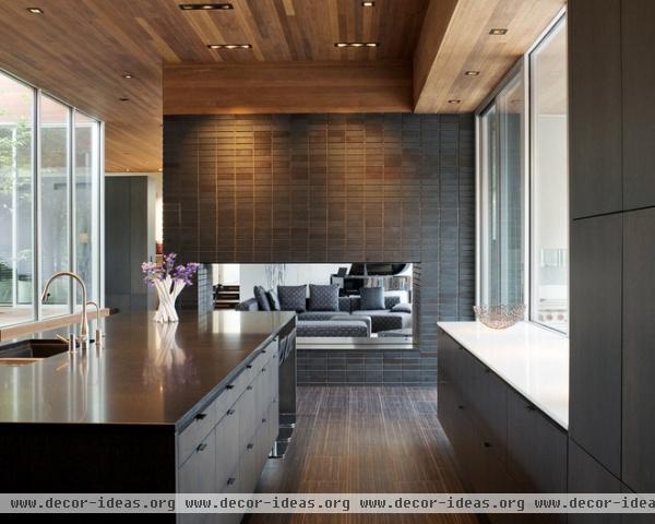
Be square. You’re probably familiar with traditional round recessed lights, but those are not the only option anymore. I’m a huge fan of square recessed light trims, especially when they’re used in places that by nature have square edges, like this ceiling. The trims fit with the dominant geometry of the ceiling — no round cutouts to be done. As a whole I think they just feel more custom.
Square trims have all of the options of their round counterparts and don’t require any specialized features. Some lights are even available trimless (with no flanges), for a completely integrated look.
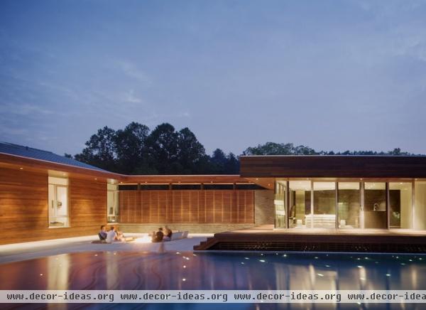
Light the background. When the budget is stretched on the interior of a home, it’s hard to think about the exterior and landscaping. But outdoor lighting is especially important when your home has living areas with large windows. Remember at night, from your living areas, any glass walls will appear as dark planes if care isn’t taken to light the area behind the glass. It doesn’t have to be much light, just bright enough to see from inside.
Lighting recessed into overhead soffits can be tightly focused on the ground, and that’s usually enough to deaden the black-hole effect. Doing this will also expand your perception and sense of space outward. You’ll be glad you did.
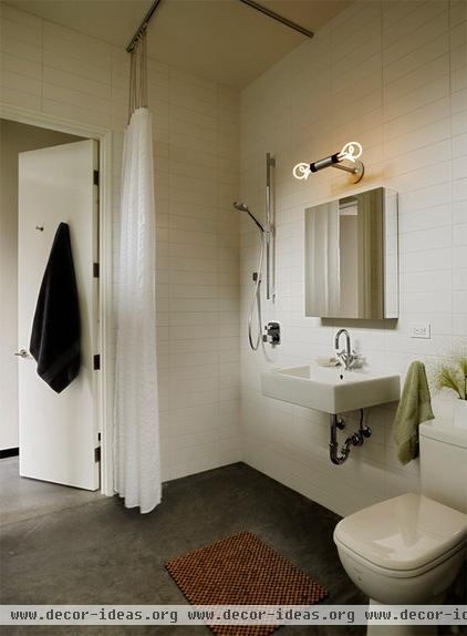
Bare the bulb. The humble lightbulb, or lamp, as the lighting professionals refer to it, is worthy of celebration. Too often we work hard to conceal this essential component.
While the bare bulb may not be appropriate for every space, it is in this bathroom. This is a place where lighting one’s face is essential and the omnidirectional light from the exposed lamp works well.
Now that legislation has forced the phase-out of inefficient incandescent bulbs, new emphasis has been placed on designing CFL bulbs that are aesthetically pleasing. The bulbs shown here are made by Plumen, in London, and are a wonderfully sculptural alternative to the more common twisted-spiral CFL.
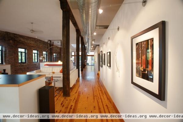
Consider museum lighting. Think of your home as a gallery and put specialty museum lighting to work. It feels unexpected and highly custom. The bulbs are typically halogen, for lighting that has a sparkle you won’t find with CFL or LED lamps. Don’t be afraid to use these even if your art collection isn’t what you’d like it to be. Consider the effect of these fixtures washing a wall of reclaimed wood or stacked stone.
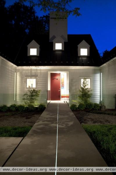
Lead with light. Here an embedded linear light draws a line to the home’s entry. Vertical windows at the corners wash the walls with light, and the interior windows suggest a welcoming home.
Designers think about the differences between night and day and how lighting will reveal those differences. This walkway comes alive at night because of a small, thoughtful insertion in a simple walkway.
Thinking outside of the normal bounds of common experience can yield exciting results; with a few simple gestures, this project offers proof.
More: 5 Questions to Ask for the Best Room Lighting
Related Articles Recommended


