Houzz Tour: Modern Treetop Living in Sydney
Our homes shelter us, but they also influence how we live and how we feel. The key is finding or creating the home that gives us the most positive domestic experience for the life we lead.
For this treetop retreat in Sydney’s Bondi Beach neighborhood, architect Matt Elkan created an environment to foster connections. “The house is fundamentally about engagement,” he says. Through its materials and layout, it engages the family of four, the surrounding trees, the views and the local climate. The home is calm too, Elkan adds. “It sits easily on its site without imposing,” he describes. “It is a subtle, careful house.”
Houzz at a Glance
Who lives here: Greg and Susan WIlliams, and their daughters (ages 9 and 10)
Location: Bondi Beach, Sydney
Architect: Matt Elkan Architect
Size: 2,153 square feet (200 square meters); 3 bedrooms, 3 bathrooms
Year built: 2013
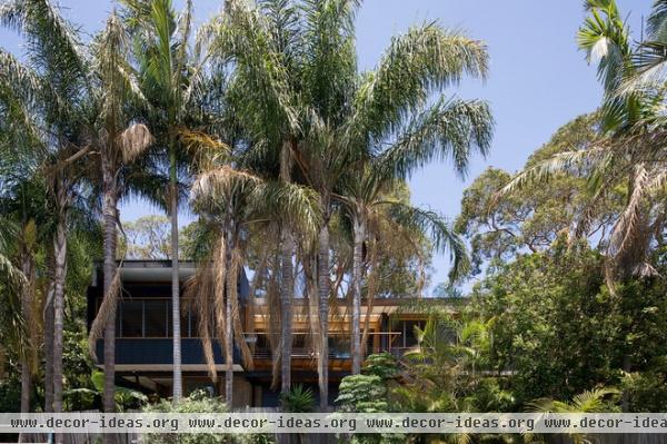
This suburban neighborhood, which lies a little less than two miles from the coast, was originally a spot for holiday cottages. It’s since been built up and developed. “This block is unusual in the area for the fact that it had a lot of remnant indigenous bushland, which the owners were very keen to preserve,” says Elkan.
“Our hope in building the new house was to create a place which not only served our needs, but was at least a little bit inspiring to live in, welcoming for guests and did justice to the site,” says homeowner Greg Williams.
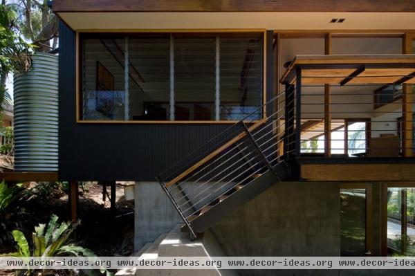
Greg and Susan wanted a house that could accommodate their growing family, but they didn’t want to build something big just because they could. “The clients had relatively humble aspirations in terms of the size of the house, which allowed more of the budget for the house to be well detailed,” says Elkan. They used the original footings of the cottage to minimize the impact of construction. The elements beyond that were done through suspension.
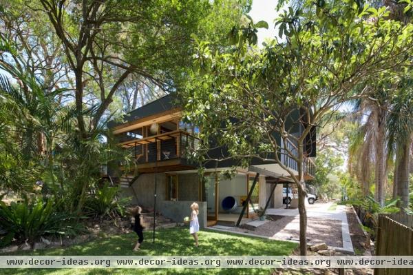
With the valley below and the trees around, Elkan and the Williamses liken the home to a tree house. The design “always seemed like the appropriate thing to do,” says Greg.
“We wanted the house to feel as much as possible as though you are living outside,” says Elkan. “Basically, it would be good if the house felt like luxurious camping all the time.”
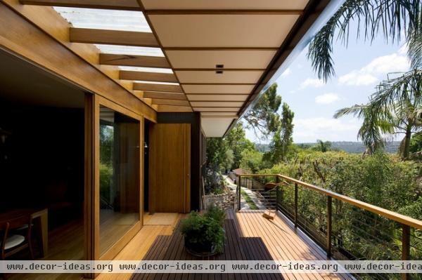
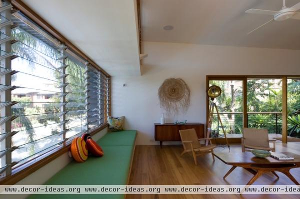
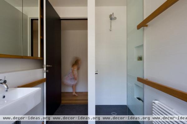
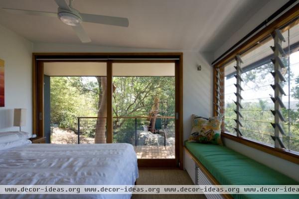
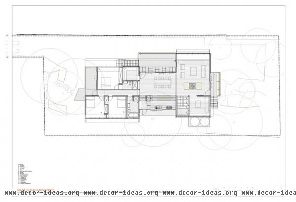
Inside there are clear delineations between living spaces. Communal areas are localized on the east side of the house; the bedrooms and bathrooms are on the west side. The architecture provides visual cues, too. “In this case we also consciously tried to make the bedrooms and bathrooms compact, with relatively low ceilings, so that people are encouraged to get out of their bedrooms and come into the common spaces,” says Elkan.
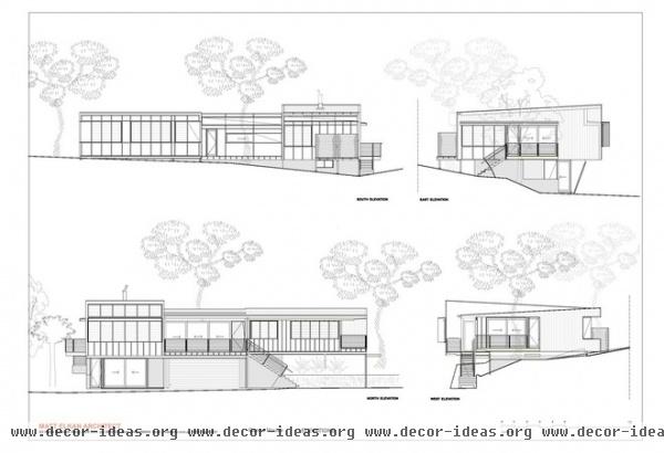
The open living room encourages circulation of people, light and air. Louvered windows draw as much light and air in as possible. The house faces north, and ocean breezes blow in from the northeast. Elkan designed the roof overhang to shade the house during the summer and welcome sun in winter, when it’s lower in the sky.
With the exception of ceiling fans, there is no active cooling. “With Sydney’s temperate climate, it should be easy to design a house where most of the heating and cooling is passive,” says Greg. By using natural forces for climate control, the home remains open to the world.
They used low-emissivity glass on the windows and double glazing in many places, and they heavily insulated the building envelope to reduce the need for active heating. There’s a wood combustion stove for heating the living room and hydronic radiators throughout the house.
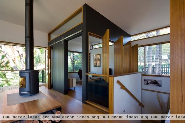
The television recedes from daily life, enclosed within a small room off the main living space. “The separate TV room was intentionally about making sure that the living room did not become a shrine to the TV,” says Elkan. “The client’s view is that TV should be something that is watched intentionally rather than something that is on in the background.”
Fireplace: Morso 7648; floors: blackbutt wood with a tung oil finish, 30 percent gloss
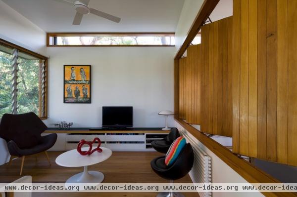
“I was particularly impressed by the client’s desire to make sure that their daughters would be active participants in family life, and that the house should help to engineer this,” Elkan continues. Movable timber screens open to engage the TV room with the rest of the house.
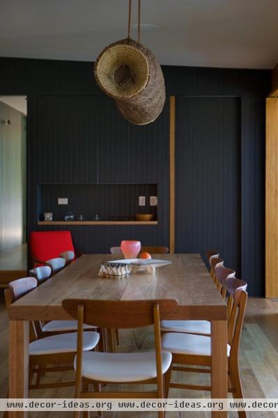
The Williamses envisioned their home as being a gathering space for friends as well as family. “The capacity to hold big dinner parties was a big deal for us, coming from a house where we really couldn’t entertain anyone in comfort,” says Greg.
“Matt took great effort to include the girls in the design process,” Susan adds. “As a result we all enjoy how we live here. We can have a house full of kids running around, and at the same time the adults can still have a conversation.”
Paul Gray, the home’s builder, built the dining table from Elkan’s design as a housewarming present to the family. He also made the light fixture above the dining table from an aboriginal fish trap and copper pipes from the original house. All the other furniture in the house was sourced from Vampt Vintage Design.
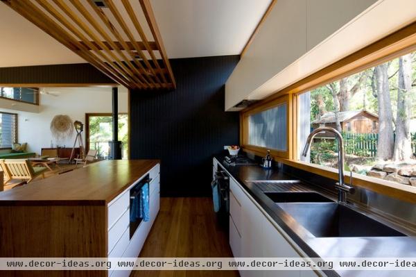
Off the dining room an open kitchen easily accommodates friends and family, bridging the two sides of the house as its central point. “We find that visitors to our house almost always end up in the dining room/kitchen area, almost as if it exerts a gravitational pull,” Greg says.
The counters are recycled blackbutt and stainless steel. The kitchen cabinets are southern blue gum veneer with a white polyurethane finish.
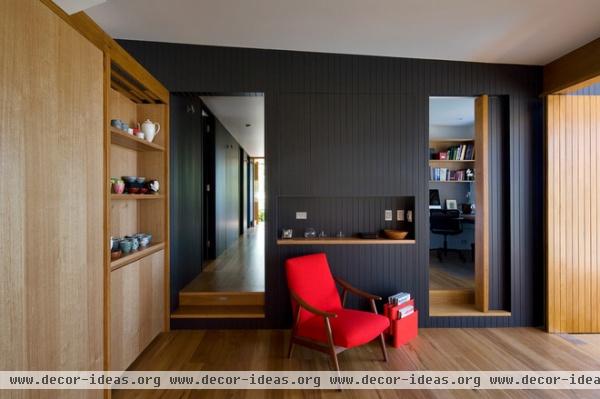
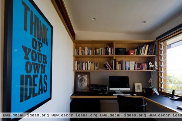
A home office adjoins the dining room. “Talking about how we might use the study was, for me, an important part of the early design discussions,” says Greg. They handled it similarly to the TV room. “It is a separate space where I can concentrate, but is also placed relatively centrally within the house, so that I don’t disappear from family life when I am working.”
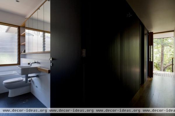
Angophora trees provide visual markers of the landscape at both ends of the home’s main axis.
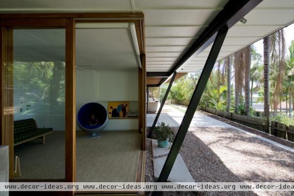
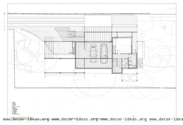
Downstairs a full basement includes a laundry room, a playroom, a garage and storage space.
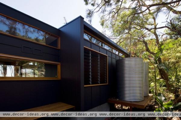
Rain cisterns are capable of holding 1,000 liters of water for the bathroom, laundry and garden.
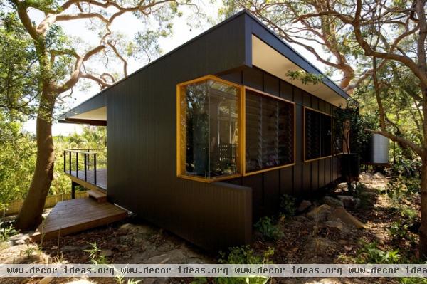
The home’s color came later in the design process. They picked a nearly black color called Monument, which then “spread like a virus through the rest of the house,” says Greg. He immediately was drawn to the hue, which he describes as “deep charcoal with a hint of chocolate.” The contrast of the black and natural wood is striking.
Elkan says, “The main consideration was that black recedes into the landscape visually. If you look at a hillside with lots of houses, the ones that stand out are the light-colored ones. The ones you don’t look at are the dark ones. Councils are trying to discourage the use of light colors for this reason. Also that they reflect into neighbors’ houses.”
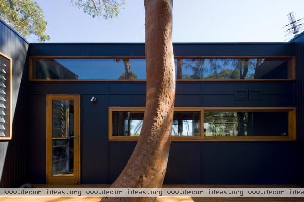
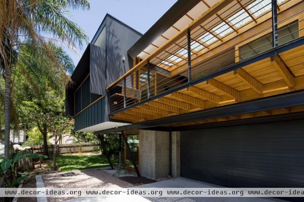
The same colors used outside the house flow inside, and vice versa. “In Sydney we try to live outside as much as possible for at least six months of the year, making spaces which flow easily from inside to outside a very important part of good design,” says Greg. It was also simpler to keep the color scheme minimalist. There are really only three main colors used throughout the house: soft white, dark charcoal and natural wood. Art and furniture add other colors.
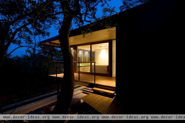
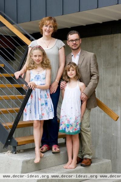
The Williams family, shown here, couldn’t be happier with their house. “I remember waking up on one of the first mornings we spent in the house to the dawn light filtering through our relatively translucent blinds, and enjoying the feeling of both simultaneously being enclosed and exposed to natural light,” says Greg. Each room has beautiful light, which Greg says changes throughout the day. “Friends comment on how peaceful they feel when they visit,” he says.
They’ve discovered how easy living can be in a home that embraces their lifestyle. “The extent to which living in a well-designed, beautiful and functional space affects positively the way our family interacts and can be a positive influence on mood,” says Greg.
More: The Unparalleled Power of Trees


