Houzz Tour: Industrial Updates to Classic Southwest Style
People often claim that it was love at first sight with their home. That definitely wasn’t the case for Matt and Lauren Morstad. “Luckily, my husband had a vision and said we could do something with the house,” Lauren says. “It hadn’t been updated since it was built in 1958.”
In spite of the never-renovated kitchen and dark, choppy living space, the Morstads saw promise in the structure and the views from the hillside Phoenix home, and enlisted interior designer Lindsey Schultz to help execute their desert modern vision. Schultz, who had previously worked with the family on their condo, opened up the living space, reinvigorated the exterior, enlarged the garage and added an additional 240 square feet to the master bedroom. Although the resulting home is vastly different from the way it started out, its rough-sawn ceiling and adobe brick walls retain an air of Southwest tradition.
Houzz at a Glance
Who lives here: Lauren and Matt Morstad and their sons, Will (age 2½) and Max (8 months)
Location: Phoenix
Size: 2,240 square feet; 4 bedrooms, 2½ bathrooms
Year built: 1958
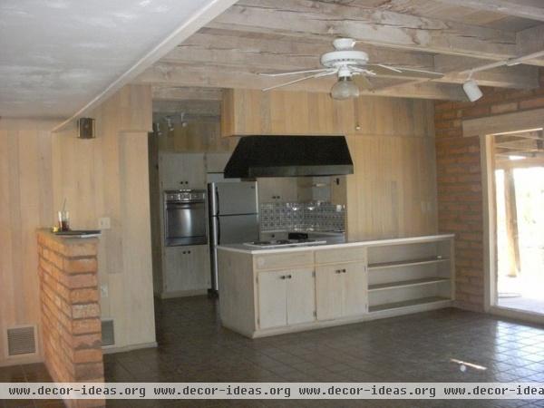
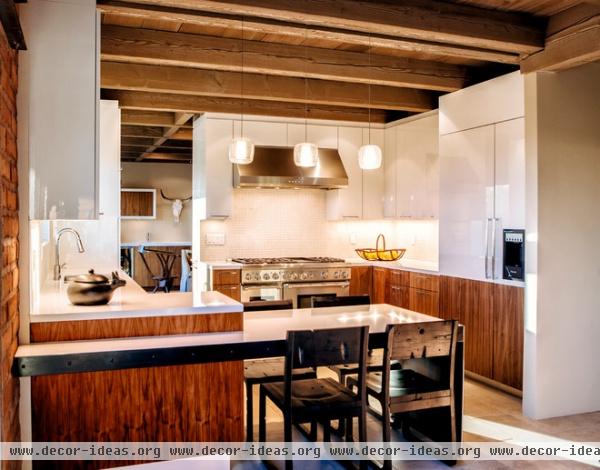
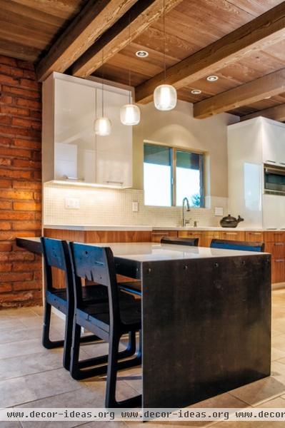
AFTER: When the Morstads bought the home in 2012, the dreary kitchen had clearly never seen a touch-up. Schultz opened up the floor plan so that the kitchen was easily accessible from both the living and family rooms. To create a clean, fresh feel, she used two-toned cabinets with a high-gloss white acrylic finish on top. “I didn’t want wood on the top cabinets, because it would have overwhelmed the space, especially next to the adobe brick,” she says.
A white Caesarstone countertop and clear glass tile backsplash reinforce the bright, white vibe. During the planning process, Lauren used Houzz to show Schultz some of her ideas, especially for the compact dining area. This built-in breakfast table — with its hot-rolled-steel frame and Caesarstone top — was inspired by an image on Houzz and now serves as the family’s primary dining spot. When company comes, the Morstads head outdoors to the covered patio, which has expansive city views.
Cabinets: custom, An Original; breakfast chairs: LDK
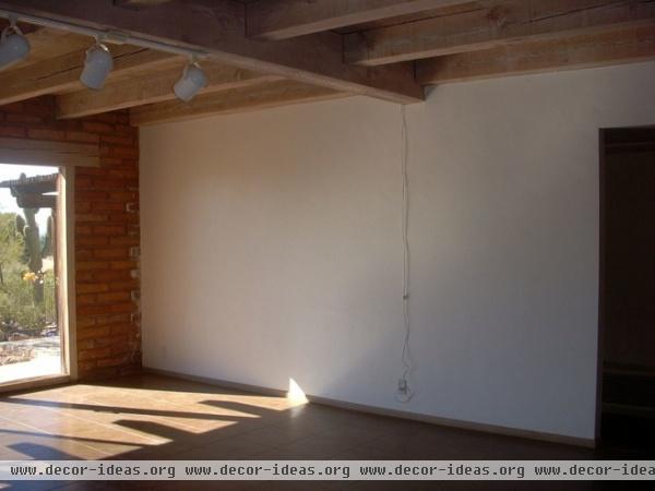
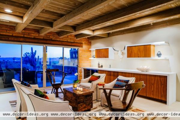
AFTER: The more formal lounge area was mostly a blank slate, but as with the rest of the house, Schultz kept the adobe brick and ceiling beams. The adobe was in great condition, though she soda-blasted the wood to remove the pickled finish.
Mexican-themed rugs, including this one, are used throughout the house for a little ethnic flair. They add a nice bit of color and pattern, but they’re also great for hiding stains — a common concern for any family with little ones.
Rug: Bungalow; wood chairs: Manor Chair, Paul Ferrante; linen chairs: Century Furniture; orange side table: Lens Table, Holly Hunt
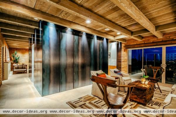
The hot-rolled-steel wall is an extraordinary piece of art, but it also serves a practical purpose: It contains hidden cabinet storage for extra dinnerware and food items.
To achieve such a colorful final product, Schultz finished the steel with Johnson wax, which prevents it from rusting and brings out and enhances the natural color of the material.
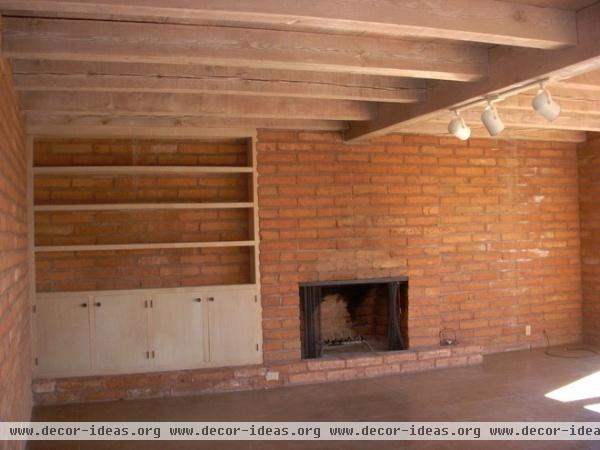
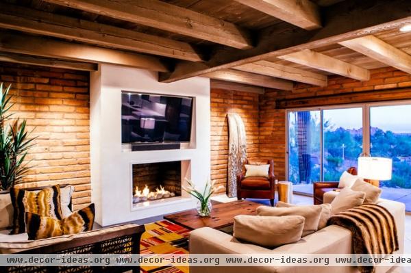
AFTER: “Originally the entire wall was all adobe brick, but it looked dark and oppressive,” Schultz says of the family room. To brighten it up, the team drywalled over the fireplace brick and added a white Caesarstone frame around the firebox and a steel hearth.
Rug: Bungalow; daybed, antique wheat thresher: Tierra del Lagarto
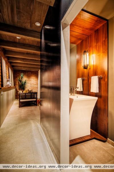
In the hallway between the two living spaces, Schultz turned a coat closet and pantry into a small powder room. The woodwork adds a warm, decorative element but also serves as a platform for the pedestal sink, which at 32 inches proved too low for comfort.
Pedestal sink: Quadro by Fresca; sconce: Restoration Hardware
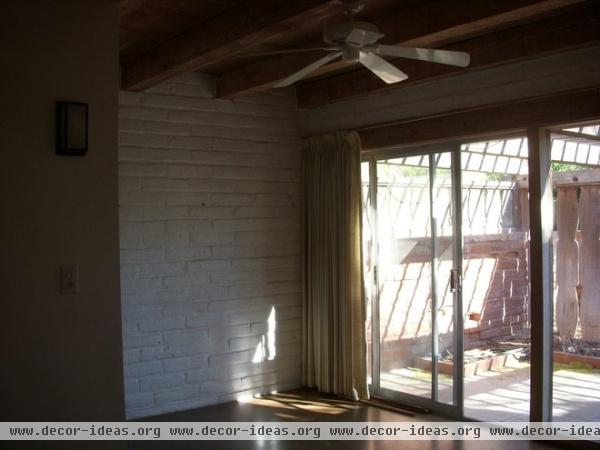

AFTER: The original master bedroom was tiny, so Schultz more than doubled its size. It now includes a small sitting area and a large L-shaped closet. A sliding glass door opposite the foot of the bed provides access to the outside.
Dark accent wall paint: Forest Black, Glidden; main wall paint: Gray Mountain, Glidden; rug: Mexicana Rose
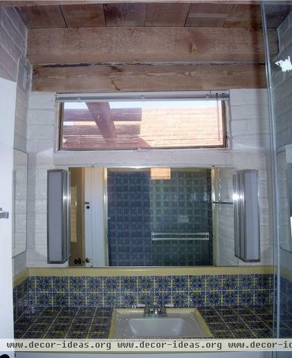
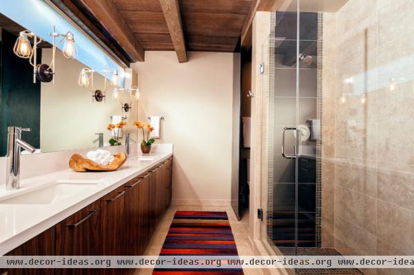
AFTER: To keep costs down, Schultz didn’t widen the narrow bathroom but did lengthen it, relocating the shower and adding another sink. She installed a longer window and used a fixed steel panel to block off the toilet.
The porcelain floor, which mimics limestone, is used throughout the house.
Wall sconce: Rensselaer, Schoolhouse Electric; rug: Mexicana Rose
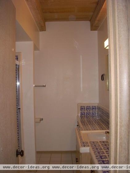
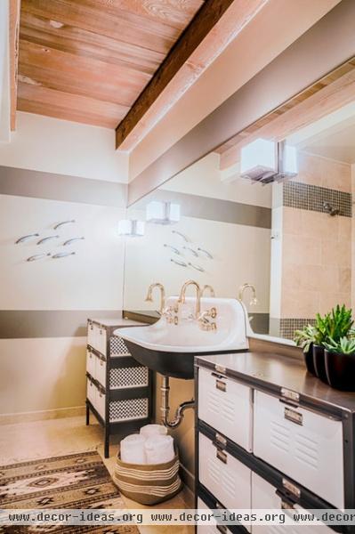
AFTER: The second full bathroom plays off a more industrial vibe with vintage metal lockers — one for each of the boys — and a trough sink.
Metal lockers: Twenty Gauge; sink: Kohler
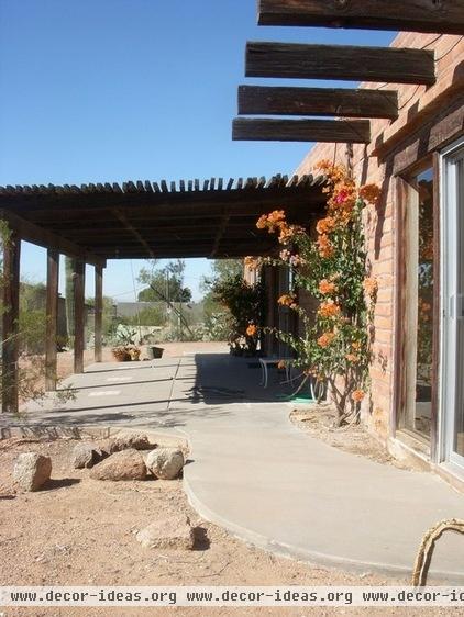
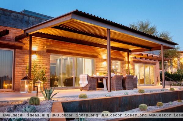
AFTER: The back patio now spans the entire width of the home and includes a great covered space for dining and entertaining. The terraced backyard includes hot-rolled-steel retaining walls, a sandbox, a fire pit, a pool, an artificial turf play area and plenty of desert plants.
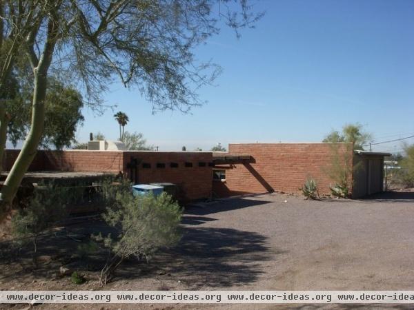
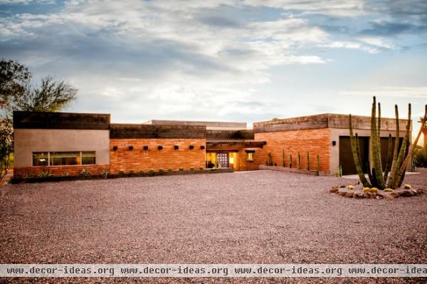
AFTER: Adobe brick is still the focal point of the exterior, but new stucco siding accents the garage and bedroom additions. The all-gravel landscape ensures that any rain runoff from the mountainside seeps into the ground instead of finding its way into the sunken entry.
A new and improved entryway includes floor-to-ceiling windows, which help showcase a great view of Camelback Mountain. The front door pays homage to the original blue door, which was too far gone to restore.
More: Houzz Tour: Minimalism Suits an Arizona Ranch House


