My Houzz: Creative Thrifting Beautifies a Texas Bungalow
Designer Misty Spencer believes that good looks can come at any price. “You don’t have to have money to create a beautiful design,” says the owner of Objects Living. “Design isn’t about brand names; it’s about having things around you that make you happy.”
Spencer’s own home is located in the heart of Fort Worth’s Fairmount district, a neighborhood filled with houses built between 1880 and 1920. “After looking at several other homes that had major issues or just weird quirks, this house seemed to have it all,” she says. “Spaciousness, great light, a fabulous kitchen, and a floor plan that made sense. It just needed a cosmetic makeover to suit my personal style.”
Spencer believes there are three parts to good design: function, style and feeling. “I believe when you find that perfect combination, it changes how you live and move in the space,” she says. “Mixing old and new objects is essential. Vintage pieces have a history and a soul, and a room is not the same without them.” Spencer has applied this design philosophy in her Craftsman bungalow, which brims with quirky elegance and vintage flair.
Houzz at a Glance
Who lives here: Misty Spencer and her children, Drake (age 7), Luke (6) and Stella (4)
Size: 2,540 square feet (236 square meters); 4 bedrooms, 2 bathrooms
Location: Fairmount National Historic District, Fort Worth, Texas
Year built: 1910
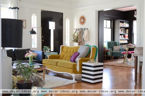
The yellow loveseat in the living room was a $30 Craigslist purchase. Spencer updated it by painting the wood trim white. The striped side table, a $20 thrift shop find, was also a DIY painting project.
“I love black and white stripes,” she says. “You’ll see it all over my house.”
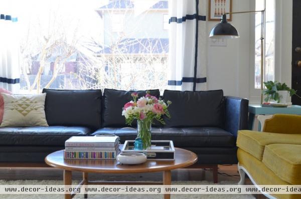
As soon as Spencer moved in, she painted the wood trim in both the living and dining rooms. “It was dark and dreary, so I painted both rooms solid white,” she says. “I love how bright it is now, and it really made me feel like the house was mine.”
A home “should reflect those who live in it — however bold, quirky or quiet you are,” she adds. “Creating a stylish home filled with things you love changes the way you feel in your space and frees you to live.”
Black sofa: Craigslist
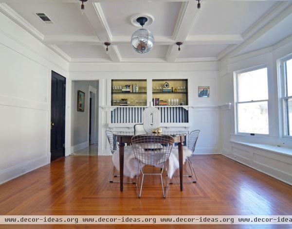
The dining room shows off Craftsman details, including a coffered ceiling, a built-in buffet, a bay window and original hardwood floors.
“Home is where you laugh, love and dance,” says Spencer, who installed a disco ball in the center of the dining room for frequent dance parties. “Do what suits you and your family. People told me not to put a disco ball in my dining room, but I did it anyway, and I love it.”
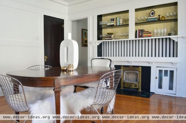
A small fireplace is tucked under the built-in buffet. Spencer painted the beadboard above with her signature black and white stripes, then backed the shelves with vintage wallpaper she found at a thrift store.
Vase: HomeGoods; table: Craigslist
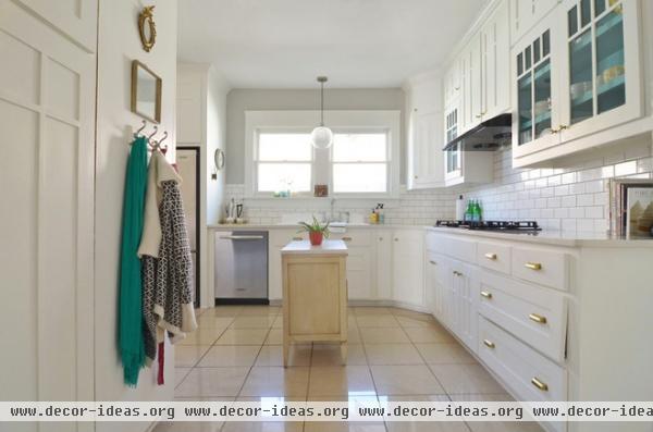
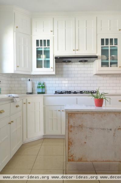
Spencer’s only major renovation was the kitchen. She painted the existing cabinets, added brass hardware to the cupboards, installed quartz countertops and tiled a new backsplash. She also painted the interiors of the glass-front cabinets a cheery aqua. A set of vintage dresser drawers, topped with quartz, serves as an island.
“I love an all-white kitchen,” she says. “I would love to put new hardwood floors in the kitchen. The tile is supercold in this old house, and wood floors would warm it up, both visually and actually.”
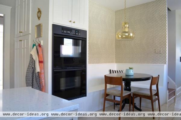
The kitchen receives bright light all day long. “There is always something happening here, whether kids are doing homework, I’m baking or friends are over for wine,” Spencer says. “When I throw parties, everyone hangs out in the long stretch of the kitchen, and I love that.”
Table: thrift store; pendant light: antiques store

The back of the house has a long hallway-like entrance. There’s natural light and ample storage; a long expanse of counter space leads to the L-shaped kitchen.
The mailboxes on the wall are from Spencer’s former apartment in Brooklyn, New York.
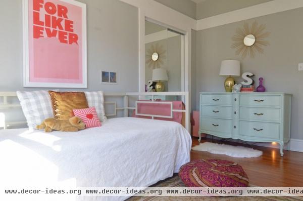
Daughter Stella’s room is a pretty wash of gray, pink and mint. A midcentury sunburst mirror hangs over a thrift store dresser. “I like to mix midcentury with French. It’s always the perfect mix of masculine and feminine,” says Spencer.
Daybed: Amazon; dresser: thrift store; ‘For Like Ever’ poster: Super Rural
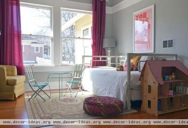
Side-by-side windows flood Stella’s room with natural light. A child-size café table and chairs mirror the color of the dresser.
Table, chairs: HomeGoods
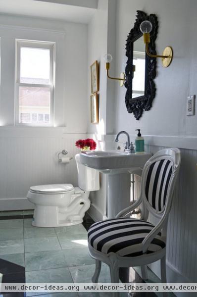
The kids share a small bathroom with a shower. A secondhand chair, reupholstered in black and white stripes, adds an elegant touch. When choosing any vintage furniture piece, Spencer pays close attention to its shape and condition.
“If you’re going to refinish a piece anyway, don’t spend a lot of money on the original,” she says. “Anything can be painted. If the shape and quality is right, it could be really amazing.”
Brass wall sconce: onefortythree
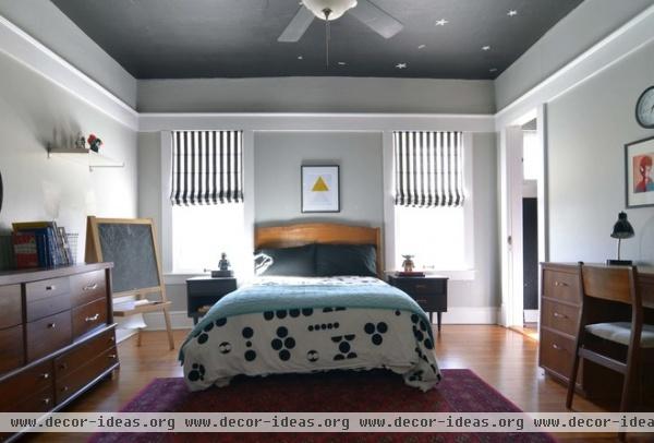
The boys’ room has a masculine yet celestial ambience complete with heavy wood midcentury furniture and a painted ceiling made to look like the night sky. Black and white stripes appear on the DIY Roman shades.
Every piece of furniture in the boys’ room was purchased secondhand. “I’m obviously a big thrifter,” Spencer says. “I have very few items in my home that are new.”
Bed: thrift store; bedding: Urban Outfitters; area rug: Garden Ridge; dresser: Craigslist
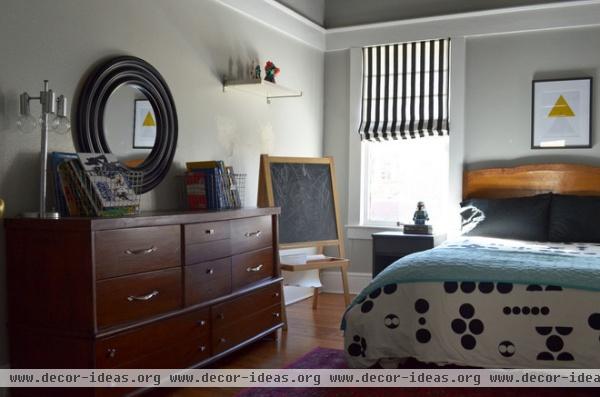
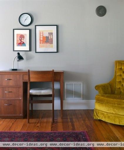
As a mother of three, Spencer is very conscious of whether things are kid friendly. She pays close attention to surfaces when designing for children, but never compromises on aesthetics.
“It’s going to get messy, and things are going to get knocked over,” she says. “I am always thinking in terms of what works with my kids. Nothing is precious.”
Desk, yellow chair: thrift store
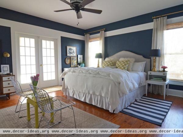
The master suite and adjoining bathroom are part of a new addition built by the previous owners and matched to the architecture of the original home. French doors open to a side porch.
Because of the room’s generous size, Spencer painted the walls dark blue to make the space feel more intimate. “The crisp white trim and bedding keep the room from feeling dreary,” she says. She made the headboard herself using plywood, batting, fabric and a staple gun.
Wall paint: Pitch Cobalt 5010-2, Valspar; striped rug: Ikea; comforter: Target; fluffy pillows: Garden Ridge; gold dot pillows: HomeGoods
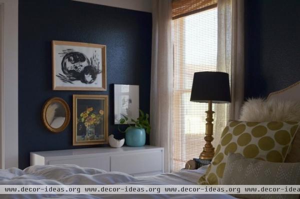
Spencer, who says she can’t live without good lighting, paid $10 for the pair of brass bedside lamps at a thrift store. A white midcentury-style dresser shares wall space with a small gallery of original art.
Matchstick shades are layered with floor-to-ceiling curtains, creating privacy but also allowing light to flow in.
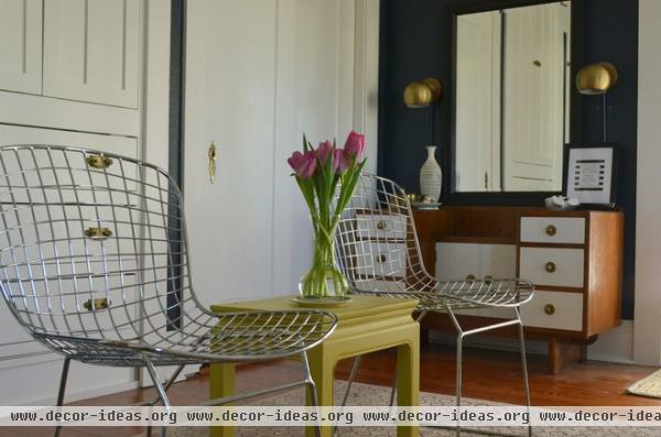
“My personal stye is influenced by a mix of eras gone by and the latest trends,” she says. “Design to me is all about mixing old and new, balancing masculine and feminine, and tempering bold colors with black and white. … My style is a mix of midcentury and vintage, classic yet playful.”
Vanity: Craigslist; chairs: Amazon
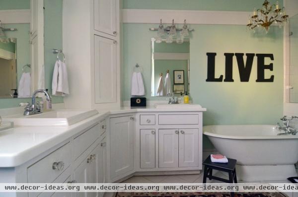
The mint-hued master bathroom has a walk-in shower and a small soaking tub. Spencer installed a vintage chandelier over the bathtub.
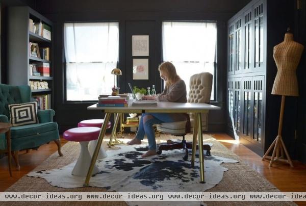
After starting her home-based design business last year, Spencer (shown here) quickly realized she needed an office in which to work, create and meet clients. “I fell prey to sitting on my couch with the computer. When you can sit down and work at any point, you need separation. The office helps me to designate my time and stay true to what is family time and what is work time.”
Her office is a treasure trove of crafty DIY painting projects. She painted the legs of her hand-me-down Ikea desk with gold metallic spray paint. She also painted the vintage stools, using white paint for the base and Design Master Spray Paint in Raspberry for the cushions. The brass floor lamp cost $8 and came from an estate sale.
Wall paint: Onyx in eggshell finish, Benjamin Moore; desk: Ikea; sisal rug: Rugs USA; cowhide: Into the West
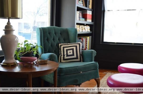
This street-facing window, flanked by built-in bookcases, is the perfect place for a comfortable chair and a table. The tufted wingback was purchased for $5 at a thrift store.
“I love Emily Henderson and her use of midcentury,” she says. “Her work is clean and beautiful, yet totally playful. I also love Miles Redd. He does such bold designs, and I love how over-the-top he can be. They both influence my design choices.”
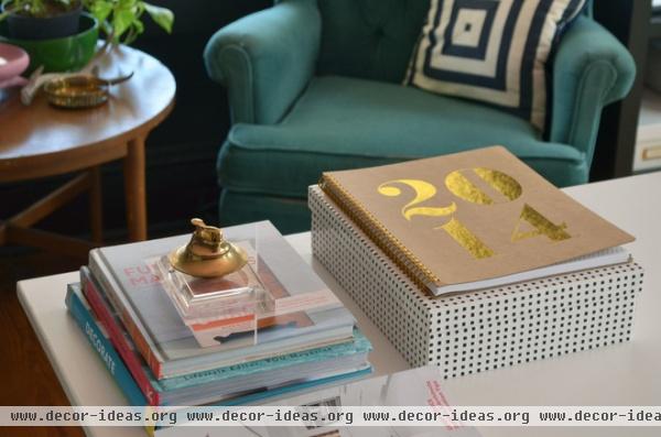
Spencer stays organized with stylish containers and a desktop calendar. A vintage brass service bell sits atop her go-to design books. “I love designing with stuff that’s already out there. You get a more unique space when you don’t go to the showrooms,” she says.
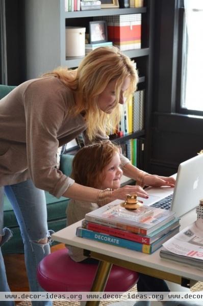
Stella enjoys “working” with Mommy in the office.
After working as a hairstylist for many years, Spencer launched her own interior design business. “I still do hair, but now I’m able to be home more with my kids and make my own hours,” she says.
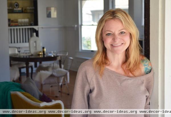
“I love that my neighborhood is rich with beautiful old homes and diverse people,” she says. “We drink wine with neighbors on the porch; my kids have playmates right next door; and we can walk to some of the best restaurants in town.”
Browse more homes by style:
Small Homes | Colorful Homes | Eclectic Homes | Modern Homes | Contemporary Homes | Midcentury Homes | Ranch Homes | Traditional Homes | Barn Homes | Townhouses | Apartments | Lofts | Vacation Homes
More: My Houzz: Hip Midcentury Style for a Mom’s Backyard Cottage


