Kitchen of the Week: Casual Farmhouse Looks, Pro-Style Amenities
When homeowners Dana and James Simpson first laid eyes on this Connecticut country cottage, its farmhouse charm was nearly hidden by a mishmash of funky additions.
The couple consulted their friend, architect Rafe Churchill, who guided them through a succession of changes, including a remodel of the kitchen. “The bones of the kitchen were great, because of the open floor plan and the wonderful 1-by-8 tongue and groove boards,” says Churchill. “It was really about figuring out how to make it more efficient.”
James is a trained chef, and a 48-inch Wolf range and 48-inch Sub-Zero refrigerator were nonnegotiable on his end. Churchill kept the room’s original footprint but reconfigured the layout of the appliances, the cabinetry and the island. This not only maximized efficiency but gave the kitchen balance, opened it up and lent it a casual farmhouse look that was cohesive with the rest of the home.
Kitchen at a Glance
Who lives here: James and Dana Simpson, and their daughters (ages 7 and 10)
Location: Salisbury, Connecticut
Size: About 380 square feet plus a 60-square-foot pantry
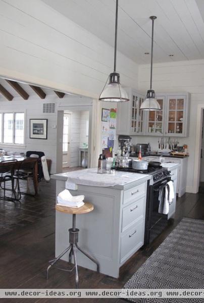
The home hadn’t been renovated since 1982. The kitchen wasn’t bad by any means, but it wasn’t functional for the way the Simpsons wanted to live. The drawers didn’t open properly, and the old range in the island was unreliable and too small to accommodate a Thanksgiving turkey.
The Simpsons lived with the kitchen for a while before figuring out what was working for them and what wasn’t. They weren’t crazy about having so many clunky upper cabinets floating around, lost beneath the high ceilings. They loved the kitchen’s bones but wanted to give it a more open feeling and a more authentic farmhouse look.
“One of the many great things about Rafe is that he respected the existing space, and he doesn’t get caught up in all the new bells and whistles available today unless they make sense for the room,” Dana says.
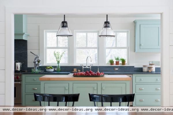
AFTER: The kitchen is open to the dining room (foreground) and the living room, so while the Simpsons wanted modern amenities, they also wanted to keep the casual farmhouse feel. Classic Shaker cabinet fronts, a Shaw’s Original farmhouse sink, simple cabinet hardware (like bin pulls) and vintage-style pendant lights helped achieve the look, as did keeping the rustic tongue and groove boards.
The couple wanted windows over the sink to enjoy the view and to feel like they’re part of any parties on the patio, so they replaced the existing casement windows with period-appropriate double-hung units. The cabinet on the right is the lone upper; they replaced some of the door-front cabinets below with deep drawers for smarter storage.
“The quirky upper cabinet brings it down to the level of a charming historic kitchen you would see in an untouched farmhouse,” Churchill says. It’s also a convenient place to stash drinking glasses.
Cabinet paint: Blue Green, Farrow & Ball; pendant lights: PW Vintage Lighting
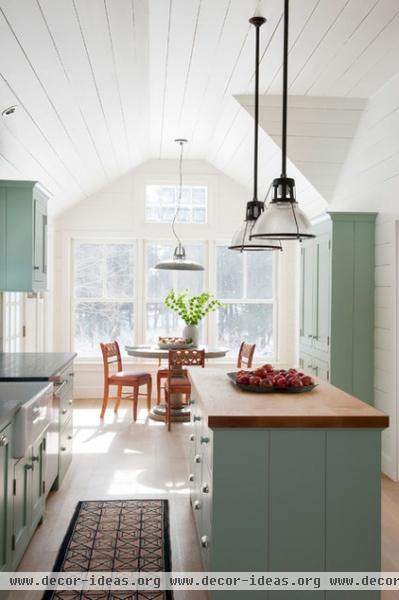
When the design process began, Churchill noted that the couple was storing a lot of things in the kitchen that they had not used in more than a year, and that they needed to thin those items out. Now all of the everyday pieces fit into the tall armoire-inspired cabinet on the right. “It was important that the cabinets look authentic rather than trendy,” Churchill says.
Without all of the bulk of typical cabinet arrangements, the room feels much more open. “When it comes to cabinets, if you build it, you will fill it,” Dana says. “I can keep the large items like paella pans and lobster pots I use once a year in the basement.”
Tip: When designing cabinets, finding the right depth is key. The armoire cabinet, for instance, was designed to be deep enough to accommodate dinner plates.
Kitchen table: Hammertown; hooked rug: vintage; chairs: vintage; pendant over kitchen table: CB2
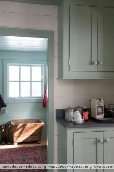
Of course, having a butler’s pantry also helps with storage. The project extended to the entry, mudroom, family room and pantry.
Churchill recommended lowering the tall pantry ceiling to 8 feet, to make it feel more traditional, and designed cabinets that were the appropriate size for food storage. “Now the cabinets engage the coved molding at the ceiling,” the architect says. The pantry also provides counter space for a coffee station, freeing up the counters in the kitchen for workspace.
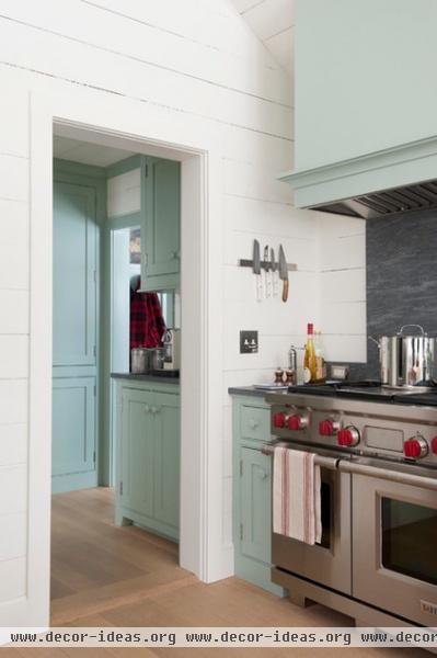
The Wolf range ended up going in the corner where the glass cabinets were before. The range anchors the space, and its placement accommodated a custom hood and an extended backsplash. The range has six burners and a griddle, as well as a mini oven that’s just the right size for dishes like lasagna. “We use every bit of this range,” Dana says.
The aforementioned Sub-Zero is directly across from the range. Churchill recommended leaving it freestanding with nothing around it, which jives perfectly with Dana’s desire to keep the space open. “The refrigerator is gorgeous, Churchill says. “Even though it’s modern, it’s more timeless to leave it freestanding, like you’d see in an older kitchen; it’s like a big, old-fashioned ice chest.”
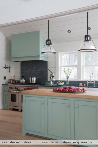
To accommodate the appliances, Churchill made the island slightly smaller and moved the overhead lighting accordingly. The maple butcher block top plays nicely off the new white oak floor. “The whole house had unique terra-cotta tile flooring before,” Dana says. “While we liked it, the color really made everything dark, so we wanted to use a really light wood floor to lighten things up.”
The countertops were a lucky find. Dana is not a big fan of granite; James is not a big fan of marble; and they had used concrete in their last home and wanted something different. “By the time we went to the stone yard, we were at somewhat of an impasse,” Dana says. Luckily, they discovered Pietra Cordosa. “It’s like a combination of soapstone and slate,” she describes. “We chose a very honed, plain finish for it.”
Wall paint: Moonlight White, Benjamin Moore; countertops: Rock Solid Marble & Granite; flooring: Franklin Wood Products
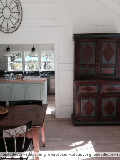
An antique armoire in the dining room provides additional storage space just beyond the kitchen. The dining room is completely open to the living room; this photo was taken from where the two spaces meet.
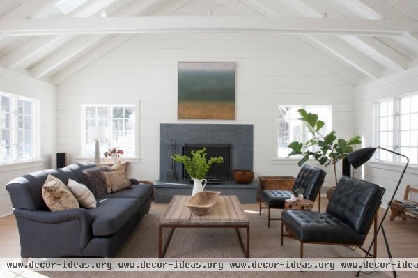
The living room got a makeover, too, including the same white oak floors and lots of white paint. The brick fireplace surround was transformed as well, using the same Pietra Cordosa stone.
The Simpsons laid templates over the slabs of stone at the stone yard, enabling them to choose the best pieces for the surround, counters and backsplash. Now their house is more as they envisioned it the first day they laid eyes on it.
All of the furniture in this room came from Dana Simpson’s family business, Hammertown.
More: Kitchen Workbook: 8 Elements of a Farmhouse Kitchen


