My Houzz: Color Hits the Spot in a White-on-White Scheme
http://decor-ideas.org 02/27/2014 23:22 Decor Ideas
When Le Michelle Nguyen and David Klein were looking to buy a home in Montreal, they wanted something with character, and they weren’t afraid to put in the effort to make it theirs. So although the couple — she’s a design student; he works in business development — were already in the process of buying a heritage loft, they changed their plans when this former loft showroom office became available.
With a little planning and some design savvy, Nguyen and Klein transformed the space into a custom-tailored home befitting their creative lifestyle.
Houzz at a Glance
Who lives here: Le Michelle Nguyen and David Klein
Size: 900 square feet (84 square meters); 2 bedrooms, 1 bathroom
Location: St. Henri neighborhood of Montreal
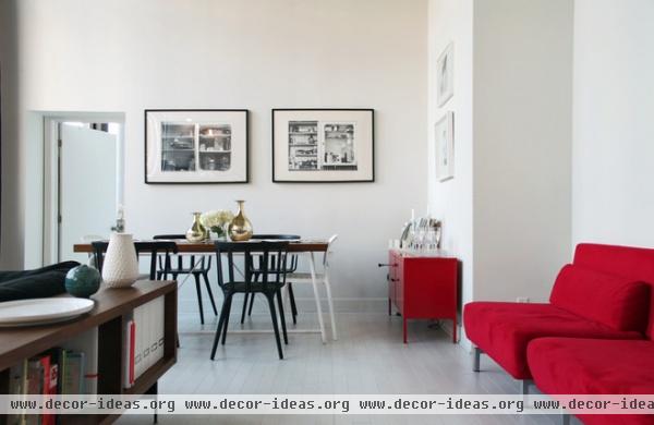
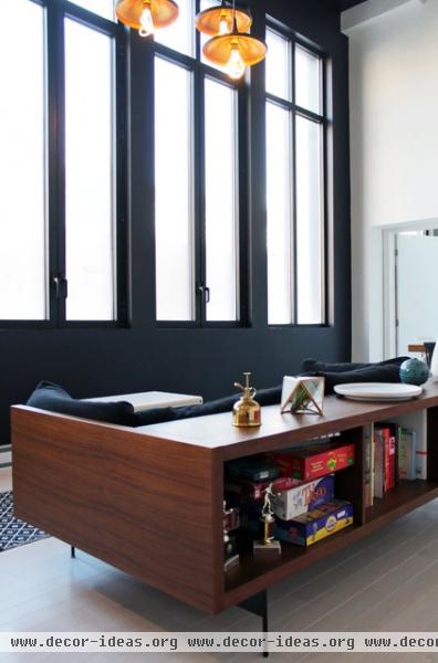
Purchasing their unit straight from the condo developer meant the couple could have a lot of customization, from the floors to the kitchen cabinet handles. They’re thrilled with their choices. “We wanted it to be white on white,” says Nguyen, who opted to add colorful flourishes through furniture and art.
The couple painted the entire west-facing wall matte black to add visual interest and contrast. Plumen lightbulbs, ordered from the U.K., complement their Tom Dixon–inspired pendant lights.
Table: Domison; lights: Ramos, Zone
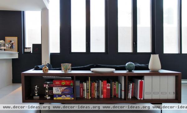
After falling for this midcentury-style sofa with storage from Montreal design company Domison, Nguyen discovered that the company had closed down their retail storefront. She contacted the firm and found out that it had simply transitioned to commercial projects and online-only sales; the sofa was discounted as a result.
Sofa: Jasper, Domison
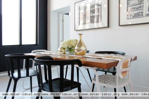
Nguyen, who is completing her design degree at Concordia University, has an appreciation for Montreal-produced art and home furnishings. The framed prints on the dining room wall were done by a photographer friend, and the table was a liquidation purchase from a local company.
Table: Domison; white chairs: Reidar, Ikea; black chairs: PS 2012 Armchair, Ikea
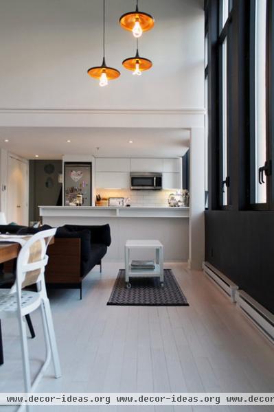
The pair live without a TV. “With the mobility of technology, there really is no need for a TV these days,” says Klein. “This way the living room is what it should be — for hanging out with people and enjoying the space.”
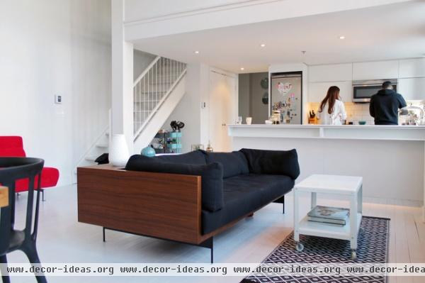
After purchasing the loft, they hired architect NAME TK to make the 16-foot-high space more functional. They closed off the lofted master bedroom, making that space more private. It now functions as a guest bedroom.
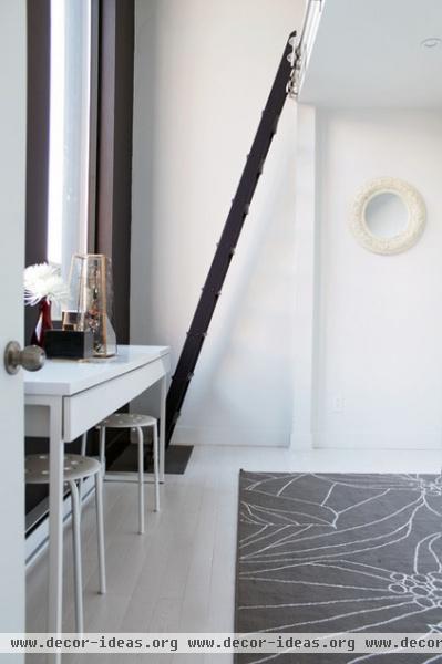
The room that now serves as the master bedroom was originally an office. Now called The Lair, it’s been furnished with a bunk bed reachable by ladder. “It’s our favorite room in the house,” says Nguyen. “It’s basically a kid’s room for adults. It’s our sanctuary — no one is allowed up there except us.”
In need of a taller ladder, Klein scored two rail ladders from Craigslist, then had them painted and filed down to fit into their scheme.
Rug: Gislev, Ikea
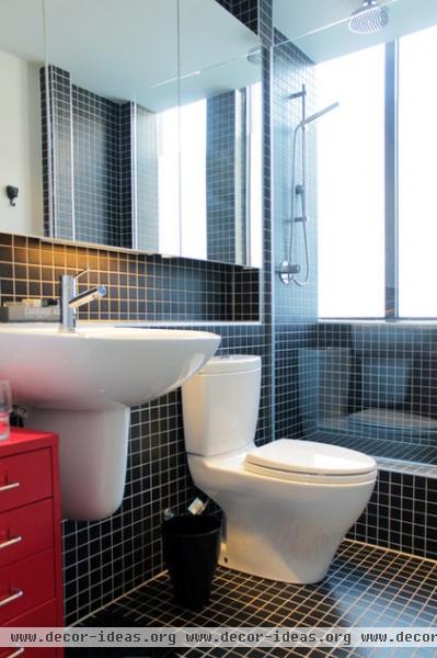
Although their contractor tried to insist on installing a bathtub to increase the loft’s resale value, Nguyen was equally insistent that the space have only a shower. “A good shower is all you really need in a house,” she says. “We thought to ourselves, ‘Are we ever going to use a bathtub?’ Why plan the construction around the next homeowners if we won’t use it?”
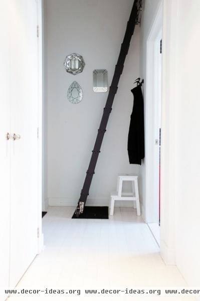
The second of the two salvaged ladders leads up to a storage platform, “where junk goes to die,” says Nguyen, laughing. She and Klein eventually plan to create a reading nook in the crawlspace.
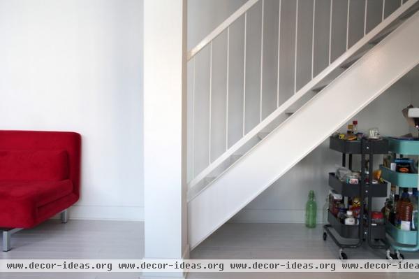
Although the kitchen doesn’t lack for storage space, the area under the stairs is equipped with pretty vintage-style rolling carts to keep oft-used kitchen items close at hand.
Carts: Råskog, Ikea
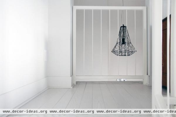
The staircase leads up to a full-height guest bedroom. This architectural pendant light hangs from the ceiling in the hallway.
Light: Apollo, Zone
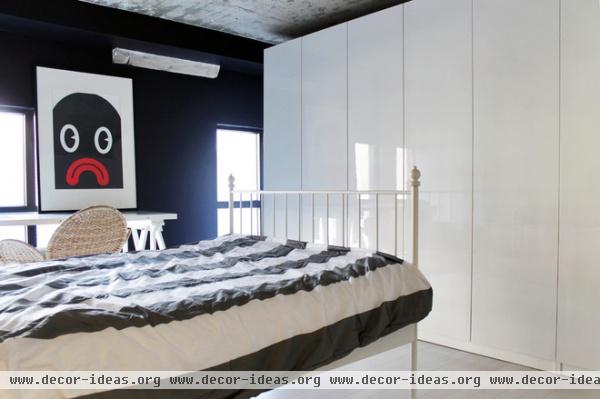
Nguyen, who has become well-versed in interior design and construction through her previous projects, has strong opinions about wasted space. “I hate closets,” she says, “I always rip them out and replace them with built-in or freestanding storage. It’s just a more functional use of space, and there are fewer dead zones that just wind up being cluttered and dirty.”
This set of built-ins dominates one wall of the guest room.
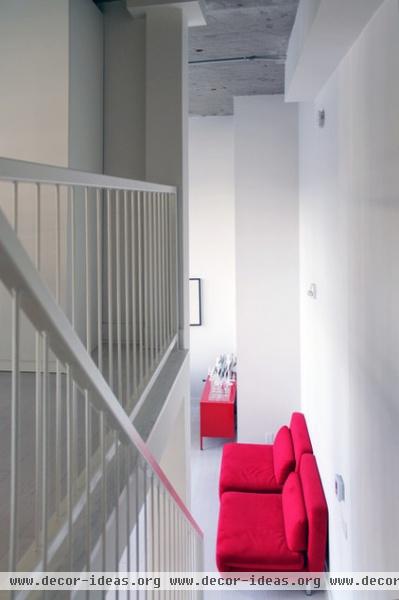
Not afraid of color, Nguyen and Klein chose furniture in a bold red hue to offset the bright, all-white space. These plush chairs double as extra beds for guests.
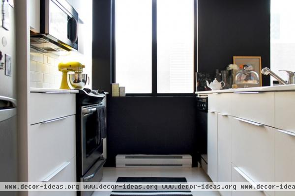
Free to furnish their kitchen from scratch, they opted for glossy white cabinets and countertops to stay consistent with their white-on-white theme. The kitchen’s burst of color comes from a lemon-yellow KitchenAid stand mixer, bought on sale.
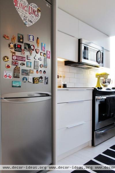
The couple splits their time between Montreal, where Nguyen works, and San Francisco, where Klein works as a business developer for an Internet company. The refrigerator hosts the magnet collection they’ve accumulated during their travels around the globe.
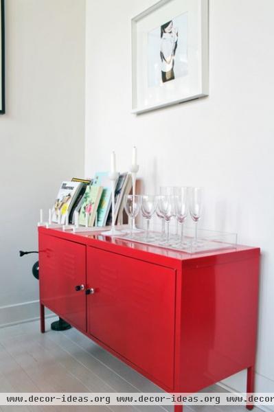
Nguyen and Klein are not necessarily budget shoppers, but careful shoppers. “I don’t believe anything you buy should be precious,” Nguyen says. “It’s nice to have an association, an emotional connection to the items in your home — be it pride for finding a great piece of art on sale or frustration because it took forever to get delivered. Then it will have a story behind it, which makes it that much more interesting.”
Storage locker unit: PS Cabinet, Ikea

Having recently purchased a second home in San Francisco, Klein, left, and Nguyen have learned a thing or two about home renovations. Nguyen’s advice to other homeowners who are starting to furnish a new space: “Try to define your own personal style, and then try to visualize the theme in your space. It will feel much more cohesive.”
Browse more homes by style:
Small Homes | Colorful Homes | Eclectic Homes | Modern Homes | Contemporary Homes | Midcentury Homes | Ranch Homes | Traditional Homes | Barn Homes | Townhouses | Apartments | Lofts | Vacation Homes
More: My Houzz: Modern Zen Style for a Montreal Loft
Related Articles Recommended


