Basement of the Week: Luxurious and Lovely in Tennessee
“But where will we put my LeRoy Neimans?” asked homeowner Bill, after the home decorating was done upstairs. “Our firm had completed a lot of work throughout this home, but there simply wasn’t a good space where his favorite artwork would fit in up there,” says Ruthann Ross of Eric Ross Interiors. The answer: The artwork would inspire the design of the family’s extensive basement renovation. Soothing neutral colors create the right backdrop for the primary colors used in Neiman’s work, while the space incorporates plenty of room for relaxing, gathering, entertaining, crafting and playing games.
Basement at a Glance
Who lives here: Bill and Rose, who have a daughter at home and another who comes to visit
Location: Brentwood, Tennessee
Construction: David Rosenkranz Custom Homes
Size: About 2,500 square feet
Photography by Marty Paoletta/Pro Media Tours
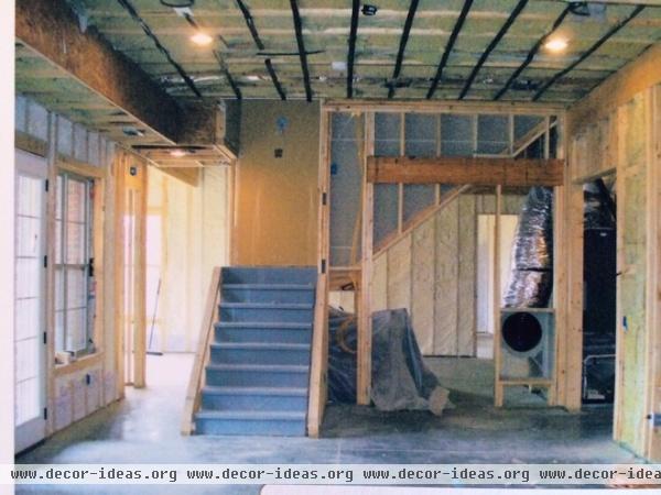
The house was sited to one day include a walk-out basement with a lot of natural light and high, generous ceilings, but the space was unfinished.
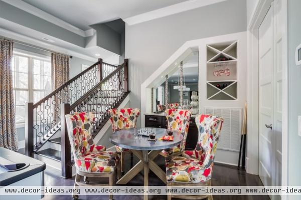
AFTER: A built-in bar is recessed into the space underneath the staircase on either side. “This was a really good way to separate some of the spaces but also make the most of the awkward space underneath the stairs,” Ross says. This side provides storage for wine bottles and glasses and accommodates a big air return vent.
Ross used mirrors throughout the space to bounce the light around, and the stripes of glass mosaic tiles appear throughout as well. The walls are painted soothing grays, which provide a good backdrop for pops of color, like the Funfetti-like print on the chairs. The table is a favorite spot for playing board games and cards.
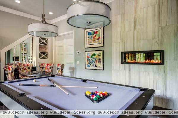
Beyond the staircase is a swank billiards area. A see-through fireplace offers a peek into the pub room behind the wall. Porcelain tile that matches the floor tile anchors the fireplace, breaks up the wall and serves as a luxe surround. Two works by Neiman adorn the wall here.
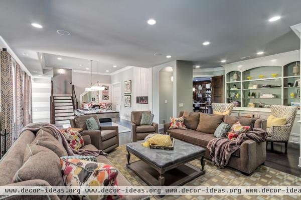
Throw pillows bring the Funfetti-like fabric into the media room. The room receives much more natural light than a typical basement and has drop ceilings that aren’t oppressive — proof that if you are building a new home, grading for walk-out-basement potential and leaving higher ceilings are important.
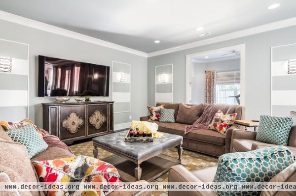
Ross repeated several themes throughout, including painted stripes on the walls, quatrefoil and circular patterns, chrome finishes, mirrors and glossy surfaces.
In the media room, overstuffed furniture, warm brown hues, lots of cushy throw pillows and a soft area rug create a comfortable and casual feel. The square pattern on the rug adds a feeling of movement.
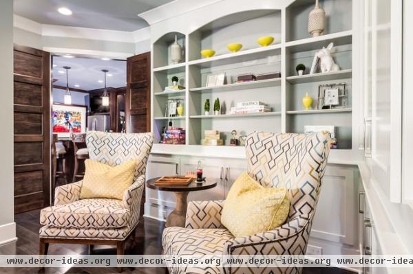
This sitting area in the media room has built-ins with plenty of room for storing board games. Ross popped in bright citrine accents, inspired by the colors in Neiman’s artworks.
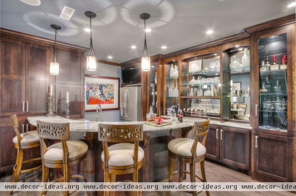
Beyond the sitting area is this swanky pub room. Because it does not receive much natural light, double doors open up to the media room, and extensive mirrors bounce the light around. Marble countertops add an elegant touch.
Wall paint: Web Gray, Sherwin-Williams
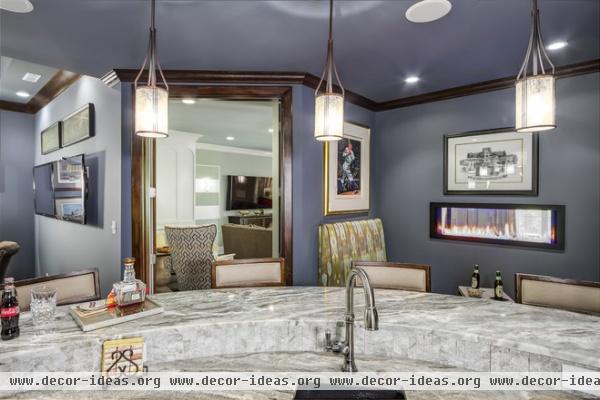
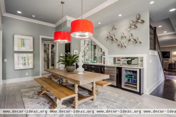
In the dining area, another bar takes advantage of the space underneath the other side of the staircase. While the room has many glossy touches, the wood table, plants, botanical rug and petal wall sculptures all lend an organic vibe. More mirrors behind the bar bounce light around a dark corner.
Petal sculptures: Wildwood
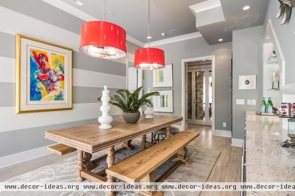
Finally, Bill had a prominent spot for his favorite Neiman painting. “The Neiman paintings really inspired the neutral background colors that could take on pops of primary colors,” Ross says. The glossy pendant lights add a shock of red that plays off the painting.
Lights: Robert Abbey; paint: Magnetic Gray, Sherwin-Williams
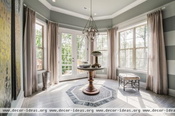
The thick stripes from the dining area lead into an octagonal entry, which leads to the pool. The entry’s shape inspired the central floor tiles; all the tiles are porcelain and can stand up to bare feet.
Light fixture: Hemisphere, Elk
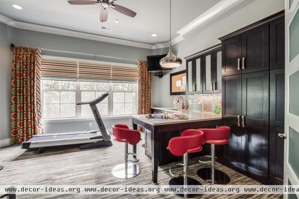
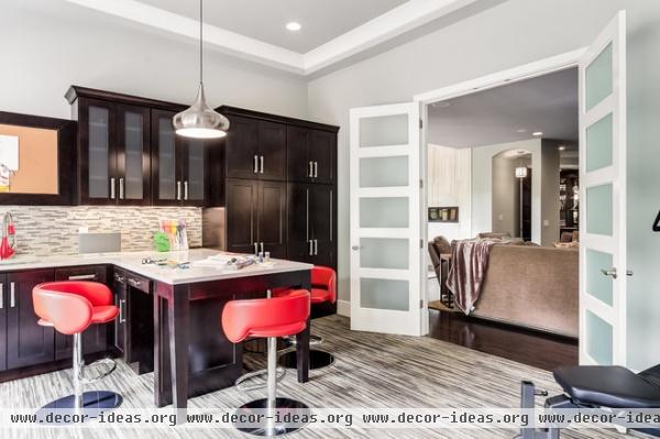
Beyond the media room, glass doors let light through to this craft and exercise room. Rose and her younger daughter enjoy crafting together, and the cabinetry, counters and sink give them everything they need.

The couple is originally from Michigan and gets many out-of-town guests who enjoy having their own private space in the basement. The pool helped inspired the tranquil atmosphere in the guest bedroom.
Wall-to-wall carpeting helps bring down the vast scale of the room, and its swirly pattern creates movement in the subdued space. The tray ceiling helps bring down the scale as well. Touches of glass tile on the chandelier and mirror tie it to the other rooms, while quatrefoil-recalling patterns repeat on the side table and mirrored nightstand.
Chandelier: Candace Olsen

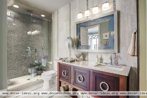
In the guest bath, glass mosaic tile stripes and porcelain tile extend across the floor and up the wall to the ceiling, while large drawer pulls on the vanity repeat the circle theme.
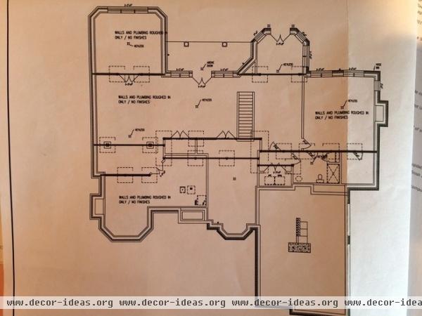
This floor plan shows how everything fits together.


