Houses Exposed: Show Your Structure for Great Design
http://decor-ideas.org 02/26/2014 03:24 Decor Ideas
Structure is the warp and woof of architecture. But modern-day homes too often reduce structure to a means to an end, hiding it like a dirty secret under a thick extraneous layer that acts more like a stage set. Most homes are built to mimic imagery from another time and place, cheaply impersonating legitimate architecture from the beautiful ages of the past; the skeletal frame then becomes nothing more than an architectural pallbearer carrying the weight of a dead design.
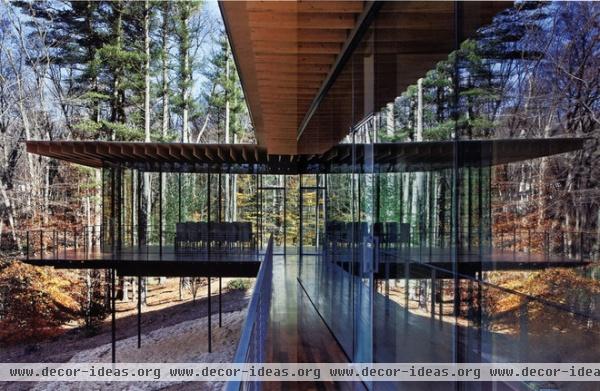
A home structure deserves more. It must do more than merely carry the weight of a building and its occupants. Structure should be expressed in a home’s design and be aesthetically pleasing. A good work of architecture cannot be separated from its bony innards, functionally or aesthetically.
Author Ayn Rand famously gave the following words to her protagonist Howard Roark in The Fountainhead: “A building has integrity just like a man. And just as seldom.” Integrity lies in the integration of a home’s space and structure to express form with function in a beautiful way, thus creating architecture.
The projects in this ideabook embody this idea. Take the example here. The structure is architecture, and the architecture is structure. The two are married with great aesthetic success and cannot be separated.
The enclosing skeleton of the home is expressed; we see column, beam and rafter. Other details (like the cable railing) are minimal so as not to interfere with the home’s simple beauty.
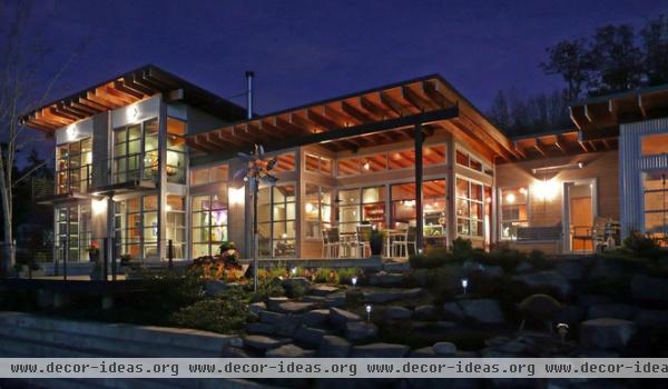
Exposed rafters create rhythm and interest here, another successful marriage of space and structure. The structure encloses space, while the interior weaves in and out of its canopy, forming livable indoor and outdoor spaces, all beneath the same structure.
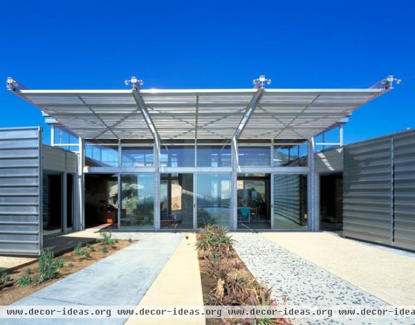
This structure is kinetic, much like a Calatrava building, with window coverings that slide down from the exposed cantilevered wide-flange beams.
Also, the exposed beams, columns and metal skin give the home an industrial character.
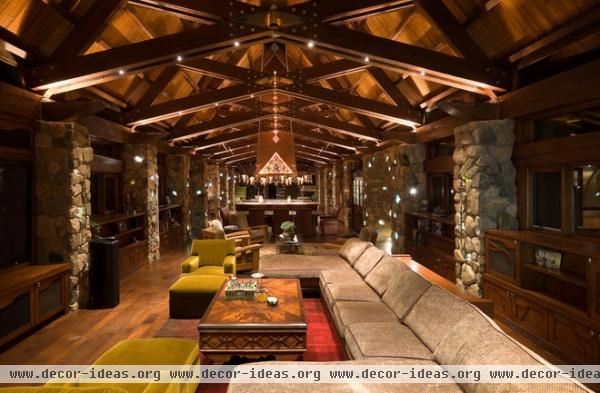
Structure creates the mood of this Park City, Utah, home, enclosing the interior like a warm blanket. The connection details holding together the structural beams are executed with a mastery seldom seen.
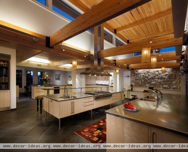
The architect could have hidden the structure of this home, could have wrapped the glulam beams in ½-inch drywall or painted them white. But good design prevailed.
The beams are exposed and expressed with simple and clean connections. The space benefits from color and interest it would otherwise lack.
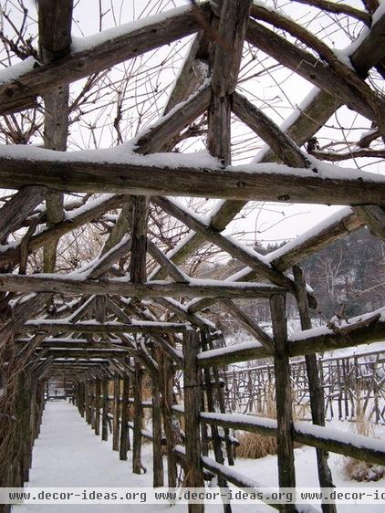
Structure is expressed here in a landscape with great beauty and authenticity. Raw wood elements form a cavalcade of spaces beneath the marching canopy. The wood pieces are primitively connected, giving integrity to the design idea.
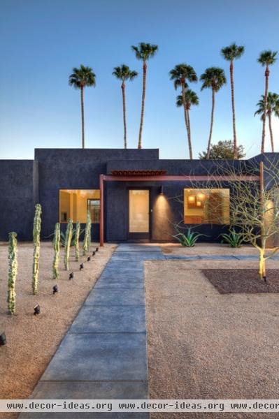
Here’s a minimalist structural expression of enclosure. This covered entry is ¼-inch plate steel held up by a steel column and a steel beam. Nothing is superfluous. The structural elements have been rusted by the elements to a beautiful bronze color.
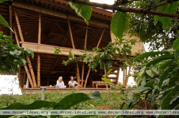
The architect of this open-air pavilion used indigenous materials and forms to create a beautiful and simple expression that speaks of its cultural qualities and regional design. Bamboo rises from the forest floor as if the Bali mountains themselves had grown the structure.
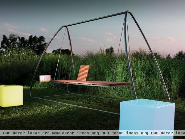
To me this is an example of the simplest structural beauty and expression. It’s clean, lyrical and sublime. Nothing is here that doesn’t belong. The composition was executed with a mastery of its individual musical notes.
As these projects demonstrate, allowing structure to be more than functional — to do more than merely carry the weight of a building and its occupants — raises the level of design.
More: Why Authenticity in Architecture Matters
Related Articles Recommended


