Keeping Cabinet Color on the Down Low
My friend Jeffrey just moved into a charming 500-square-foot cottage in Seattle. It was built in the 1920s and is one of eight little Craftsman houses tucked onto a single lot in the city’s Capitol Hill neighborhood. Although the cottage was modernized years ago, the kitchen still retains its “vintage character.” In other words, it is small and doesn’t have a lot of storage or counter space.
Jeffrey replaced the countertop and backsplash and was thinking about painting the cabinets next. Initially, he planned to paint both the upper and lower cabinets gray-blue. But in such a small kitchen, I thought, wouldn’t it be better to paint just the lower cabinets, to anchor the space, and leave the upper cabinets white to match the walls, so the room feels airier and less constricted?
I searched around Houzz for examples of kitchens where just the bottom cabinets are painted a color. I think the results are fresh, the color adds character, and the pale uppers make the kitchens feel more spacious. See if you agree.
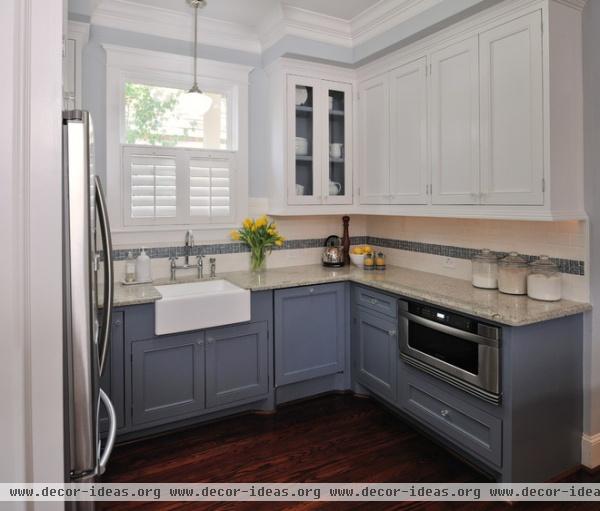
With a small kitchen, it’s best to limit the color palette so the space feels unified. Here handsome blue base cabinets add color and character, but the kitchen doesn’t feel constricted, thanks to the white upper cabinets. The pale blue walls help bridge the top and bottom, as does the band of accent tile along the backsplash.
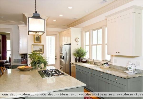
I love an all-white kitchen, but I know a lot of people are sick of them. Here’s a great compromise: White upper cabinets and counters, and base cabinets painted a dreamy gray-blue. The result feels classic, like an all-white kitchen, but has a lot more individuality.
Note also how the lantern and paintings give the space a classic air that mitigates that “clinical” feel people sometimes complain about in an all-white space.
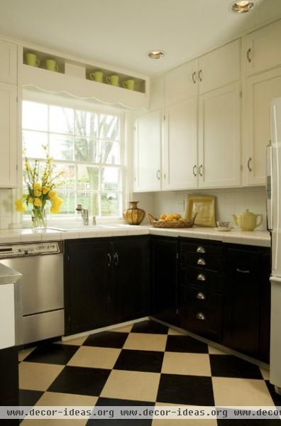
It’s funny that a small kitchen with black cabinets could end up feeling so sunny, but that’s the case here. I applaud the designer for her daring — and the homeowners for their trust.
Notice how the color repeats between the lower cabinets and the floor tile, which is set on the diagonal to make the small space appear bigger.
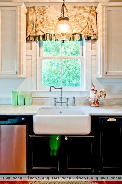
Here’s another example where black lower cabinets are paired with white uppers. The Carrara marble counter, with its gray veining, helps bridge the two extremes, while the window treatment adds a welcome softening touch.
More ideas for using black in your kitchen design
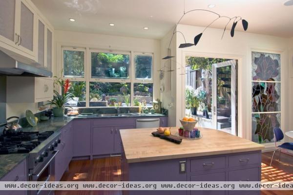
I’m not brave enough to paint my kitchen cabinets purple, but by golly, it works — mostly because the walls and uppers are white. A strong color can look great if you give the eye somewhere to rest.
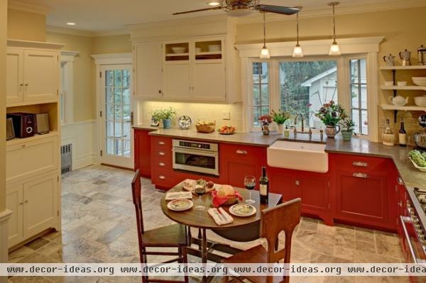
Another case in point: This fire-engine-red kitchen might have provoked a three-alarm blaze in your retinas without the leavening power of the neutral floors, walls and upper cabinets.
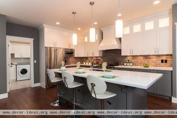
Texture and material play a big role in the success of this two-tone kitchen. The textured brick backsplash bridges the gap between the blue lower cabinets and the snowy white uppers, creating a distracting line of demarcation that makes the color difference feel less extreme.
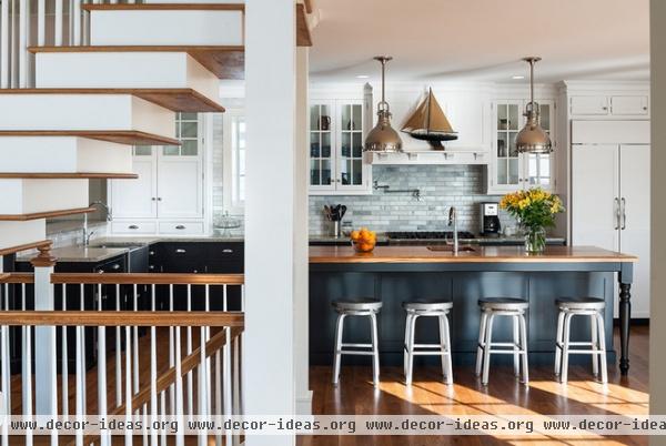
Here’s a beautiful example of the same principle at work. The Carrara marble subway tile incorporates the colors above and below it, so you’re less aware of the differences between the two — it all seems to form a unified whole.
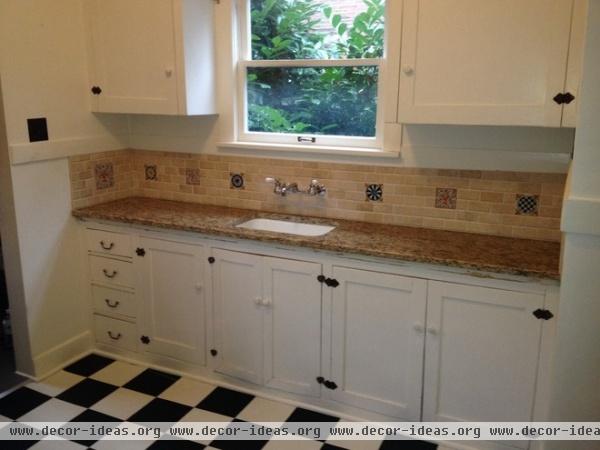
Here’s Jeffrey’s kitchen the way it looks now. The shallow bottom cabinets appear to be original to the cottage and are fairly utilitarian in appearance.
What do you think? Should Jeffrey just paint the bottom cabinets and leave the uppers white? And what color should he use?
More:
How to Paint Kitchen Cabinets
The Unmatched Kitchen: Mixing Finishes With Style


