Design Workshop: 10 Surprising Twists on Window Trim
Architects often think about projects in terms of systems. It’s one of our strategies for organizing the complexities of construction into a coherent whole. Each system has an order and interfaces with the other building components in a clear way. Windows have a special place in our systems. They help to define site connections, permit or screen views, and modulate natural light entering our spaces.
When thinking about how window systems integrate into the larger structure, I like to develop a clear logic that describes how they’re placed in walls, which always requires adopting an attitude toward trim. Trim is a standard vehicle for hiding joints where materials come together — the edges of Sheetrock are a good example. Trim can also set a building in a particular time period.
But to me, the more integrated even a small detail such as trim is with an idea about a place or structure, the more it can support the overall logic of a building. The following projects eschew traditional ideas about trim in service of a bigger, modern idea.
1. Ultrathin Trim
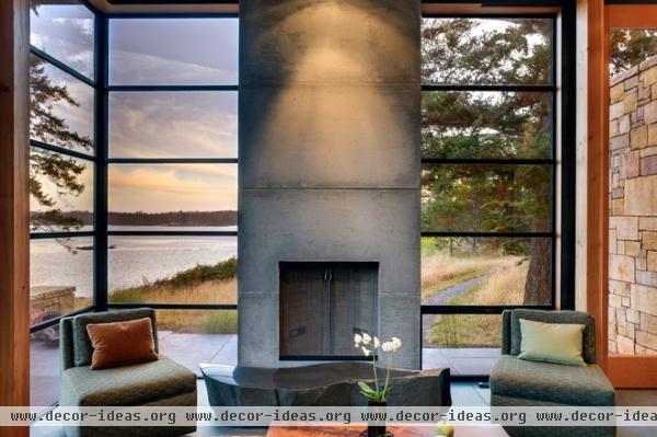
In a space dominated by the view, this steel window system has been designed to get out of the way. Note the dark tone of the frame, which recedes, and the narrow sight lines. The idea is supported by the trim surrounding the window, which is equally minimal. It’s just enough to conceal the fastening of the windows to the structure but no more. The trim complements the interior palette, which oscillates between the cool steel, stone and concrete, and the warm Douglas fir, and highlights the thickness of the wall plane.
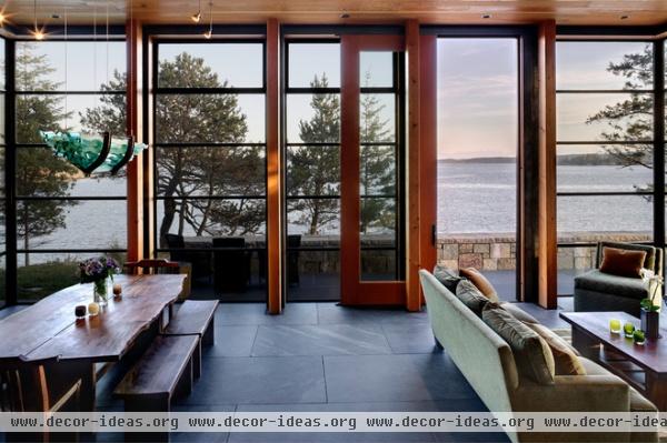
Facing the view and the harsh winter winds, this room is both light and open, but also confidently structured. You sense the space’s ability to resist the rugged site’s forces, with a heavy floor and well-proportioned, closely spaced columns. The module of construction is dictated by the fir posts, and each window assembly fits precisely within the structural bay. The crisp dark steel is bridged by a thin band of wood linking the window back to the structure.
Paring down the window trim to a very thin band reinforces the window’s place in the order of the exterior wall (subservient to the structure), while allowing maximum light into the space and preserving the delicate nature of the windows. Thick window trim would’ve undermined this intentional and mannered approach to the window openings.
2. Extension Jambs
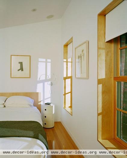
An extension jamb is the interior portion of the window frame that extends to the full depth of the wall. A common treatment of the extension jamb is to paint it the same color as the wall or window surface. Here the architects have emphasized the wall depth and opening by choosing to contrast the clear-finished wood window with the surrounding painted Sheetrock wall. This highlights the windows as distinct architectural elements in the wall assembly and brings in a natural wood component.
There are a few different methods for achieving this type of look. One is to return the Sheetrock into the opening and apply the wood extension jamb on top of the Sheetrock returns. Another is to relieve the back edge of the trim board enough to cover the gap between Sheetrock and window. Either way, the look feels rooted in tradition while remaining stripped down, modern and clean.
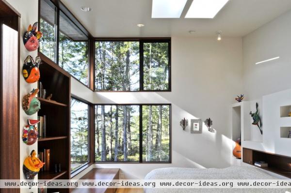
Here we see another play on the wood-extension-jamb idea with natural wood outlining the window openings. This treatment tends to work well in complex spaces, where there are many things competing for attention — the view, the cabinetry, skylights. Here the windows fit into a system of elements that are given importance by their treatment. The cabinetry and windows share the same material, a warm reddish wood, and very similar finely crafted details. They are perceived as part of a family of bespoke elements in the overall building composition.
3. Reveals
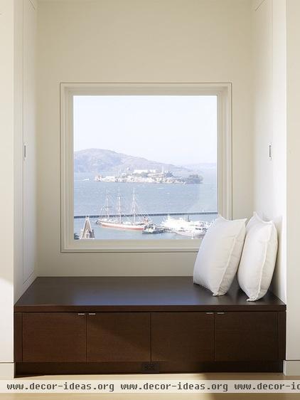
A thin shadowed line surrounding the window frame describes another contemporary approach to window trim. This one acknowledges the difference between window and wall but ever so subtly.
Reveals can be created by using different extruded trims at the edges of the Sheetrock surrounding the window. These trims come in various widths and are fabricated from either metal or vinyl by manufacturers like Pittcon, Fry Reglet and Trim-tex. The reveal enables one to achieve a planar look to the wall without the added dimension of trim protruding outward.
It’s a thoroughly modern aesthetic that quietly showcases the window frame as an opening, without the fussiness and associated stylistic hang-ups of trim. The Sheetrock finishing costs are higher with this type of treatment, but if it’s a tailored modern look you’re after, this is for you.
4. Drywall Returns
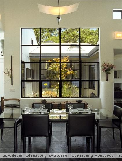
If the goal is to call attention to the opening itself or the window frame, choosing a drywall return is a no-hassle way to trim your window. This can save on finish carpentry and preserves the planar wall aesthetic without the need for reveal trims. This process is used often in commercial construction; it entails wrapping or returning the Sheetrock at the window perimeter back to the window frame. This takes the traditional place of the wood extension jamb and provides a clean, no-frills look.
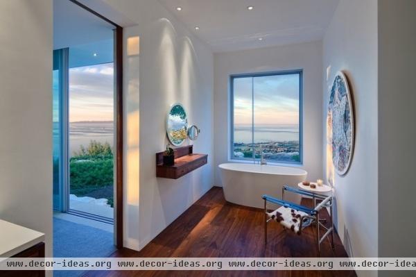
Drywall returns highlight views and openings very well but lack detail of any sort, which for some spaces wouldn’t be appropriate.
In this project the architects extended their attitude about trim everywhere. Note the base and crown conditions. They make perfect sense in this modern, minimalist space focused on the view. Care must be taken during the Sheetrock finishing stages in projects like this, as this surface will be the final window finish.
5. Drywall-Return Hybrids
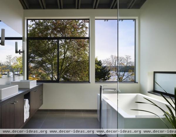
If the drywall-return look is too stark for you, consider adding a deeper sill of contrasting wood or stone. It will add texture, color and shadow and can be a fine place to place plants, objects or personal effects on.
This bathroom has Sheetrock returns at the head and jambs, but has a darker stained oak sill (sometimes termed a stool). Look closely for an added reveal detail between the sill and the wall beneath. Shadow lines are important in this composition. The thin mullions, dark sill line, shadows in the structure above and reveals are all tightly controlled and intentional.
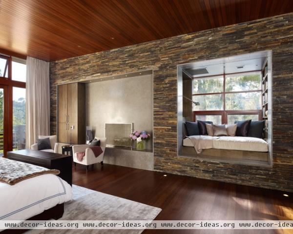
6. Stone Trim
The stone extension jamb in this example forms an entire reading alcove. The architects lined the incised window opening in a honed stone, placing emphasis on the depth and solidity of the stone mass to form the wall.
The effect is a break in the textured stone surface, but there’s a logic to it. It appears the incision was carefully created just for this purpose, and the most tactile surfaces near the reading alcove were smoothed and worn to allow them to be sat upon or brushed against. Stone lends weight and solidity to any wall, but it comes at a higher price, so use it accordingly and cautiously.
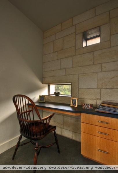
7. Steel Trim
The trimmed frame of these openings is particularly beautiful to me. The window proportions seem derived from the module of stone that comprises the wall. The window has the appearance that a stone block was carefully removed to let light in. The trim treatment supports the lightness of the glazed insertion but also highlights the thickness and monolithic nature of the stone wall.
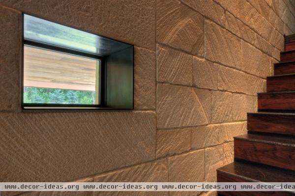
Lining the opening with steel allows maximum light into the space. The thin profile circumscribes the opening to precisely define the cut in the wall and also to provide a textural counterpoint to the rough-hewn stone. Thin, light and machined against the mottled limestone, the steel defines a logic for spanning openings in stone walls that is carried throughout the project.
Many view steel as appropriate only in industrial or ultramodern spaces, but as seen here it can play well with all types of materials. Use steel when you’re looking for slender, sleek and thin profiles around your openings.
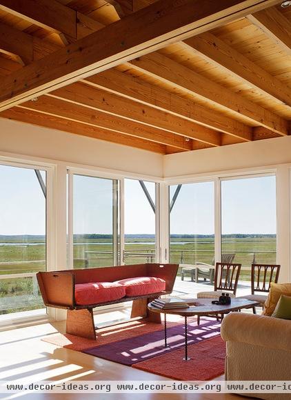
8. White on White
Here we see a minimalist, monochromatic white-on-white trim. I love that it’s been clearly defined as part of the wall system, and that its function is simple and direct. It’s not designed to call attention to itself; it’s simply covering the joint between construction components.
A three-part systems approach is really apparent: The wall and window system are one; second is the floor system above, rendered in wood and clearly displaying how things are supported; and finally, the main floor plane is the third. The trim is blocky and sharp, matching the Shaker-like detailing of the space. White on white doesn’t compete for attention; it defers and plays well with others.
9. Wood on Wood
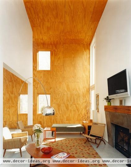
Matching the trim to the adjacent wall finish works well when the goal is to highlight a particular surface and emphasize apertures rather than the trim itself. The openings appear as simple cuts in the plywood shell rather than openings framed in a contrasting material. The plywood wall finish is the star here, and the trim plays a supporting role in making the system read as a whole.
Note that the wall to the right makes use of the same principle, rendering white on white. It’s a great example of taking a single attitude toward trim and applying it uniformly everywhere, even when the materials vary.
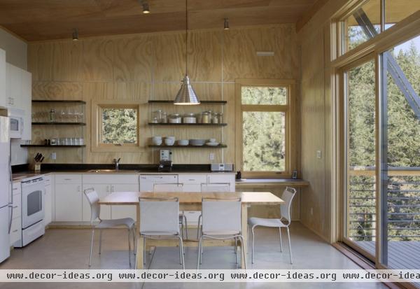
Monochromatic trim and wall treatments unify small spaces and can be useful where fussy detailing either just isn’t warranted (as in a camp) or is too costly. I really appreciate the set of rules the architects put in place here. By rendering the windows, walls and ceiling in wood, they’ve removed the sense that any one thing in the architecture is more important than another. My eye is drawn toward the contrasting elements instead, the view and the objects within.
10. No Trim
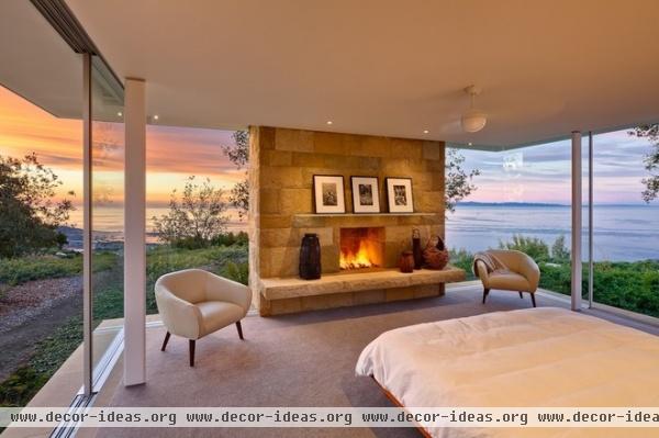
Fitting for this view, the window (and door) system is fully integrated into the structure of the room. The window frames are recessed into the floor and ceiling assemblies to give the appearance of a slot of space contained between the floor and the hovering ceiling plane. Omitting trim altogether isn’t easy or cheap, but the results here make the effort worth it.
More: See more Houzz guides to choosing a great trim for your house


