Houzz Tour: Natural Beauty in the Blue Ridge Mountains
Many considerations go into determining where to live and where to build a house. For much of our lives, jobs and schools are a determining factor, but other things come to the fore later — nature, climate and nearby amenities. For a couple of Connecticut empty nesters originally from England, natural beauty and proximity to an international airport for flying to the U.K. were important.
They bought a 13-acre site in the foothills of the Blue Ridge Mountains — horse country, yet also near Charlotte, North Carolina, with its airport. They worked with design-build architect Rob Carlton from Asheville to create a modern home that takes advantage of its gorgeous location. Let’s take a tour of the house, a combination of multifaceted forms spread across a flat portion of the property.
Houzz at a Glance
Location: Near Charlotte, North Carolina
Size: 3,500 square feet
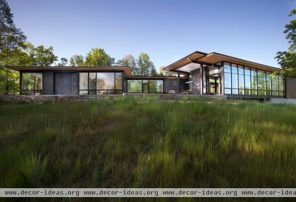
The house is laid out like a flattened U or a chevron, consisting of the main pavilion on one end (right side in this photo) and the master suite on the other end (left side). A glass structure next to a large terrace links the two parts of the house.
Here we are looking at the south side of the house, which opens itself up for views and sunlight, while overhangs help with summer shading. From here we can grasp the horizontal layering of the house: Wood roofs sit above walls of wood, glass and the occasional weathered steel, all above a stone base.
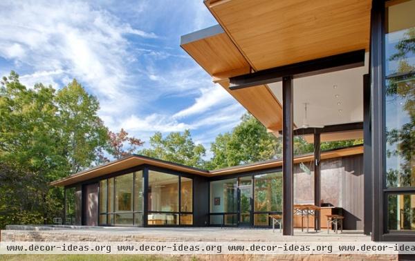
A closer look at the terrace that sits between the main pavilion on the right and the master suite on the left reveals how the structure changes between the two halves. The on-grade master suite is framed in traditional wood, but the larger pavilion is framed in exposed steel, since it literally bridges part of the site (this can be glimpsed in the center-right portion of the previous photo).
Clear-stained cypress is used for the soffits, providing a lighter counterpoint to the sometimes dark walls.
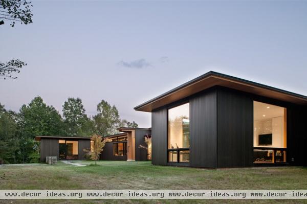
The other side of the house, oriented to the north, is more solid. Dark-stained cedar siding in a vertical tongue and groove configuration predominates, bookending the full-height glazing in the master suite’s exercise room (foreground) and the guest suite in the distance; the entrance can be seen jutting into the yard between the two.
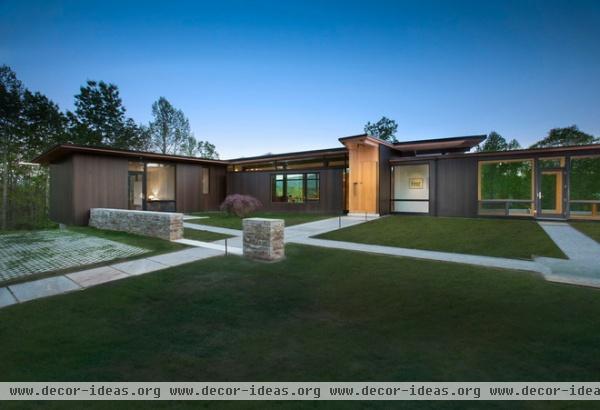
Stone and wood were not the first choice for Carlton and his clients. An initial design of poured-in-place concrete met resistance from the board of the planning community where the house is located. Even though the north side of the house is hidden on approach due to the trees and topography, the community shies away from “bright” materials like concrete. The dark wood certainly moves in the other direction while still having the modern aesthetic the owners wanted.
A break in the stone wall in the foreground leads to the front door, which is set off from the adjacent walls through the lighter wood. Note the other paths and doors that lead to the master suite via the glass link on the right, and to the guest suite on the left.
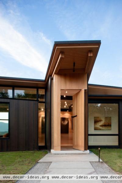
Being a design-build architect, Carlton handled most of the construction, but certain details required the help of local craftspeople. One such instance is the front door, a large, balanced (rather than hinged) wooden door that matches the soffits.
A large steel handle is set into the door in an L configuration. It makes sense that Carlton brought in outside help to craft the entry, since the jutting plan of the front door elevates the entry in importance, calling for something specially crafted.
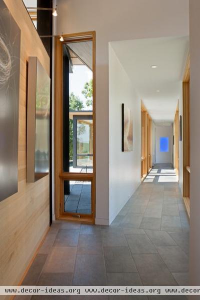
Once inside the front door, one has two options: turn left to the living area and other rooms (kitchen, study, guest suite) or right to the master suite. Here we are looking to the right, down the hallway that becomes the glass link before ending by the master bedroom at a James Turrell–inspired piece with blue paint and lighting set into the Sheetrock of the far wall.
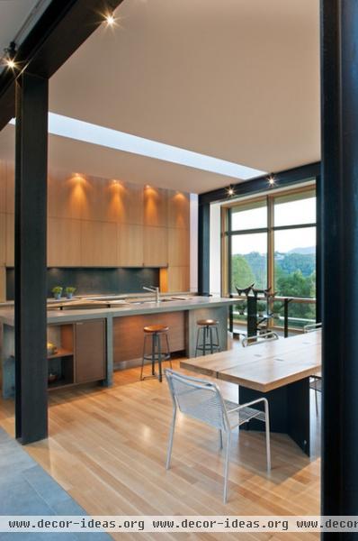
Turning left brings us to the living area, which has a large opening off the corridor. Here the structure makes itself known, both in the way it frames the opening into the space and the way it frames the window openings beyond.
In this view are a couple more interesting details. First are the two skylights, one over the kitchen island and one raking the white-oak cabinets beyond. These long apertures bring additional light into the large and long space while also directing one’s gaze to the window and view beyond.
The second detail is the island itself, fabricated in concrete by local craftspeople. This substantial piece hints at what might have been if Carlton’s first scheme had been embraced by the community board.
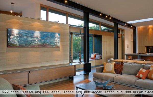
As in a lot of houses today, the living room, dining room and kitchen make up one large space. Carlton nevertheless uses the structure and built-ins to break down the scale of the space and provide some special moments. In addition to the steel frame giving some rhythm to the space, a low and long cabinet in the lower left corner provides storage and a place for art. Crafted locally, like the door and island, the steel looks impossibly thin to be in such a configuration.
Steel and wood are also used in the built-in storage and window seat in the corridor past the opening here. This creates some continuity between the two spaces, while making the corridor a place to be, not just a place to walk through.
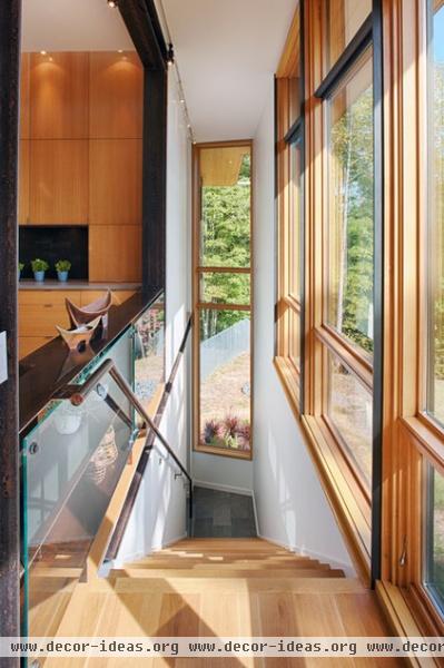
Carlton emphasizes that the multifaceted forms take advantage of the house’s siting by allowing for different experiences throughout the house. So as one moves from space to space, the landscape opens up through large windows (as in the living space) as well as smaller openings that reveal particular views.
Even the movement from the garage, tucked below the guest suite, is well considered. One moves through the mudroom, then turns right to ascend the stairs to the living area, where the space opens as one rises and the view through the glass gets more and more expansive.
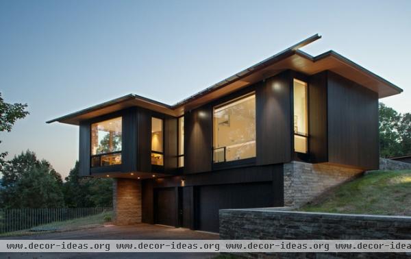
Here is a view of the east side of the house, the one section that is two stories. Directly above the garage is the guest suite, while the study is propped upon the stone wall on the left to cantilever over the driveway. Note the way the gutters cantilever from the roof to become slender scuppers directing rainwater away from the house.
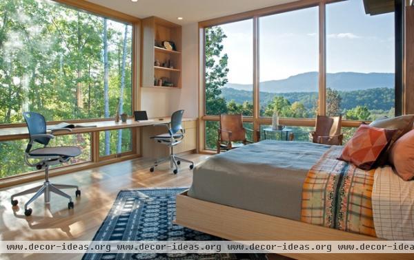
Here is the view from the study-bedroom that cantilevers over the driveway. The view is breathtaking, and the cantilever creates the impression of floating, since the trees extend down below the edge of the glass at the floor.
With floor-to-ceiling glass, it’s easy to wonder how the couple lives without curtains; where is the privacy? Considering that they own 13 acres, and that the house is laid out strategically, it is not an issue. Unlike urban situations, where prying eyes are right across the street, in this Blue Ridge Mountain context there are none.
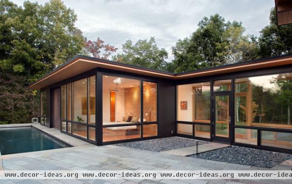
This last part of the tour shows the master suite on the far south and west side of the house. Looking from the large terrace next to the glass link (which we saw in the second photo), we see not only the master bedroom but the lap pool it overlooks.
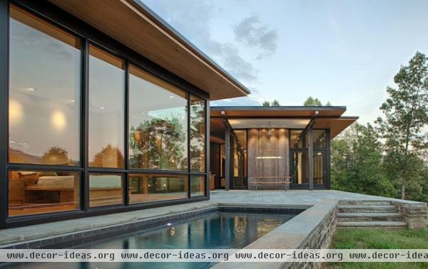
The lap pool fits the owners’ healthy lifestyle. Making it part of the stone plinth upon which the house sits is a nice touch; it’s as if the water feature is part of the site.
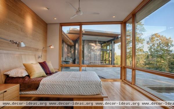
The master bedroom takes in a view of the terrace, pool, trees and sky. A large wall of weathered steel anchors the terrace, adding some texture to the exterior yet fitting with its dark and modern palette.
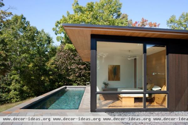
Note the way the sunlight hits the pool and creates rippled reflections on the ceiling and walls of the bedroom.
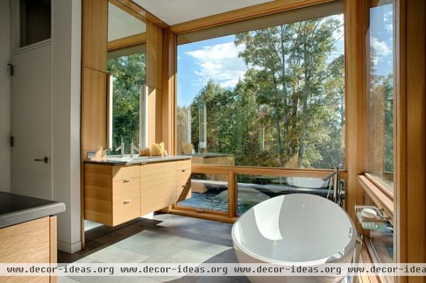
This last view is the master bathroom, which sits at the other end of the lap pool. As with a municipal pool, access to the lap pool is through the bathroom, which has an enclosed water closet (behind the door at left). This situation allows the swimmer to bathe before and after a swim and not drip water through the house. It is indicative of the thought put into the house on the part of Carlton and his passionate clients.


