Houzz Tour: Gaining Space and Options With a Flex Room
It’s amazing the difference adding one room can make. Transforming an outdoor breezeway into a 195-square-foot entry and flex room (bonus room) in this 1960s California cottage improved the home’s flow, brought in light and gave the owners a versatile extra space for living, dining and entertaining.
When Bostoners Brad and Susan Harmon were seeking a California vacation home and came across this cottage, it was in bad shape, and the circulation was a problem. “It was dark and awkward; it made people move through the house on a diagonal and made good furniture arrangement impossible,” says architect Amy Alper. She collaborated with the couple to expand and rearrange the floor plan and better connect the home to the outdoor spaces, using the existing framing. Let’s walk through and see just how expansive this modest home feels.
Houzz at a Glance
Who lives here: Brad and Susan Harmon
Location: Healdsburg, California
Size: Originally 912 square feet; now 1,107 square feet; 2 bedrooms, 2 bathrooms
Photography by Eric Rorer
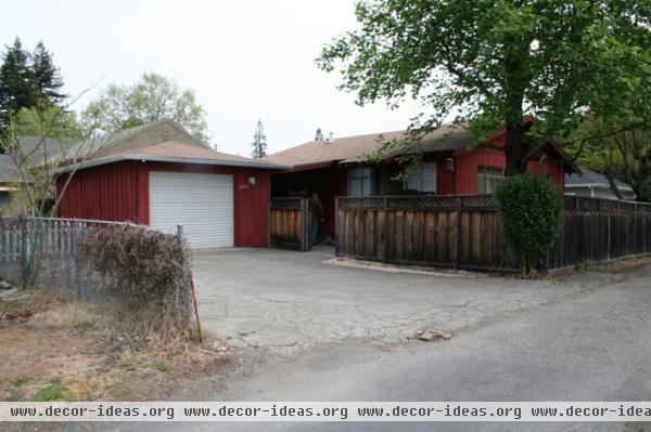
BEFORE: The Harmons had gotten married in Healdsburg, California, and returned often for visits. A vacation home and eventual relocation here had been a dream that involved a fixer-upper project. Brad is a remodeler, millworker, tileworker and more, and Susan’s hobby is interior decorating. “They are both super design-oriented,” Alper says. When they found this 1960s cottage, they could see the possibilities; they knew they could design it themselves but hired an architect to ensure that it would reach its full potential.
“We brought Amy Alper in as soon as our offer was accepted,” Brad says. “We warned her in advance that due to our backgrounds, we wanted to collaborate with her, but that we had plenty of our own ideas.”
“They picked and sourced a lot of the finishes themselves, and Brad acted as general contractor and did a lot of the work himself,” Alper says. She came up with ideas and solutions to help them maximize their space while working with the existing structure, and figured out how to better connect the house to the outdoors.
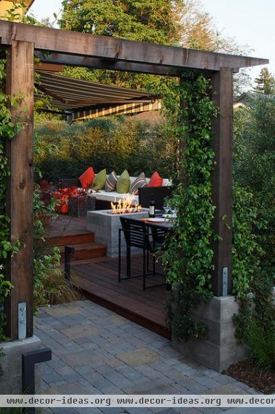
AFTER: See the opening in the previous photo in the fence to the right of the garage? That’s about where this pergola now stands. The new entry sequence is an experience, transitioning from street to driveway and into the front yard’s series of relaxing outdoor rooms.
Extending the living space outdoors was a priority for the Harmons. In fact, there’s a play on enclosed and open spaces, and public and private ones, throughout the entire property.
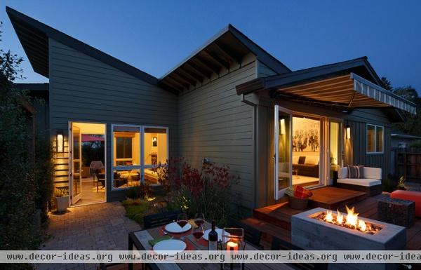
As we pass under the pergola, an outdoor dining space is to the right, and a 90-degree turn to the left leads to the home’s main entrance. This house offers thoughtfully designed spaces for outdoor living that truly extend the floor plan. Out front, different zones are designated by plants and multilevel ipe decks. Both the outdoor lounge and the dining room enjoy the fire pit.
Alper’s biggest move was opening the side of the house and adding the new flexible entry space. (The entire left section of the house underneath the slanted roof is the new addition.) “The house was very dark and awkward, and my clients wanted to be able to get a new roofline while using existing framing,” she says.
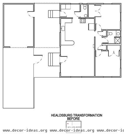
Here’s the plan before …
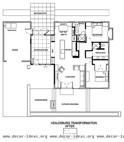
… and here’s the new one. The only addition to the exterior footprint was the new flex room and a small
cantilevered bay off the guest bedroom (in the upper-right corner of the plan). All of the walls rendered in bold are new.
The couple did not want the guest room and the master bedroom to be next to each other, so the master bath divides them. Across from the master bath in the hallway lies a mini library.
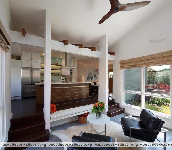
The area in the foreground here is the addition, the flex room. It’s an entry space that also works as a sitting or dining area. The pitched roof and expansive windows bring natural light through to the kitchen.
The steps mark where the exterior wall used to be. “By blowing out the side of the house, we were able to avoid a lot of structural complications,” Alper says.
Ceiling fan: Haiku
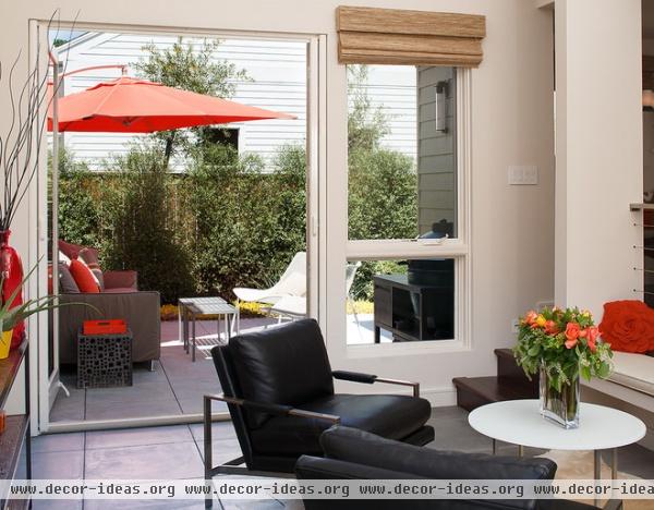
Straight through the flex space, across from the front door, is a big view of the backyard and access to it. The same scored, poured concrete flooring indoors and out creates a seamless transition.
French doors: Integrity from Marvin, upgraded with Emtek lever sets and StowAway screen; table: Room & Board; Milo Classic Leather Armchairs: Crate & Barrel
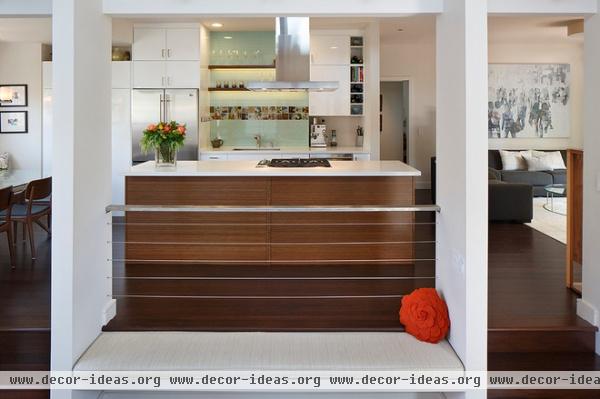
A custom built-in bench provides a place for removing shoes as well as extra seating in the flex room. The two pilasters at either end hold up the roof at its low end. The top of the steps marks where the old exterior wall used to be.
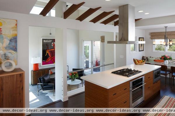
The exposed beams are the existing ones from the old roof; the header is new. Leaving the rafters exposed in the kitchen was one of the couple’s favorite suggestions by Alper. Operable clerestory windows at the top of the flex space bring more light into the kitchen and evacuate hot air.
Alper reconfigured the kitchen to create better flow; now there is a simple circulation path from the living room to the kitchen. (It runs in front of the island in this photo.) The only dining area in the house aside from the flex room is the banquette off the kitchen.
Flooring: Teregren stranded bamboo; range: Wolf; oven, dishwasher: GE Monogram
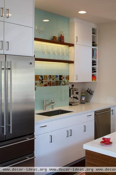
A custom glass tile backsplash from Tilevera extends all the way up to the ceiling and creates a focal point in the kitchen. “It’s seen from the entryway, so we wanted to create something that looked more like art than just a kitchen backsplash,” Susan says. She coordinated some of the banquette’s pillows to complement the tile. Custom bamboo floating shelves provide room for glassware and LED lights, which highlight the glass tiles.
The couple had about 70 percent of an Ikea kitchen in storage and used the pieces here, mixing in upgrades such as bamboo for the island panels. Alper finagled enough room between the cabinet and the wall for cookbook shelves. Brad did all of the tilework and millwork.
Glass tile: custom, Tilevera; sink: FrankeUSA; faucet: KWC
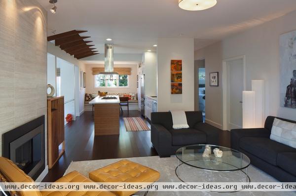
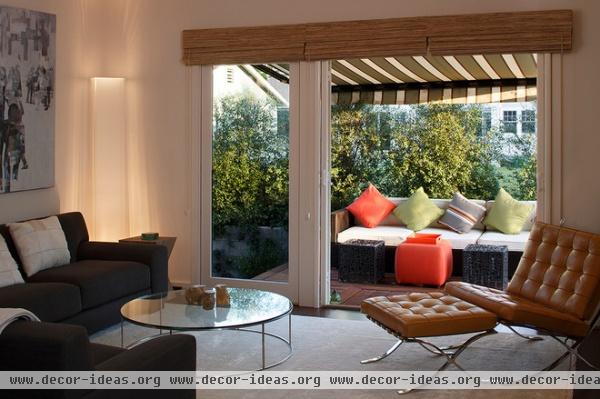
The fireplace surround in the living room is 12- by 24-inch travertine, which adds a beautiful texture to the carefully edited material palette. The living room is open to kitchen as well as to the backyard. A motorized Sunbrella awning extends the living room out to the deck.
Fireplace: Regency
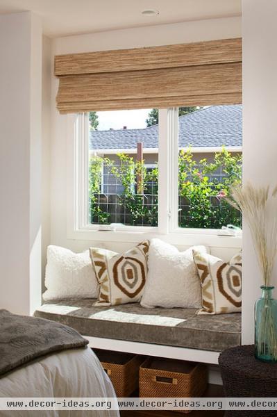
In a relatively small home, a micro addition like this bay window can make a big impact. The master bedroom nook here provides extra seating, storage space and a big connection between the bedroom and the yard. The cushion is custom and covered in Italian velvet.
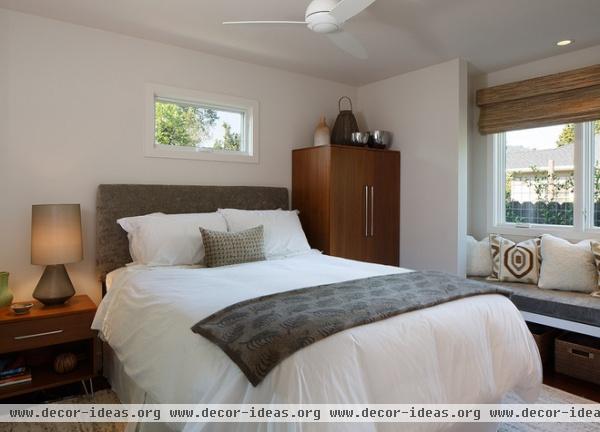
Here’s the rest of the master bedroom.
Bedding: Restoration Hardware
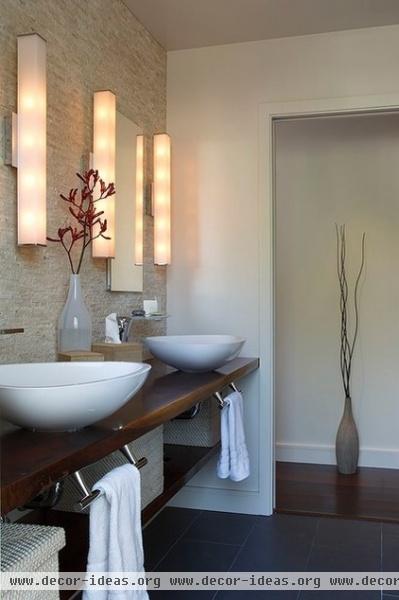
Alper’s design for the master bathroom is another favorite of the couple’s. Beautiful earthy textures create a soothing retreat.
Sconces: Lynn Bath Bar, Tech Lighting; sinks: Axor Massaud, Hansgrohe; floor tile: Cenere 12- by 24-inch porcelain; all tile from Ceramic Tile Center Santa Rosa
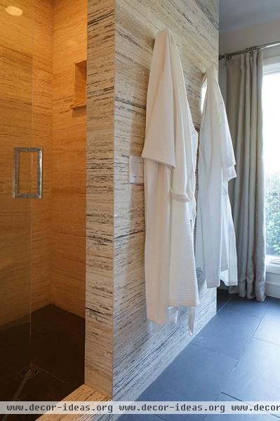
Natural light streaming in and light-colored tile in the shower and on the walls keep the room bright. Multiple showerheads complete the luxurious experience.
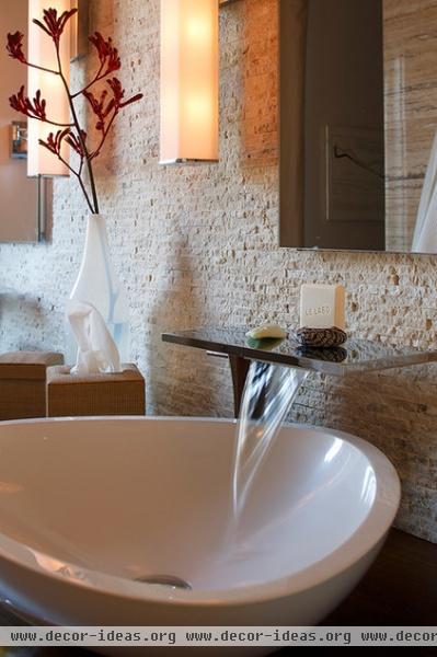
These sinks were one of many elements the couple sourced themselves. “Brad and Susan are very savvy designers,” Alper says. “In fact, whenever I’m looking to source something and I can’t find it, I call them.”
The wall tile here is the same as the one around the shower; both are Alabastrino travertine. It is vein-cut and polished on the shower wall and split-face mosaic on the vanity wall.
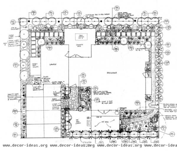
The couple wanted a lot of help with maximizing indoor-outdoor living. Once Alper had her part down, they brought in landscape designer Margaret Baumgratz to help with the outdoor rooms and plantings. (The plan is shown here.)
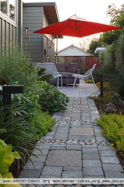
Drip irrigation throughout the entire property increases privacy, minimizes water use and maintenance, and complements the landscape design. The private backyard patio is a quiet sanctuary, and a beautiful stone walkway surrounds the house.
“Our advice for renovating a small house is to decide what is most important to you in how you are going to use the space, and clearly communicate that to your architect, contractors and others who are working with you on your project,” Brad says. “If you need bookcases, say so. If you don’t want your guest room right next to your master bedroom, say so. If you entertain a lot, think about more open spaces versus small rooms. These were all things that were important to us.”


