Houzz Tour: Dappled Light Inspires Artistic Wrapping
Inspiration can come from a place visited overseas, a photograph, or a lifetime of memories. But when it comes to our homes, inspiration often comes from nearby: the neighborhood, across the street or the land upon which the house sits.
In this case a pine tree inspired this house, which architect Daniel Monti designed for his parents, who come to California for extended visits with family. The house is built to accommodate three generations — the parents, Monti and his wife, and his brother’s three children — so they can spend time together in one place.
The tree is a defining feature of the block, 5 feet in diameter at its base and with a 60-foot-wide canopy. Inspired by what he describes as “the dappled light coming down through the tree canopy,” Monti wrapped the house in patterned and pleated Cor-Ten steel to create the same effect within its rooms. Let’s take a tour of this beautiful and striking house.
Houzz at a Glance
Location: Venice neighborhood of Los Angeles
Who lives here: The parents of Daniel Monti of Modal Design
Size: 2,727 square feet (3,245 square feet with the garage)
Photography by Benny Chan/Fotoworks
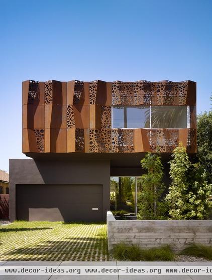
From up and down the street, the pine tree can be glimpsed over neighboring houses, but the second floor of the house’s eastern street front stands in for the tree, which cannot be seen from straight on in this view. Like a tree’s canopy reaches out from its trunk, the second story cantilevers beyond the garage and glassy entrance below.
The upper floor is covered in Cor-Ten steel panels that are creased and cut with a pattern of various-size circles to give this wrapper some depth and to filter the light. While the weathered steel does create a protective barrier, it rusts, so Monti painted the stucco below it a chocolate brown so the rust will not show.
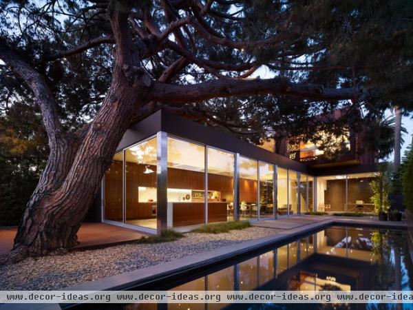
While the front of the house is closed off to a degree through the folded panels and the setback of the entry, the backyard is primarily glass. Here the tree filters the light, so the Cor-Ten screen isn’t necessary.The living space on the ground floor is visually and physically linked to the space outside, which is important given the indoor-outdoor living so common in Los Angeles.
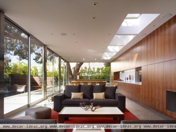
Four sets of sliding glass walls allow access to the backyard and enable the indoor and outdoor spaces to flow together. With such large expanses of glass, glare and contrast can be an issue, even with the pine tree’s canopy. Monti located a skylight along the wall opposite the glass, in effect balancing out the light in the large space.
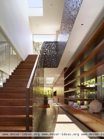
A skylight can also be found above the straight-run stair just a few steps inside the front door. Beyond is the living room we saw in the previous photo. We can also see guardrails that look like the exterior screen on the front of the house. While they look the same, they are actually different, something we will see in close-ups of each, next.
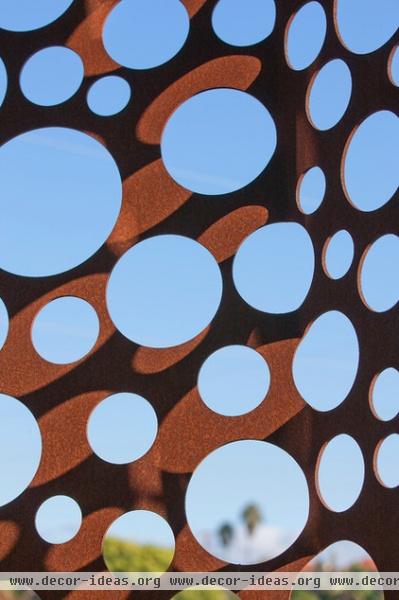
Here is a close-up of the exterior screen on the second floor. The pattern of different-size circles was determined by Monti, drawn in software; a fabricator then cut out the holes using CNC (computer numerical control) technology.
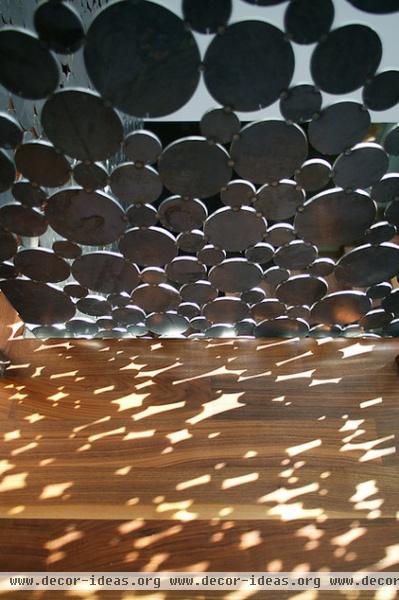
The stair guardrails are an inversion of the exterior. Instead of solid panels with circles cut out of them, they are solid circles welded together; the voids are the spaces between circles.
These pieces are actually the waste of the exterior screens, but where the design of the exterior was controlled by the architects through the use of technology, Monti just gave the metal fabricator some rules for placing the circles. The result is a hybrid of contemporary technology and traditional craftsmanship. I like being able to see the welds.
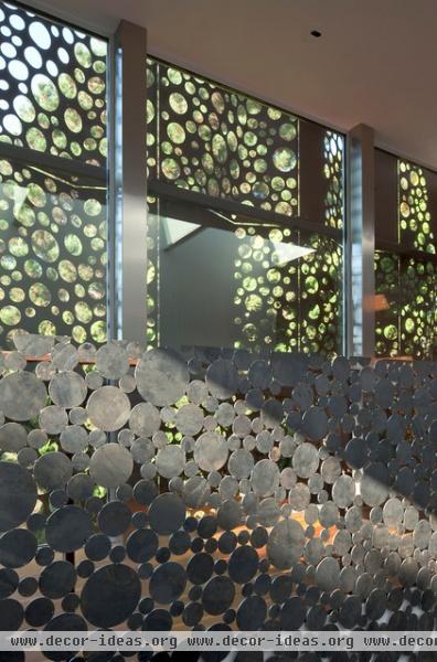
Here we can see the stair and the exterior screen — the yin and the yang — in the same photograph.
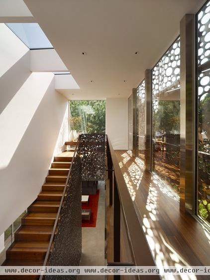
The stair ascends to a landing, which gives a view of the pine tree through a large opening. Turning 180 degrees would bring us to the three bedrooms: the master for the parents and two smaller ones for each of the other generations.
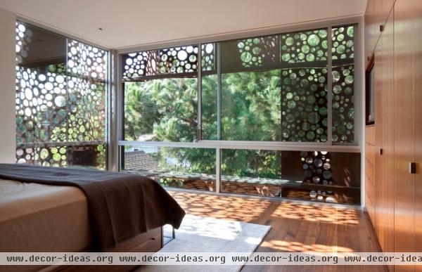
Here is the master bedroom, located on the west end of the second floor to have the best view of the tree. As on the front of the house, part of the screen has been cut to provide unencumbered views. The glass also slides open to allow for breezes.
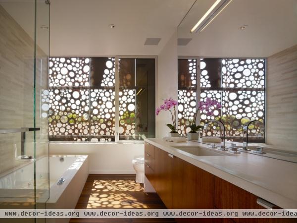
The Cor-Ten panels filter the southern light entering the master bath, and they would also create some privacy if another house were built nearby. Such a thing might just be a matter of time. As Monti says, “The neighborhood is in transition; most existing single-family residences were built in the early 1920s and ’30s, but most are so small, they’re either being renovated and expanded or torn down for larger homes.“
The house that he designed is on par with those newer houses, which also embrace a modern, “boxy” aesthetic. But the Cor-Ten panels allow the house to be “a modern box without being a modern box,” Monti says.
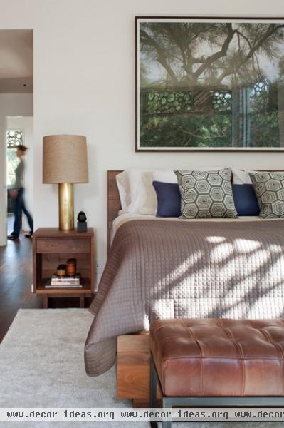
Monti chose materials for the interior that feel natural and not dated. While the first floor has concrete floors with radiant heat, the upstairs is fitted out with walnut floors with a natural oil finish. Here we are looking from the master bedroom to the other bedrooms on the east side of the house.
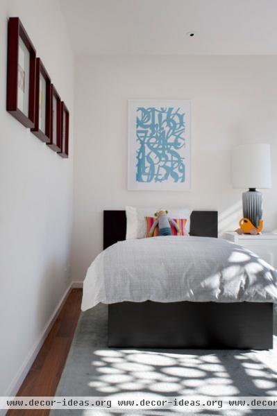
Here is a view of the children’s bedroom, whose windows face south and, as can be seen here, benefit from the dappled light coming through the screens.
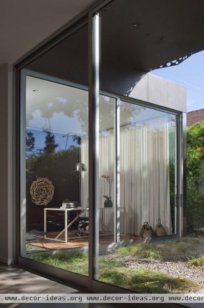
Now we head back downstairs to conclude the tour. In this view from the living room, we can see the office, which is a separate room but is visually connected through the large glass walls, which also slide to give access to the yard.
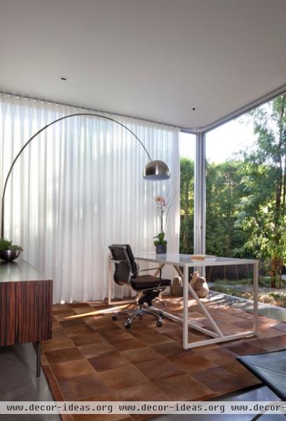
A curtain on a track can close off both the side and rear-facing glass walls for privacy.
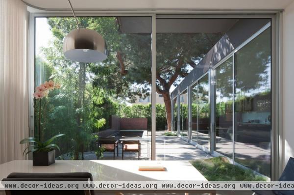
Of course, with this view of the backyard and the pine tree, why would you want to close the curtains?


