My Houzz: Global Handicrafts Personalize a Fixer-Upper
As a journalist and an international health adviser, respectively, Matt Steinglass and Pauline Oosterhof have lived all over the world. After stints in Vietnam and Ghana, the pair set up house in the Netherlands, where they took on a 1920s fixer-upper. They and their two children always brings the experiences and memories of the last place to each new house, filling each home with a colorful collection of cultural handicrafts and ethnic artifacts.
To revamp their latest home, a wood-paneled structure in Haarlem, the family tapped Van Nieuwenhuizen Construction, construction supervisor Piet Schol and interior designer Anja Hesp. “First we talked with Anja about the concept,” says Steinglass. “She wanted to know how we would use the house, our hobbies and what we wished for.” On their wish list were separate workspaces and an area where Oosterhof could practice yoga.
Houzz at a Glance
Who lives here: Matt Steinglass, Pauline Oosterhof and their kids, Sasha (age 11) and Sol (9)
Location: Haarlem, the Netherlands
Size: 1,561 square feet (145 square meters); 3 bedrooms, 2 bathrooms
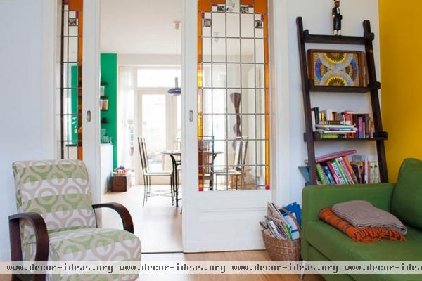
The living room initially featured chunky wooden closets and wood paneling. The couple removed the closets, along with an old gas heater and flue. The sliding stained glass pocket doors are original.
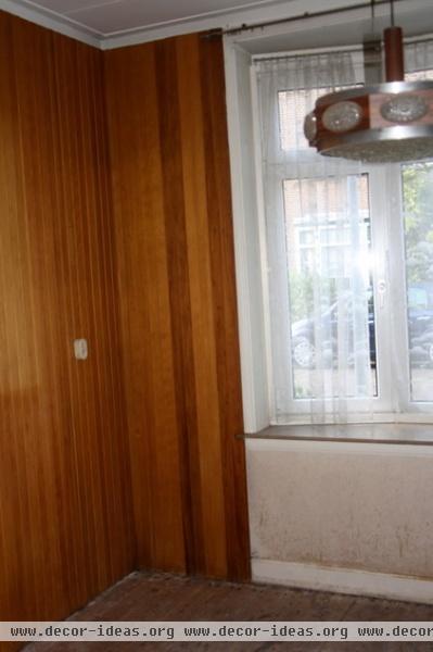
Wood paneling lined the living room walls — a relic of a 1980s renovation, the owners believe.
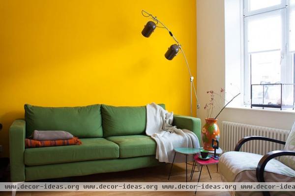
AFTER: First the couple removed all the old wood paneling. “We found layer after layer of wallpaper from all eras,” Steinglass says. “Art deco pop art from the ’60s, dark brown from the ’40s and fine wallpaper from the ’20s.
A vivid yellow accent wall lightens up what was once a dark and moody space.
Couch: Karlstad, Ikea; glass shadow box: Showcase Curiosity, Baden Baden; throw: Chunky Denim Throw in Sand, Mölle, Greenwich Village
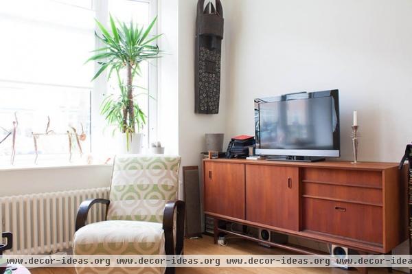
“The 1950s TV console reminds me of my youth,” says Steinglass. “I like that the Danish vintage designs all have straight lines and a small element with curves — in this case in the legs. I also like the warm hue.” The carved wooden mask was purchased in Togo. The upholstered armchairs are from Vietnam.
TV console: Marktplaats
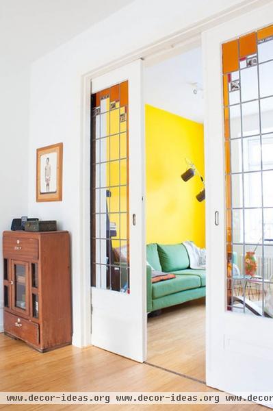
“The authentic stained glass sliding doors are what sold us when we came to view the house,” says Steinglass.
Cabinets from Ghana are positioned on both sides of the doors.
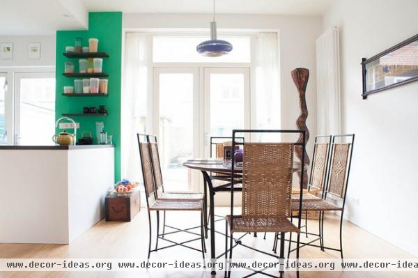
The couple removed a wall to open up the kitchen and connect it with the dining area. In place of the wall there’s now an island with a green accent wall and shelves. “We like to keep the conversation going while cooking,” says Steinglass.
The table was hand made by a woodworker in Togo. “We wanted to have an oval for more people,” Steinglass says. In the corner stands a carved wood snake made by the one of the Baga people of Guinea, who call such snakes bansonyi. “We bought it from an art dealer in Togo. The snake god is a god who can bring rain and fertility,” says Oosterhof. “I love the abstract ‘delta’ representation of the snake’s head and the blocky, sinuous lines.”
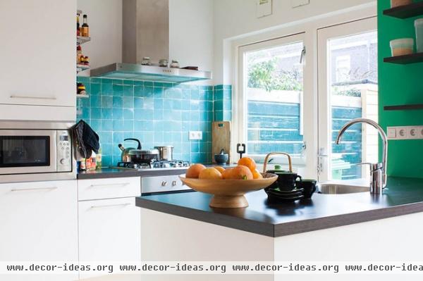
An aqua tile backsplash adds contrast in the compact kitchen.
Kitchen cabinets: Bruynzeel Keukens; tiles: Zellige in Blue Ciel, Design Tegels
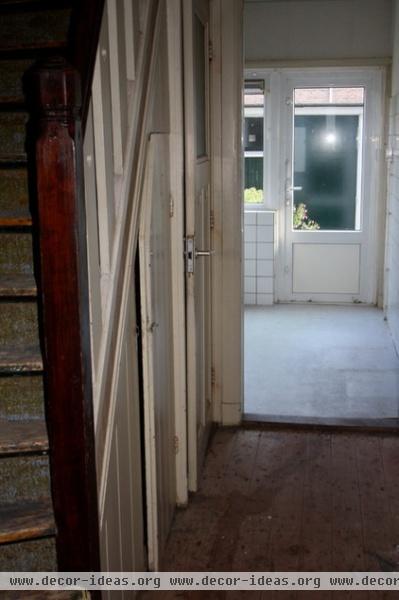
The old hallway to the kitchen.
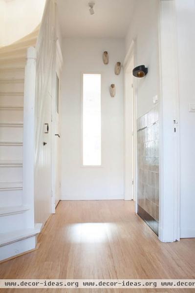
AFTER: Steinglass inserted a window in the passageway between the front hall and the kitchen. “I like the sight line you have when you enter the house,” he says. “You can look straight through to the kitchen.”
The locust-shaped ceramic accents on the wall are from Vietnam.
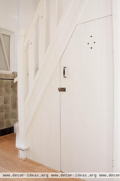
Most of the walls got a fresh coat of white paint. The homeowners preserved some of the original details, like little hearts cut into the banister and an elfin storage closet under the stairs.
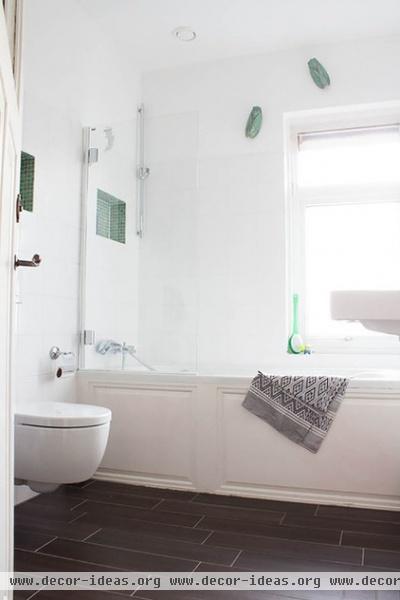
The kids’ bathroom has a clean, modern aesthetic with subtle mosaic details.
Green mosaic tiles: Sicis; white tiles: Kol Tegels
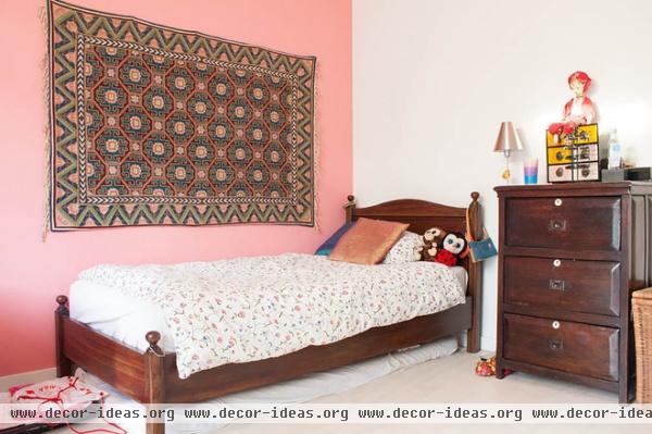
A tapestry from Nepal adorns the pink accent wall in daughter Sasha’s bedroom. “I bought [it] when I was on a hiking trip for my 40th birthday,” says Steinglass. The doll is Indonesian, a gift from an older Dutch lady in the neighborhood.
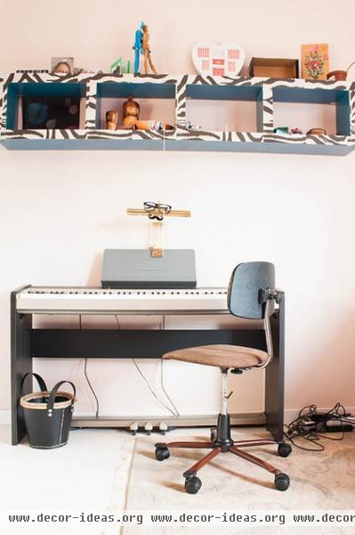
Opposite Sasha’s bed is a keyboard. A wall-mounted Expedit shelving unit from Ikea is spruced up with zebra wallpaper.
Wallpaper: Natives VP 628 01, Élitis, De Mooiste Muren
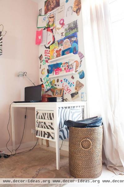
Sasha’s desk is covered with the same zebra wallpaper. The red circular box on top is a Vietnamese wedding box, traditionally carried by the groom’s mother to present gifts to the bride’s family in a prewedding ceremony.
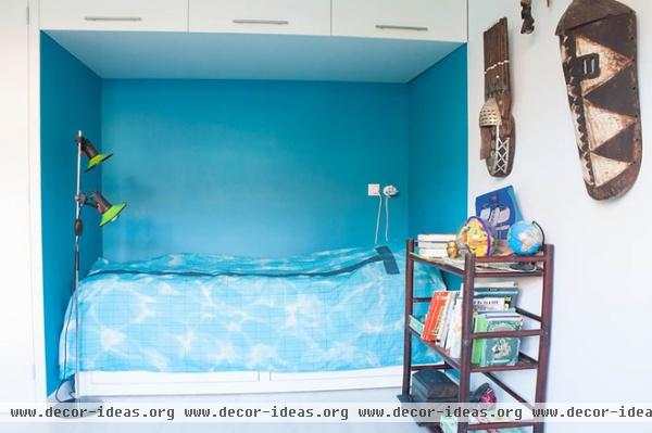
Interior designer Anja Hesp designed a bed to fit perfectly in this nook in Sol’s room, with overhead cabinets for storage. The sleeping space simulates a swimming pool, with a pool print on the comforter. Tribal masks from Ghana adorn the walls.
Comforter: Pool, Snurk
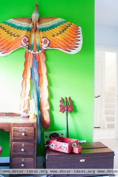
A large kite from Vietnam hangs above Sol’s desk.
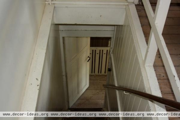
The attic was a huge undertaking. There used to be a door and a flight of stairs leading up to the attic between the two children’s bedrooms. This photo looks down from the attic to the door below.
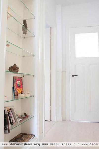
AFTER: Hesp came up with the idea of closing off the stairway and building a new one; shelves fill in what used to be the old doorway.
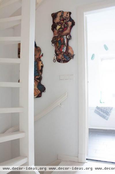
The wall by the new stairs is decorated with artwork from Togo. “These are found-trash sculptures from Togo by an artist named Tété Azankpo,” says Oosterhof. “They represent a boy and a girl. I liked the sassy head tilts and the way the girl fit into the crook of the boy’s midriff.”
She recalls watching Azankpo work: “He starts by making the wooden backing boards out of found scrap wood, setting small fires and burning holes in them on the ground while striding around sort of the way Jackson Pollock does in the famous photo shoot of him working,” she says. “Then he decides what he thinks the resulting shapes connote and adds more aluminum cans, shards of enamel pots, springs, old brushes and other found objects.”
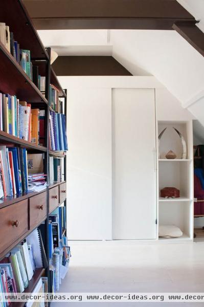
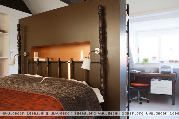
The attic space used to be two small rooms and a tiny loft. The couple made it one open master suite and got rid of the loft.
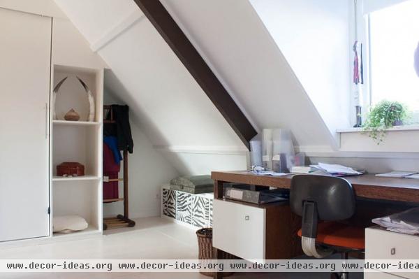
Part of the new attic master suite serves as a work and yoga space for Oosterhof.
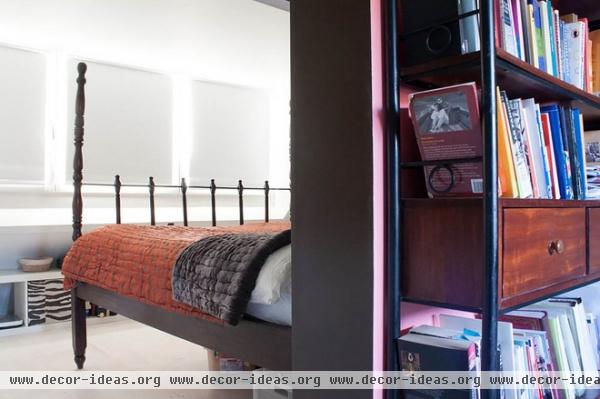
A divider wall and bookcase separate the sleeping area from the workspace.
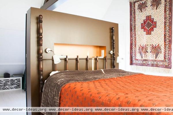
“The master bedroom is now like a retreat, with lots of light and the high ceiling,” Steinglass says.
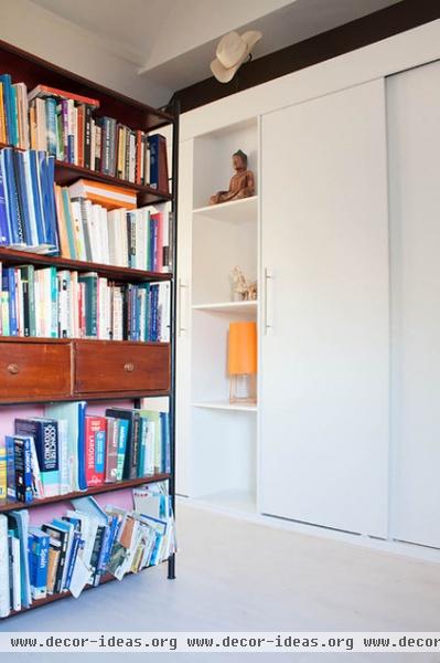
Hesp designed this wall of storage and shelves, and Van Nieuwenhuizen Construction built it. “We bought the Stetson cowboy hat at the Dallas airport on the way back from a hiking trip to the American Southwest in 2000,” says Steinglass. “I always remember the trip, because it was when Pauline succeeded in quitting smoking.”
Orange lamp: Mini Sophie, Frau Maier
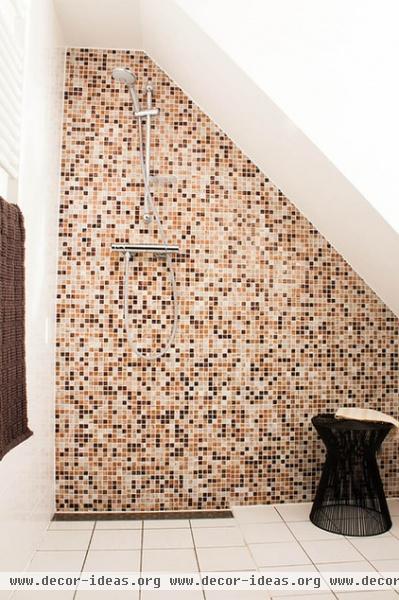
A bathroom with a mosaic tile accent wall occupies a small corner of the master bedroom.
Wire stool: Pol’s Potten, Baden Baden; towel: Sjakies
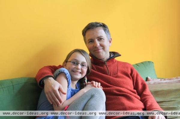
Matt Steinglass and Sasha relax in the living room.
See more photos of this house | Show us your home!
Browse more homes by style:
Small Homes | Colorful Homes | Eclectic Homes | Modern Homes | Contemporary Homes | Midcentury Homes | Ranch Homes | Traditional Homes | Barn Homes | Townhouses | Apartments | Lofts | Vacation Homes
More: My Houzz: Remodeling Modernizes a Neoclassical Dutch Home


