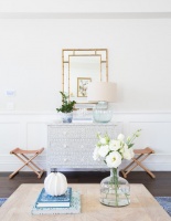
My Blue Heaven: New Reasons to Love the Color of Sea and Sky
http://decor-ideas.org 02/11/2014 12:22 Decor Ideas
Blue is a go-to color. Almost everyone likes it, and with good reason. Blue makes us think of the sky, the sea and the heavens. It evokes a sense of trustworthiness, dignity — even royalty.
But how did we get this color? As you might know, it wasn’t used in ancient cave drawings. Blue developed over time, a shade at a time. A little history might give you new reasons to love this hue — or new ways to introduce it into your home.
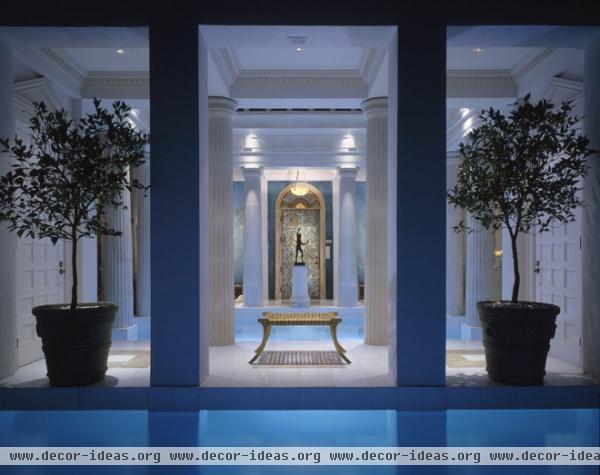
In ancient times blue pigments came from a semiprecious stone called lapis lazuli. Consequently, the color was costly to produce, so it became associated with royalty — a connection that remains to this day.
The Egyptians and Chinese prized the color and worked to create blue pigments, mixing various mined elements such as copper, lead and limestone. The Mesoamericans made their own version of blue using resins and plant extracts. Egyptian blue, Han blue and Mayan blue were some of the first incarnations.
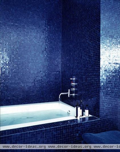
The Romans used blue simply as a background color. By Byzantine times, churches featured dramatic blue mosaic ceilings mixed with gold, echoing the heavens and the sun, and adding glamour.
In the bathroom, use blue mosaic tiles to emulate not only an ocean effect, but to reference the color’s ancient past.

Ceilings are still a popular place for the color. Try a midnight blue ceiling in your dining room for a traditional celestial effect.
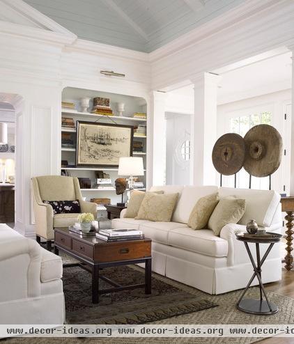
If midnight doesn’t strike you as the right time of day for your room, try a pale sky blue on the ceiling instead.

Or use a light blue on the ceiling of your porch. It’s a classic way to echo the sky as a transition from the exterior to the interior of a home.
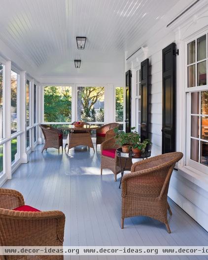
Or turn things upside down. Instead of using blue on a ceiling, as in ancient churches, apply it to the floor.

Blue was neither common nor prized for many centuries. In Celtic culture blue was the color of barbarians (think Braveheart). The Catholic Church, however, gave blue a boost around the 12th century when the Virgin Mary was commonly shown wearing robes of a deep blue-purple color called ultramarine. Ultramarine became the most expensive version of blue for centuries, another link to royalty and divinity.
The wall shown here is upholstered in ultramarine wool felt — an exquisite touch that seems entirely in keeping with this color’s royal history.
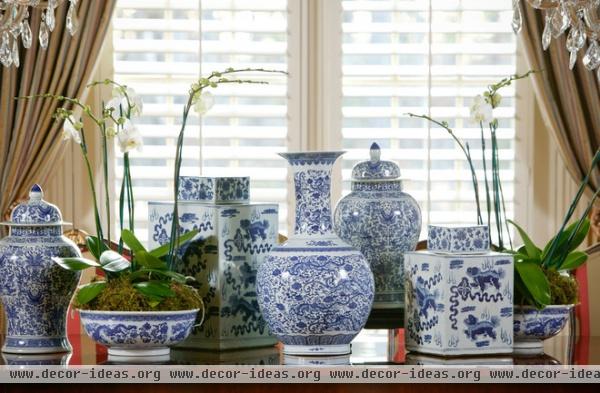
Blue and white is a classic color combination with a storied past. It was popularized through Chinese porcelains that were covered in intricate blue and white patterns. The vases, tea sets and other porcelain items were exported to Europe beginning in the 14th century, and were copied by European manufacturers for centuries.
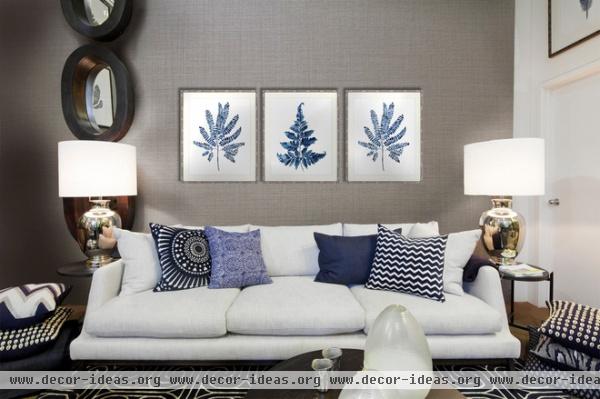
The color combination remains popular today. You can’t go wrong layering blue and white pillows in various patterns and shades on a neutral background.

By the 15th century, smalt, a glass containing cobalt, was ground up and used for paint, making blue more obtainable and forever changing the world of fine art painting. Can you imagine a work by Monet without it? Try using a strong blue, like cobalt blue, where it will make a statement.
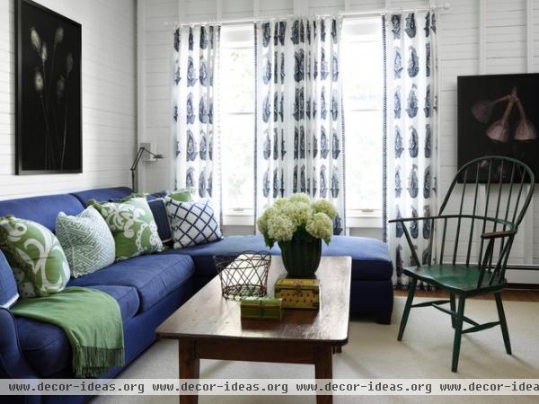
Higher-quality indigo blue was imported to Europe from India in the 16th century, replacing the blue popularly made from the woad plant. Indigo is a deep, saturated blue that holds its color more than earlier versions did. European kings, especially the French, favored it.
Indigo is now a common part of our daily life, appearing in everything from jeans to textiles. It’s a bit exotic, a bit true American, dressy and casual at the same time. It works well in a multifunction room such as a family room, where you might host a cocktail party one night and a game night another.
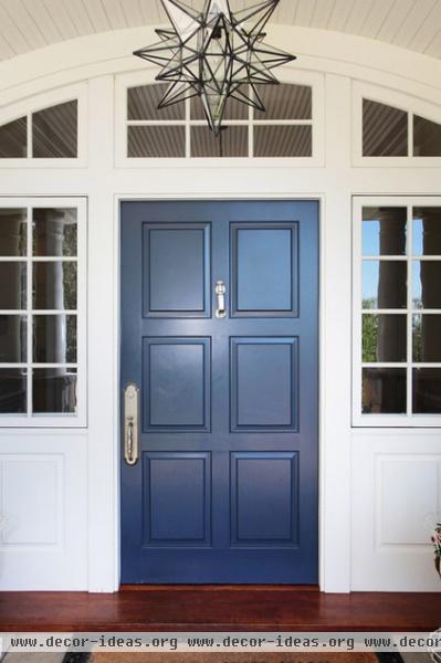
Prussian blue was created by a Berlin chemist in the early 1700s and was one of the earliest synthetic blues. It was also used by George Washington at Mount Vernon, giving it a solid presence on American soil. It makes an amazing front door color — a product of science that conjures the beauty of nature.

Instead of using blue as a strong accent to showcase its exclusive past, use it everywhere as a neutral color that envelops the room. Make it subtle or …
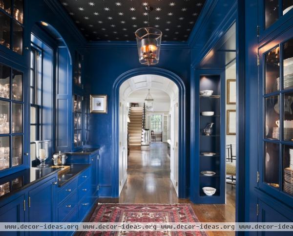
… make it dramatic.
No matter how you use your favorite shade of blue, take a moment to think about why you like it and how it will affect your space. You might just learn something new — not only about the color, but about yourself.
More: Dreaming in Color: 10 Beautiful Blue Bedrooms
Related Articles Recommended

