More Top Paint Picks for 2014: New Greens, Blues and Neutrals
http://decor-ideas.org 02/10/2014 03:22 Decor Ideas
In this final installment of our series on top paint companies’ 2014 colors of the year, we look to Valspar, which has divided 24 hues divided into three categories: Zenergy, Time Traveler and Yours Truly. These palettes aim to “restore spirits with a return to simplicity, reconnect us to cultures and customs gone by, and reinvent style with expressions of creativity,” the company says. The colors in each palette are a nice mix of unusual muted colors and fresh, springtime-ready, happy hues.
Here are my favorite nine picks from the bunch.
More colors of 2014: Pantone | Benjamin Moore | Sherwin-Williams | PPG Pittsburgh Paints | Farrow & Ball
Blues
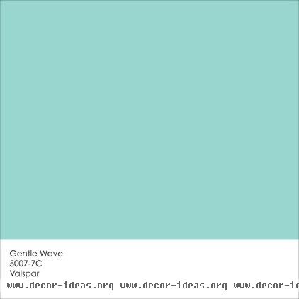
Most of us have positive associations with watery blues, such as Gentle Wave. For me they are reminiscent of lazy summer days spent at the beach or lounging poolside with a good book.
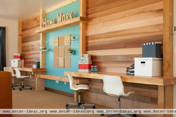
I like my turquoises bright and bold, and tend to use them more as accent colors. Since blue and orange are complementary colors (opposite each other on the color wheel), blues contrast well with orangey wood tones. Use them together for a lively, dynamic vibe — the perfect palette for a home office.
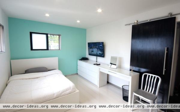
Add some personality to a light and neutral bedroom by painting the headboard wall in your favorite fun hue. Cool colors tend to recede, so this color choice, similar to Gentle Wave, helps the room feel more expansive.
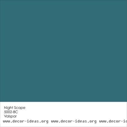
Night Scape is a deeper greenish blue that will bring elegance to a space. Think of it as turquoise all grown up.
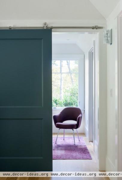
A similar dark teal hue has a huge impact in small doses — use it to showcase interesting architectural elements. I like the contrast here between the deep, dark door color and the vibrant fuchsia rug just inside the room.
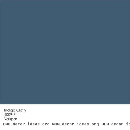
Indigo is definitely in right now, but you should always select colors for your home based on what you like, not on trends. Of course the nice thing about a trendy color is that it’s easier to find coordinating textiles and decorative accessories in that hue. So if you love navy blue and indigo, now is a good time to pick up accessories.
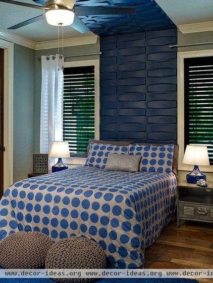
If you opt to bring a dark blue into your home, think about using it selectively — to showcase interesting features, such as this cool headboard.

Dutch Licorice is one of those colors many designers absolutely love to work with. It looks like a blue-purple-gray-black-brown hybrid to me. In other words, it’s delightfully complicated and will add a wonderful bit of drama to a room.
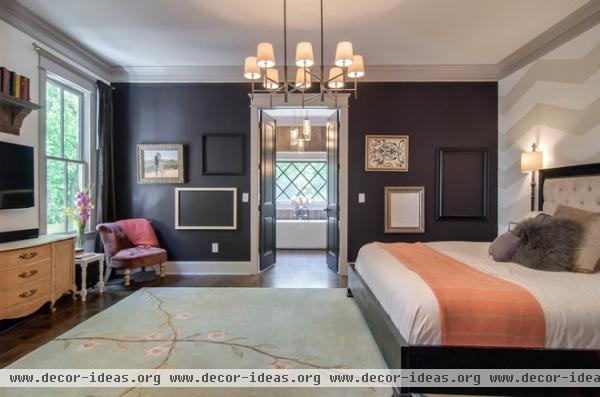
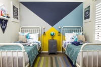
Here’s a similar hue, used as an accent wall color. A little bit of this deep, dark beauty goes a long way. I’d avoid using it on all four walls unless you really want to make a dramatic statement. But here, used on one wall and combined with plenty of natural and artificial light, as well as light neutrals, it packs a wallop without going overboard.
Greens
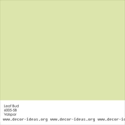
Spring greens are continuing their popular run in home interiors. We tend to be drawn to such fresh hues because they remind us of nature, youth and renewal. Leaf Bud is a great choice for homes in cold, overcast climates, because it imparts warmth and energy.
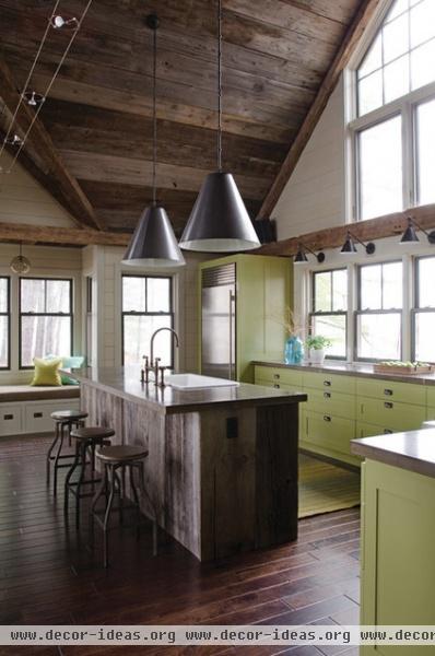
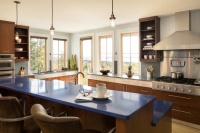
This similar herbaceous hue is a terrific color choice for kitchen cabinetry. It creates a happy and fresh feeling.
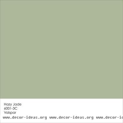
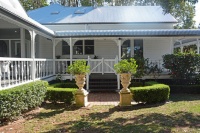
If you prefer a mellower green, check out Hazy Jade. It has more blue and less yellow than Leaf Bud, which reduces the vibrancy, yet it still has a nice, natural vibe. This particular shade of green is a great choice for the exterior of a home.
Neutrals
I am admittedly on a mission to encourage homeowners to move away from white, gray and beige neutrals. There is nothing inherently wrong with those hues, and they can serve a useful role in a home’s color palette, but I try to encourage folks not to use them simply by default. I know it’s easy to just paint your entire house Swiss Coffee and call it a day, but I urge you to think outside of the beige box.
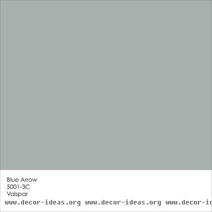
Blue Arrow is an example of an unconventional neutral. It’s a medium greenish-bluish gray that can stand on its own or partner well with bold brights or fellow neutrals.
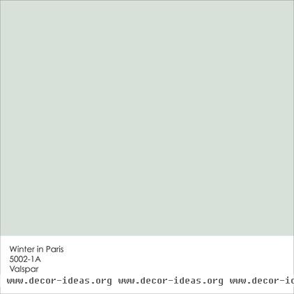
If your home lacks a generous amount of natural light, you might want to go with a lighter paint color for the majority of your walls. A light greenish-bluish gray, such as Winter in Paris, is a great option, especially for those in hotter climates. The soft and soothing hue will give the feeling of cooling relief from the heat.
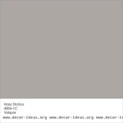
Here’s another neutral hue with a good bit of personality. Is it beige? Is it gray? Hard to tell, and it will move around on the gray-beige continuum depending on the time of day and the quality of the light. It is a fairly dark hue, however, so I’d pair it with plenty of white to keep it crisp and light.
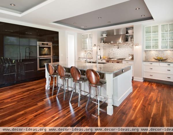
A similar greige hue really makes the recessed ceilings stand out in this handsome kitchen.
Tell us: See anything you like? How have you used similar hues in your own home?
More colors of 2014: Pantone | Benjamin Moore | Sherwin-Williams | PPG Pittsburgh Paints | Farrow & Ball
Related Articles Recommended

