My Houzz: High End Meets Budget Friendly in Toronto
Meg Gardner met her husband, Steve, when they were working together at an advertising agency in New York. When Steve accepted a job offer in his hometown of Toronto, the couple moved there and bought a Victorian house in the Annex, an eclectic neighborhood filled with century-old homes.
After living in the home for more than seven years without any major renovations, the pair decided to dig out and finish the basement. (Years of banging their heads on the ductwork while doing laundry had taken its toll.) They were so satisfied with the outcome, they decided to extend the same look and feel to the rest of the house. They quickly realized it was too much work for them to take on, so they called in a friend, Kirsten Marshall of Palmerston Design Consultants, for some professional help.
Houzz at a Glance
Who lives here: Steve and Meg Gardner and their sons, Jake (age 8), Henry (6) and George (3)
Location: The Annex neighborhood of Toronto
Size: 200 square meters (2,157 square feet), plus a 49-square-meter (525-square-foot) basement
; 5 bedrooms, 2½ bathrooms
Year built: 1906
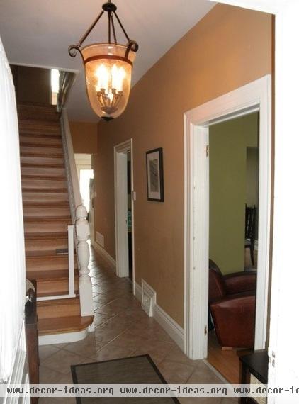
When the Gardners moved in, the main floor felt cramped and small. It was divided into three rooms; each space was painted a different color, and there were outdated plywood cabinets in the kitchen and sloping laminate floors throughout. They lived with this for the better part of a decade and made the space as comfortable as possible, documenting their efforts (and the most recent renovation) on Meg’s blog, Loving Albany.
When the time finally came to rethink the design of the home, they knew exactly what they wanted to change.
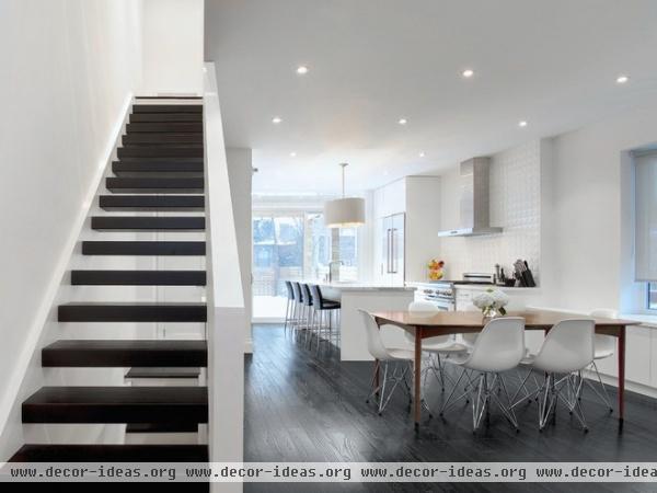
AFTER: With help from Marshall, the couple reenvisioned the main floor as a sleek, open space with a pared-down material palette. Wire-brushed red oak floors stained charcoal gray contrast with crisp white walls and millwork. Open risers and a sliding glass door add to the sense of space while ensuring that light flows through the rooms as much as possible.
Flooring: Yorkdale Hardwood Flooring Centre; paint: Simply White, Benjamin Moore (used for walls and trim in all rooms except the basement bathroom)
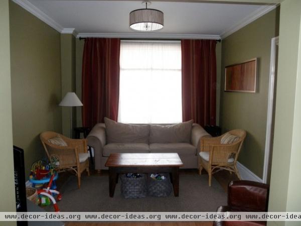
Here’s the old cramped and closed-off living room.
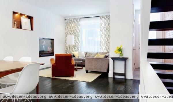
AFTER: The living room feels much bigger now, thanks to the removal of the dividing wall that separated it from the dining room. The Gardners acquired a new sectional and coffee table; they already owned the rug, curtains, floor lamp and leather chair.
The family wanted the space to be modern but still warm and inviting. They love a minimalist look but still needed a space that would function for a family of five. (Everything had to pass their “livable” test.)
“Our sectional is a pretty good example,” Meg says. “It has modern, low, clean lines, but it’s the most comfortable seat in the house.”
To reduce visual clutter, the TV was recessed into the drywall so it’s flush with the surface, and is backed by walnut veneer. To help define the edge of the space, Marshall introduced a second walnut recess offset from the TV; it’s used for displaying art and other objects.
Sectional: Amadeo, Barrymore; coffee table: Pi, Shelter; rug, curtains, lamp: West Elm; pillows: Milk & Cookies
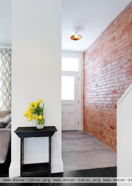
The front entry is a departure from the material palette used elsewhere on this level. Here concrete-inspired ceramic tile meets an exposed brick wall, which is original to the home. The air vent in the floor is nearly imperceptible, having been cut from the tile with the aid of a computer
Light fixture: Mysterio, from Diesel with Foscarini; ceramic floor: Cercan Tile; door handles: Barcres
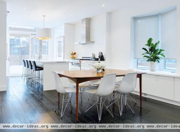
The family already had an eat-in kitchen and rarely used the original dining room — it felt like a dead space in the middle of the house. Opening it up to the rest of the floor was one of the major reasons for the renovation.
The center of the space was misaligned with the bay window, and hanging a pendant would have drawn attention to that fact. The owners took a subtler route instead, installing recessed can lights over the vintage table and chairs.
Table: Guff Furniture; chairs: Eames Molded Plastic Chairs; cabinetry: Akurum, Ikea
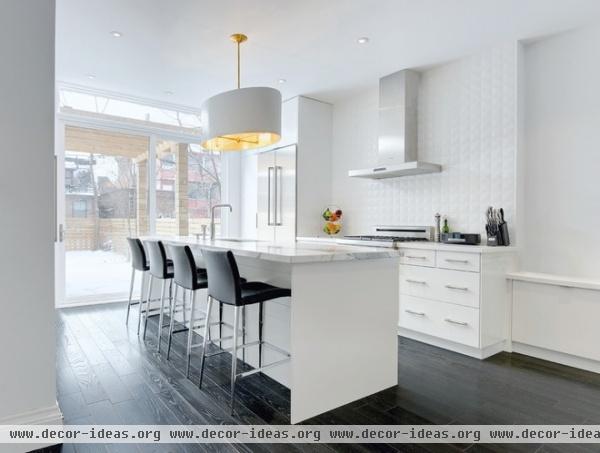
The new kitchen is a well-designed mix of high and low; it appears much more expensive than it really was. The contractor, Nuno Teixeira of Caliber Group, painstakingly installed off-the-shelf Ikea cabinets so they looked custom built for the space. The family splurged on a marble countertop for the island but saved money by installing white Caeserstone and a low-cost tile on the rear wall. The indulgent gold pendant was designed by Marshall and fabricated locally by Dean Lee, owner of Lampcage in Toronto.
Appliances: Thermador; cabinetry: Akurum, Ikea; island marble: Olympia Tile + Stone; drawer pulls: Richelieu; edge pulls: Berenson; sink: Radius Maxi Sink, Blanco; pendant: designed by Palmerston, fabricated by Lampcage; counter stools: BLVD Interiors
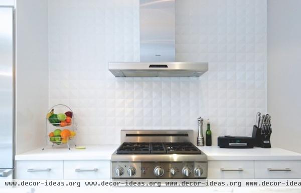
Countertop: Caesarstone, Pure White; backsplash: The Tile Store
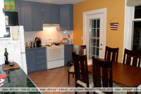
Confined to a closed-off room at the back of the house, the former kitchen was in need of an overhaul.
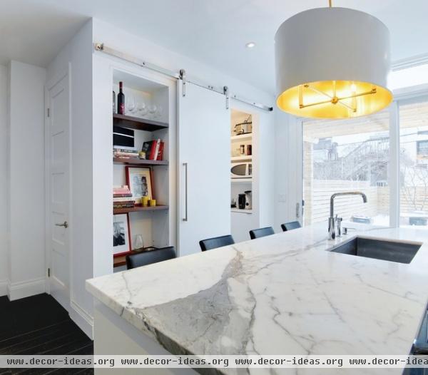
AFTER: The corner of the kitchen that used to contain the oven and some cabinets now packs in a lot more function. The small run of cabinetry has been replaced by a puzzle-like arrangement containing a powder room, a compact pantry and multiple open display shelves.
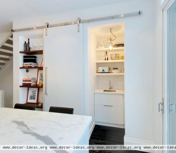
As the kitchen has no upper cabinets, the pantry helps to conceal much of the storage. Containing a small sink, all of the countertop appliances and a healthy dose of storage, it’s an ultrafunctional space that still looks stylish.
Barn door hardware: Real Sliding Hardware; light fixture: Well Glass Pendant, Davey Lighting; faucet: LaTorre; sink: Radius Bar Sink, Blanco
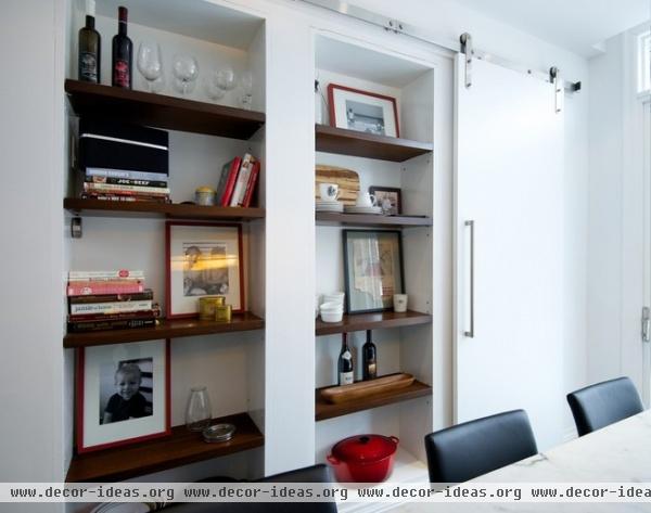
The barn door can be pulled shut when needed, revealing the second shelving area. Framed on the middle shelf is a page from a magazine found during the renovation and dating from 1947.
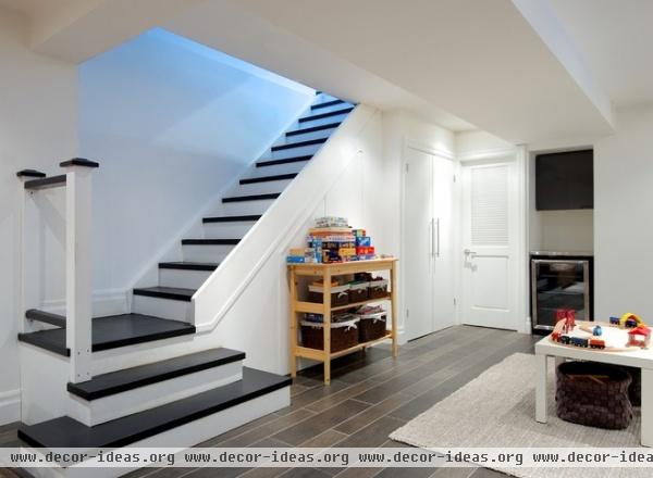
The initial inspiration to renovate the whole house came from the basement redesign. It was the first major project that the Gardners took on after buying the home; once they completed it, they made the decision to continue with the other floors.
The basement has become a great play area for the couple’s three small boys and helps keep much clutter off of the main floor. The homeowners are planning to install a banister; they kept the staircase open during the remodel to make it easier to carry stuff up and down the stairs.
Flooring: Olympia Tile & Stone
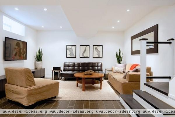
The main basement space also contains a second sitting area, far removed from the upstairs bedrooms, making it perfect for both early-morning cartoons and late-night episodes of Mad Men.
Media console: Ikea; rug: West Elm; coffee table: Guff Furniture; prints: Mr. City Printing
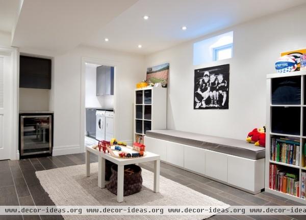
Before the renovation Meg built this banquette for the kitchen table using Ikea cabinets. Now it has found a perfect second home in the basement play area, doing double duty as a comfortable seating area and storage.
Shelving: Expedit, Ikea; rug: West Elm
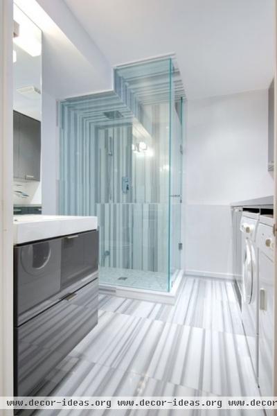
To save money, the Gardners used economical Ikea cabinetry for the laundry area and vanity, offsetting it with a graphic tile on the floor and shower surround. They installed a recessed showerhead to compensate for the soffit overhead.
Vanity, cabinets: Ikea; laundry countertop: Perfect Stainless; floor, shower surround: Olympia Tile + Stone; showerhead: Aquabrass; shower kit: Rubi; paint: American White, Benjamin Moore
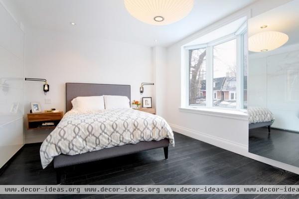
The master bedroom features two more lamps built for the space by Lampcage, mixed with a George Nelson Saucer Lamp, custom walnut night tables and Ikea storage. The TV is hidden in the mirrored cabinet and can be pulled out on a swing arm.
Bed frame, headboard: Narrow-Leg Nailhead Upholstered Bed Frame, West Elm; duvet cover: Organic Ikat Links in Platinum, West Elm; sconces: Lampcage; nightstands: designed by Palmerston, fabricated by Downtown Tile Centre; pendant: George Nelson Saucer Lamp; closet cabinetry: Ikea
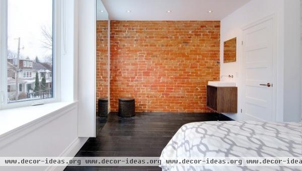
Well before the main renovation took place, the Gardners exposed the brick in their bedroom. Unexpectedly finding a pipe partially buried in the walls (likely used to transport kerosene to a light fixture), they left it in place until it was pulled out during the demolition, leaving a scar-like hole in the wall. In a panic, they tried to track down matching brick without any success, until they found an almost exact match in the unlikeliest of places: Craigslist.
Since there was already plumbing in the wall, they decided to leave a sink in the room. With three young boys using the main bathroom in the morning, it’s come in handy many times.
Vanity: designed by Palmerston, fabricated by Downtown Tile Centre
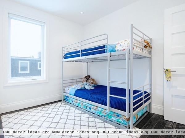
The simple yet stylish kid’s bedroom features a jolt of electric blue in blankets atop an economical bunk bed from Ikea.
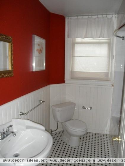
The second-floor bathroom prior to the renovation.
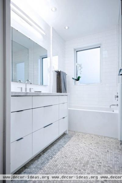
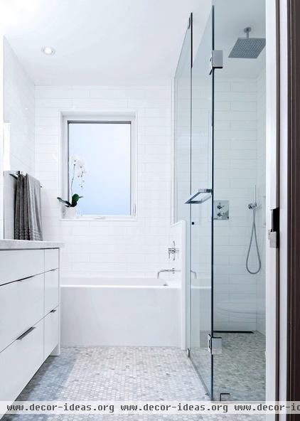
AFTER: As this home had to last them a long time, the Gardners consciously invested more in the big-ticket items. Aware that the main bathroom would be one of the most used rooms in the house, they had Marshall design a custom vanity and splurged on higher-end plumbing fixtures and bathroom accessories. For the couple it all came down to deciding what was worth it, and what they could do without or be content with replacing in the near future.
“Kirsten and Nuno were very good soundboards for when we had to decide high or low end,” says Meg. “They always had ideas for how to get around things without compromising the vision.”
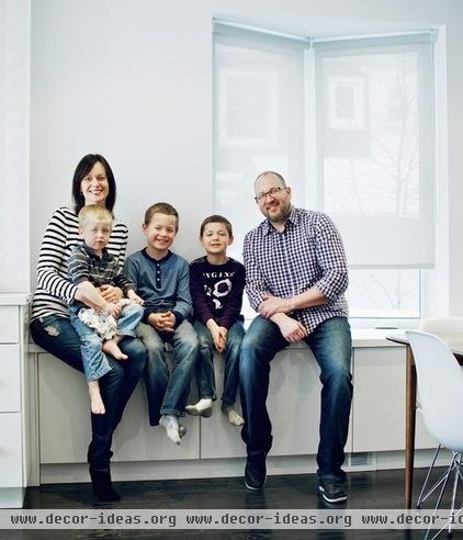
Meg, shown here with the rest of the family, admits that going through a major renovation is incredibly daunting. “But working with the right partners makes it all worth it,” she says. “We can’t say enough about how wonderful our partners were and how much we absolutely love our home.”
Browse more homes by style:
Small Homes | Colorful Homes | Eclectic Homes | Modern Homes | Contemporary Homes | Midcentury Homes | Ranch Homes | Traditional Homes | Barn Homes | Townhouses | Apartments | Lofts | Vacation Homes
More: My Houzz: Brightness and Creativity in a Live-Work Townhouse


