Houzz Tour: An Updated '70s Home Puts Art on Show
In 1973 architect W. Crutcher Ross designed a house in Charlotte, North Carolina, for Henry and Mary Miller. It was designed in the Sea Ranch style, inspired by the famous residences north of San Francisco that featured shed roofs and cedar siding as protection from the strong ocean winds. While the exterior exhibited the style’s forms and material palette, well integrated into its wooded context, the interior was designed as a showcase for Henry’s business, the Miller Tile Company. A brown, Mexican Saltillo tile covered most of the floors (where there wasn’t orange carpeting), and tile was used in different and sometimes unexpected ways throughout the house.
Fast-forward 40 years, and architect Mike Standley of Liquid Design was faced with the house’s renovation for a couple with an extensive contemporary art collection. (The house had other owners between the Millers and Standley’s clients, but very few changes had occurred in that time.) To better create an environment suited to their collection, Standley ditched the tile flooring in favor of a simpler, lighter palette. The ’70s decor gave way to something brighter without completely obliterating the character of the house. And when the clients approached Ross before he passed in 2011, he gave them his blessing on the updated design.
Houzz at a Glance
Who lives here: A couple with a collection of sculptural glass
Location: Charlotte, North Carolina
Size: 3,850 square feet plus a 1,000-square-foot 2-car garage

The one-story house is on a sloping corner lot in Charlotte’s affluent Foxcroft neighborhood, surrounded by houses double its size. These houses literally looked down on the house, which had been considered one for the wrecking ball. While the renovation focused on the interior, the exterior also was upgraded to increase energy efficiency and reduce moisture infiltration, while maintaining its unique appearance. These efforts ensure that the house will stand for at least another 40 years.
This side serves as the formal entrance. From left to right is a library jutting at an angle, the setback entrance behind the tree, the dining area/kitchen below the sloped roof and a flat-roofed garage on the right. There is an obvious informality to the design, so as we go inside we’ll focus on the details, rather than the layout.
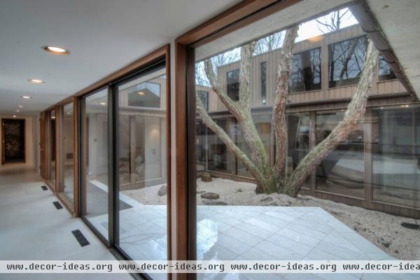
Standley describes the house as “a museum-like series of volumes.” A central courtyard with a 40-year-old river birch tree ties those volumes together.
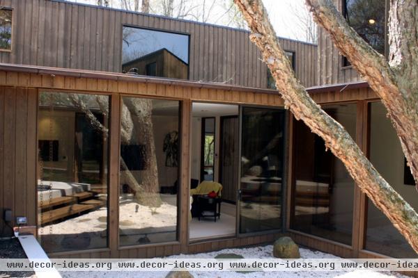
In addition to being a private outdoor space for the residents, the courtyard brings light into much of the interior, particularly through clerestories about 18 feet up.
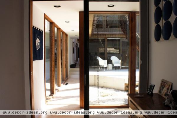
The living room and dining room border two sides of the courtyard; corridors line the other two sides. The glass walls and doors allow light to enter adjacent spaces, such as the master bedroom, from which this photograph was taken.
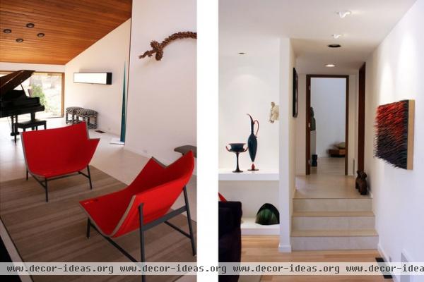
The front areas of the house — those we saw from the outside at the beginning — originally featured the Mexican Saltillo tile. Now the floors there are covered with a large Italian porcelain (left photo). The more private spaces feature wood floors. The steps (right photo) create a transition between the two surfaces through the tile applied to the risers.
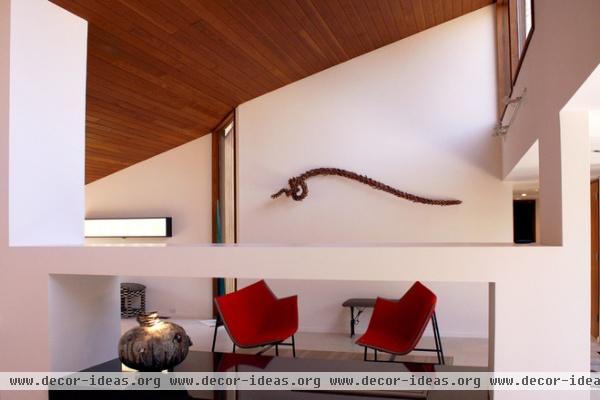
Here we can see a clerestory window bringing light from the direction of the courtyard to the front of the house on the left. The jog on the far wall may seem arbitrary, but it allows a view of the front door from the space on the left.
In the foreground is the renovated fireplace, which Standley says uses bioethanol, a clean-burning alternative to natural gas. It’s surrounded in a bench-like fashion by a single 5- by 10-foot slab of black granite.
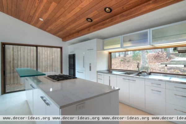
Where once there were yellow cabinets, orange paint and brown finishes, now there is a light palette with the porcelain tile and the white cabinets illuminated by the windowed backsplash. The island features a bar made from 3form resin floating on aluminum brackets.
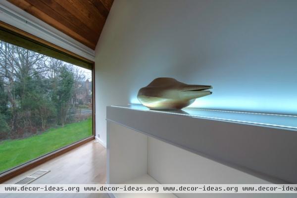
The triangular master bedroom benefits from a large picture window facing a side yard. Even this room is set up for the display of art.

The master bedroom features a south-facing sun court. On one side of it is the toilet and a shower; opposite is a freestanding tub. The tile is new, keeping with the subdued renovation, but the shelves with rounded corners are original — good spots for displaying more art.
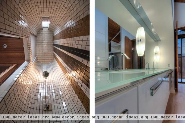
The differences between old and new can be seen in the master bath. The vanity in the dressing area has a floating glass top and white cabinets that recall the design of the kitchen, while the 17-foot-high(!) elliptical shower has the original tiles, giving an indication of how original owner Mr. Miller treated every part of the house as a canvas for his products.


