Houzz Tour: Nature Suggests a Toronto Home’s Palette
Imagine what a building that’s been vacant for years must look like. Now imagine what that must be like to renovate. Designer Jason Ho didn’t have to imagine, because in 2012 he purchased a three-story townhouse that hadn’t been lived in for five years. For Ho, who is currently wrapping up a master’s in architecture, this was more than just a real estate venture, it was fieldwork — an opportunity to experiment with any detail, finish or material that had caught his eye in class.
Ho intended to rent out the top two floors of the townhouse and lease the first floor to a shop or business. But after exploring the neighborhood and falling for the outdoor space, he decided to take the 700-square-foot first floor for himself. He had been a designer for six years, but this was the first time Ho remodeled for himself.
Houzz at a Glance
Who lives here: Jason Ho
Location: Leslieville neighborhood of Toronto
Designer: Pause Architecture + Interiors
Size: 700 square feet; 1 bedroom, 1 bathroom
Year remodeled: 2013
Photography by Alex Lukey Photography
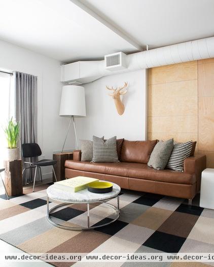
The stark landscape of northern Canada inspired the palette. Birch forests (represented by birch plywood and tree trunks) and the rocky outcroppings of the Canadian Shield (represented by extensive use of steel) play against against each other throughout the home, presented on a stage of white.
By selecting his primary materials first, it was easier for Ho to visualize how they would render themselves in the design. It may seem backwards, he says, but by starting with the materials instead of the layout, you can then explore how others have designed with those surfaces and finishes. If you start with materials, the layout may take shape from there.
Eve Sofa, Abra Floor Lamp: EQ3; Smart Round Marble Top Coffee Table: CB2
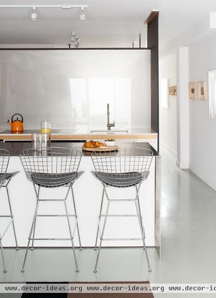
The interior was an empty shell, and Ho tailored the floor plan to his lifestyle. He gave more square footage to the open kitchen and living area, because he likes to entertain, and shrunk down the bedroom. The beauty in renovating for yourself is you can devote more time and space to the things you value most, he says.
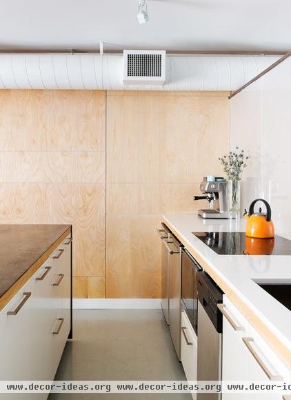
The kitchen doubles as the dining room. Ho modified Ikea cabinets with custom millwork and some ingenious flourishes. The island, shown here on the left, is built on casters and can be rolled to create more room in the kitchen or living area. A wood table leaf pulls out from its side, basically doubling the surface area; Ho says he’s had eight people comfortably sit around the island for dinner. Stainless steel wraps up the side and across the counter.
A birch plywood wall panel extends along the far wall. Ho installed the paneling in asymmetrical pieces, rather than as a solid sheet, to break down the scale of the panels and align the edges with various features in the home. It’s a warm and unifying element in all rooms.
Base cabinets: Ikea; countertops: engineered stone, stainless steel
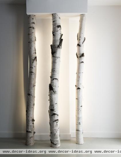
Ho built many of the pieces in this project, including this hallway light fixture. He cut a channel in the back of the birch tree trunks and inserted an LED light strip for a soft, even glow.
The floors throughout are painted gray with an industrial-grade epoxy, usually seen on factory floors. When Ho moved in, the flooring was an unattractive concrete that he decided to cover up. So far the epoxy has been great — waterproof and durable, and only a sponge is required to wipe up any mess.
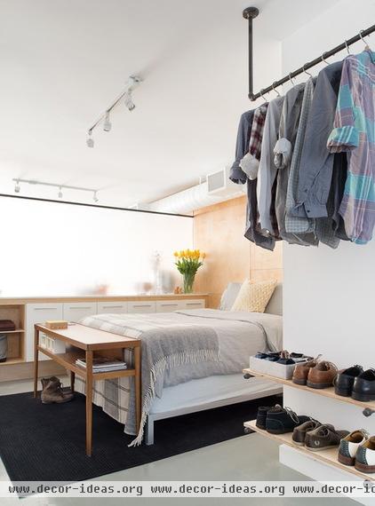
In designing the bedroom, Ho’s primary challenge was light. He wanted the room to be cozy but preferred a bright and airy space over a dark cocoon. In a first-floor room with no direct light, this seemed nearly impossible. But always ready to experiment with a new material, Ho installed sanded acrylic partitions between the kitchen and bedroom. The room now receives plenty of light but has privacy. The panels also add to that snowy northern look.
Ho built the clothes rack and shelves with plumbing pipes and birch planks. Though the rest of the home has an updated contemporary style, this feature alludes to a more industrial look, warmed up by the light wood shelves. Ho says this closet system has forced him to be tidier.
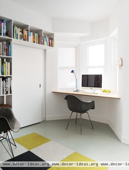
At the front of the house, the bay window in Ho’s home office faces the street. At first he figured he could stick a chair in the bump-out, but quickly realized he wouldn’t sit there and would be wasting space. So Ho popped a desk surface into the nook.
The sliding door here conceals the home’s utilities. Ho built a bookcase around the door to both add storage and enhance the wall.
Ho is happy with his new home. Its size and look suit him. He toiled over every detail, every dimension, every material to produce something he’d only ever experienced on paper. He sees this place as an office for his firm someday. Until then it’s home.


