Design Workshop: Materials That Tell a Story
Meaningful architecture, for me, always relays a story. It’s fundamental that it conveys something about a place, a specific time, a person or a family. It must have an opinion, an attitude. Architecture doesn’t have to be an explicit rendering of that idea; rather it can be discovered over time while living in a structure or just by knowing a little more today than yesterday.
My personal design process always begins with my asking the question, “What is the story I’m trying to tell?” Architecture can convey historical ideas, ideas about craft, personal tastes, an attitude toward light (or dark), the forest canopy, a city skyline. This seed of an idea can become the design engine for the project, a reference point for decisions made along the way. Most architects refer to this as a parti, but the term is far less important than the actual concept. One of the most basic and accessible means of conveying this idea is through the use of material.
I’ve chosen three common materials to focus on that are particularly fluent narrators: natural stone, wood and concrete. Let’s have a look.
Stone
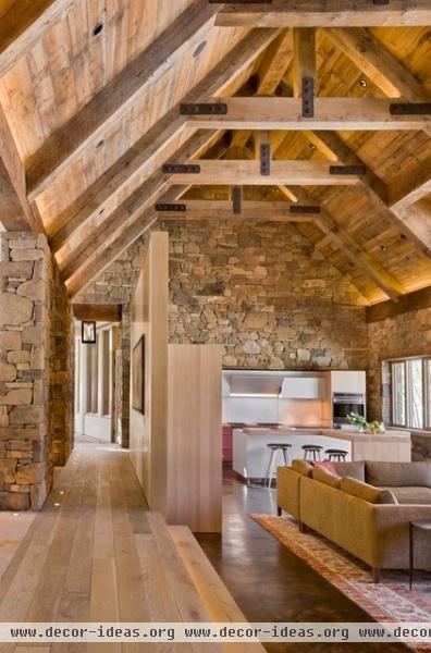
The story of this space is richly textured, and while this project employs all three of the materials we’ll be discussing, we’ll focus particularly on the stonework.
Constructed of four types of locally sourced stone as well as reclaimed barn wood, this room poignantly illustrates the care and precision of the mason’s hand in laying this stone. The material links the architecture to the indigenous geology not only in tone and texture, but also because local tradespeople were employed to craft its assembly.
The knowledge of local stonemasons is invaluable, as they’re intimately familiar with the raw materials. They understand how to best fit the pieces, their inherent graining and characteristics, how to span openings — all of the things that comprise a wall that’s structurally sound and inherently beautiful.
This knowledge is present in the finished product, and that story becomes a part of the home. Stone is an excellent means of conveying ideas about shelter and permanence as well. Its mass can temper thermal extremes, and the stone itself is monumental (in both cost and appearance).
The polished concrete floor anchors the home in the present day and offers a smooth surface at one’s feet. The difference in shine also delineates living space versus the circulation or hallway space, where the wood has a dull finish.
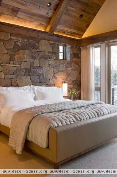
The roof structure here is constructed from reclaimed rafter stock, which matches the local stone in tone and texture. There’s a real magic to the contrast of old and new, rough and refined, that the architects have delicately balanced. This is integral to the story and feel of the home.
Contrast is a theme in all of our examples, and it’s extremely important. Like character development in a good story, texture lends depth and interest. It can also make even very small spaces seem much larger.
When selecting materials, architects rely on two basic types of contrast: textural and tonal. Textural contrast works well when materials are tonally very similar, as seen here in the muted French grays. Tonal contrast, as we’ll see in another example, works to highlight form and volume. Note how the texture of the wood recalls its past life as a barn; the markings and weathered patina warm this new space with historical deference.
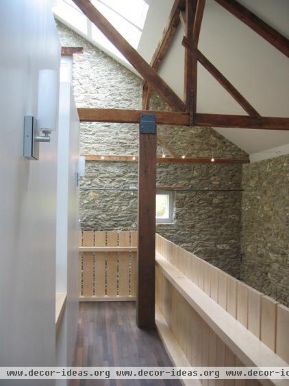
In this stone barn conversion, the existing timber frame of an 1862 barn was preserved, as well as the exterior stone walls, and new interior volumes delineating public and private spaces were inserted.
The chestnut timber frame displays the markings of the original framers who shaped the beams by hand hewing them. The deliberate choice to reuse the existing structure and integrate the new architecture into the old makes this story rewarding and interesting. The narrative of old and new intertwining enriches both.
Note how the stone here differs from that in the previous example, not only in color and form but in the mortar joints. Each tells a story about the individuals and the local building climate where it was constructed.
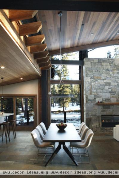
The cool gray of the locally quarried stone offsets the warm hues of the wood ceiling and modern lodge aesthetic here. The heavy chimney mass clad in gray is anchored to the site.
Sourcing local materials makes especially good sense when it comes to stone. Not only does using local stone support the local economy, but it saves on shipping costs for an extremely heavy material, making it both a more economical and sustainable choice — which also becomes part of the story of the home.
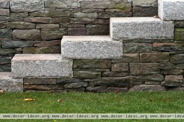
These cut stone treads tell a different story than their contrasting wall counterparts. The even grain of granite is well suited to its being shaped mechanically into the larger slabs required for steps. This fine grain can be “flamed” with a torch to split off minute pieces of the material, leaving a rough surface suitable for treads.
The wall stone, by contrast, is stacked in smaller increments, as its own physical properties and geometry require. The distinction between the wall and stairs is simple, allowing each material’s story to be quietly revealed. Large stone blocks for walking; small stones for stacking and retaining earth. This is an example of an attitude toward design. There’s a reason behind these decisions, an intent.
Concrete
Consisting of three basic ingredients — portland cement, water and aggregate — concrete is, by weight, the most widely used building material in the world. A chemical reaction called hydration transforms the highly plastic concrete material slurry into its binary opposite. The process itself is quite old, dating back to Roman times, but the means and methods remain quite similar today.
Formwork must be constructed to contain the slurry while it cures, and it’s often this formwork that can impart much meaning to the concrete’s character and its storytelling ability. The narrative quality of concrete is often explicitly about the actual process of making: how it’s shaped, what aggregates are used, the color, the texture.
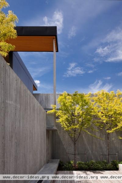
Here the architects have exploited the plastic nature of concrete and have lined the usual plywood forms with boards, thus the name board-formed concrete. The imperfect nature of these form liners, along with the slight gaps between the boards, imparts a texture to the finished product. Here it’s used to accent the verticality of the space.
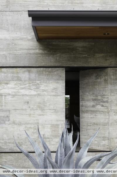
By contrast, on this project the architect specified a wider board as well as a more tightly controlled aesthetic. The wood graining is apparent in the finished surface as a reminder of the process by which it was created. It lends a subtle tonal mottling and figure to an otherwise static monolithic element.
The architect has also capitalized on the plastic nature of concrete by creating this formed aperture in the wall that offers a peek at a certain angle to the tree canopy to the left. I particularly like the integration of the thin bands of steel above and below the opening that correlate with the proportion of the windows on this level of the home.
Steel and concrete have an intimate relationship that is part of this story as well. Reinforced concrete relies on steel reinforcing to help it resist structural loads. Concrete can easily resist compressive loads (crushing) but it isn’t great at tensile loads (stretching), which is why we embed steel reinforcing bars in concrete. This detail hints at that relationship in a very understated way: thin steel against massive concrete.
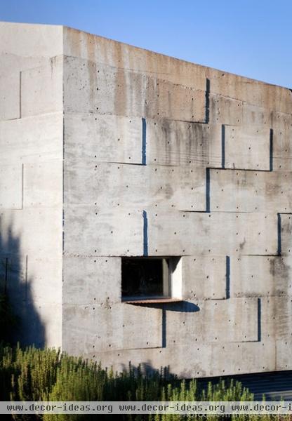
In this artist’s studio, the architects have wonderfully illustrated the story of concrete and married it with the local environment. The finished wall surface is irregular and messy, an inherent part of the forming process. It’s been exploited here to mark the ever-changing light of day.
The finely textured dots denote the location of the form ties, the metal ties that hold the forms together as the concrete is being poured, which prevent the forms from separating. The ends of the ties are broken off when the forms are removed. Oftentimes these are filled or top-coated to conceal them. Here they are celebrated as part of the story of making and add speckled shadows to the wall face.
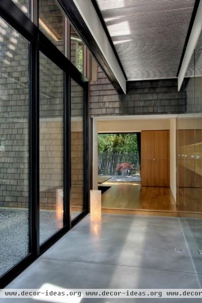
Concrete can also be rendered silky smooth. The troweling and final finishing of the concrete is the mark of a skilled concrete subcontractor. When floors are left exposed, as in this example, the skill of the tradespeople is particularly important as well as the curing process. Any covering left touching the top of the concrete will cause a variegated finish; a hand trowel and a machine trowel will both leave different finishing marks.
Note the joint pattern, which the architects have dutifully aligned with the window mullion. These joints are critical parts of the story of concrete. As it cures, concrete shrinks and cracks, so care must be taken to control the location of that cracking. These so-called “control joints” are slots that are tooled or cut into the face of the concrete, making it just a little bit weaker than the surrounding concrete and thus the first place the concrete will crack as it cures. Knowing these details, however small, enriches the experience and understanding of a place.
Wood
Renewable, timeless, warm and tactile — just a few of wood’s great characteristics. The narrative quality of wood can derive from its history in other structures — like reclaimed timber — or it can come from a local source.
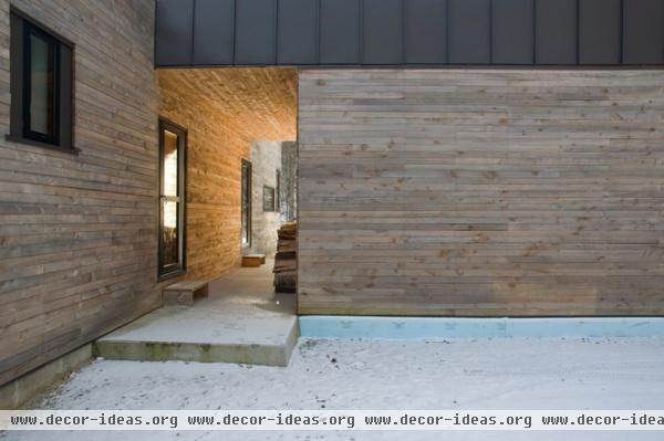
Old-growth forests in New England, where this project is located, were clear cut during the industrial revolution, so many of our sources of wood come from the relatively fast-growing second-growth softwood species, like this locally sourced hemlock. The architect specified that this siding be “green,” which means that over time as the wood dries and shrinks, the joints will open up, creating even more shadow and figure on the building facade.
This example highlights tonal contrast at work. The highly machined dark standing-seam metal roof against the natural figure of the knots in the hemlock emphasizes form and proportion. The hemlock will weather naturally and mark each passing year as it fades to a silvery gray, a complementary contrast to the black roof. These forms will remain crisp and distinct. I particularly love the way the wood skin is positioned lower on the wall at eye level, at a point where we experience it most intimately.
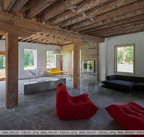
This former derelict canning factory, now a residence, highlights the wood structure and all of its attendant structural complexities, creating a rich and varied counterpoint to the monolithic concrete floor surface. The roughly hewn wood support structure tells the story of how loads are transmitted to the foundation below, with more massive timbers transitioning loads from beams to posts.
Many of the narrative markings of its former life have been left open to view. The marriage of old and new is well balanced in this conversion; the reference to the past remains, although the entire structure could easily have been whitewashed, erasing the old.
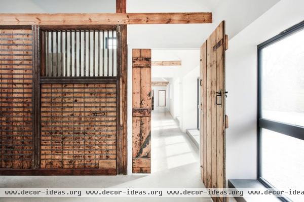
Here carefully selected interior elements have been cleaned and preserved to reveal the marks of their construction and heavy use over time. It’s hard not to appreciate the architectural agility with which the architects have accomplished this conversion of a former horse stable.
The partitioning of spaces was derived from the regular module of stable bays, maintaining the openness of the original structure. The natural wood elements in this space are allowed to annunciate their historic past.
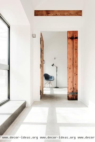
The uniform finish of the concrete floor also reminds us of the structure’s former agrarian use while providing both tonal and textural relief to the pure white walls. It also permits the natural timber structure and dividers to sparkle and take center stage.
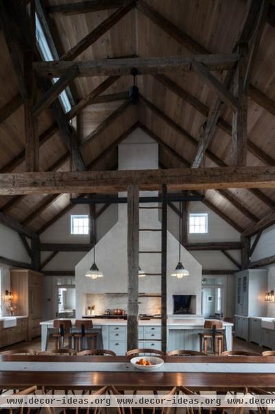
This reclaimed and reconstructed barn frame originally built in 1790 has become the structure for a new kitchen, dining and living addition to an existing stone farmhouse on the same property. The frame’s former hayloft was removed to achieve this overscaled and airy volume. The ladder, integrated into the barn’s timber frame, has been left in place, reminding the occupants of its storied past.
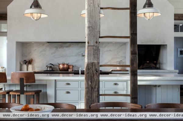
The old hayloft’s access ladder bears the markings of batter boards attached at the right side and what looks to be a new column replacement on the left. It wasn’t uncommon for the bottoms of the timber posts to rot, requiring in situ repair. The older post above is more silver, and you can clearly see where the splice joinery links old and new.
The narrative here is much more explicit, but it’s clearly been the design engine for the decisions made by the owners and architects. Stories like this one abound, and almost any material can be a vehicle for storytelling in design. Which one will you tell?
More: Updated Woodstoves Keep Home Fires Burning


