Nature’s Color Wisdom: Lessons on Green From the Great Outdoors
http://decor-ideas.org 02/05/2014 03:23 Decor Ideas
Green is a tremendously vibrant, alive, healthy, nurturing color. The color of forests, spring gardens, fresh produce, herbs, mountains and moss, it is one of the most widely found colors in the world — and because of this, we find it naturally soothing. When choosing paint for an interior, green can be tricky, but it really shouldn’t be. It’s made complicated by the fact that so many of the paint colors out there have little relation to the natural world. Start looking at green through the lens of nature, and I think you will find your interior color palette coming together more easily. Let’s get started.
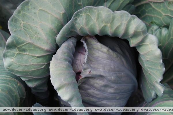
Greens in nature. Look at any plant with variegated foliage, like this lovely, plump cabbage, and you can see how green can blend nearly seamlessly with other hues. Here the bluish purple fades into silvery green. Nearly any plant, if you look closely enough, will reveal many subtle shades of green. Now step back and notice what surrounds the green plant you have been looking at — it may give you an idea for a color pairing.
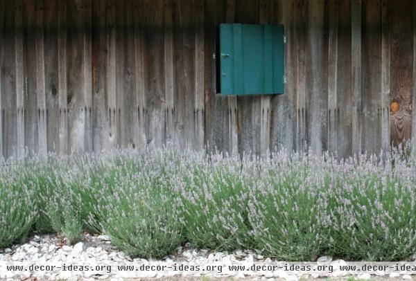
Green + wood = foolproof combo. Wood makes for one of the most natural, least fussy pairings with green — think of rows of lettuces in the garden atop wood mulch, bright green leaves against the gray-brown trunk of a tree or these thick tufts of lavender against the weathered wood exterior.
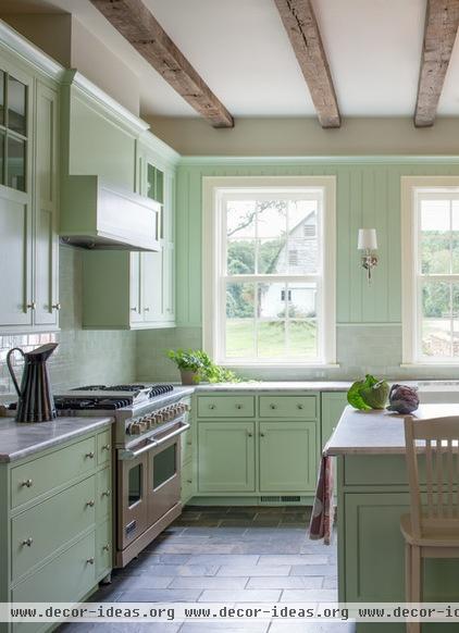
Using green and wood in the kitchen. Pale mint green on cabinetry and beadboard walls looks quite cheerful in this farmhouse kitchen. The thick, bare wooden beams overhead bring an earthy warmth to the space. If your home is not blessed with rustic beams, you could create a similar mood with simple butcher block counters or a rough-hewn kitchen table.
Be careful to choose a natural shade of green for eating and cooking areas — something too harsh could cast a sickly light on you and your guests.

Traditional greens. Duller shades of green with a bit of gray mixed in are most at home in traditional interiors. Think pea soup, moss, lichen and misty hillsides.
That’s not to say they must be very murky. Take these Shaker-inspired bookcases, for instance — the green is fairly vibrant but just subdued enough to look rich and natural.

A sumptuous study. Create a rich, handsome look in a study with deep green walls and bookcases, a roaring fire and a silky rug. Consider painting the trim the same hue as the walls for a seamless, elegant look.
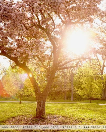
‘Spring Shine’ Photograph - $35 Bright, warm spring greens. Think sunlight on a dewy meadow, bright new spring shoots, bold green foliage and lemongrass.
These colors feel fresh, lively, modern and optimistic. With so much white and yellow in them, bright, warm spring greens beg to be paired with white, woods and other pale spring hues.
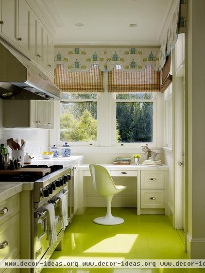
Ideas for bright, warm greens. Try a painted floor for a cheerfully unexpected touch in the study or kitchen. Paint thrifted wooden furniture or old wine crates spring green to liven up a white interior, or paint the walls of your breakfast nook the hue of a fresh leek.
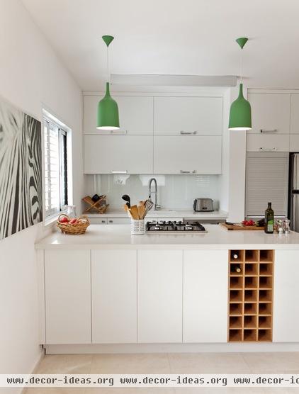
Green accents. Punctuate an all-white space with vibrant green lamps or pillows to give your room a quick wake-up call. Bright kelly green is a confident color that’s ideal for adding oomph to a space that seems like it’s missing something.
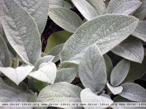
Silvery greens. Walking the line between gray and green, silvery greens are elegant and light, making them incredibly versatile. Think of lamb’s ear, olive leaves, eucalyptus and lichen on a craggy cliff.
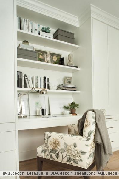
Ideas for using silvery greens. Subtle, pale silvery green makes a natural partner for whites and grays. Even a small touch of silvery green — in a fabric, a piece of art, a cushion — would be enough to add interest and depth to a neutral scheme.

Working with multiple shades of green. Muted shades of greenish gray are soothing, calling to mind old English country homes, and are quite easy to live with. Try a greenish gray on stairs, trim and built-in features, and a pale beige on the walls. If you are worried about finding shades of green that work together, try picking hues from the same paint chip card — or have your paint store make one green paint color you love into several tints by blending in different amounts of white.
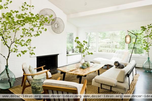
Practice with houseplants. An easy way to begin experimenting with greens is to bring in more houseplants, potted trees, cut foliage and windowsill herbs. If you have neutral rooms, you will find they suddenly feel more interesting and dynamic with the addition of living green things.

Photograph by Amy J. Greving - $30 Start noticing green wherever you go. Blades of grass, leeks in the market, fat spring peas in their pods, cabbage leaves, tulip stems, silvery sage leaves, dark green olives, moss, lichen … Take snapshots with your camera if you like — sometimes taking action can help focus attention.
At the end of a week of snapping photos of green wherever you find it, review the pictures and see which shades call out to you.
Tell us: Do you use green in your home? Would you like to? Share your favorite (or least favorite) green paint colors in the Comments.
Related Articles Recommended


