Houzz Tour: From Anonymous to Outstanding in Georgia
What started as a request to design a garage for the client’s cars veered off into a renovation of her 1,600-square-foot “mid-’50s, postwar Cape trickle-down,” as architect Timothy Hagan describes the canvas he was given. The client gave Hagan lots of freedom — more than he’s used to, he admits — in fulfilling her desire for something more open and contemporary.
The new design makes itself known on the street with a trellis above the elevated front porch, a hint at an interior whose key element is a wood ribbon that moves from front to back, ceiling to wall, tying the living and dining spaces together.
Houzz at a Glance
Who lives here: A lawyer
Location: Decatur, Georgia
Interior design: Suzanne Williams
Size: 1,600 square feet total, about half of which was included in the renovation
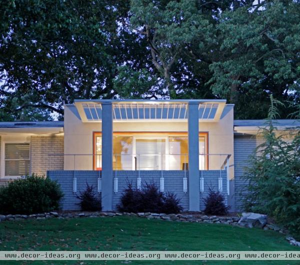
Front porches are sometimes seen as an antiquated element, things that hark back to a time before cars, television and the Internet. In Hagan’s hands this one makes a statement while also creating a semiprivate zone in front of the new window-filled entry. Without the columns, trellis and porch, the new entry would have been too open to the street, missing a transition.
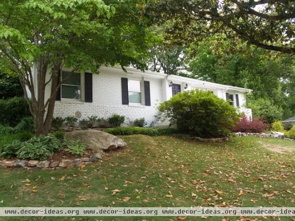
The house was fairly anonymous, its entry hidden behind a large bush and featuring decoration (shutters and sconces) at odds with its simple and then-contemporary design.
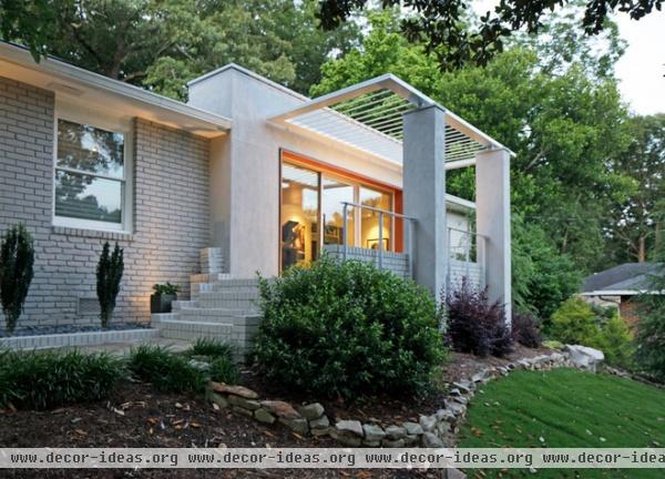
AFTER: Hagan turned something plain into something special. The path is the same as before, bringing guests to the entrance via a path parallel to the facade. The new porch elevates this movement, building the anticipation.
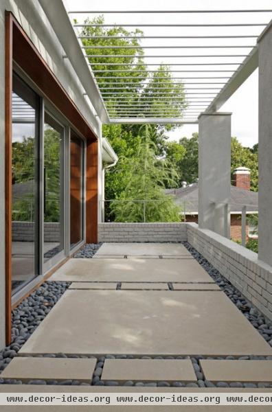
Limestone and black river stones continue the rhythm of movement toward the entry. The limestone extending to the exterior wall signals which glass pane swings open (it may look like a sliding glass wall, but it is a swinging door, a storefront system) to admit entry.
The low brick wall ties this space to the house, while the stucco piers and steel trellis create an open space that nevertheless feels contained. Steel railings are mounted to the face of the brick for safety, yet their design keeps the porch open.
Last, a frame in Cumaru wood makes a transition from brick to glass, while hinting at what is happening inside.
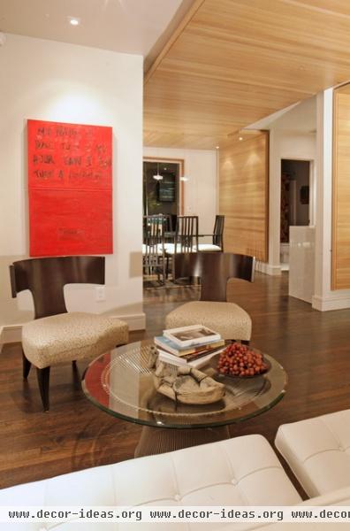
The space that Hagan renovated is an L shape, with one leg extending back to the dining room and the other extending to the right (beyond the frame) to create a large living room; a small extension of this space can be found at the left.
From this position near the front door, we can see the wood plane on the walls of the dining and living room, tied to each other through the ceiling. In addition to visually uniting the spaces, the wood ceiling “covers a less than perfectly flat transition across the ceiling between the two rooms where we removed a header,“ Hagan says.
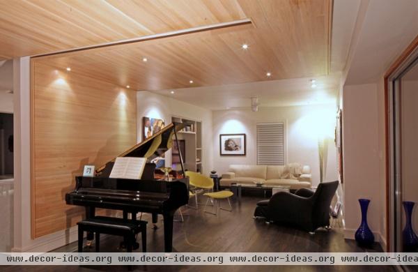
Shifting our view to the right, we can see the rest of the living room and how the ceiling seems to wrap down the wall by the piano; the gap in the wood ceiling helps it read like a ribbon. The far end of the living room was an underused bedroom; now it’s part of a generous space broken into distinct zones.
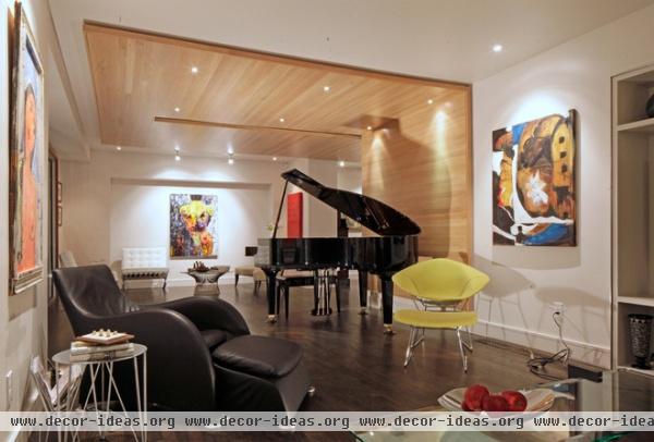
One zone is defined by the wood ceiling and wall, here occupied by a piano. A second zone is in the foreground, with a couch, chairs and a television (just out of frame to the right). The renovated interior highlights the client’s art and modern furniture — for example, by creating “frames” on the walls for paintings.
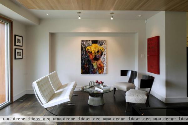
One such frame — a recess in the wall — can be found in the third zone near the front door. This small leg off the L is ideal as a seating area with the client’s modern furniture.
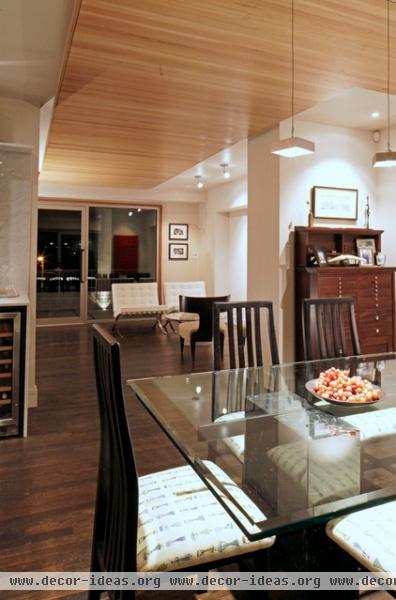
From the dining room at the back we can see the flow of the space toward the large glass wall and door at the front and the seating area beside it. Even though the rift-sawn white oak runs perpendicular to this front-back direction, the implication of movement is clear, just as with the limestone steps at the front porch.
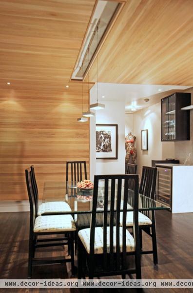
This view of the dining area is good for seeing the slot between the wood and helpful for understanding why it is there. While it creates the impression of a continuous ribbon from back to front and vice versa, this slot is also a gap for the pendant fixtures above the dining room table. It also acts as a transition between the different directions of the wood on the left and the right.
Note: While we can see a small bar beyond the table, the kitchen is actually behind us, in a part of the house that was not renovated.
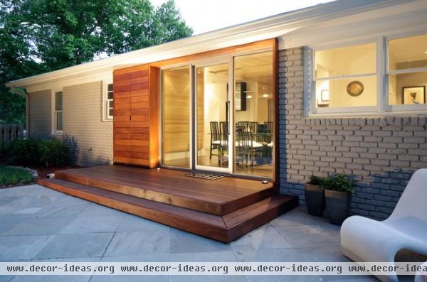
Hagan treated the back of the house similarly to the front, opening it up with a glass wall and door. He framed the glass opening with wood and defined an outdoor space through an elevated surface, in this case wood and without a trellis.
Here there is an extension of the wood frame on the side that makes it appear like the ribbon from inside has infiltrated the exterior. This extension is actually a set of wood doors with some storage behind it; the wood also covers the electric meter. This small detail helps to express that good design is ultimately a means of making the most of the circumstances, something Hagan has done here in about 800 square feet.


