Old-School Swagger for a Modern Powder Room
Interior designer Kirstina Crestin says her Ipswich, Massachusetts, client wanted a powder room that was handsome, but not so masculine that it didn’t have universal appeal. “He needed to keep it neutral enough for resale,” she says. Crestin’s mind kept reverting to a photo of Neal Caffrey, the character played by Matt Bomer on the TV show White Collar. “The way that character dresses is a throwback to a vintage gentleman,” she says. And that was just the kind of image she wanted to capture in this room.
Crestin was also inspired by vintage sepia-toned prep school photographs. They suggested the colors and materials she used, and added character to the room, where she incorporated them as accessories. Check out this new bathroom’s old-school swagger.

The bathroom was steeped in late-1980s Southwestern style.
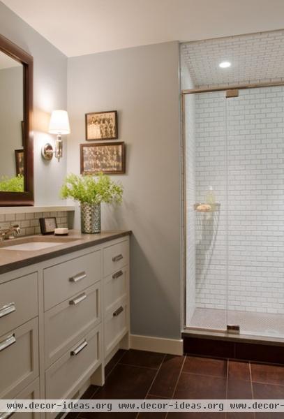
AFTER: “The bathroom rides the line between fancy and casual,” Crestin describes. Using streamlined menswear as inspiration helped keep the room looking clean, classy and deceptively larger. For example, the baseboards are crisp and unfussy, and there are no crown moldings to clunk up the ceiling in this small space.
Counter: Lagos Azul limestone with a honed finish; mirror: Restoration Hardware; all lighting: Visual Comfort; wall paint: Yarmouth Blue, Benjamin Moore; vanity paint: White Dove, Benjamin Moore
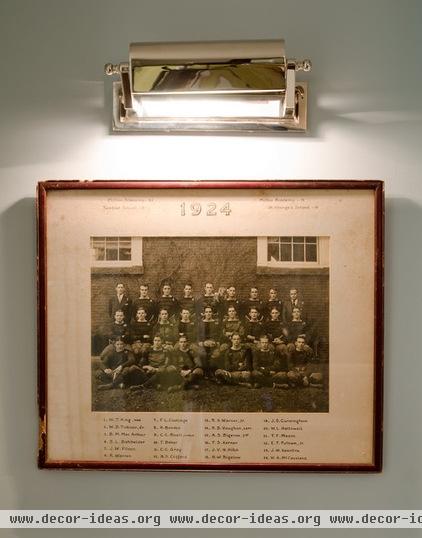
This vintage 1924 photo from local prep school Milton Academy isn’t actually of the owner, but a vintage find from one of Crestin’s favorite haunts, Salt Marsh Antiques. “The owner of the shop is very knowledgeable and pointed out several students who went on to become prominent citizens,” she says.
Accent pieces like this lend the room a masculine aura that could be switched out, if needed, to give the room a different look. The unexpected art light adds some illumination over the commode.
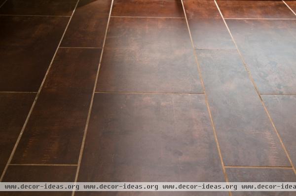
Inspired by the 1920s photo, Crestin sourced a tile that is ceramic but has a worn leather look, resembling the finish of a well-used club chair or a vintage football. “I needed the flooring to add richness and to ground the space well,” she says.
Next she chose a light blue-gray paint for the walls to complement the deep tones of the floor tile. The hue also keeps the room from looking strictly masculine.
Floor tile: Discover Tile, Boston Design Center
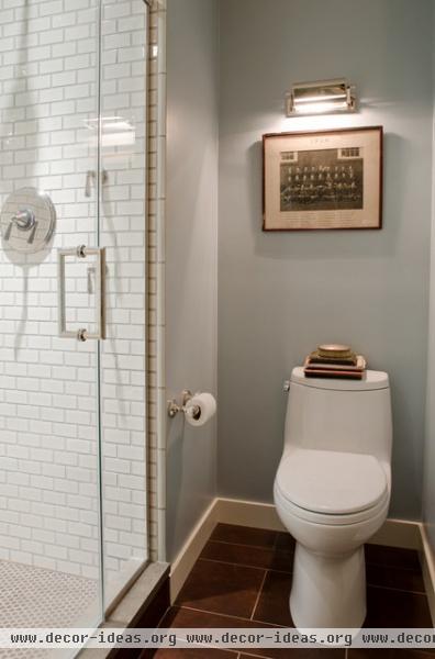
“I didn’t want to do just another subway tile, but I did want it to have universal appeal,” Crestin says of her shower tile selections. The 2- by 4-inch Ann Sacks tile was the right fit in size and color — its edges have a very subtle blue-gray tone that works well with the wall color. The penny round tiles on the shower floor are also from Ann Sacks and bring in some curves, like buttons bring to a pin-striped suit.
Toilet: Toto; shower door handle: 8-inch MT Series Round Tubing Mitered Corner Back-to-Back Pull in polished nickel, CR Laurence
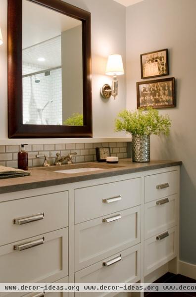
“This bathroom was not all about a vanity story, so we didn’t go with something superspecific, like a repurposed dresser,” Crestin explains.
The designer needed something that provided a lot of storage and would have wide appeal in case of resale. Thus, she designed a custom cabinet that nods to a furniture look, with feet that appear to lift it off the floor, doors with inset panels and vintage file-cabinet-style hardware.
Over the backsplash Crestin originally specified a rail wide enough to lean photos against, but the room’s tight dimensions didn’t allow for it. However, she kept the idea. “It looks intentional and helped us avoid an awkward bullnose at the top of the backsplash tile,” she explains. “It also relates nicely to the leather-framed mirror.”
Bath hardware: Lugarno line, Restoration Hardware; vanity hardware: Duluth pulls, Restoration Hardware
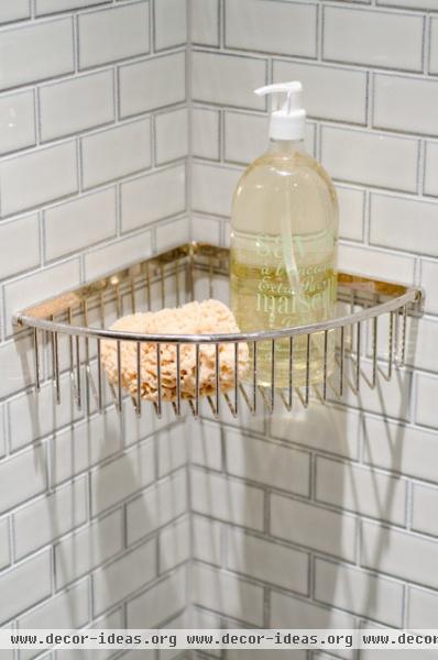
Small details matter. Crestin spent a lot of time seeking out fittings that were weighty and had presence, like this basket and the shower door handle.
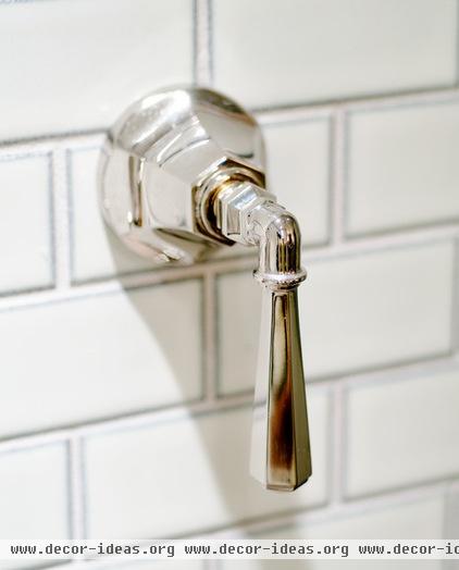
“When choosing a finish for the lighting, handles and other hardware, I knew we needed to dress the room up and mix in something with a nice sheen,” Crestin says. Trophies the homeowner had around the house inspired the idea to add shine via polished nickel. “It’s the room’s only ‘glitter,’” the designer says.
The finish accessorizes the room the way Neal Caffrey’s tiepins adorn his bespoke suits. (By the way, I’m s-t-r-e-t-c-h-i-n-g this Caffrey stuff as much as I can — any excuse to stare at the photo of Mr. Bomer during my workday … )
Shower and backsplash tile: 2- by 4-inch Savoy tile in Cottonwood, Ann Sacks; shower floor tile: ¾-inch penny round in bronze, Ann Sacks
More: Console Sinks for a Vintage-Style Bath


