My Houzz: From Dreary Storeroom to Modern, Light-Filled Home
http://decor-ideas.org 01/31/2014 23:23 Decor Ideas
Architect Peggy Betke and her boyfriend, Bouke Touw, a corporate finance manager, searched around Amsterdam for a unique space they could convert into a home. They finally found what they were looking for on the ground floor of an old brick building that was being used to store old doors and a boat.
It took six months — and a lot of labor and love — to adapt the space for human habitation. But with Betke designing and supervising the project, the couple ended up with a light-filled, contemporary home that feels domesticated but still retains an industrial edge.
Houzz at a Glance
Who lives here: Peggy Betke and Bouke Tauw
Location: Amsterdam
Size: 130 square meters (1,399 square feet); 3 bedrooms, 1 bathroom
Year built: 1933
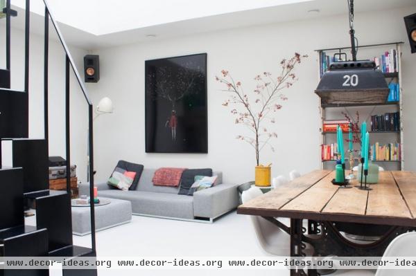
The first thing Betke and Tauw did was even out the floors. Part of the surface was angled, perhaps to make it easier to roll the boat in and out. To give the space a lighter and airier feeling, they poured new concrete floors and polished the surface to achieve a snowy white finish.
In furnishing the home, the couple chose pieces with metal elements and a rough, industrial look.
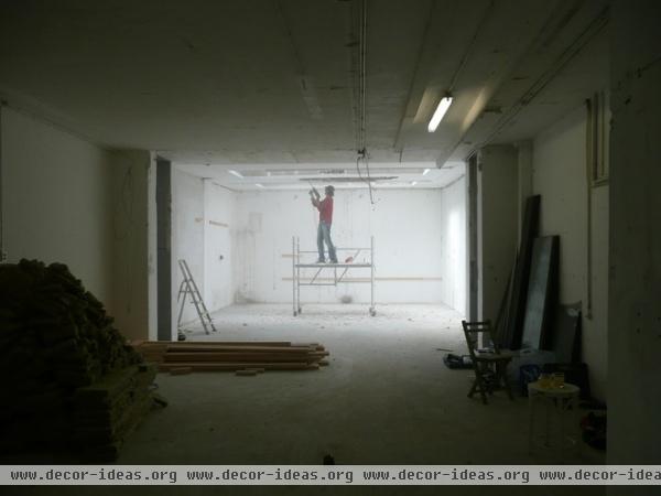
Tauw tore down the ceiling at the beginning of the construction project to install a sliding sunscreen. Here he is standing in what is now the living room.
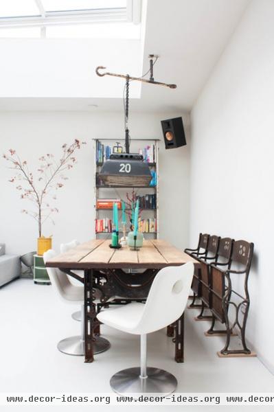
AFTER: The living room was built in the back of the storage space to mitigate noise from passing traffic. There were no windows in the walls back there, so Betke had to work with the two small roof windows that were already there. She enhanced and enlarged them, creating an oversize construction consisting of three automated sliding sections that can be opened individually.
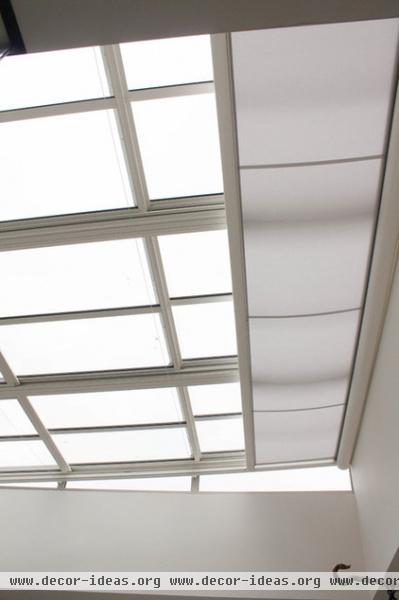
Here’s the new roof window. The automated sliding sunscreen allows the couple to control incoming light.
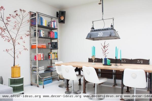
Most of the furniture and interior elements are either vintage, secondhand or industrial in nature. “I have a few favorite [sources] for industrial items,” says Betke. The books are sorted by color.
Bookcase: Jan van Ijken; lamp: 360 Volt; table: Vivre; theater chairs: Neef Louis
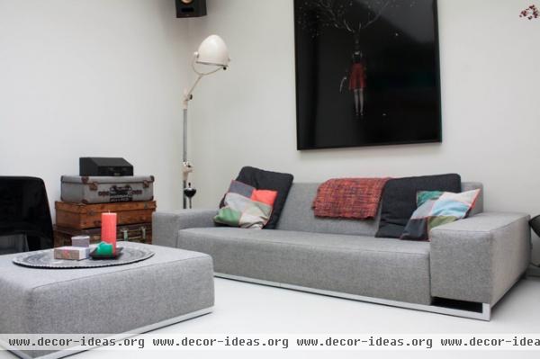
The couple likes simple, sleek lines, so they chose a low-profile gray sofa and matching ottoman from Hulshoff Design Center. Above the sofa hangs a Meryl Donoghue painting Betke and Tauw encountered at an exhibition and couldn’t get out of their minds. Betke says, “We like it because it is whimsical, quirky and robust at the same time, due to the pistol she is holding.”
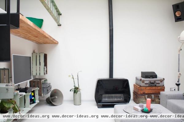
Betke loves decorating with secondhand finds. The heater is from Marktplaats, and the suitcases are vintage.
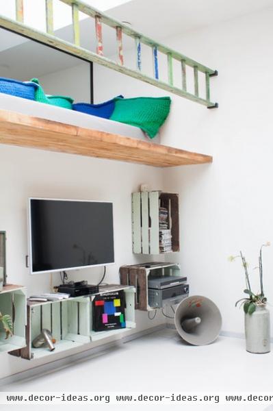
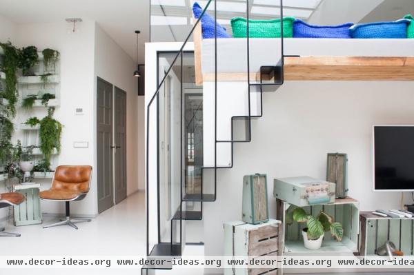
Betke painted secondhand crates and mounted them to the wall for extra storage. A detachable ladder serves as a railing for the loft lounge above. “In the summer we open the roof window and lay here in the sun,” says Betke. “And on summer evenings it is the best place to relax with a glass of wine.”
Betke made the pillows and daybed herself.
Crate paint: Mint, Flexa
The doorbell hanging from the ceiling to the right of the vertical garden is a quirky design by Peter van der Jagt; it’s made from two wineglasses suspended on either side of a clapper.
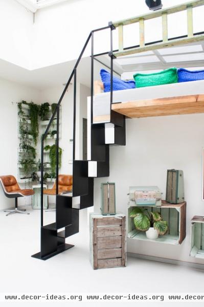
A geometric steel staircase leads to what the couple calls their chill zone, added to compensate for the lack of a garden or balcony.
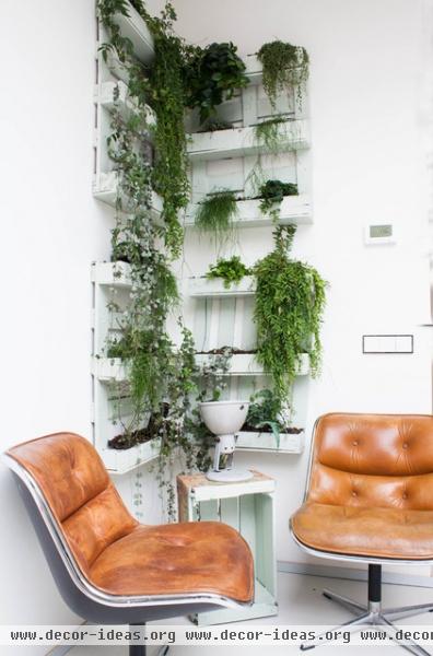
Two leather swivel chairs from Knoll form a cozy reading nook in the corner. Betke made the vertical garden by deconstructing a pallet and painting the pieces white, then applying fish pond liner to resist water. The plants include Hedera, blue fern (phlebodium aureum) and japhrolepis (aeschynanthus).
A painted apple crate serves as a side table.
Crate paint: Mint, Flexa
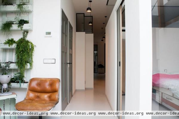
The couple built the bedrooms and bathroom in the middle of the space because those rooms need the least light. To conserve space they chose sliding doors for the bedrooms and used the original doors they found for the bathroom and toilet. All the doors are painted light gray.
To bring more light into the master bedroom, Betke designed broad windows on two sides.
Pendant lamps: Flos
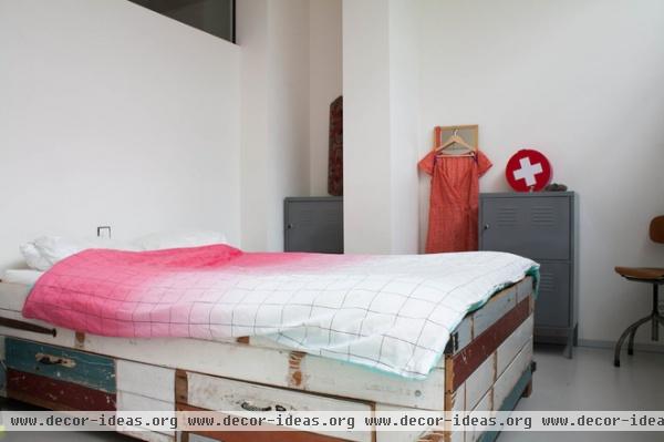
Betke designed and made the bed from scrap wood.
Comforter: Minimal, Scholten & Baijings for Hay; gray locker cabinets: Ikea
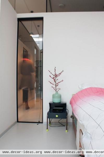
One of the new bedroom windows is shown here. “It makes the room lighter and adds an extra sight line,” Betke explains, “because you can see straight to the kitchen and front door.”
She continues, “We also kept the walls low on all the bedrooms, with glass above them. If we had the walls stretching to the ceiling, there would have been less light and it would have felt much more confined.”
Pendant lamps: Flos
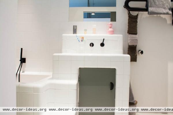
Betke staggered the height of the bathroom vanity to echo the living room stairs and to make it easier to climb into the tub.
Faucets: Zucchetti; tiles: Dtile
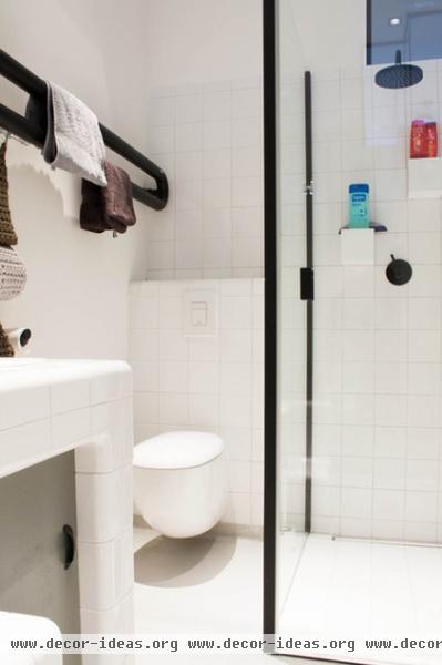
The oval-shaped heater mounted on the wall doubles as the couple’s towel rack. The shower enclosure mimics the design of the front entry.
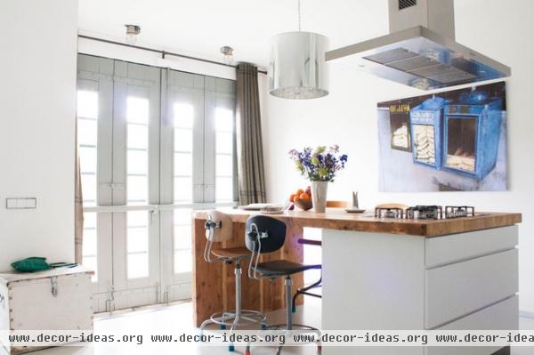
The entryway opens up into a spacious kitchen. Betke and Tauw set the kitchen in the front part of the space, adjacent to a busy street. “The kitchen is where one is usually active, and where one needs less privacy, so we thought it would be better to have it here, instead of in the back with the living room,” says Betke.
Joost made the custom island. “We like the rough plywood,” says Betke. “It is robust yet also adds warmth.”
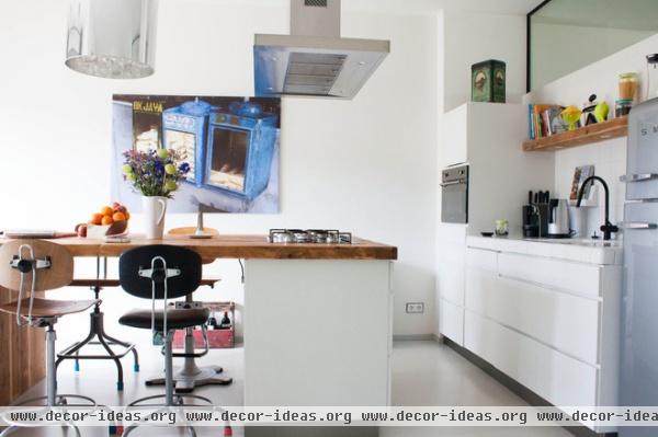
The backsplash tiles were designed by Peter van der Jagt and are available from Dtile. The kitchen cabinets are an affordable Danish design by Kvik, and all the appliances are by Smeg.
Betke collected the stools from different places. “I started with the two showing and found the other two later on,” she says. The print is a photo she shot in Indonesia.
Faucets: Zucchetti
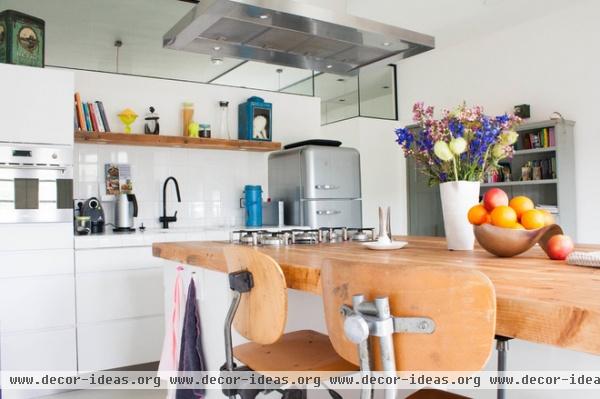
Windows between the top of the wall and the ceiling help keep cooking odors to the kitchen but let light in.
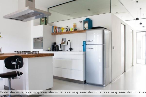
Although the front of the house isn’t as bright as the rear, illumination still manages to make its way here from the roof windows in back, thanks to the interior transoms and light-sharing hallways.
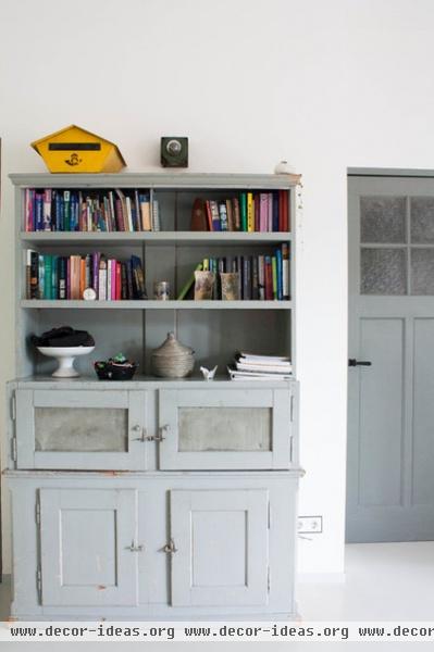
A vintage cupboard holds books and mementos in the kitchen.
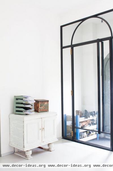
Betke designed this glass and steel door between the entry hall and the kitchen.
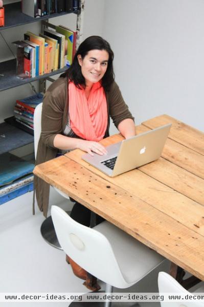
Betke works on design projects at the dining table.
See more photos of this house | Show us your home!
Browse more homes by style:
Small Homes | Colorful Homes | Eclectic Homes | Modern Homes | Contemporary Homes | Midcentury Homes | Ranch Homes | Traditional Homes | Barn Homes | Townhouses | Apartments | Lofts | Vacation Homes
More: 5 Incredible Home Conversions
Related Articles Recommended


