Basement of the Week: A Creative Space for Kids and Storage for All
Interior designer Justine Sterling was tired of her family’s having to enter their lovely colonial home through a dank basement, and craft projects had overtaken the kitchen upstairs to the point where it was hard to find cooking or eating space. In addition, her family’s home had no usable attic space and needed storage for items like wrapping paper, sports equipment, seldom-used platters and excess dry goods. Here’s how she crafted a bright, light and bold spot that serves as her children’s art studio while meeting the whole family’s storage needs.
Basement at a Glance
Who lives here: A couple and their 2 kids, Ruby (age 6) and Reid (3)
Location: Melrose, Massachusetts (just north of Boston)
Size: About 400 square feet; includes a powder room
Budget: About $20,500
Photography by Jessica Delaney Photography
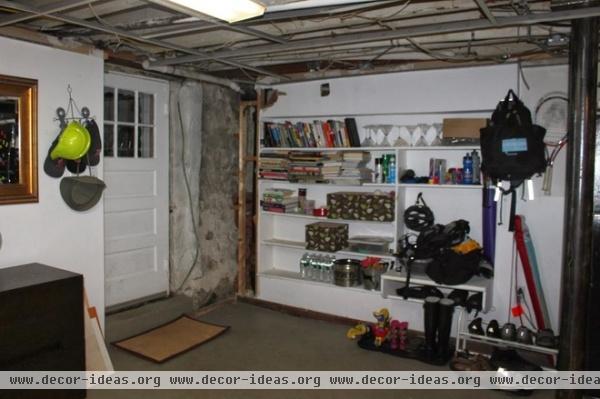
The door here is the main one the family uses to enter their house from their driveway. The dark reception area was far from welcoming.
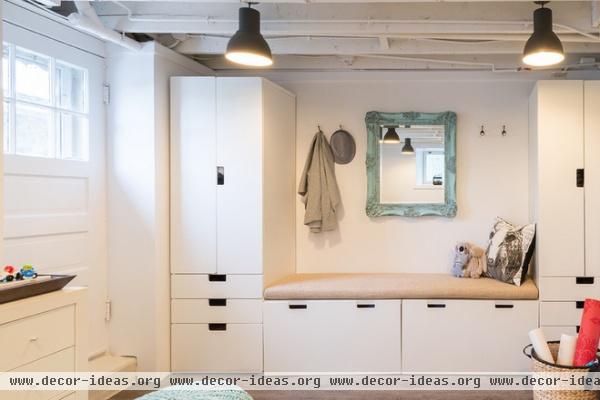
AFTER: Thinking about how her family bundles up helped Sterling track down the best mudroom organizing system. The children use one wardrobe, and the adults use the other. The bins under the bench contain baskets for dry shoes, and every family member has a drawer for gloves, hats, mittens and more. “People are amazed when they see my kids come in and put that stuff away, but it had been my goal for a long time. I pushed them for a while, and it worked,” Sterling says.
Cost breakdown: Because Sterling is a designer, there were no design fees for this project, but construction totaled about $17,000 (including permits, demolition, asbestos removal, new work, new doors, trim, electrical, lighting, plumbing, painting, flooring and installation of everything). The furniture, rugs and other accessories cost about $3,500.
Bench, wardrobes: Stuva, Ikea
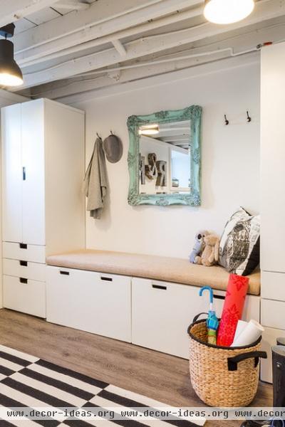
Measuring carefully, Sterling found that this system from the Ikea kids’ line best fit the space, with about a half inch to spare. She had a custom cushion made for the bench. She’s originally from Johannesburg and says, “I always like to add a touch of South Africa to my personal spaces, like the texture in the yoga mat basket.”
The mirror also hails from Johannesburg; it was one of her first decorating purchases and has traveled with her wherever she’s lived. “It started off gold gilt, but this its third color I’ve painted it since I bought it,” she says. “I love black and white and neutrals but knew this area needed a little color.” She painted it aqua, then used a glaze from Home Depot to give it a patinated look.
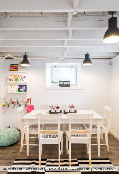
“Right now, my daughter is the collagist, painter and crafter, and my son just wants to copy whatever she does,” Sterling says. “My kitchen was being overtaken by crafts, and not having any room to cook or eat was driving me bonkers!”
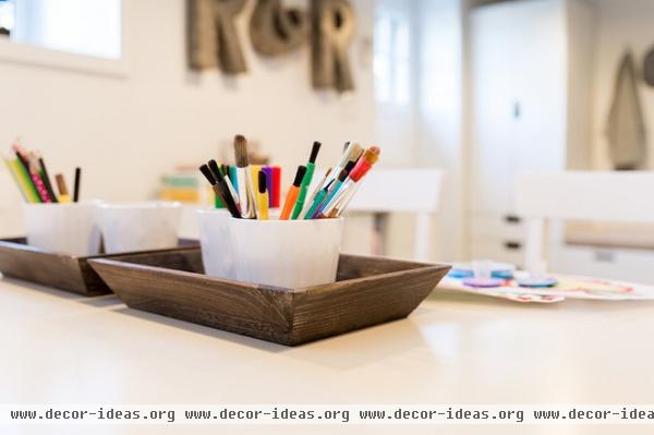
Thus, the focus of the new room is creative play and art. The kids love to play games, paint and play with Play-Doh and stickers at their craft table, and everything they need is close at hand in baskets and in the buckets hung from a rod on the wall. The space is an electronics-free zone — no Wii, no WiFi, no TV.
Displayed work adds color to the mostly black and white space; Sterling hung picture rails and curtain rods with clips for easy propping and hanging.
The chairs also bring in a South African touch. A modern take on Riempie chairs, they were part of a collaboration between West Elm and South African design studio Source. Sterling scooped up six of them on sale.
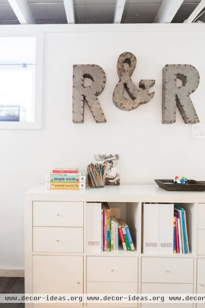
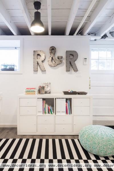
The “R & R” stands for “Ruby and Reid.” While the space is free of electronics right now, Sterling did have this wall wired for a future TV. “When the kids are about 12, I know this probably will be their hangout area with friends,” she says.
Two windows as well as the glass in the door give the room a decent amount of natural light; the white walls help bounce it around; and the lighting scheme makes up the rest. Because the ceilings were only 8 feet high, the team ripped down the drop ceiling and left the rafters exposed. This made the ceilings feel higher and left enough room to mount 12 black industrial pendant lights. They ripped out wiring that dated back almost 100 years, added new wiring and spray painted it and the entire ceiling white.
Sterling outfitted the Ikea pendant lights with $35 LED bulbs, so that the running costs of the basement wouldn’t be too high even if someone forgot to turn off the lights every now and then. “The bulbs actually cost more than the fixtures themselves,” she says.
Letters: Zentique; shelves: Expedit (outfitted with drawers and doors), Ikea
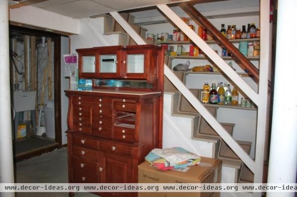
The exposed staircase could have meant a costly railing installation; Sterling opted instead to add a bold accent wall.
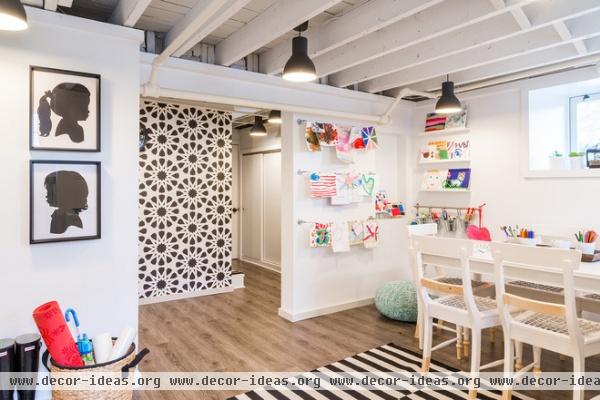
AFTER: Graphic wallpaper packs a visual punch on the staircase wall (the stairs are on the other side). “I loved this pattern because it’s very graphic but also kid friendly,” Sterling says.
Structural columns dictated where walls needed to go, including the art wall and the wall with the silhouettes of Ruby and Reid. This was one of several tricky layout challenges Sterling faced.
Rug: Stockholm, Ikea; wall covering: Alhambra, Wolf-Gordon; poufs: Land of Nod
The basement has had its problems with moisture, which Sterling attacked in several ways. One, she had the downspouts rerouted so they wouldn’t let water collect close to the retaining walls. Two, she had the walls semiwaterproofed with green board. Three, the family runs a dehumidifier during humid months.
The flooring is a vinyl plank tile that keeps the space dry. Sterling had the original concrete floor evened out before the tile was laid; the pieces simply interlocked without any glue required, and standard baseboard covers the edges.
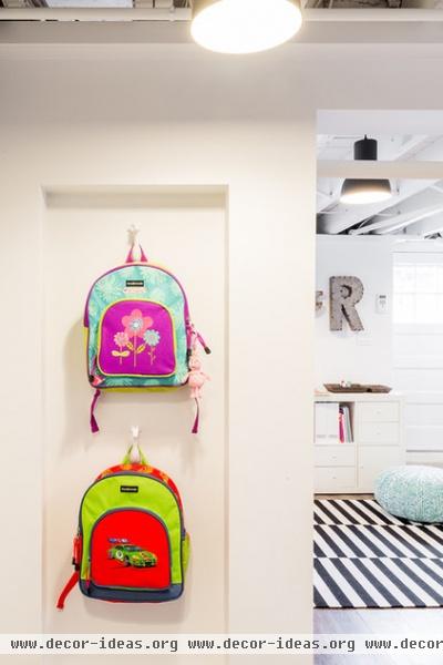
Hooks in a niche behind the art wall hold backpacks. This hallway leading to the laundry includes a pantry, a refrigerator and baskets for storage.
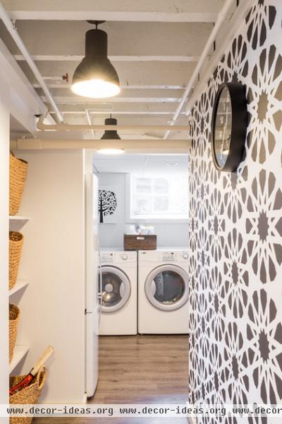
“I wanted to keep the laundry down here, because right now the kids love to be where I am, which means they’ll follow me down, then play down here,” Sterling says. The space also has a second refrigerator for extra storage and snacks for the kids.
The baskets to the left are a work in progress; right now each one contains equipment for different activities, like swimming or skating.
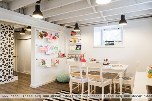
The craft table extends an extra foot on each end. “You can cram a ton of kids at this table,” Sterling says. In fact, Reid’s third birthday party this past October marked the new room’s debut. Kids came down here to do crafts and get their faces painted at the safari-themed bash.


