Room of the Day: The Most Flexible Foyer Ever
http://decor-ideas.org 01/29/2014 04:22 Decor Ideas
When Kimberly Saunders DuBose, a designer for Ethan Allen in Wilmington, North Carolina, was asked to reimagine a garage as a living space, both her design skills and her artistic talents were put to the test. The man who was renting the apartment over the two-car garage ending up purchasing the building, and because his preferred method of transportation was a bicycle, he hired DuBose to integrate the parking space with the living space. Working with a limited budget, she used color and paint to make an entry that is not only used for storage and exercise, but as a way to provide a warm welcome.
Photography by Daniel Ray
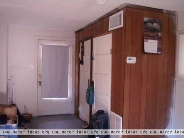
This shot shows the nothing-special nature of the garage before the remodel. When DuBose’s client bought the building, it was decided that one of the parking spaces would become the entry.
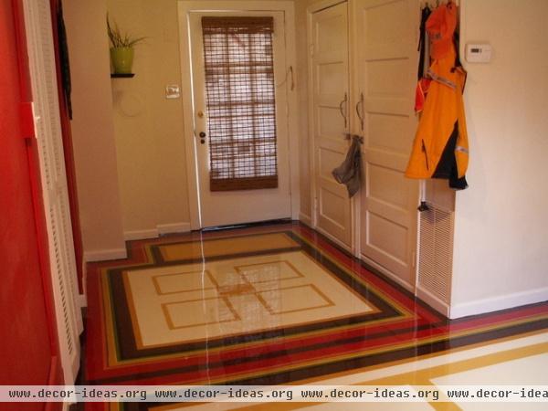
DURING: Because his bicycle is parked here, the owner wanted a durable floor covering. DuBose, who is a fine artist in addition to a designer, came up with the idea of painting the concrete floor for a surface that’s friendly to both feet and wheels. While her client, a professor at a nearby university, was out of town for the holidays, she had the floor acid washed and primed with a commercial-grade concrete primer. It was only then that she started to work; the designer’s shot here shows the project coming together.
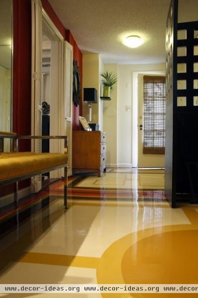
AFTER: DuBose broke the space into zones delineated by the floor patterns. The area nearest the door acts as a welcome mat.
“I had done a few spatial sketches,” she says. “But I had no firm idea about what it would look like until I got in there with my pencil, tape and straight-edge ruler.” After she completed the designs, she sent photos to the client for approval before having the floor sealed with a commercial-grade epoxy.
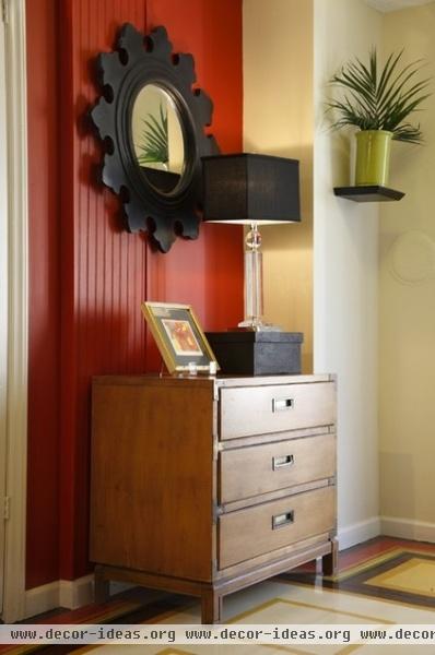
“Budget was tight, so I got some pieces, such as this campaign chest, from a wonderful local consignment store,” she says. “The mirror and lamp came from Printer’s Alley.” The small dresser has more than good lines. “He needed a place to put his keys when he came in the door,” DuBose says. “And, because he asks guests to remove their shoes and put them in a basket when they come in, he keeps socks in the bottom drawer for people who need them.”
The bold red-brick wall color helps camouflage some design awkwardness. “There were several different kinds of wall material,” says DuBose. “The strong wall color helps the eye skim over that.” In fact, it’s DuBose’s feeling that the bold patterns and glossy floor detract from the not-so-desirable popcorn ceiling that was left for budgetary reasons.
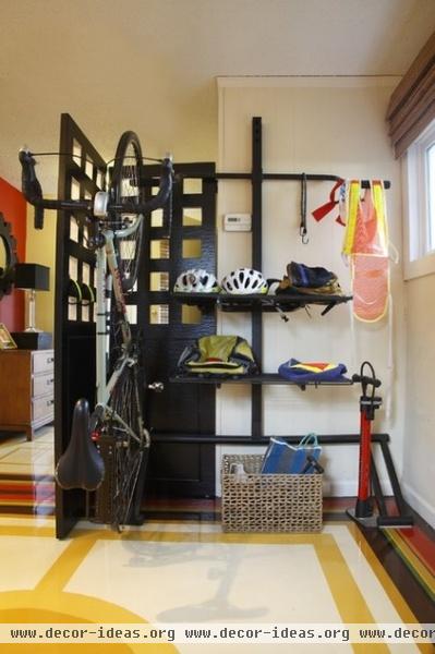
Walk farther into the space and you will see the utilitarian secret concealed by a screen (a 200-pound behemoth that was also scored at a consignment store). A bike rack with shelves makes sure that the items the owner uses every day are within reach. “I wanted to make it so he didn’t have to dig for anything,” says DuBose. “We got a rack for two, so his visitors have a place to store their bikes.”
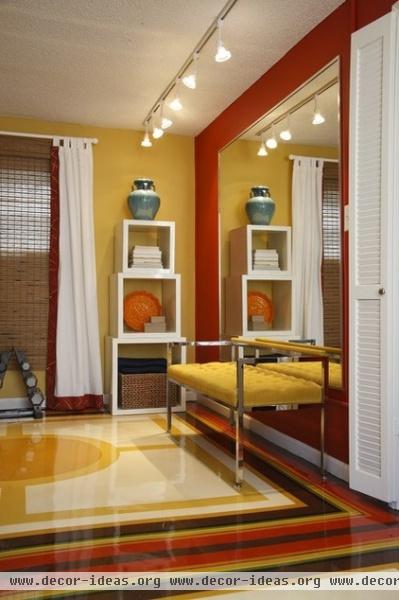
In the same zone, DuBose installed a large mirror. “He likes to meditate, do yoga and work out, and this gives him room to do it all,” she says. “The circle is meant to represent the sun, and that is where he sits while meditating.” DuBose created the circle by securing a length of string to the center of the room before tying the other end around a pencil and, keeping the string taunt, drawing a circle.
Maybe because the project had her tapping into her different skills, DuBose calls it one of the most satisfying she’s completed. She says, “The whole thing was a cross between drafting and painting.”
More: Previous Room of the Day
Related Articles Recommended


