Design Workshop: The Intriguing Effects of Exposed Framing
Architects refer to the underlying structure of a home as the bones. This structural frame, so fundamental to architecture, is often concealed behind finishes, layers of drywall, wood, tile and cabinetry. Exposing it to view and incorporating it into living spaces provides a number of interesting opportunities and unique visual effects. It’s not, however, trivial to do so.
While many people have fallen in love with the aesthetic of exposed studs on the interior — in a summer cabin or a fishing shack, for example — today’s energy codes now largely dictate a basic level of insulation on almost any structure. But there are ways to preserve the look of exposed framing and its magical effects without sacrificing a building’s energy performance. Let’s look at some.
Natural Connections
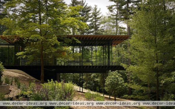
This addition to a glass house in Connecticut essentially comprises two elements: wood and glass, both referencing a sylvan landscape. The architect has plainly exposed the roof’s black spruce structural members, a simple move that harks back to the wooded site in material and form.
The broad horizontal overhang moves the eye toward the surrounding forest. The repetitive structural bay mimics the pattern of trunks, and it’s a bright overhead field of color that counterbalances the dark Brazilian walnut floor and recalls the airy forest canopy. The slender ceiling joists contribute to an overall sense of lightness and a delicate, hovering roof plane.
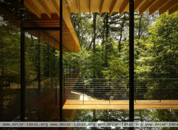
Insulation for the roof level occurs above the roof rafters and maple plywood sheathing. Moving the plane of insulation above the roof rafters established a continuous plane of insulation. This insulation prevents the wood of the rafters from conducting heat from the interior to the exterior and has an even greater R-value, because it eliminates the joints between different materials. Joints invariably expand and contract at differing rates, allowing for the infiltration and movement of air.
In most cases, insulating a structure with exposed framing on the roof or walls requires pushing the plane of insulation toward the exterior. This will increase the thickness of the wall or roof by the depth of the insulation and final finish, but has the benefit of achieving a better overall insulation value.
Crisp Interiors
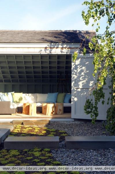
The reading lounge shown here takes full advantage of the exposed framing to offer a textured, sheltering space in which to linger. By painting the interior framing, the architects dressed up what could’ve been a mottled and informal interior. Yet it remains relaxed. To my eye it appears crisp and balanced between informal and formal. The finish creates punchy shadows and plainly reveals the way the building is constructed.
Paint can conceal knots and other imperfections often found in framing lumber, and it will often allow the use of a lower (less expensive) grade of framing. The color chosen can markedly change the mood of the space. Darker colors add visual weight, reduce the perception of volume and foster an intimate feel, while brighter colors enlarge the sense of space, increase reflected light but also tend to highlight imperfections and show wear and tear more readily.
Formal
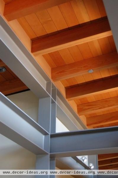
Not everyone finds the informal cabin an appealing aesthetic for everyday living. The framing shown here was selected for its uniform appearance. Wood is categorized and sold based on visual appearance. A strict set of grading rules describes visual characteristics that certain grades of wood are allowed to have (knots, imperfections, voids, checks etc.). The clearer the appearance, the higher the cost. This project makes use of a very high grade of wood selected for its uniform grain and coloration. It fits with the refined, controlled aesthetic.
Informal
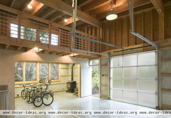
A detached garage is the ideal setting for revealing raw, unfinished wall construction (a connected garage requires a fire separation and Sheetrock). The plywood walls lend warmth to what is traditionally a cool space, and the open studs offer the freedom to hang various objects, such as tools and racks.
The stud bays can be subdivided for shelving, and eliminating the need for finishing increases future flexibility while saving money. Leaving the framing members in a wall exposed should be paired with a strategy for dealing with things that are typically concealed behind a wall finish. This typically includes the mechanical, electrical and plumbing infrastructure. As long as these elements are intentional, designed components — metal conduit for wiring, cast iron for plumbing, rigid ductwork — they’ll feel completely appropriate.
Scale
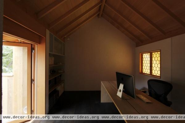
Part of a natural palette of building materials, this tongue and groove ceiling illustrates a common method of exposing roof rafters and framing. The roof rafters, running from eave to ridge, support a field of horizontal tongue and groove planks. Above these planks sit the roof insulation and finished roof covering. The result is a warm texture of wood slats sitting above the ceiling framing.
By exposing the framing in one particular location, the architect altered the scale of the room, breaking up the room into its component parts: the dark floor, the light walls and a neutral-tone ceiling.
Exposing the structure on a ceiling has other advantages too. It gives the space a distinct look and texture but with less dust and fewer cleaning issues than with exposed wall studs. This hybrid approach (exposing only the ceiling or only the walls) is great for small spaces, which can seem larger when individual assemblies are highlighted.
Integrated Storage
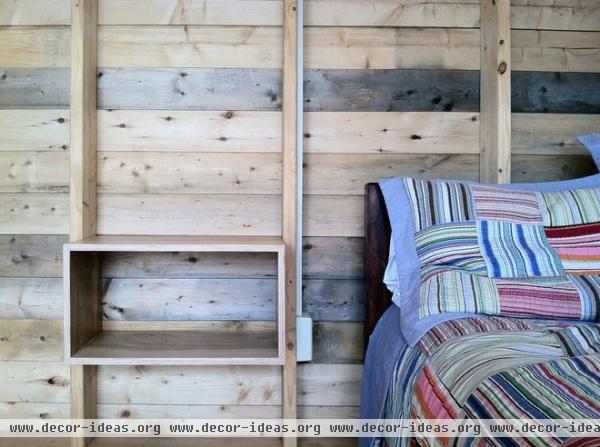
The architect here worked with the structural bay created by the stud spacing and inserted a small nightstand. Opportunities abound for this type of storage solution within exposed-framing stud bays. Elsewhere in this project, the 2-by-6 vertical wall studs have 2-by-8s bridging the opening horizontally, which effectively creates a pattern of 7¼-inch-deep shelves every 16 inches on center.
Historic Detail
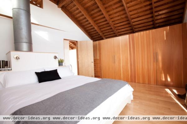
Oftentimes renovation work involves completely tearing out old framing and starting over. By integrating existing exposed framing when possible, you preserve a piece of history while simultaneously adding a reclaimed, environmentally responsible interior finish. Skip (or spaced) sheathing, the ladder-like horizontal boards seen here, can be found under many older roofs.
The purpose of the spaced boards was to provide the shingles above a means to dry and a way of ventilating them. This prolonged the shingles’ lives and made for a cooler roof. By placing sheathing above this existing skip sheathing, the architects preserved the patinated structural members and made them an integral part of the interior space. Their warm tone and texture gives life to the ceiling plane and makes the large vaulted room feel welcoming and cozy.
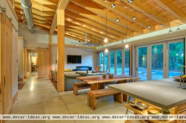
Added Volume
Expressing the structural framing members, whether in the walls or, as in this space, the ceiling, will usually increase the apparent scale and size of a room. This is for a couple of a reasons, the most obvious of which is that the volume between the rafters has been incorporated into the space below. The second and perhaps subtler effect is caused by the repetition of small members. This tricks the eye into thinking the space is larger than it really is. The effect can be manipulated depending on intent — larger spacing and fewer members will reduce the scale; more members will increase it.
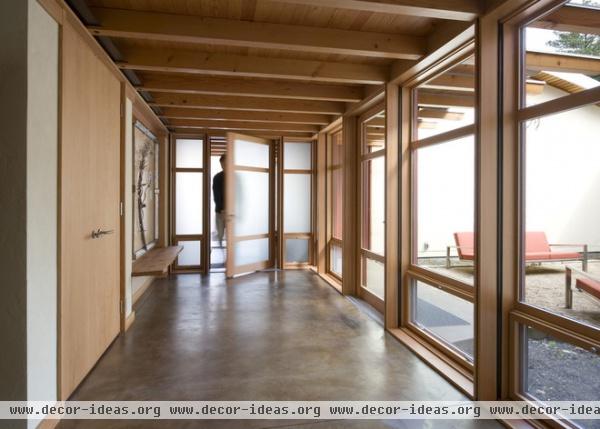
Link Interior and Exterior
Notice how the roof rafters appear continuous between interior and exterior here? By visually linking the interior roof construction with the exterior, the architect made the interior space not only feel more connected but appear larger too. Overhanging roof planes are a perfect opportunity to orchestrate these types of interior-exterior connections. They quite plainly describe how the building is put together and provide all of the color rendering and architectural drama the space requires.
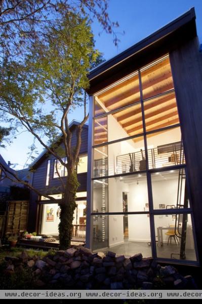
Color and Texture
Without the natural wood to warm up this space’s overhead ceiling plane, the primary tones would be white and gray. Leaving wood in an unfinished state captures the natural beauty of the material and requires lower up-front finishing costs. Exposed plywood can be rough and full of blemishes (as in the garage space seen previously), or it can be specified with different facings for a more finished appearance. When choosing to expose the framing members and plywood sheathing, it’s important to remember this and to match it to the desired aesthetic of the space. The textured, shadowed ceiling has a strong presence in this space, rendering it relaxed, informal and inviting.
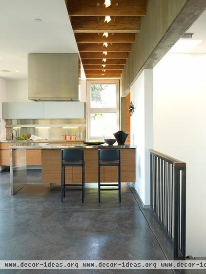
Movement
Exposed ceiling members marching along at a regular interval can establish movement — here directing the eye toward the view beyond. The unfinished wood ties nicely with the cabinetry and feels a part of the humble materials selected for the living space. The added height offered by the framing interval has been cleverly married with the interior lighting concept, which further suggests movement and makes for a dynamic space.
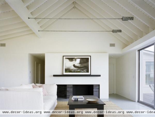
Lightness
Painting the framing members white or off-white preserves the textured interplay of light and shadow but raises the vertical dimension of a room significantly. Not surprisingly, it also reduces the “hat” effect that natural wood finishes in a ceiling plane can sometimes create. This space feels clean and minimalist, but not without interest and detail. White framing members can often feel cottage-like regardless of the scale of a space.
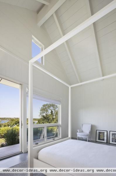
The interior architecture isn’t competing with the surroundings here; the monochromatic interior treatment suggests a deferential attitude. Subtle details of connections and individual boards are the only architectural adornment in this space. This doesn’t, however, equate to boring. The space is confident and full of nuanced interest. The shadow of the exposed element paints delicate lines of gray shadow on the white ceiling.
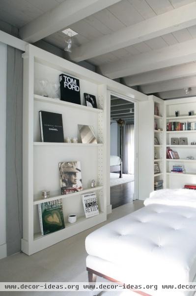
Minimalist Detail
Exposed structure can also work with a minimalist space, especially when painted in a neutral tone. Noted for its restrained styling, minimalism seeks no extraneous decoration. This room shows how an exposed structural concept can feel at home in a minimalist aesthetic. Leaving the painted ceiling framing without cover fits a “No more than necessary; no less than than required” mantra quite nicely. It quietly expresses its necessary function.
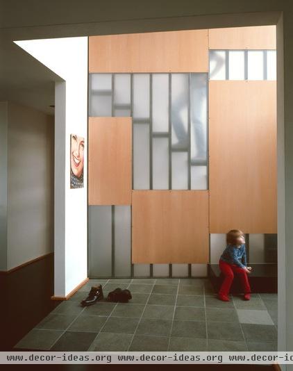
Whimsy
I’ll close with this image, which I find really delightful. Challenging conventional ideas about how to assemble buildings and their components, like a stair, is one of the most enjoyable aspects of architecture for me personally. How often have we moved through our homes without giving a second thought to how we do it? Your answer, I’m guessing, is “All of the time.”
Engaging the senses in the simple act of climbing a set of stairs incites wonder and contemplation. The architect deliberately left the walls framing the stairs exposed to view through a carefully selected mosaic of translucent and solid panels. This simple gesture, integrated with the framing members, adds dimension, connects spaces, permits light and can’t help but make you smile.
More: Design Workshop: Just a Sliver (of Window), Please


