Houzz Tour: Part Traditional, Part Modern and All Family Friendly
http://decor-ideas.org 01/24/2014 06:23 Decor Ideas
She’s more traditional; he likes modern; and they need their home to be family friendly to boot. Maria von Hartz and Annie Fitzgerald of vonFitz Design paid attention to how this family lived and plucked the best elements from both their styles. “The house itself is comfy and traditional but open; it’s kind of a loft-like farmhouse,” von Hartz says. Not only did they find a balance between the two styles by mixing pieces, but they designed elements that incorporated them both. More important, they designed the house with every family member’s needs in mind.
Houzz at a Glance
Who lives here: Ben and Lilli Lee and their 3 boys
Location: Los Angeles
Size: About 5,400 square feet; 5 bedrooms, 5 bathrooms
Photography by Shooting LA
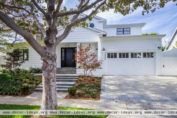
The Lees bought the house to remodel it, but it wound up being one of those projects that’s technically a renovation because they left one wall up during construction. The team kept an overall traditional feel that incorporated clean, modern lines and motifs, such as the X-shaped elements (seen here on the garage doors) and lots of white paint punctuated by blue-black details.
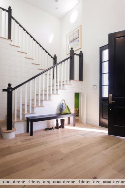
The foyer hints at what awaits inside. The bannister and newel posts are a modern-traditional mash-up. The walls are bright white, while the front door and sidelights have a more traditional look.
“The walls are just MDF scored with lines to resemble tongue and groove planks,” von Hartz says. “This brought in a traditional element while making sure the lines were superclean, crisp and modern.” Likewise, the baseboards have no curves or ornamentation, and there are no ceiling moldings.
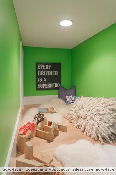
The designers considered the couples’ three young boys with every decision. This little hideout is underneath the stairs.
See more hidden forts
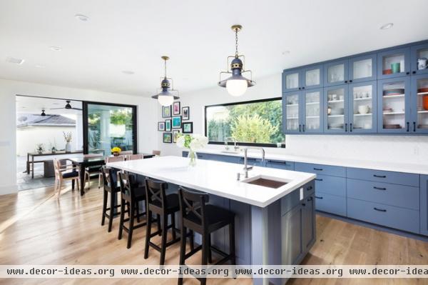
WIth the family’s love of cooking and constant entertaining, and with the kids around, the kitchen is the heart of this home. A large island seats everyone, provides loads of storage and offers an extra sink for food preparation. The shapes on the backs of the stools have an X theme that subtly continues through the house.
Ben Lee’s real estate business means that sometimes as clients prepare for resale, their trash becomes his treasure. The vintage pendant lights you see here had been in pretty rough shape and terra-cotta in color. The team had the castoffs refurbished, and now they are unique fixtures the Lees love.
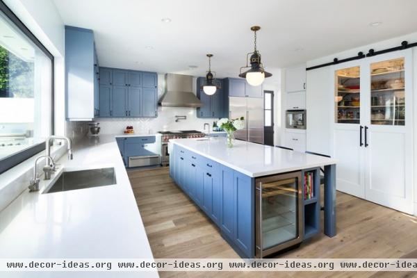
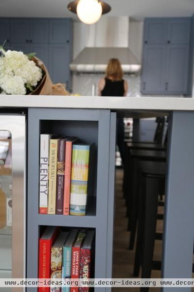
The island has a cookbook shelf and a refrigerator for the kids stocked with drinks for them, and every shelf is within their reach.
“We used indestructable, hardworking surfaces everywhere,” Fitzgerald says. “The white oak floors only get better looking with more wear, and the Caesarstone counters can take a beating.”
Range: Wolf 48-Inch Dual Fuel Range With Grill; flooring: white oak in Provence, French Connection by Garrison
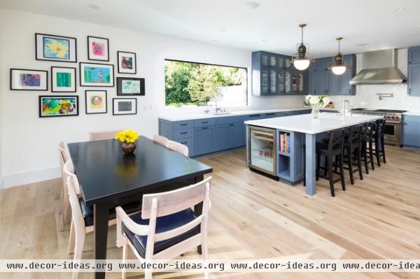
“Making everything transition from indoor to outdoor with ease drove the design,” von Hartz says. The 9-foot-long window over the sink also serves as a pass-through to the patio. Using a cut-to-size pocket door and integrating the kind of motion sensor that makes grocery store doors open like magic, contractor Ronnie Friedman of A1 Construction and Design invented a large pass-through window that slides into the wall with the wave of a hand; no crawling onto the counter or straining one’s back while cranking required.
The gallery wall is full of the kids’ artwork in Ikea frames for easy updates. The table is custom; the chairs are vintage. Von Hartz and Fitzgerald had the chairs stripped and bleached, and covered them in a blue-black Naugahyde.
See the window in action
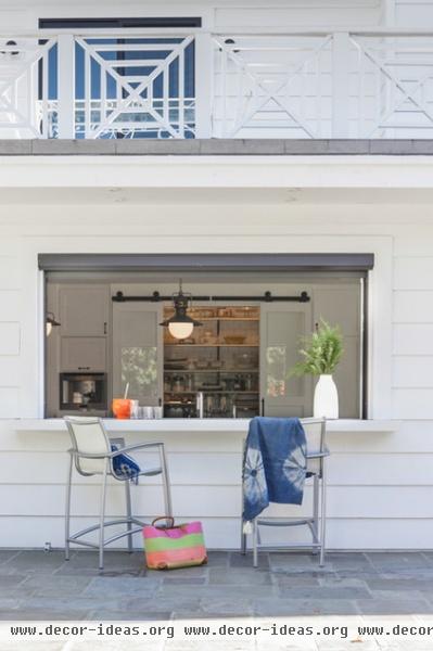
On the other side, those in wet bathing suits can pull up a chair and grab a snack or a drink.
More great ideas for indoor-outdoor bar counters
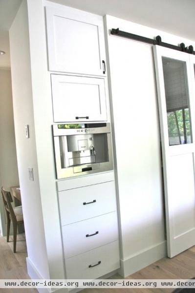
“Lilli is a great cook, and everything in this kitchen needed to be superfunctional,” Fitzgerald says. “We worked out every detail of the storage, from platters to cereal boxes, during the planning phase, as well as what, where and when people would be doing different things in the kitchen.”
A desk tucked around the corner between the kitchen and the dining room serves as command central, keeping the household organized.
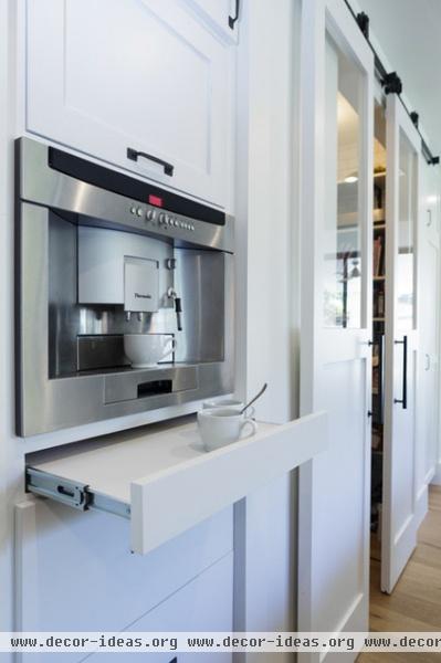
A Thermador coffeemaker is built into the cabinetry. A small shelf pulls out for setting up a coffee station underneath; the flip-up cabinet above stores all the coffee-making supplies.
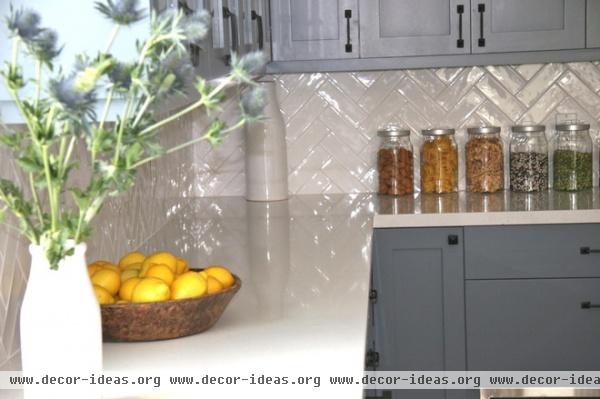
The simple Shaker-style cabinets make both the modernist and the traditionalist happy.
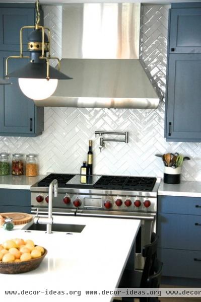
A glossy backsplash in a traditional herringbone pattern contrasts with straight lines but maintains the clean look.
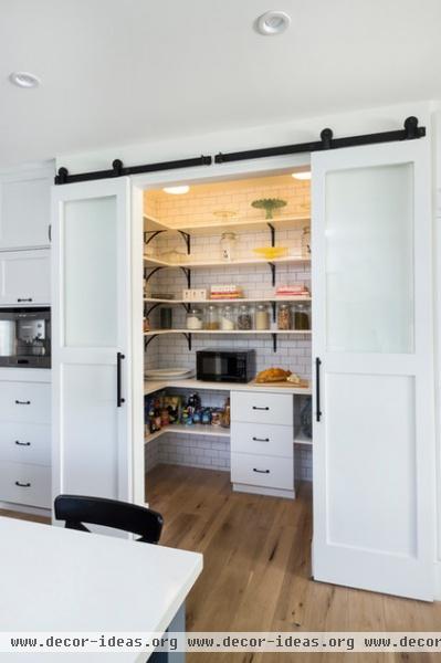
“We really wanted the pantry to serve as a big, beautiful feature of the kitchen, so we used glass doors and tiled the walls from floor to ceiling,” Fitzgerald says. When closed the glass panels in the doors reveal Lilli’s cake plate collection, glass jars full of dry goods and canisters.
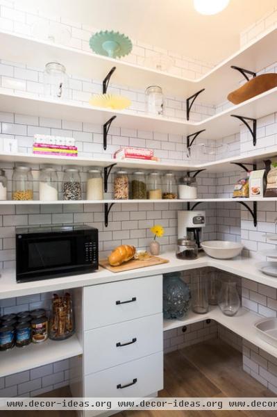
Solid panels conceal the less attractive items on the bottom, like the microwave. “We don’t really like a microwave out in the kitchen, and she doesn’t use hers much, so we put that in here at child height,” von Hartz says. Same for a few other small appliances, as well as cereal and other items the boys need to make their own breakfasts. “It’s important for the kids to be able to be self-sufficient,” she says.
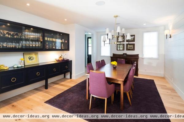
Unable to find just the right sideboard for the dining room, the duo designed this built-in and had it custom made, playing off the gold tones in the clients’ barware with the hardware. The vintage phone is one of Ben’s treasures. The cabinet at the end of the table and the teak table and chairs already belonged to the clients; the designers had the chairs re-covered in a durable Sunbrella fabric.
The spare detailing and molding continue here with extra-large unadorned baseboards and scored MDF on the walls, adding modern lines while complementing the more traditional tongue and groove paneling.
Chandeliers, sconces: Jonathan Adler; rug: Restoration Hardware
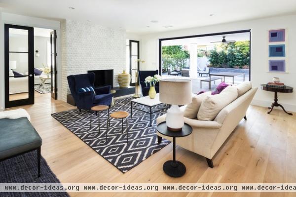
The kitchen opens to the living room, which is also very open to the outdoors.
At first the clients had the rest of the home filled with their own furniture, but about two weeks before they were to host a party, they called von Hartz and Fitzgerald to come work some more magic. This meant shopping for items already in stock, no customizing possible. They mixed vintage and big-box-store items, like the vintage stools and Ikea chairs.
Fireplace surround: Arto; rug: West Elm; sofa: Essex, Crate & Barrel
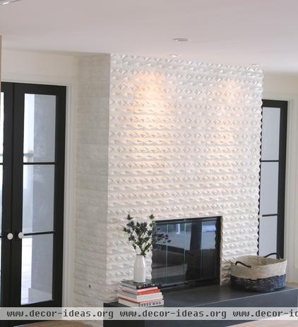
The fireplace surround merges modern and traditional. They covered it in dimensional concrete tiles from Arto in glazed matte white. “They have a very handmade feel,” von Hartz says. The hearth is Absolute Black granite.
The updated take on French doors allows the media room beyond them to feel like it’s open to the rest of the home, but lets Lilli and Ben shut out the TV noise.
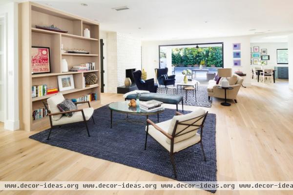
The rug defines another sitting area; the chunky shelves nod to midcentury modern style. They are made of oak that was stained and oiled, adding another raw element. The vintage armchairs add two more X shapes.
Coffee table: vintage; bench: Crate & Barrel, covered in blue calfskin
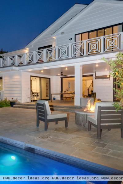
A fire pit provides cozy flames and heat for cool nights. The X theme continues to the balcony railing.
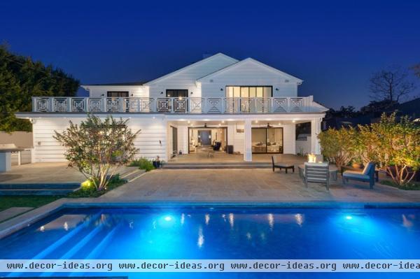
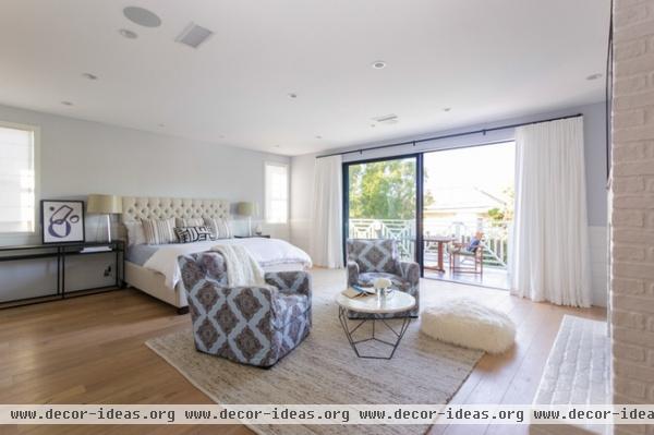
Much like the living room, the master bedroom has a big connection to the outdoors, via large glass doors out to the balcony.
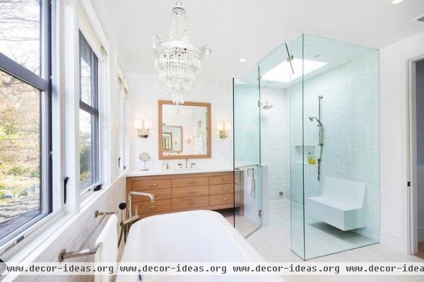
The Lees wanted to bring the chandelier from their old home into their new home, and it found a spot in the master bathroom. The walls are marble, the floor is porcelain, and the bench in the shower is Caesarstone. In contrast, the designers ordered up the custom oak vanities to add a raw element.
All tile: Stone Source; bathtub: Andrina, Americh
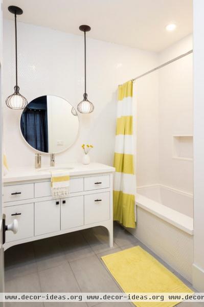
The traditional-modern mix continues in the bathrooms, where mostly white finishes and a vanity with a vintage-furniture look work in harmony. Stripes contrast with circles in here; even the walls are covered in penny rounds.
Mirror: CB2; shower curtain: West Elm; vanity: custom; counter: Pure White, Caesarstone
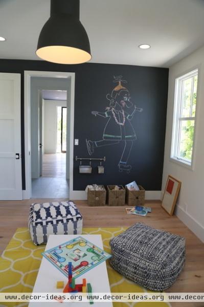
A playful chalkboard wall suits the playroom, as do comfy poufs from West Elm.
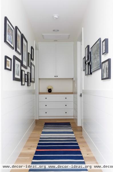
A built-in cabinet at the end of the hallway provides linen storage, another example of how the duo examined how their clients lived to figure out exactly what their storage needs would be.
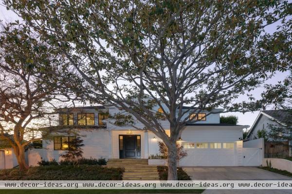
While Ben is a real estate whiz, it’s hard to imagine the family will ever leave a home that suits every member so well.
Related Articles Recommended


