Houzz Tour: Making Midcentury Modern Work for Modern Times
Though their ranch house was built in the 1950s, it was not a good showcase for this Atlanta couple’s love of all things midcentury modern. The rooms were cut off from one another, making the home feel dark, and there was no access to the basement from inside.
Project designers Brent Potter and Courtney Rogers of Renewal Design-Build combined midcentury modern and contemporary elements, designing an open floor plan and a small entry addition that makes a giant impact. The dynamic new entry gives the home’s facade midcentury modern flair, floods the main floor with natural light and creates a much-needed indoor connection to the basement. “We really mixed midcentury modern with modern times,” Potter says.
Houzz at a Glance
Who lives here: A couple and their 13-year-old son
Location: The Druid Hills neighborhood of Atlanta
Size: 4 bedrooms, 3 bathrooms
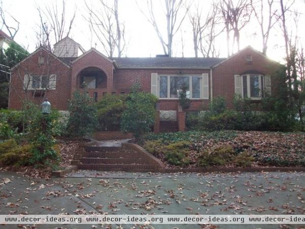
Hidden behind the shrubs was the former exterior door to the basement; an important wish on the homeowners’ list was access to the basement from inside the house. Adding a staircase inside with the existing floor plan would have hogged too much valuable living space.
When the couple bought the house, they knew it didn’t have the exact style they were looking for, but they appreciated that it was built during the ’50s and liked some of its strong features, such as the interior courtyard. The team spent a lot of time driving through the neighborhood to be sure their design respected the neighborhood’s style.
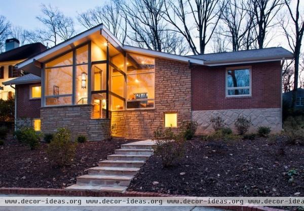
AFTER: The only change to the home’s footprint is the new 10-foot-deep entryway, but it’s had a game-changing effect on the exterior and the interior. The stone and glass facade now provides a grander sense of entry, engages the sidewalk with clear and easy access, and provides access to the basement from indoors. The new front entry included a major grade change; it’s about 4½ to 5 feet lower than the original.
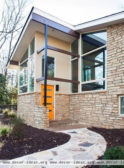
The entry path leads to a 90-degree turn into the covered entry area and front door. Tucking the door perpendicular to the house allowed for a spectacular arrangement of windows across the front facade and for a stone wall to help conceal packages left at the door.
The front door’s gold tone is a favorite of the homeowners and gives a hint of the interior color scheme. The rafter tails protruding just past the overhang and the stacked stone nod to midcentury modern style.
Door: Crestview; stone: Tennessee Crab Orchard Strip Rubble Veneer
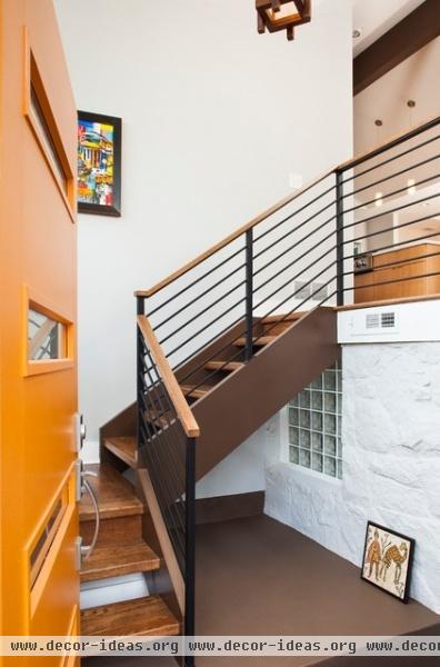
The wall on the right with the glass block window used to be the exterior wall. The now-enclosed basement entrance is down the stairs to the right.
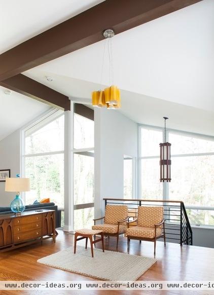
The new entry experience amps up the drama, leading from a compressed space up into a light and wide-open floor plan. A contemporary oak and steel staircase ascends to the foyer, which provides vast views outside and through to the living room, dining room and kitchen. The foyer itself is a flexible, transitional space, complete with seating.
The couple has always enjoyed collecting midcentury modern pieces and acted as their own interior designers. Some pieces are heirlooms; some were found on Craigslist; some came from favorite local haunts (like City Issue). They found both the light fixture over the stairs and the sofa on trips to the West Coast.
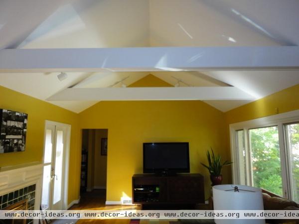
The couple had never been crazy about the crossbeams clunking up their living room’s vaulted ceiling.
The French doors (left) lead to the central courtyard.
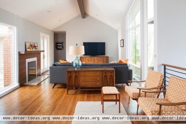
AFTER: The new space has a much cleaner and more open vault, with just one ridge beam taking on the supporting role. The entire open area enjoys all of the light and views provided by the new addition’s windows.
The new fireplace surround is walnut plywood with a clear finish. The marble is Carrara in a mosaic of triangular pieces that mimics the windows.
The couple enjoys commissioning original art and furniture; a friend made the TV cabinet.
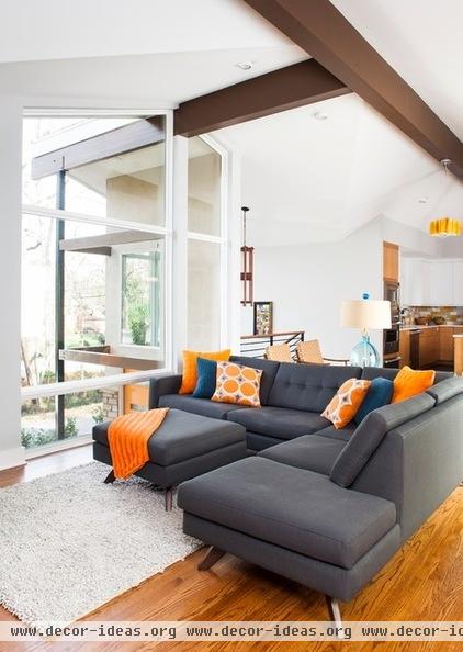

This shot gives you a clear idea of the floor plan; at the top of the stairs, the foyer opens to the living room on one side and the kitchen on the other; the dining room is just beyond the kitchen. New windows and doors expanded the existing views to the courtyard.
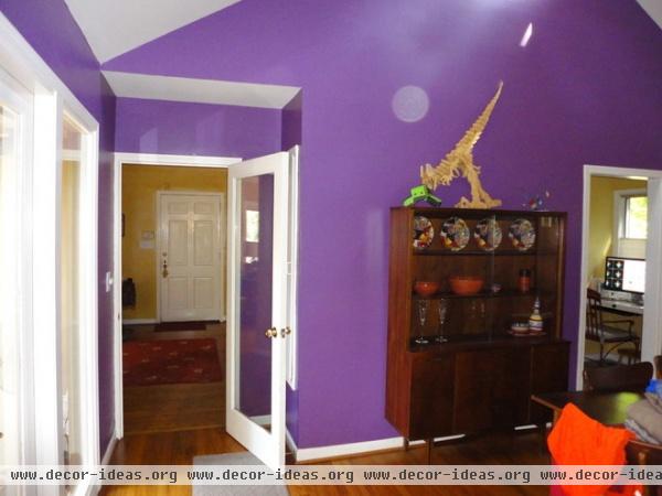
Here’s the old dining room with its purple wall and vaulted ceiling. Both are now gone. “Our clients felt like the space was not intimate enough — sitting down at a table with such a high ceiling overhead,” Potter says. Also note that the door you see beyond the glass door is the former front door. That spot is now at the top of the new entryway staircase.
When comparing this photo to the one below, the desk on the right side will help orient you; it’s in the same spot in both photos.
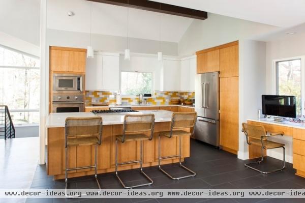
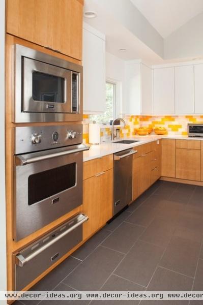
AFTER: Floors and ceilings define the different rooms within the new open plan. In the kitchen the floor tiles resemble contemporary concrete.
The glazed maple sections of cabinetry and accents punctuate the space in an artistic way, while the white upper cabinets blend in with the wall and avoid an overly woodsy look. Instead, they appear to recede into the walls, reflect the light and draw the eye to the view out the window.
Counters: White Zeus Extreme, Silestone; floors: Daltile; all appliances: Viking
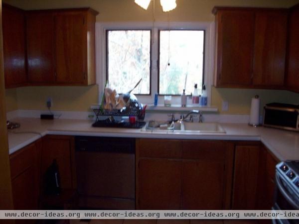
The walls and cabinetry made the kitchen feel dark. In addition to taking down the walls, the designers relocated a laundry room that contributed to the closed-in feeling.
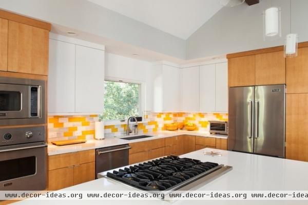
AFTER: The couple wanted as large an island as possible without seams on the countertop, so they designed it around the largest size of Silestone available. The range on the island has a downdraft system.
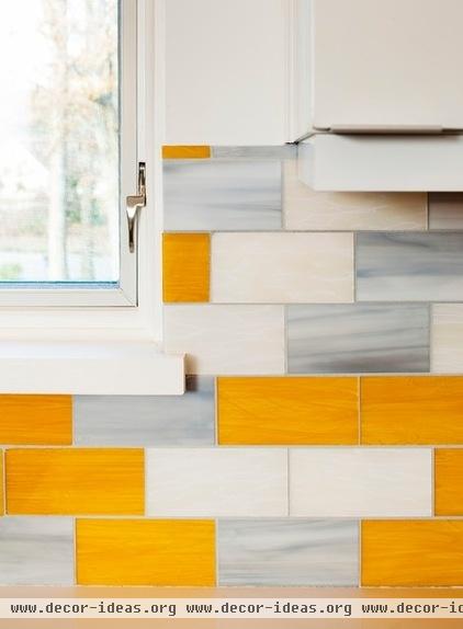
Their beloved gold tones are a highlight in the kitchen, thanks to this mosaic tile backsplash, custom ordered from Ann Sacks. “It’s a gorgeous milky glass that incorporated the golden tones they love so much as well as gray-blue,” Rogers says. Undercabinet lighting highlights the tiles’ playful and colorful rhythm.
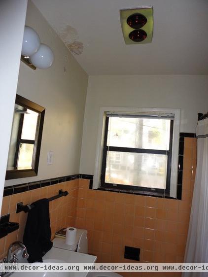
This old guest bathroom felt too tight.
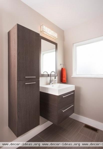
AFTER: By lifting the vanity and cabinet off the floor, the designers were able to make the room feel more open while still providing ample storage. The uninterrupted large-scale floor tiles (12 by 24 inches) also make the room feel larger.
Instead of fussing with window treatments, they chose privacy glass from Pella that has a pebbled texture. This small move keeps things pleasingly uncluttered and clean-lined.
Floor tile: Fabrique Collection, Daltile
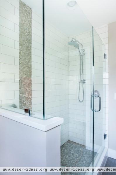
The half wall of glass between the toilet and the shower stall also helps keep the light flowing and lends a more open feeling to the small room. A mix of tiles is a play on scale; it blends strong horizontal and vertical lines.
“This couple is so passionate, communicative, decisive and easygoing — they are great folks to work with,” Rogers says. Now that they’ve all found their rhythm together and construction on the front of the house is complete, they will begin part two, the more private areas of the home, in about a month.


