Houzz Tour: Finding the Flow in Berkeley
Sharon and Curtis Sakai were already enjoying much of California’s splendor from their Craftsman house in Berkeley. Their hillside abode offered sweeping San Francisco Bay views and had a large backyard, but it didn’t give them the open layout they wanted or the indoor-outdoor connection that California living is famous for. They hired Lynn Fisher and Hiromi Ogawa, of Ogawa Fisher Architects, to resolve that. “The owners are avid cooks and wanted a larger, more open kitchen where people can gather and work together, with better connection to their expansive rear yard,” says Ogawa.
Houzz at a Glance
Who lives here: Sharon and Curtis Sakai and their 2 teenage daughters
Location: Berkeley, California
Architect: Ogawa Fisher Architects
Size: Originally 2,800 square feet with 3 bedrooms and 2 bathrooms; added 700 square feet with a master suite and a guesthouse
Year remodeled: 2011
Photography by Mariko Reed
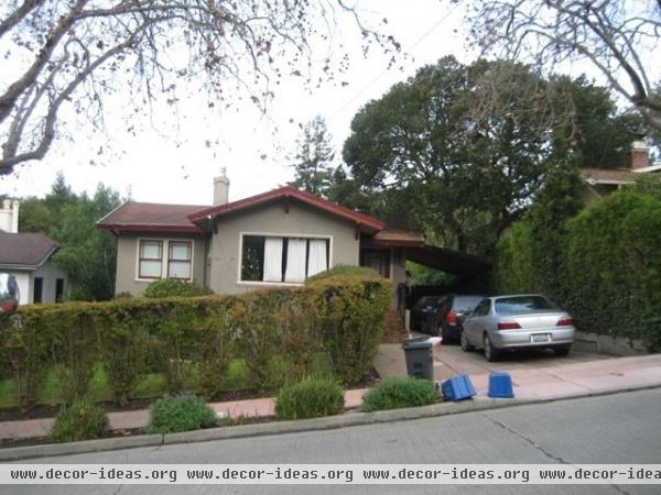
“The existing house was a traditional one-story, three-bedroom, two-bath Craftsman home,” Ogawa says. The renovation included a second-story master suite addition and remodeling the kitchen. The team left the front living room, formal dining room and two existing bedrooms as is.
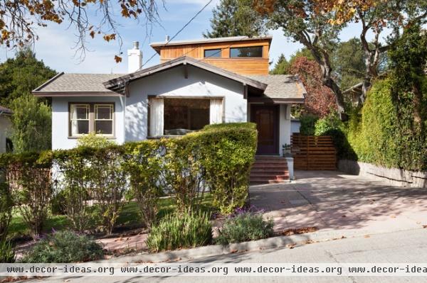
AFTER: The architects made no changes to the front facade except a new paint job — but you can just catch a glimpse of the addition peeking over the roofline. Instead of mimicking the existing architecture, they mixed it. “It’s a great opportunity to showcase the owners’ personal style, and our job is to create harmony and timelessness with the different elements at play,” says Ogawa. “We also don’t believe it’s imperative to match the traditional vocabulary, as if to pretend that the new construction has been there since the beginning.”
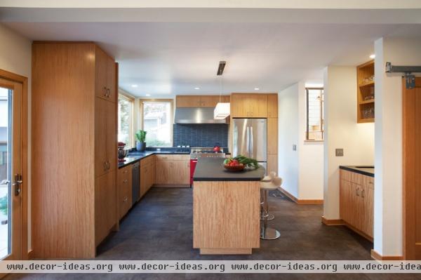
Ogawa and Fisher expanded the kitchen and relocated it to the back of the house. “The kitchen has become the modern family’s gathering place,” says Ogawa, “and this one is no exception.”
In addition to typical kitchen amenities, the kitchen also features a wok burner and bar area. A bright red Bertazzoni range interrupts an otherwise neutral color palette, serving as a bold yet playful focal point.
Countertops: Absolute Black granite; cabinets: figured anigre wood, City Cabinetmakers
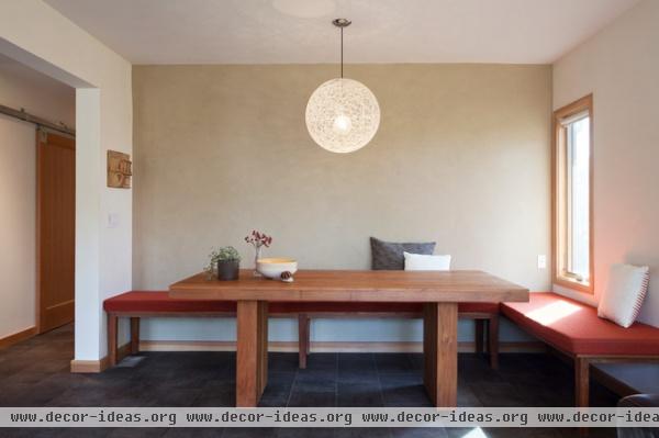
The kitchen now includes an eating area. “It welcomes every guest as if they are part of the family,” says Ogawa. It also enhances the open, airy concept of the new downstairs layout.
An American Clay wall treatment and a light fixture by Mooi soften and enliven the corner. The light is “really great in the room, casting web-like shadows while giving off a warm glow,” Ogawa says.
Dining table, bench: custom; ceiling light fixture: Random Light, Mooi
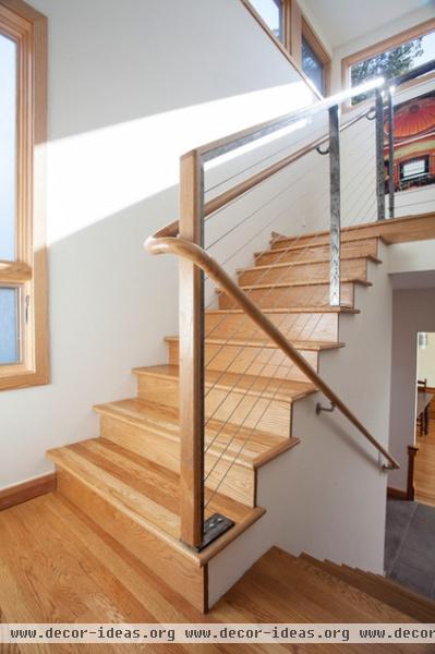
The remodel draws the indoors out but also brings the outdoors in. “Natural light is a critical design element for all of our projects,” says Ogawa. Clerestory windows span the north and east sides of the house, bringing plenty of sunshine to the second floor throughout the day.
Large windows on the first floor welcome as much natural light as possible and provide prodigious views of the backyard and bay.
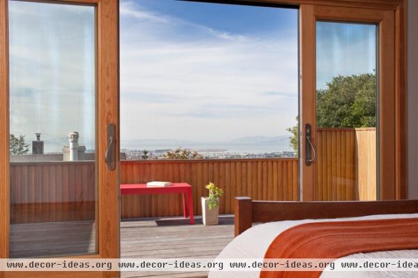
The Sakais already enjoyed an impressive bay view; they could even catch a glimpse of the Golden Gate Bridge from their roof. By adding a second story, they were able to have their dream: a second-floor master suite with a view (an even better one). Sliding glass doors frame one of California’s most iconic scenes.
The couple also added a lot more living space downstairs. “By changing the layout of the first floor and adding a second-floor master suite, it completely transformed the way the owners enjoy the house and the property,” Ogawa says.
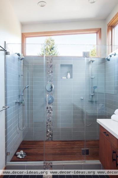
The master bathroom adjoins the bedroom. Clerestory windows allow natural light in.
Tile: 4- by 12-inch Ambienti series (floor: Nero, wall: Salvia), Supergres; shower floor: teak
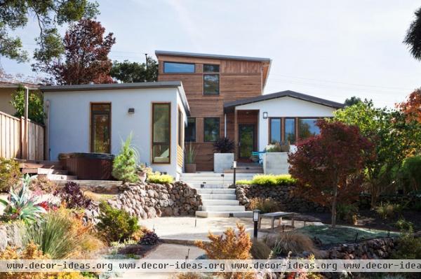
“The original house had almost no connection to the rear yard,” Ogawa says, “so it was critical that we really understood the family’s desires and lifestyle so that we could create the best solution for them.”
The homeowners envisioned a clean flow between the kitchen, living area and outdoor space, so Ogawa and Fisher didn’t stop designing at the door. They added hardscaping and concrete steps that cascade down the site, connecting the main house to the guesthouse.
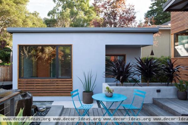
The home office and sometimes guesthouse sits just off the main house, with a deck nestled in between (for enjoying those San Francisco Bay Area sunsets).
The architects and homeowners hit it off with this project — so much so that Ogawa and Fisher will update the front of the house this year.


