Best Ways to Use the Soft Yellow Color of 2014
http://decor-ideas.org 01/21/2014 03:24 Decor Ideas
Does Benjamin Moore’s color of 2014, Breath of Fresh Air, leave you cold? Do you wilt at the sight of Radiant Orchid, Pantone’s selection? Then maybe Pittsburgh Paints’ Turning Oakleaf is more your speed. It’s a fresh, cheery and warm alternative to gray or beige. Here you’ll see the color used in actual rooms, along with color palettes I’ve pulled together to help you coordinate it with other colors.

According to Pittsburgh Paints, this sunny hue is “like a buttercream; [it] has a fullness to it, while remaining light enough to act as a neutral. It’s mellow and stable, providing the calm we all seek before embarking on new journeys.”
I do find this color very optimistic, perfect for starting the new year on the right foot. Let’s look at how the color works in actual interior spaces.
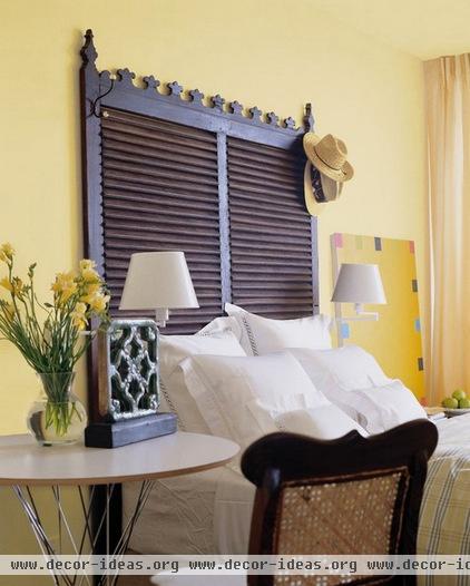
In this image provided by Pittsburgh Paints, you can see what a nice color Turning Oakleaf is for a bedroom. It has the right amount of saturation to be interesting, while remaining soft and soothing. It’s also a fantastic background color to darker, dramatic elements, such as that fantastic headboard.
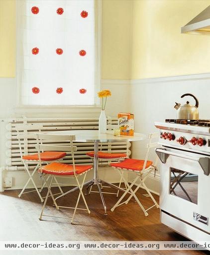
Or use it in the kitchen. Yellow is a tried and true kitchen color, but I appreciate that this particular yellow doesn’t appear too thin or pastel. The small bits of bright orange here work well with the soft yellow walls.

Pair Turning Oakleaf with whites and other light neutrals for a softly elegant living room.

You can also add punches of other, bolder colors, such as the peacock blue on the table and pillows here. Because Turning Oakleaf is fairly light and muted, it can work as a neutral background hue to pretty much any other color.

I’m a big fan of colorful ceilings, and I think Turning Oakleaf is a great ceiling color choice, especially in a bedroom. If the weather outside is frightful, it would be quite nice to wake up in a room that has such warmth and a glowing, sunny vibe.
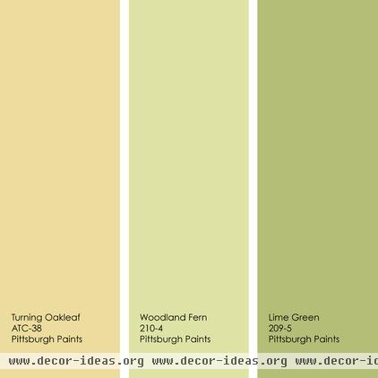
For a fresh, colorful space, mix Turning Oakleaf with yellowish-green hues. Any of these three colors would work well as a wall color, with the remaining two used as accents.
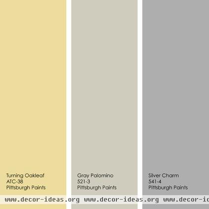
Or put Turning Oakleaf in the spotlight, as the lone splash of color in an otherwise neutral space. I like layering warm and cool neutrals to give a room dimension. Use the neutral hues to downplay any elements in the room you don’t want to draw attention to. Use a vibrant color or colors to play up those items or areas of your home that are worthy of notice.
Tell us: Have you fallen for Turning Oakleaf? How would you use the color in your home?
More colors of 2014: Pantone | Benjamin Moore | Sherwin-Williams
Related Articles Recommended


