My Houzz: Turning a Netherlands Barn Into a Country Home
Jacco Fontein and Grieteke de Leeuw knew their 19th-century Netherlands home was meant for them when they saw the lion’s-head fountain on its exterior. “De leeuw” is Dutch for “the lion,” while “fontein” means “fountain.”
The previous owners had transformed the house and its adjacent barn into two homes, with two entrances, two kitchens and two bathrooms. It was an ideal remodeling project for Fontein and de Leeuw, because they could stay in one of the structures while renovating the other.
The couple spent two years planning the remodel and getting the necessary permits for the historic-view home. Then they spent another two years working with contractor Frank Klemmer and interior designer Tjitske de Ruiter of Villa Idea to merge the farmhouse and barn into one big home and transform its interiors. Now a new open layout, natural materials like wood and stone, and bygone touches like barn doors help highlight and enhance the original design details.
Houzz at a Glance
Who lives here: Jacco Fontein, Grieteke de Leeuw and their two Labradoodles, Oye and Balou
Location: Alphen, the Netherlands
Size: 670 square meters (7,212 square feet); 2 bathrooms, 3 bedrooms plus a home office
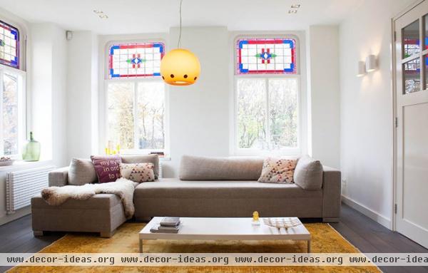
The farmhouse’s living room still has the original windows, but otherwise this space was given a complete overhaul. The couple worked with designer de Ruiter to create a warm setting within the crisp white walls.
Sectional: The Puzzle, Esquada by Robert Warnaar; rug: Rozenkelim; all pillows from Fest Amsterdam; yellow candleholders: Koro, Fest Amsterdam
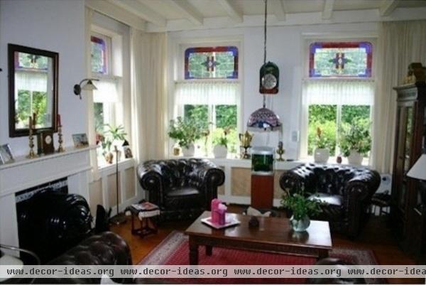
This view shows the space as it was furnished by the previous owners.
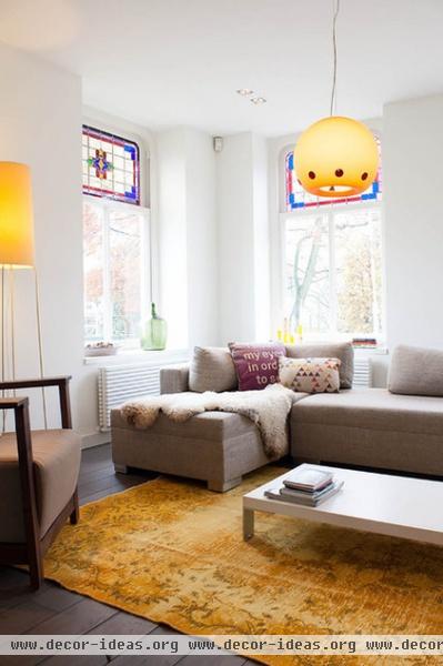
AFTER: A yellow-dyed kilim rug from Rozenkelim warms up the new oak floors, which have been treated with an ash-brown oil finish.
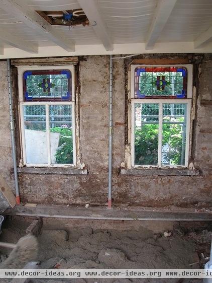
Part of the home was a milk cooling barn used by farmers in the late 1800s. In the early 1900s, it was a cooling barn for fruit from the many orchards in the area. “When we started to strip down the place, we found many historical elements that were reminders of the house being a cooling barn, like the thick walls, and jute in the walls as insulation material,” says Fontein.
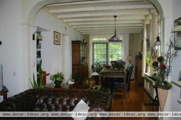
This is the view looking toward the back of the house from the old living room. The couple installed new insulated French doors where the old ones had been.
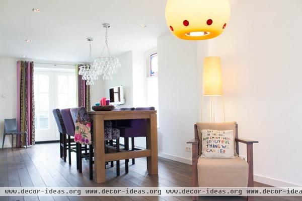
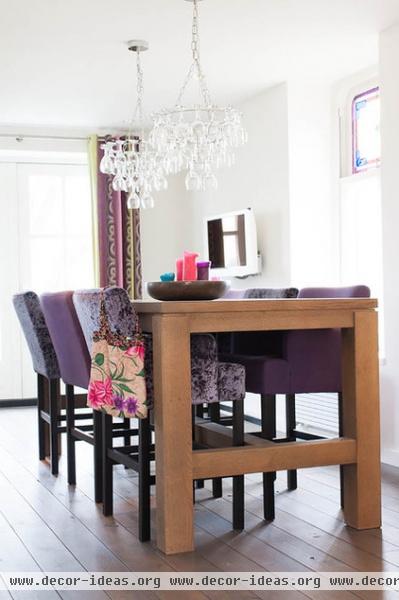
AFTER: One of de Leeuw’s favorite spots is this pub table, where she has her morning cup of coffee and listens to the radio. De Ruiter advised the couple to use mismatched fabrics and colors to make this space more interesting.
De Leeuw owned a bar in Spain before she moved to the Netherlands, and insisted on the wineglass chandelier, Leitmotiv by Eibert Draisma.
Table: Bartafel Big Foot, Keijser & Co; chairs: Bliss, Keijser & Co; cushion: Elenia, Fest Amsterdam; floor lamp: Slim Sophie, Flinders; curtains: silk and cotton, Designers Guild
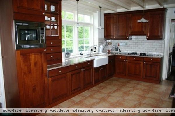
The old kitchen was dark and a bit dated.
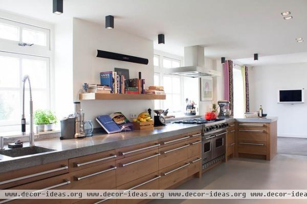
AFTER: The couple knocked down a wall and eliminated the upper cabinets, making the space feel open and airy.
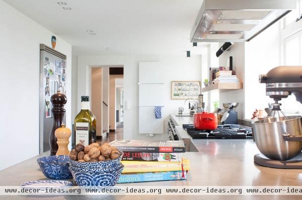
De Leeuw spent a lot of time cooking in the kitchen with her siblings while she was growing up, and it’s now one of her favorite pastimes. She and Fontein are never short of walnuts, thanks to a walnut tree in their garden.
Bowls: Loods 5
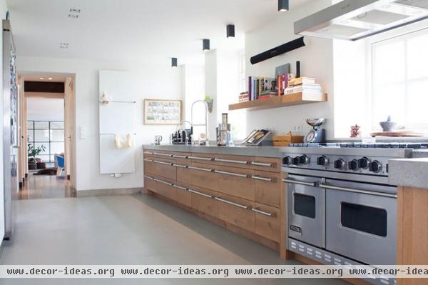
The kitchen features concrete floors and oak cabinets, which are topped by concrete counters 8 centimeters (3.15 inches) thick.
Kitchen cabinets: Wim Mulckhuyse; ceiling spotlights: Prologe, Kreon
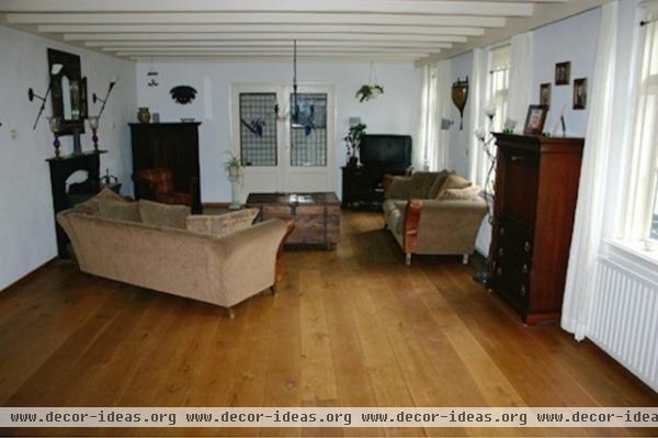
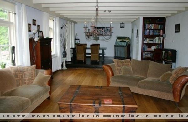
This is what the room off the kitchen used to look like, before the couple remodeled it and installed a glass divider wall.
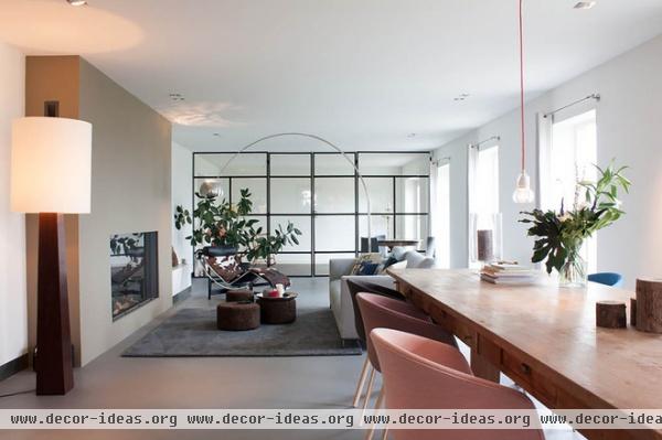
AFTER: After crossing the kitchen you enter the other part of the house, which is illuminated by large windows and warmed by a new modern gas fireplace. The eye-catching floor lamp is made of wenge wood and was designed by de Ruiter.
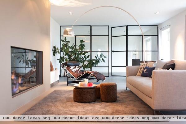
On winter nights the couple loves to sit near the fireplace. The trio of ottomans used as a coffee table were designed by Jasper Morrison for Moooi; they were constructed from layers of cork. De Ruiter added the LC4 Chaise Longue by Le Corbusier; the cowhide classic now anchors the space.
The homeowners removed a wall, exposing what was once the barn’s kitchen, which they eliminated. A glass and steel wall/doorway now divides the two spaces. Eventually the empty room at the rear will be used as a lounge for drinks or card games. “Maybe a bar concept,” says Fontein. “We haven’t decided yet.”
Sofa: Hampton, Verzelloni; Magenta rug, Carpet Sign; lamp: Flos Arco LED floor lamp, Flinders; wall paint: Khaki, Painting the Past
This space is now the dining area and connects to the kitchen.
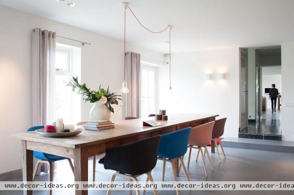
AFTER: The couple worked with a lighting specialist from Villa Idea and installed can lights, wall sconces and pendants throughout the house.
Pendant lamps: &tradition; wall lamps: Duell Wall Modular; spotlights: Minigrid in Trimless D, Delta Light; linen curtains: Libeco
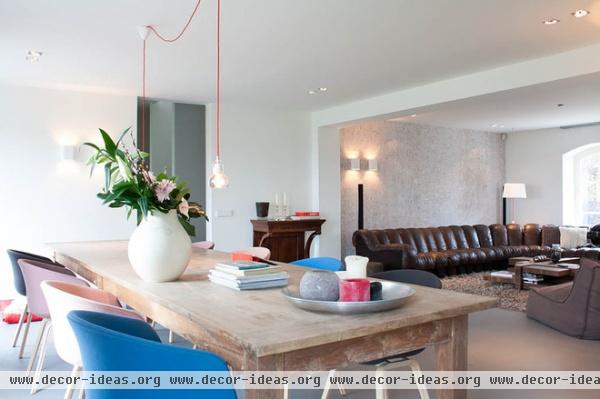
The couple entertains often, as de Leeuw enjoys cooking lavish meals for loved ones. The dining table is 4 meters long (about 13 feet), so it seats 10 comfortably. “Especially with holidays and birthdays, we need a large table to fit the whole family,” says Fontein. Adds de Leeuw, “But we also use this table for our weekend breakfast, and sometimes I come sit here and read a newspaper or do some administration.”
The teak table has a rustic, almost reclaimed look, but it is not vintage. The dark wooden side table against the wall is an heirloom from Fontein’s grandmother.
Table: teak, Floris; chairs: About a Chair, Hay
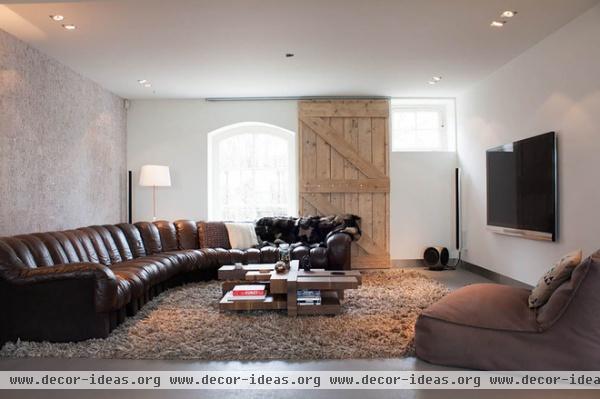
The oversize vintage couch, a De Sede DS 600, has emotional value for de Leeuw, because she grew up with one just like it. She tried to convince her father to hand his down to her, but he wouldn’t, so the couple bought one themselves. “It is the couch I and my siblings would make somersaults on,” says de Leeuw.
An area rug made from New Zealand wool warms up the concrete floor and softens the robust look. The couple loves to watch television here.
To carry through the history of the milk barn and farm into the design, they incorporated a sliding wood barn door as an alternative to curtains. In the corner is a designer lamp from Design Heure that features a cotton shade with an eye-catching red cord.
Coffee table: Manhattan by Linteloo; wallpaper: Elitis; rug: Ice by Mark Janssen, Tapijten; chair: Zoe, Verzelloni
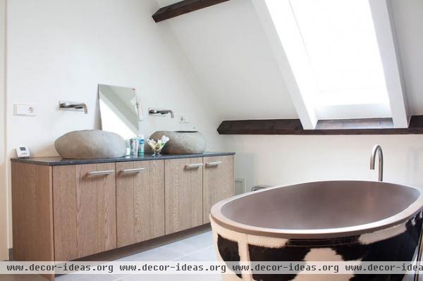
Both bathrooms in the house are the work of bathroom specialist Van Boven. “When we first went there to discuss our options, we had the strangest conversation,” says de Leeuw. “Whenever we articulated an idea, he showed us something we strongly disliked. We went home and expected nothing but disaster to come from his hand. But on our return to see his final design proposal, we were positively surprised. It was just what we wanted. Apparently he had been testing our dislikes to find out what we do like.”
The couple’s love of simple, natural materials carries over into the guest bathroom through the two natural stone sinks.
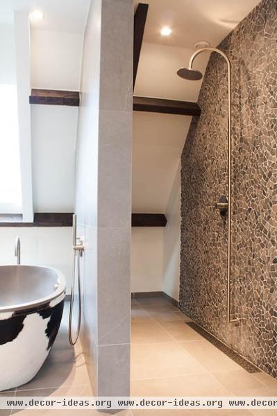
The guest bathroom is divided into two functional spaces by a thick wall with extra-large tiling. The shower is open and has a brown mosaic wall from Bisazza via Van Boven.
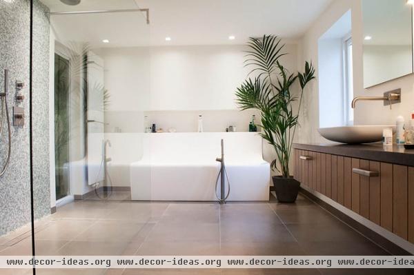
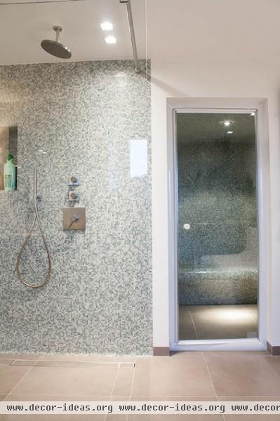
The master bathroom features a double walk-in rain shower. A sleek bathtub from Van Boven draws attention. In the corner is a steam room with a mosaic tile finish to match the shower.
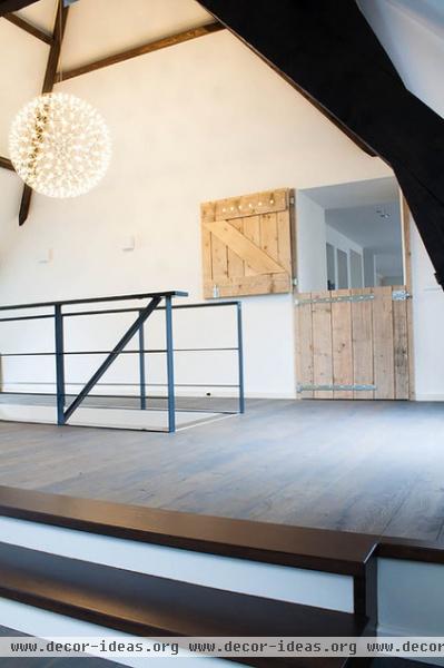
A wooden barn-inspired door connects the two parts of the house, while steel stairways lead downstairs.
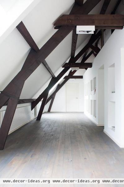
The attic is one of the couple’s favorite spaces; it was inspired by a magazine clipping (next photo). “When we saw the photo we knew we wanted the exact same built-in bookcase construction in the wall,” says Fontein. The fir beams are restored originals.
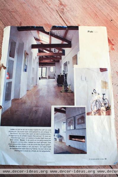
The magazine clipping from Vtwonen that inspired the attic.
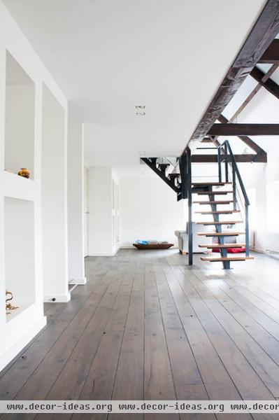
A steel stairway beyond the barn doors leads up to the master bedroom. A small lounge area for guests was established in a corner of the attic.
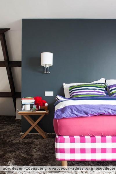
The master bedroom is simple and warm, with bright colors and a soft rug. The owners built a small wall to serve as a headboard.
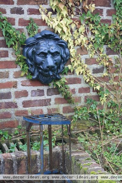
This is the lion fountain that helped inspire the home’s purchase.
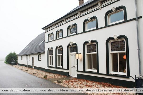
The house is protected by national heritage laws, so the couple made only minor changes to the exterior. They repainted the house to highlight the original trim and replaced the roofing.
The original lion heads above each window are another detail they kept intact.
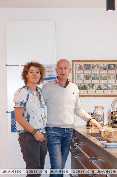
De Leeuw and Fontein hang out in the kitchen in front of a framed vintage kindergarten-classroom print.
See more photos of this home | Show us your home renovation
Browse more homes by style:
Small Homes | Colorful Homes | Eclectic Homes | Modern Homes | Contemporary Homes | Midcentury Homes | Ranch Homes | Traditional Homes | Barn Homes | Townhouses | Apartments | Lofts | Vacation Homes
More: Rustic Roundup: 5 Barn or Barn-Inspired Homes


