Design Workshop: Just a Sliver (of Window), Please
Without windows, our architecture would be lifeless, heavy and dark. We use window openings to control light, admit fresh air and connect our interiors to the outside world. Because they control these key components of our built environment, windows are integral to setting the mood of a space.
Sliver, or ribbon, windows have a particularly unique way of controlling the way we feel in a space. Used high in a wall, they wash the ceiling with an even light, making a space feel secure yet luminous and introspective. Used low in a wall, they create a dramatic shift in focus, highlighting and reflecting the adjacent ground color, material and weather outside. Used at or just below eye level, sliver windows create a carefully controlled horizontal framed view to the building’s surroundings.
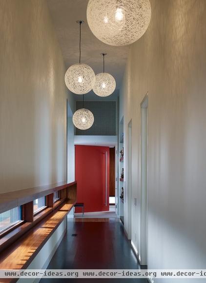
Below Eye Level
By locating these sliver windows significantly below eye level, the architects have maintained a connection to the outdoors, provided natural lighting to the hallway and directed the interior-exterior sight lines toward the ground.
This is done intentionally to change the eye’s focus toward the other elements in the hallway and direct movement. The bold lighting and the destination — a brightly colored door — receive the most attention as a result.
The sliver windows create a well-lit pathway to follow and an eye-catching linear shelf of contrasting wood that bounces light vertically to warm the white hallway. The lowered natural horizon point also makes the hallway naturally feel taller.
Effects: Encourage movement; create mystery and a highly controlled experience.
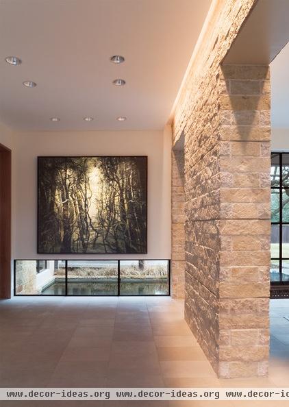
Pairing a low window with an exterior surface material, such as this water pool, allows for light to be reflected off the material’s surface toward the interior. This washing of light can be different depending on the exterior material’s color and reflective characteristics as well as on the time of day, the season and the solar orientation.
For this gallery space, a muted, indirect light is perfectly appropriate. The low window also permits the majority of wall space to be used for artwork.
Effects: Create focused attention (interior and exterior); the exterior surfaces enhance the interior reflections and the quality of light.
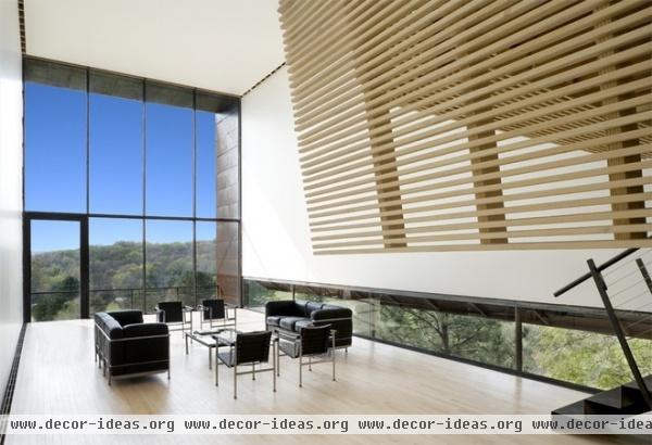
Sliver windows provide a tenuous and unexpected base to the floating wall above them in this living space. They focus views to the nearby trees, and by extending the windows wall to wall, the architect has connected the interior floor space to the adjacent forest canopy.
The wall appears to float as a thin shell roof folding into and becoming a wall. By locating this window at the floor, the building form and interior space become dynamic interlocking L-shapes.
Effects: Reinforce striking geometries and create strong outdoor connections.
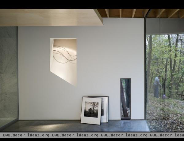
On the lower level of the same house, this sliver window calls attention to two elements: an angled steel column and a tree trunk. It’s sort of a portrait, one abstracting the other.
Effect: Editorializes and highlights the unique.
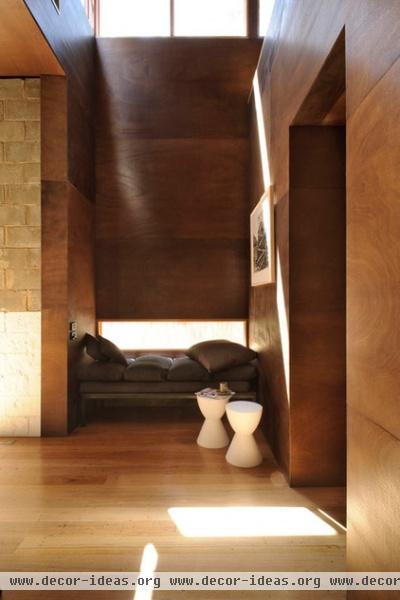
Seated Eye Level
As we move the windows higher up in the wall plane, closer to our natural sitting position, the placement tends to suggest use and offer distinct perspectives.
This sitting alcove has a controlled slot of light right at seated eye height as well as one high above. The upper sliver windows wash the space in ambient light, while light from the lower window warms the wood walls. Despite its tall volume, this space exudes comfort and security. The lower window engages a very specific activity and rewards the user with a special view available only in repose.
Effects: Cozy, intimate and special.
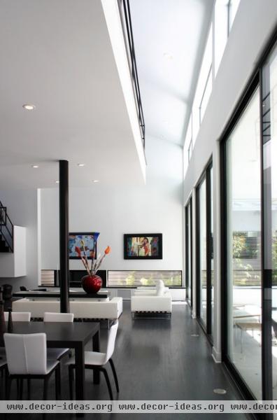
Here we see the combination of two uses of sliver windows. The upper, or clerestory, windows wash the white ceiling with bright natural light, while the lower windows near the seating group permit only very carefully controlled views outside.
Neighboring structures and views may not always be desirable, and narrow windows allow the interior experience to be carefully modulated. Seated, one has a sense of the exterior space and natural light but no sense of just how close the property line actually is.
Effect: Conceal views while admitting natural light.

With a view like this, why not glaze the entire wall? There are many reasons not to. If this view faces north, a small amount of glazing, especially in a northerly climate, just makes sense. Also, by placing the window as the architect has here, it calls attention to a very specific view to the landscape, which is revealed slowly, depending on your position in the room. When the viewer is standing, the view is more about the lake; when seated, it combines water, mountains and sky; and when lying in bed, it’s more about the tree line and sky.
This changeable horizon through a controlled view allows the interior experience to be more complex and enriching. And revealing only one measured, narrow view at a time fosters a more intimate understanding of the building’s site.
Effect: Painterly and abstract, this treatment engages the whole of the surroundings.

This view functions as a living panoramic landscape painting and reinforces many of the previously discussed concepts. It’s also a great example to illustrate proportion.
To be considered a sliver or ribbon window, I suggest a 3:1 width-to-height ratio at a minimum. If you’re looking for more of a sliver and have the room, use a ratio of 5:1 and up. This particular window nicely correlates to a 3:1 proportion. Using anything less will appear more rectangular than horizontal, and it will be difficult to achieve the effects we’ve been discussing.
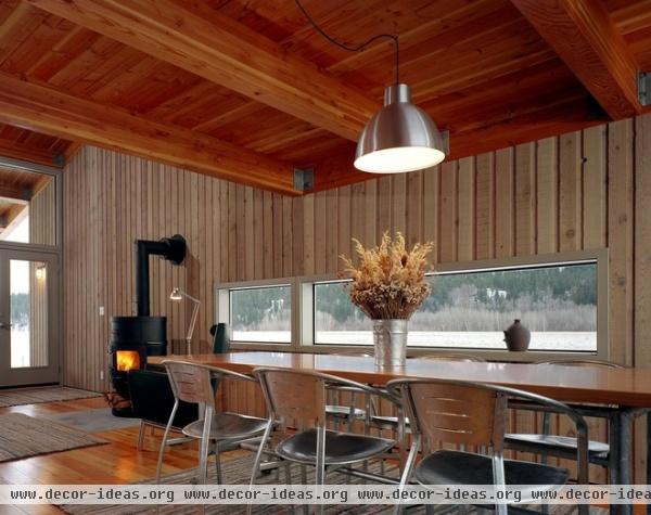
Here the dining space has a contemplative panoramic painting. Again, the sliver of view affords a changing perspective on the vast landscape beyond, but one that is highly specific to one’s vantage point.
Effect: Used in a space that is exclusive to seated functions, this treatment highlights the surrounding topography’s horizon line.
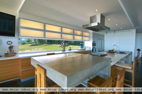
Standing Eye Level
Placing narrow windows at this elevation in a wall makes great sense for spaces where the activity is centered around standing. As you might expect, most of these examples are found in kitchens.
In this kitchen the horizontal window has been stretched to epic proportions. It brings a verdant view into the kitchen, provides ample natural light to the work surfaces as well as the entire room, and it’s a weightless counterpoint to the massive and weighty elements that comprise the kitchen below the windowsill.
Effect: When sliver windows are taken to the extreme, the wall surface appears to dissolve, connecting inside and outside.
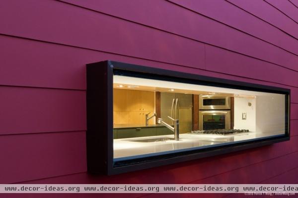
This project showcases a unique application of the sliver window. On the exterior it features the horizontal window element as something special. On the interior it provides additional counter space, whether for storage or growing herbs. It confidently incorporates a transparent backsplash and window into the architecture of the home.
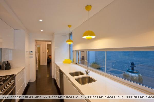
The proportions of this galley kitchen are matched by the horizontal band of windows, which highlight a private exterior courtyard beyond. The use of sliver windows here alters the visual perception of space, essentially borrowing the exterior courtyard space and incorporating it into the kitchen. The tight footprint feels much more spacious as a result.
Because this home is at the center of a three-lot block of row houses, the architects used the courtyard as a way to deliver light to the interior spaces. While they gave up some interior space, they found a clever solution to a common problem. The sliver windows also control the views to the neighboring house, only permitting views to the outside wall and display area.
Effect: Enhance the apparent dimension of a small space, especially in urban environments, where views often require filtering.
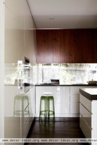
It’s hard to discern in this kitchen what is backsplash and what is window. The kitchen feels like a part of the outdoors, and the sliver window effectively counterbalances the solid cabinetry. The architects have hidden the frame of the window glazing, adding to the custom-tailored look. Everything feels as if it’s part of a family of thoughtfully considered, highly customized design elements.
Effect: A brightly lit workspace with strong connections to the exterior.
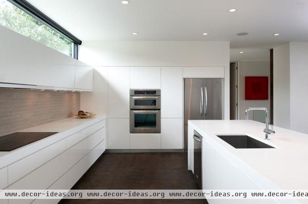
Above Eye Level
Narrow windows located high in the wall are usually called clerestory windows. The principal reasons for shifting windows vertically in the wall like this are to take advantage of natural daylight while promoting privacy and prohibiting views out.
Locating windows higher in the wall delivers more light farther into the space. The sliver window shown here washes the ceiling plane in even light and maintains a kitchen space separated from the outside.
The upper cabinetry becomes a light shelf, bouncing light even deeper into the space. An operable clerestory provides excellent ventilation capabilities, and without the need for supplemental lighting, the clerestory window is an energy-conscious choice as well.
Effect: A cloistered, inwardly focused yet bright and evenly lit space.
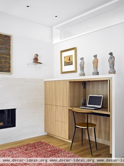
Another creative application of the sliver window can be seen here on the interior wall of an office space that borrows light from an adjacent room. Placing the window high in the wall moves it out of the way of the workspace, minimizing distractions while conferring all of the advantages of natural lighting to the space. This is an excellent way of transferring light between rooms while maintaining separation and privacy.
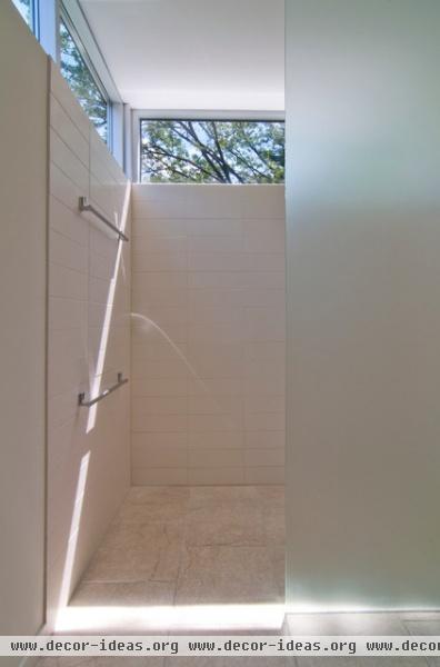
Bathing spaces lit by natural light are particularly enjoyable places. Daylight intimately connects us to our natural circadian rhythms, warms us and wakes us. Daylighting paired with light-hued interior materials, such as the tile in this shower, creates a luminous and soft look. This makes the sliver window used high in the wall of a shower or bathing space especially attractive.
Note how the ceiling plane appears to hover or float. The clerestory window creates this unique effect; it reduces the apparent weight of the ceiling plane, replacing it with a view to the outdoors.
Effect: A brightly lit interior that preserves privacy.
More: Design Workshop: Playing With Fire


