Houzz Tour: Shaker Simplicity Inspires a Modern Farmhouse
When the owners of this house met with architect Rafe Churchill for the first time, they brought along the 1953 children’s classic One Morning in Maine by Robert McCloskey for inspiration. In the book McCloskey — best known for penning Make Way for Ducklings and Blueberries for Sal — recounts the adventures of an older Sal as she loses her first tooth.
The backdrop for the story is a sensible and simple country house that has charmed generations of children, and the clients were similarly enchanted. They asked Churchill to create a new home with a similar vintage feeling, and also to include very modern sustainability features.
Not only do solar panels provide all of the energy needed (the only time the family pulls energy from the grid is when they run the filtration system for their freshwater pool), but all the packing materials and building scraps were either reused or recycled during construction.
Houzz at a Glance
Who lives here: A couple and their 2 children
Location: Sharon, Connecticut
Size: 4,500 square feet; 4 bedrooms, 2½ baths
Photography by John Gruen
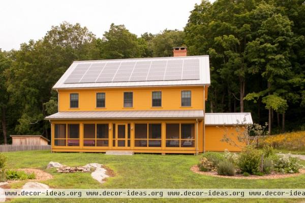
The house could easily be mistaken for a circa-1890s farmhouse — but a second look reveals the solar panels, which almost blend in with the metal roof. Churchill says that often when people design a modern farmhouse, they reference something like what a member of the landed gentry might have resided in, rather than a humble dwelling where a hardworking farmer might have lain his weary head. “These clients wanted a truly simple farmhouse,” he says.
For inspiration Churchill and his clients visited Hancock Shaker Village in Massachusetts, home to a former Shaker settlement and 20 historic buildings. There they drew upon all the buildings for design cues — including a workshop painted a vivid yellow — in some cases measuring and precisely replicating interior details.
Exterior paint: Yellow Oxide, Benjamin Moore
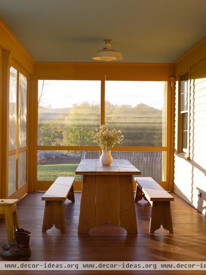
Of course, no hardworking Shaker would have had the luxury of a screened-in porch, but it is needed here. “The house faces south to take advantage of solar gain. Without the porch the lower level of the house would overheat,” says Churchill, noting that for green reasons, the house was built without air conditioning.
The porch is also designed to take advantage of the views of the fields, gardens and orchards, with the mullions placed low enough to not obstruct the view of someone seated at the table or lounging on the daybed.
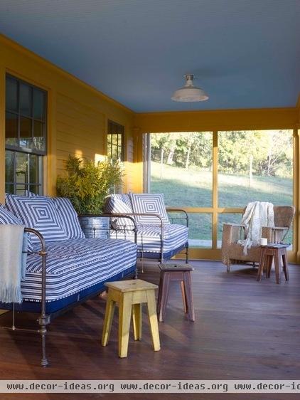
Heide Hendricks, who runs an interior design firm called Reservoir and is married to Churchill, outfitted the porch with vintage daybeds. During the day they act as seating, but at night they turn the space into a sleeping porch.
Churchill covered the interior wall of the porch with exterior siding. “I feel that for an authentic look, it is important to show the supposed evolution of the house, and to try and suggest a history with details,” he says.
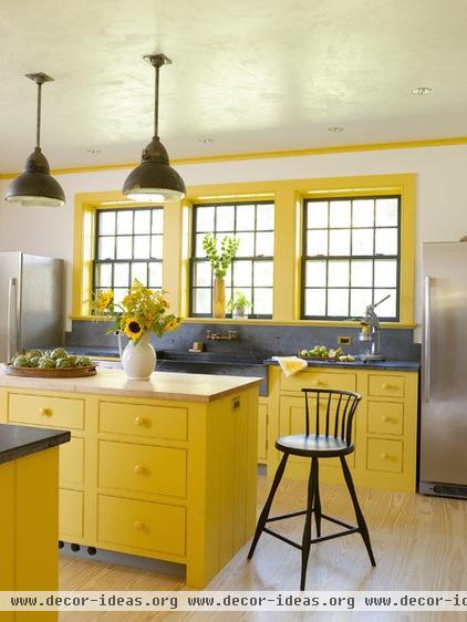
“The kitchen faces north, so the bright yellow was chosen to always provide the suggestion of sunshine,” says Churchill. The color does have some basis in history, too. “The Shaker houses were very neutral in the public spaces, but in some of the bedrooms at Hancock Shaker Village, the colors are wild and surprising,” says Churchill.
Hendricks says the color reflects the personality of one of the owners. “She is very vivacious, with a larger-than-life personality — and she loves bright colors,” she says.
Real plaster covers the walls for an authentic look; it was lightly polished for a subtle sheen.
A full refrigerator and a full freezer flank the sink, and they are not surrounded or fronted by cabinetry. “A modest vintage house would not have concealed the appliances,” says Churchill. “We fantasize about the nostalgia and charm of a farmhouse, but when you buy a Sub-Zero refrigerator and hide it behind cabinetry, it can go the other way. Sometimes it’s best to simplify.”
Lights: PW Vintage Lighting; cabinet paint: Babouche, Farrow & Ball; appliances: Frigidaire Professional Series
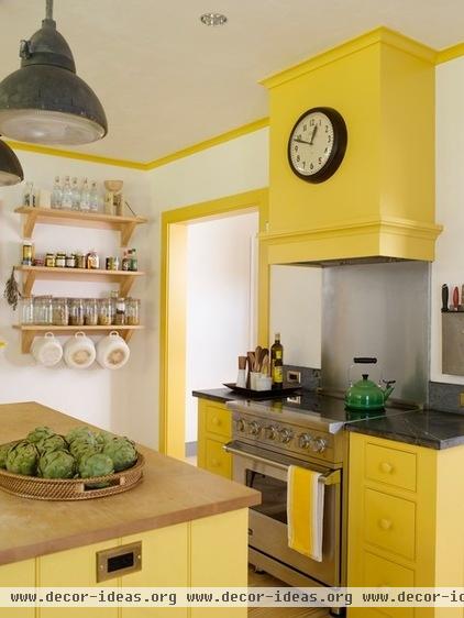
The cabinet doors are a design Churchill likes to employ. “True Shaker drawer design is tough, as each was so specific to the item it held,” he says. “We like the look of these drawers, which are flush with a beaded face frame.”
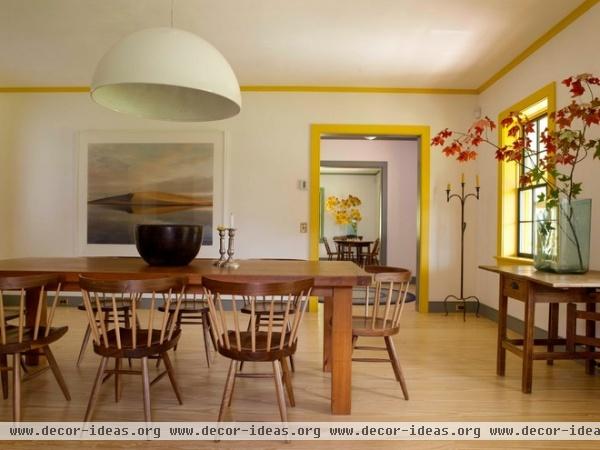
The painted trim continues in a historically inspired palette through the rest of the house. “Although we didn’t use exact Shaker colors, we did use shades that are based on historic colors,” says Churchill.
“This is not to be a formal space that is only used on a few occasions, but rather an industrious space where the family gathers for every meal — as well as doing homework, working on projects and even displaying finds from the pond and garden,” says Hendricks. “We kept the furnishings simple but hardworking. The midcentury chairs by George Nakashima have an affinity with the expert craftsmanship and unadorned Shaker aesthetic. Underneath the dome the light has a plaster relief showing a bountiful flower garden, echoing the view from the windows.”
Molding paint: Babouche, Farrow & Ball; light fixture: Sky Garden, Flos
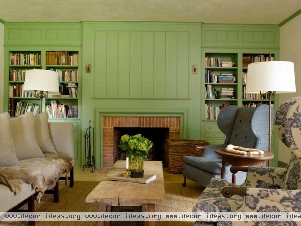
For many turn-of-the-century farm families, the formal parlor was reserved for the very best furniture and decorative items. The living room in this house follows suit, populated by elegant modern pieces with lines that suggest an earlier time, and a fireplace surround and shelves with classic lines made modern by their green color.
“We wanted this room to be the quiet retreat at the end of the day, with just enough essentials for comfort,” says Hendricks. Noting the lack of overhead lights, she adds, “The architect and I agree that we would rather see the play of light from lamps at varying heights. The effect is very comforting and flattering to the occupants.”
Chairs: BDDW; coffee table: Berkshire Antiques and Garden

“The client really loved the Shaker practice of having drawers of different sizes for very specific uses,” says Churchill. “Under the bookshelves we made drawers like this for the kids’ art materials.”
The diminutive sconces came from another, truly old farmhouse that Churchill renovated. “One of the biggest mistakes people make when re-creating the farmhouse look is scale,” he says. “Original farmhouses didn’t have overscaled pieces.”
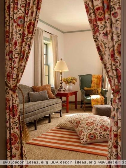
A small den serves as a media room. The curtains at the door can be lowered when the kids watch movies, while the adults linger around the dining table or fireplace.
“There are two children in the family, but they have seven or eight cousins,” says Churchill. Hendricks adds, “Kids flop on the oversized pillows and love to run through the curtains to make a dramatic entrance at the start of a movie.”

For anyone familiar with the farmhouses of the U.S. Northeast or Midwest, where mudrooms are often rustic affairs, the appearance of the mudroom/back entry of this house will seem familiar. Don’t be fooled by the look of unfinished framing, though; it’s just another way Churchill made a new house appear old. “We actually built this on top of an insulated wall system,” he says. “This room is supposed to look like a later addition. It’s where everyone comes in and takes off their coats, skis and boots.”
A reclaimed brick floor completes the design.
Window molding paint: Blue Hague, Farrow & Ball
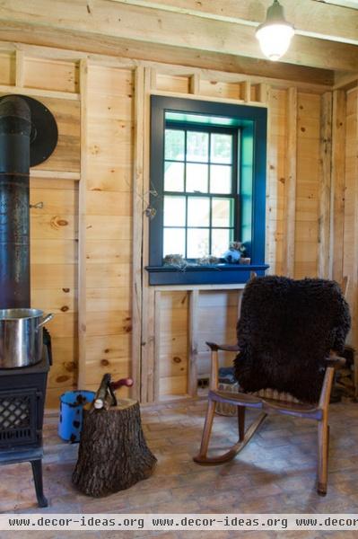
The room has less workman-like uses as well. “This is really the husband’s living room. You can find him here reading a book in his leather chair, stacking firewood or sitting with a friend when he’s not in the garden,” says Hendricks. “The bones, onions and flora on the windowsills are gathered by the family while roaming the property and tending the gardens.”
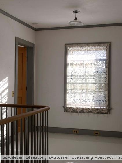
The second level demonstrates the painstaking design details. The scale of the stair balustrades and handrail was copied exactly from a building in Hancock Shaker Village. But elsewhere the architect and designer had more creative license.
“In a true Shaker house, the molding would not be painted; it would be oil-rubbed wood. In this house only the Douglas fir doors express the natural color and grain.
Molding paint: Incarnadine, Farrow & Ball
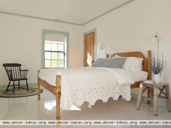
The bedrooms are minimalist to promote rest. “The decor is very spare and limited to the comforts of a good night’s sleep,” says Hendricks. “Crisp linens, hand-crocheted coverlets, fluffy duvet and pillows — old school and simple.”
The painted floors upstairs conjure the romantic notion of a farmhouse, but here they have the contemporary twist of a full-gloss finish. “The effect is calming,” says Hendricks.
Molding paint: Teresa’s Green, Farrow & Ball; floor paint: Cornforth White, Farrow & Ball; antique coverlet: Millerton Antiques Center; bed: Country Bed Shop; bedside table: Hunter Bee
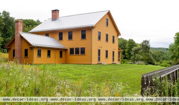
Like a classic farmhouse, this home is designed for community. “The house is created for gathering; there are guest rooms but no guest suites or guest houses,” says Churchill. “This is not a house where you walk the visitors up the stairs on Friday evening and see them again on Sunday. This is a house for visiting and being with others.”


