Houzz Tour: Craning Toward the View in Seattle
http://decor-ideas.org 01/10/2014 23:24 Decor Ideas
The architects at Elemental Design in Seattle had to come up with an unconventional approach for an out-of-the-ordinary lot. “The owners couldn’t find a house they liked on the real estate market, so they decided to build and purchased a slender lot in the Phinney Ridge neighborhood,” says Elemental Design owner Ryan Stephenson. The architects were charged with creating a modern house that would embrace the light and views. The problem was, the view was to the side, so they decided not to meet the challenge head-on.
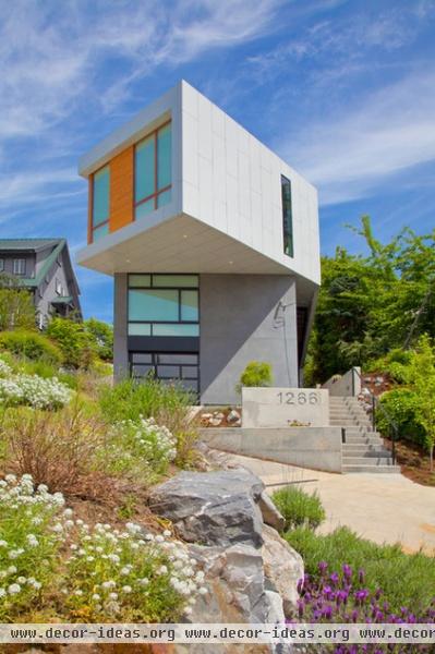
“Architect Dave Biddle designed a house that cranes its head to the view,” says Stephenson. The analogy is apt, as the upper floor appears to rotate on what could be compared to a neck.
Houzz at a Glance
Who lives here: A couple with 2 kids
Location: Phinney Ridge neighborhood of Seattle
Size: 2,500 square feet; 3 bedrooms, 2½ bathrooms
Year built: 2010
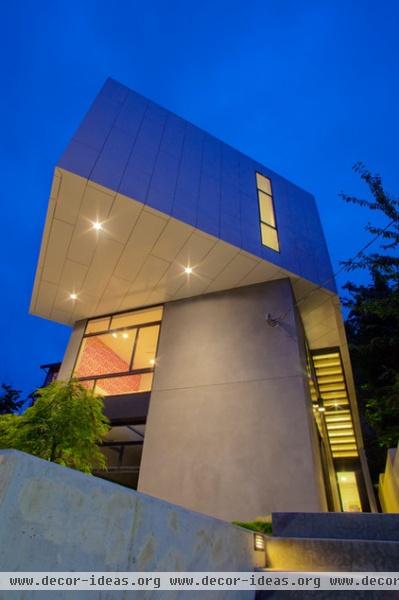
The pivoted space contains the living room, giving the family the chance to enjoy the landscape during the day.
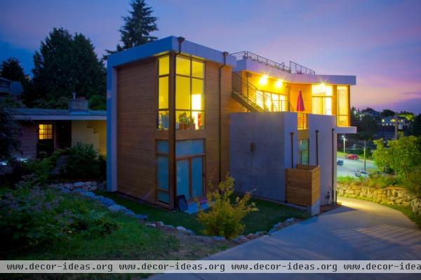
Because of the lot’s slender nature, the home’s footprint is also narrow. The architects gave the family more outdoor space by adding a second-story deck and a roof deck.
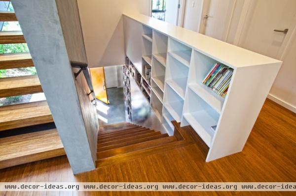
The entry is on the lowest level. The stairwell morphs into bookshelves near the bedrooms.
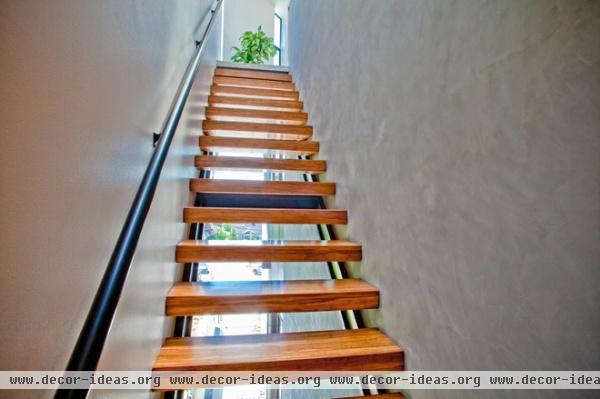
In the spirit of letting in as much illumination as possible, the interior stairs are topped by skylights and backed by glass, so light seeps in under the treads.
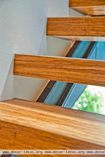
This detail shot explains the construction. The metal frames sheets of glass.
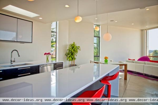
The public rooms — living room, kitchen, dining room — are at the top level. The theory is that this is where the family spends waking hours, so these rooms are in the lightest and most view-filled spaces.
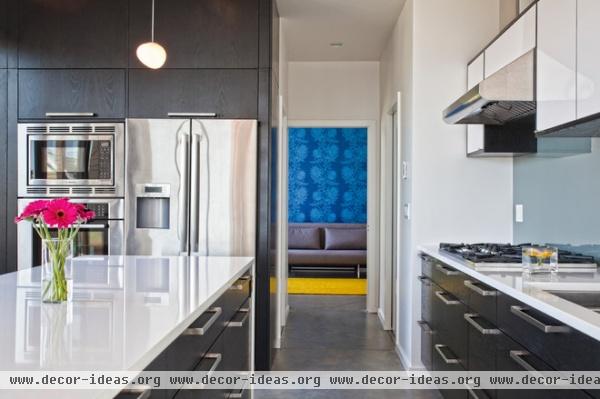
The dark-stained cabinets were chosen to coordinate with the concrete floors.
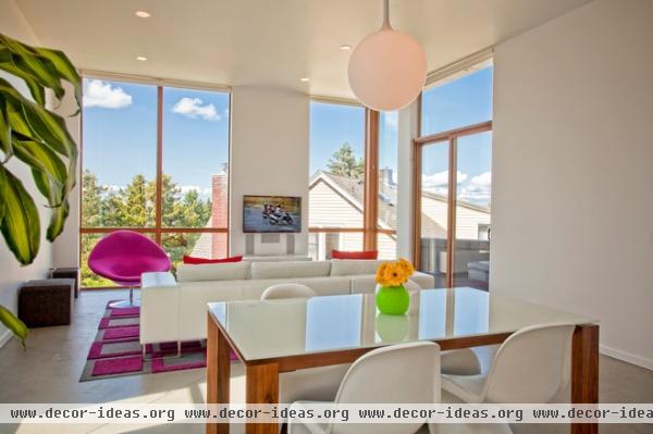
Moving through the kitchen and into the living room, the reason for the turned head becomes apparent: peeking over the neighboring rooftops, you can see the Olympic mountain range.
Fuchsia chair: Globe, Artifort; sofa: Chartreuse; rug: Flor
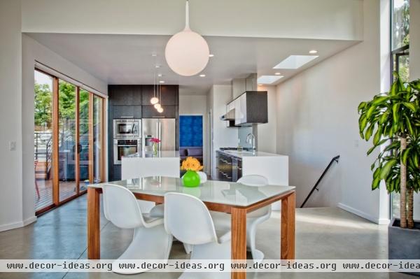
The dining room table is set at an angle to allow for better circulation.
Dining table: Omina, Calligaris
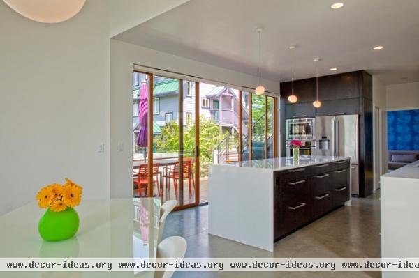
A deck is located off the kitchen, to give the family more outdoor space. From here they can access the roof deck.
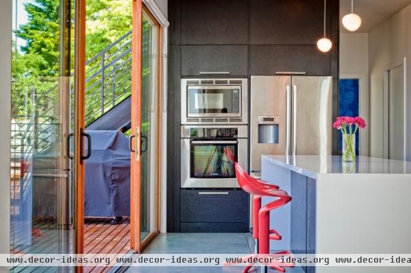
Red bar stools make a vivid exclamation point against the dark cabinets and gray floors. “The owners are very interested in modern design and clean lines,” says Stephenson. “They selected all of the furnishings.”
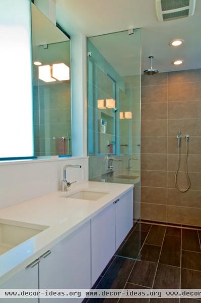
In the private rooms downstairs, the shapes are geometric and simple. “We like to do showers with no curbs, so there’s no interruption in the space,” says Stephenson.
Light comes into the room through a frosted pane of glass.
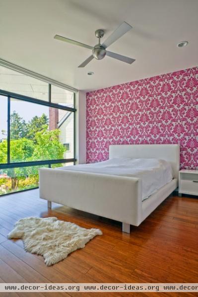
The mullions of the floor-to-ceiling bedroom windows are in an almost Mondrian layout. “We have no curbs on the windows either,” says Stephenson. “The idea is that your eye goes directly to the outdoors.”
Related Articles Recommended


