Mix Pillow Patterns Like a Pro: 17 Foolproof Themes
Patterns are a scary thing for many people. But instead of confronting their fears head-on, they settle for a yawn of solids and tawny beiges. This is a sensible solution for large investment pieces like sofas and sectionals. But that doesn’t mean everything needs to be neutral territory.
Pillows are a good place to learn about layering patterns. They can be added easily and relatively inexpensively. The trick is to approach patterns like the professionals do, by picking a common theme. If your pillows are united by a color, a texture or a pattern, chances are they will go together.
I’ve pulled together some ideas for mixing pillow patterns using a variety of themes. Once you’ve seen how it’s done, take two or more patterns and mix them liberally. Anxiety should dissipate soon after!
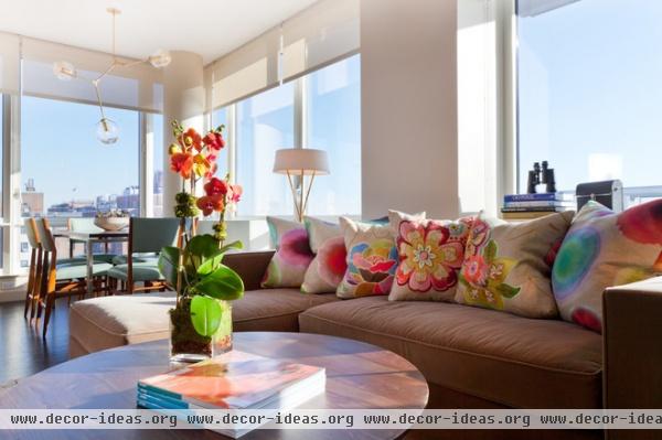
Blooming fantastic! Use the power of flowers to create a bouquet on the sofa. In decorating, as in nature, flowers work together when they share a similar palette. Here the pillows with embroidered jewel-tone posies pair well with the batik ones because their hues are similar.
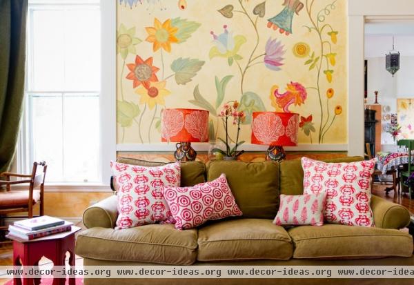
Power punch. An assembly of bold red and white prints provides eye-popping color. The pattern mixing works well here because the prints are all of a similar scale and have the same color combination.
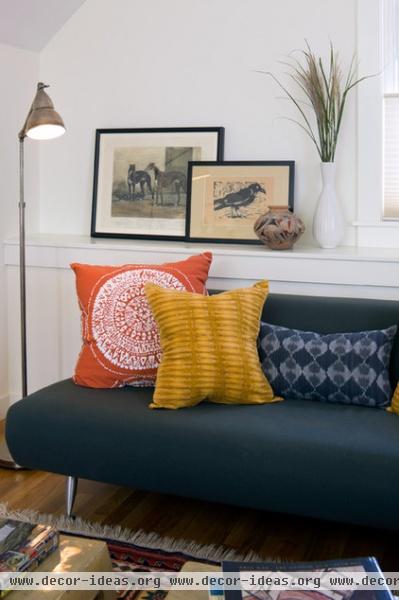
Fit to be tie-dyed. This collection of pillows is tied together by the technique used to make the fabrics. Even though the colors and patterns are all completely different, the common dyeing technique makes them work as a group.
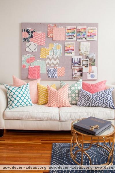
Geometric quandary. Besides sharing a common Moorish tile pattern, these pillows are all dressed in pastels. The dusty, feminine colors are coupled with white, making this collection of cushions refreshingly playful on an off-white sofa.
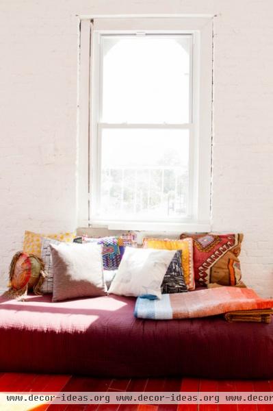
You’ll be floored. Rug remnants look stunning when they’re turned into pillow covers and grouped together. Flat-weave rugs like kilims or dhurries work best as pillow covers. (Don’t try this with old broadloom!)
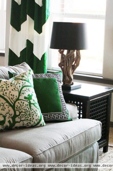
Easy being green. Here a single color provide a common thread. The velvety texture is also a uniting element, as is the use of positive and negative space in the designs. The green bursts off the pillow on the left, where it’s used in silhouette, but recedes in the pillow on the right, where it’s used as the ground.
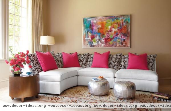
Pulsate with color. Pick one pattern with great contrast and use it liberally. Counter it with an outlandish solid color. Black and white works well, as seen here, but a navy-white or purple-cream combination would produce a similar result.
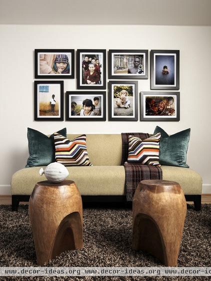
Let artwork be your guide. Pull together a seemingly unruly collection of patterns by picking colors from nearby artworks.
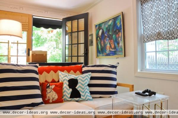
Family tree. Why not toss some silhouettes of family members or pets into the mix? This is a witty alternative to the familiar staircase lined with family portraits.
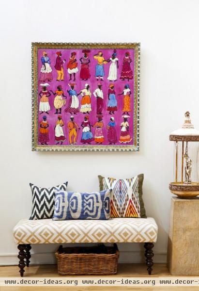
Tribal rhythms. A collection of ethnic designs in varying colors and prints mixes well on this patterned bench. Much like the earlier tie-dyed collection, these mud prints exhibit a commonality without exactly matching.
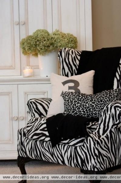
Don’t spook the herd. Corral a menagerie of similar animal prints and toss them together on a chair or sofa. This bold example was achieved without color — it has only black and white.
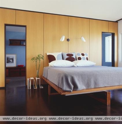
Color, scale, repeat. Pick a pattern and use variations of it … over and over again. Here a chocolate and powder-blue print is used to great effect. Those bold spots enliven a very restrained bed.
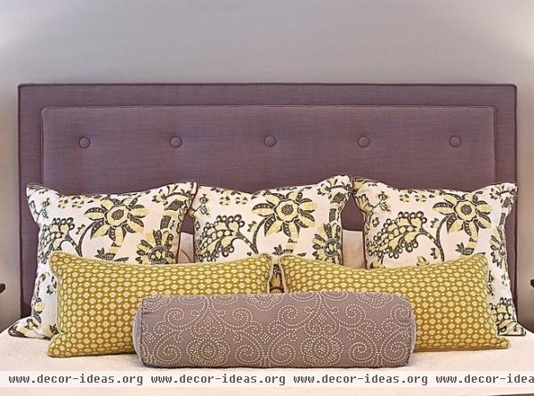
Distinctive quality. Pick three distinct patterns and give each one its own layer. In this instance, playing elongated shapes against squares adds another level of pattern to the mix.
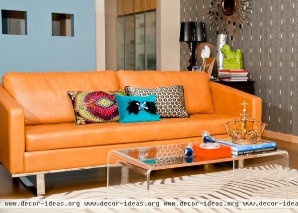
Eclectic mix. When it comes to patterns, an orange leather sofa demands a bold mix. Here three bright silk pillows hold their own against the bold background. Using blue (orange’s complementary color) as an anchor keeps that pillow center stage, while its shimmering companions play supporting roles.
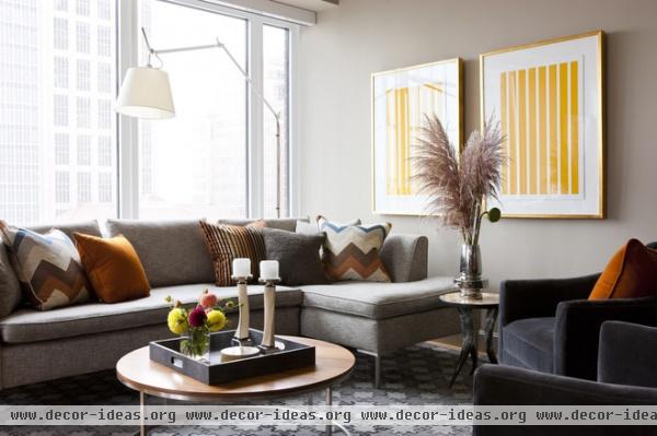
Subdued. Earth-toned stripes and chevrons take a greige sofa to new heights. Each pillow is a different pattern, but they all have something in common: a drizzle of caramel that adds just the right amount of sunny color.
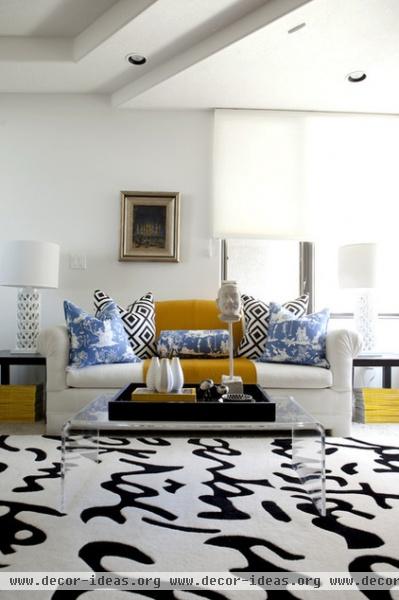
It worked with soup cans. Andy Warhol demonstrated the value of repeating the same image over and over. The same principle applies here with pattern. Any two patterns can be handled this way. Notice how they are paired here; this keeps them balanced and limits any visual cacophony.
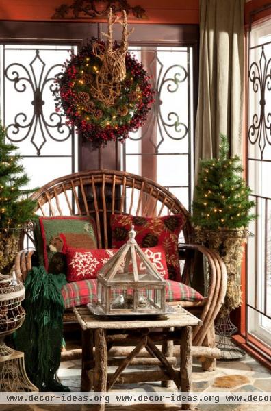
Knotty and nice. Country-style needlepoint is one of the common threads used here. There is also the complementary color scheme of red and green. Notice how the naive charm of the pillows echoes the rustic quality of the settee — that helps make it work, too.
More: 9 Pointers for Perfectly Styled Pillows


