My Houzz: From Underused Dining Room to Family Hangout
Ten years after Enid and Jim Brock built their hillside home in Santa Cruz, California, the couple realized that a great idea doesn’t always translate into a great room.
Enid wanted the dining room to be a multifunctional space for entertaining and family time, and figured a fireplace and ample seating would do the trick. “I came up with several strategies to make sure the dining room wouldn’t become a forgotten space,” she says. But despite her best efforts, the room felt too formal and dark, and sat empty except for the occasional holiday get-together or piano rehearsal.
Finally Enid asked interior designer Suna Lock to make the space a destination for gathering.
Project at a Glance
Who lives here: Enid and Jim Brock and their 3 daughters
Location: Santa Cruz, California
Interior designer: Suna Lock, Stripe Design Group
Size: 352 square feet
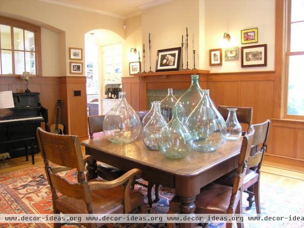
The Brocks had designed the room with a fireplace, “because everyone is drawn to a hearth,” Enid says. “I liked the way people would be able to see the fireplace when they walked in the front door, have the experience of walking past its light and warmth, and perhaps then choose to stop and sit in the dining room so they could continue to enjoy it.” Unfortunately, that didn’t happen.
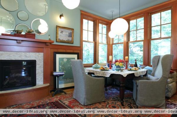
AFTER: “The dining room’s rebirth started with a picture I saw in a magazine,” says Enid. The photo was of a bathroom, and on the wall above the tub were a dozen round mirrors, of all sizes and styles.
“I had been fretting about what to hang above the dining room fireplace for about eight years by then, and had never hung a single thing,” she recalls. “I had propped various paintings up on the mantel; I had taped panels of fabric and strips of butcher paper on the chimney wall. I had tried so hard to come up with something that looked beautiful up close, yet also grabbed your attention when you saw it from afar, and I had found nothing.”
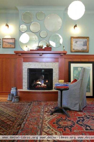
Enid and Lock searched for vintage mirrors at local flea markets and on eBay. “And that was the beginning of the transformation,” Enid says.
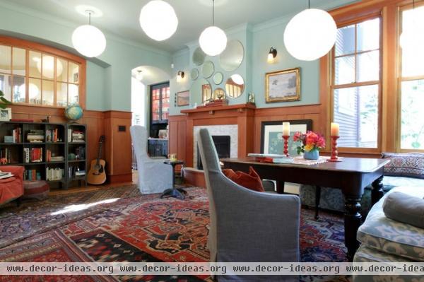
Early on Enid had considered removing the can lighting and installing a center chandelier. “But I couldn’t wrap my mind around the chandelier,” she says. “I am constantly moving the table around the room depending on how many people I’m feeding and how many leaves have to go in the table.”
To Enid, “the whole point of a chandelier in a dining room is that it hangs above the table and creates that romantic glow that draws you in,” she says.
Instead of hanging just one chandelier in the middle of the room, Enid and Lock hung several paper pendants. “Now wherever I move the table, there’s a pendant just waiting there, ready to create a pool of light in the middle of the table,” Enid says.
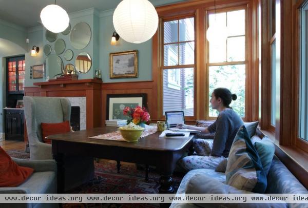
In the past 10 years, Enid changed the walls from a coffee-colored hue to white in an attempt to lighten up the space. She eventually settled on what she describes as a moody blue.
The dining room table originally had wooden chairs to match, but they weren’t particularly inviting. Enid ended up moving the table to the corner and ordering a custom banquette. “[Jim] grew up in a kitchen with a red booth, and he always said everyone loves to hang out in a booth,” she says. “Our banquette isn’t red Naugahyde, but it attracts our teenage girls like a bowl of M&Ms. They now crawl on in, with their tea and their popcorn and their calculators and their laptops, and hours pass before they emerge.”
That’s one of the daughters on her laptop at the dining table here.
Paint: Dix Blue, Farrow & Ball; art: Fuji Arts
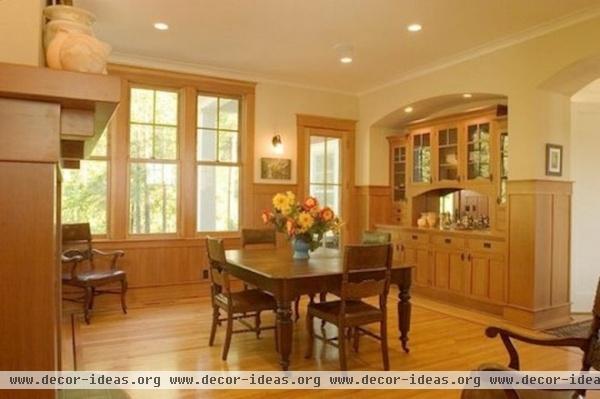
When designing the layout of the house, Enid placed the dining room so it would be part of the home’s normal circulation. To get from the front door to the kitchen, you had to walk through the dining room, not past it, which Enid hoped would encourage more use of the space.
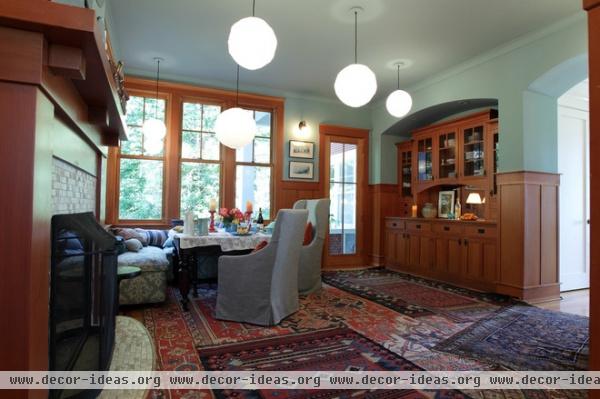
AFTER: The architecture remains true to the original layout, but now the room feels far more enticing. Enid covered the wood floor with layers of Oriental rugs. “It feels soft on your feet wherever you are in the room,” she says. The slipcovered chairs are more comfortable than their predecessors, and are light enough to pick up and move by the fire.
The shady, north-facing room has large windows to help compensate for its orientation and a built-in sideboard for ample storage.
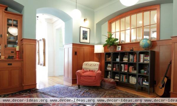
Enid’s design included a window in the wall between the dining room and her home office, to bring in more natural light. She once had a piano here but installed bookshelves in its place, to create a cozy reading area.
Bookshelf: Restoration Hardware Baby & Child; chair: vintage
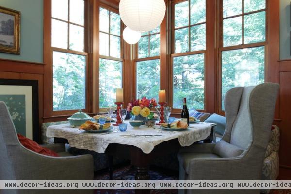
After a long decade of tweaking, the dining room is finally complete and has become a hub for Enid and Jim’s family, whether it’s for a study session or a holiday party.
“As for dinners,” Enid says, “now we eat in the dining room.”
Chairs: Belgian Transitional Slipcovered Wingback, Restoration Hardware
See more of this home: My Houzz: A Hilltop Family Home in Santa Cruz


