Houzz Tour: Strong, Modern Lines Stand Up to the Trees
The owners of this home live primarily in Brooklyn, but their hearts reside on a bucolic, tree-surrounded spot in Woodstock, New York — despite the fact that they jokingly call it Bug Acres. Joe Smith, principal at Hall Smith Office Architecture, has remodeled a series of apartments for the couple in the Big Apple, but expects that this is the only home he will design for them in the Catskills. “They like to move around the city, but even though this is just their weekend house, it is their permanent home,” he says. “I expect they will hold on to it for the rest of their lives.”
Houzz at a Glance
Who lives here: This is a weekend home for a couple and their 2 kids.
Location: Woodstock, New York
Size: 2,700 square feet; 4 bedrooms, 3 bathrooms
Year built: 2011
Photography by Rachel Stoller
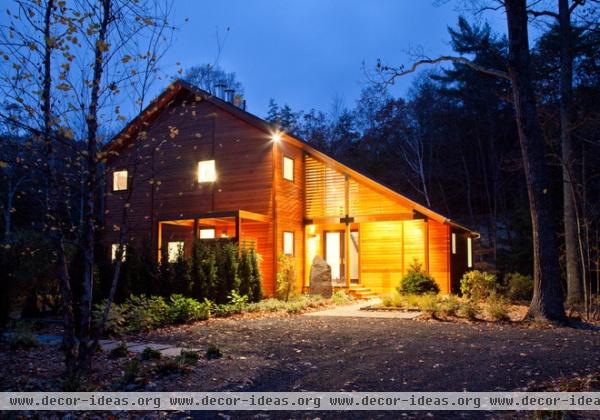
The original homestead consisted of a two-room, mice-infested cabin. Working with CWB Architects in Brooklyn, Smith helped the clients design a modern home on the site.
To reach the front door, visitors walk through an open-air anteroom covered with slats. “The approach to the entry is not straightforward, and we wanted to make the way in prominent,” he says.
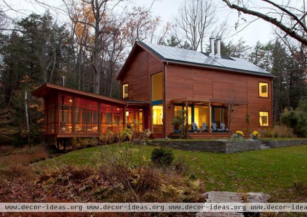
Reacting to the home’s insect-inspired nickname, the architect created a modern screened porch addition. “The house sits in a clearing in a small basin, and a stream runs through it,” he says. “In some months the swarms of mosquitoes can be deadly. The porch gives [the owners] a sheltered place to enjoy the property.”
Since they aren’t preoccupied by swatting bugs, the owners can enjoy the sound of the burbling creek. “The screened porch juts over the water slightly,” Smith says. “The sound of the running water is beautiful — it became auditory architecture.”
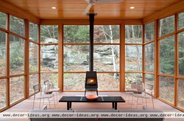
Although the porch can’t be enjoyed in the dead of winter, the architects extended its usability by installing a wood-burning stove.
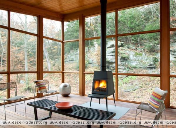
“For years I looked for the perfect woodstove, but the only ones I could find were either too European looking or potbellied models straight out of the general store,” says Smith. “When I found this Shaker-inspired stove with tapered legs, I knew it was the right one.”
The woodstove is perched on a slab of stone inset in the decking material.
Woodstove: Shaker Stove, Wittus
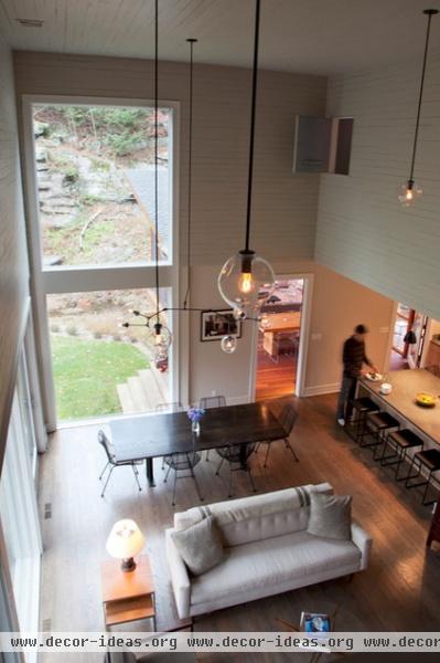
The living and dining room are in a double-height space. Second-floor interior windows from the kids’ rooms and playroom open onto it. “We wanted the family to be able to be connected, no matter where they were in the house,” says Smith.
Light fixtures: Lindsay Adelman
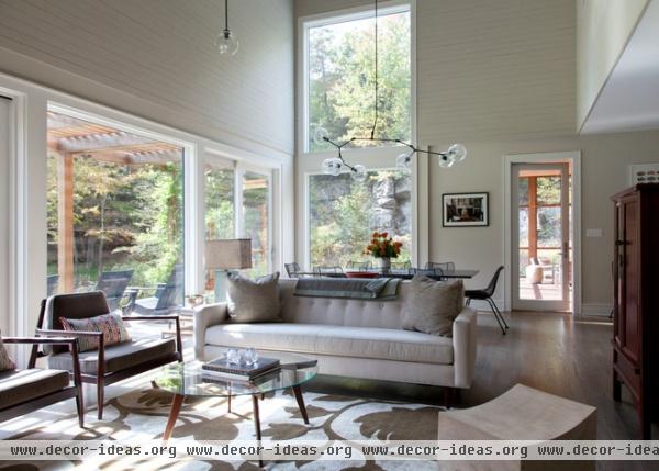
The architect envisioned the windows as long slots framing the views. Brendan Coburn of CWB suggested leaving the wall over the sliding doors blank, and after visiting a nearby historic house, Smith agreed. “Frederic Edwin Church, the famous artist, built Olana, his own home, nearby,” says Smith. “I visited and noticed how beautiful the blank walls were. If you put windows everywhere, you lose the power of it.”
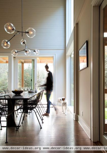
In an unconventional move, the architects covered the highest walls with horizontal paneling, leaving about a dime’s width of space between the planks. “It frames the space the same way a kid’s toboggan [cap] frames his face when it’s pulled down over his head,” Smith says.
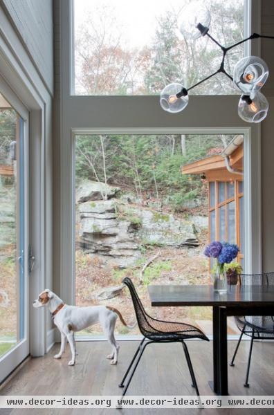
The windows were carefully sited to frame the views. This one was placed to capture scenes of the nearby rocky hillside. “I went up during all times of the year and studied the site,” says Smith. “In the bedrooms we placed the windows so you can lie in bed and almost feel like you are sleeping in the woods.”

The galley kitchen opens to the dining room. “We didn’t put upper cabinets in, because we wanted to have a window here,” says Smith. “Most of the storage is in a pantry that’s tucked to the side of the kitchen, but the small shelves between the range and the refrigerator keep necessities close at hand.”
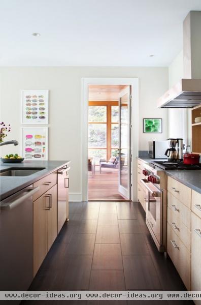
A door in the kitchen leads to the screened-in porch.
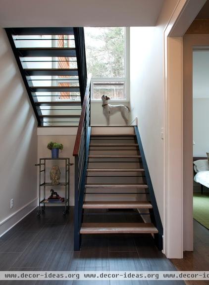
A vertical line of windows runs up the stairwell, allowing people to experience the views as they ascend.
The entrance to the guest room and a bathroom can be screened by a curtain. “The interior designer, Catherine Brophy, had that idea,” he says. “Pull the curtain, and you have a private guest suite. And the curtain is much more interesting than the expected pocket door.”
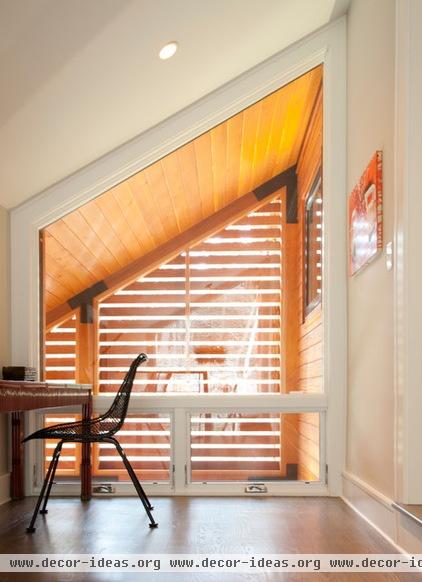
At the top of the stairs, a window looks out to the slatted entry. The designers made the landing more functional by installing a desk and chair. “It became an Internet surfing area,” says Smith.
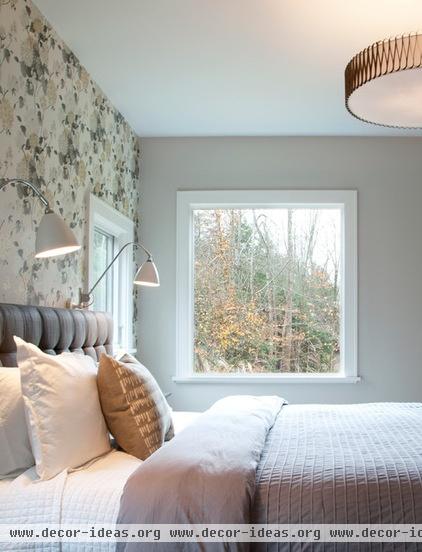
“In architecture school you are not taught to appreciate decorative objects,” says Smith. “I’ve surprised myself by becoming fond of wallpaper. The designer selected this pattern, and it brings so much life to this wall.”
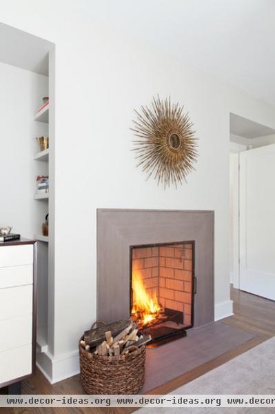
The stone around the fireplace has a strong striation. The architect had it cut to resemble a mitered picture frame.
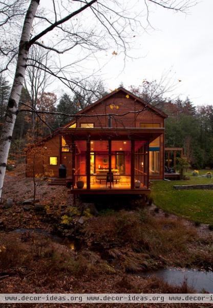
“With the strong lines of windows and doors, slats and screened-in porch, we envisioned that this home would be like a lantern,” Smith says. “At night it glows.”


